Stage — Talent Booking Landing Page Template
Sync is a hub-and-spoke entertainment CRM landing page built for agents, promoters, and studio executives. It unifies talent rosters, deal pipelines, and audience analytics inside one dark-glass dashboard. A Feature Tab Switcher hero, Problem-to-Solution spoke sections, and persistent anchor navigation guide visitors from industry pain to precise feature resolution, earning the click before they leave.
by Rocket studio
Quick summary
Sync is a single-page entertainment CRM landing page template built around a hub-and-spoke anchor navigation structure. It presents a Tech Glass visual identity, a three-tab hero dashboard, and a Problem-to-Solution scroll arc. Booking agents, festival programmers, and studio executives are the core audience. The page moves every visitor from recognized pain to confident action.
Who this template is for
This template is built for professionals who manage complex creative relationships under deadline pressure. It speaks directly to the people keeping deals alive in fast-moving entertainment industries.
- Booking agents tracking rider requirements and tour logistics across multi-city schedules
- A&R representatives managing demo submissions and artist development pipelines
- Festival programmers and promoters cross-referencing artist availability, stage conflicts, and sponsorship obligations
What problem this template solves
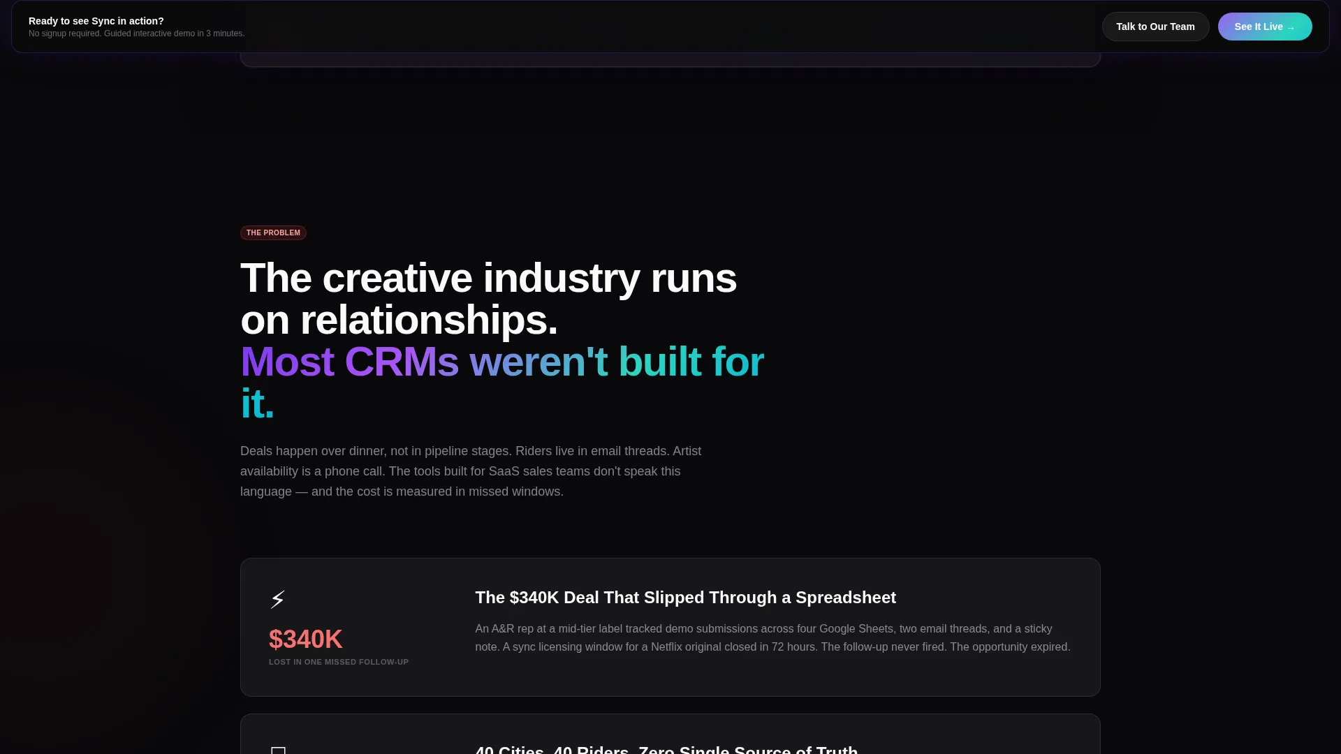
Entertainment deal-making runs on relationships, timing, and data that rarely live in the same place. Teams lose revenue when information is fragmented across spreadsheets and siloed inboxes. This template frames that pain visibly and then resolves it section by section.
- Fragmented contact data causes missed follow-ups and broken deal momentum
- Manual pipeline tracking lets sync licensing windows and booking opportunities slip through unnoticed
- No unified view means forecasting audience demand and venue fit requires guesswork instead of insight
What you get with this template
You get a fully structured, single-page landing page that presents an entertainment CRM product with clarity and momentum. Every section has a defined job, and the layout keeps visitors oriented and engaged from the first tab click to the final call to action.
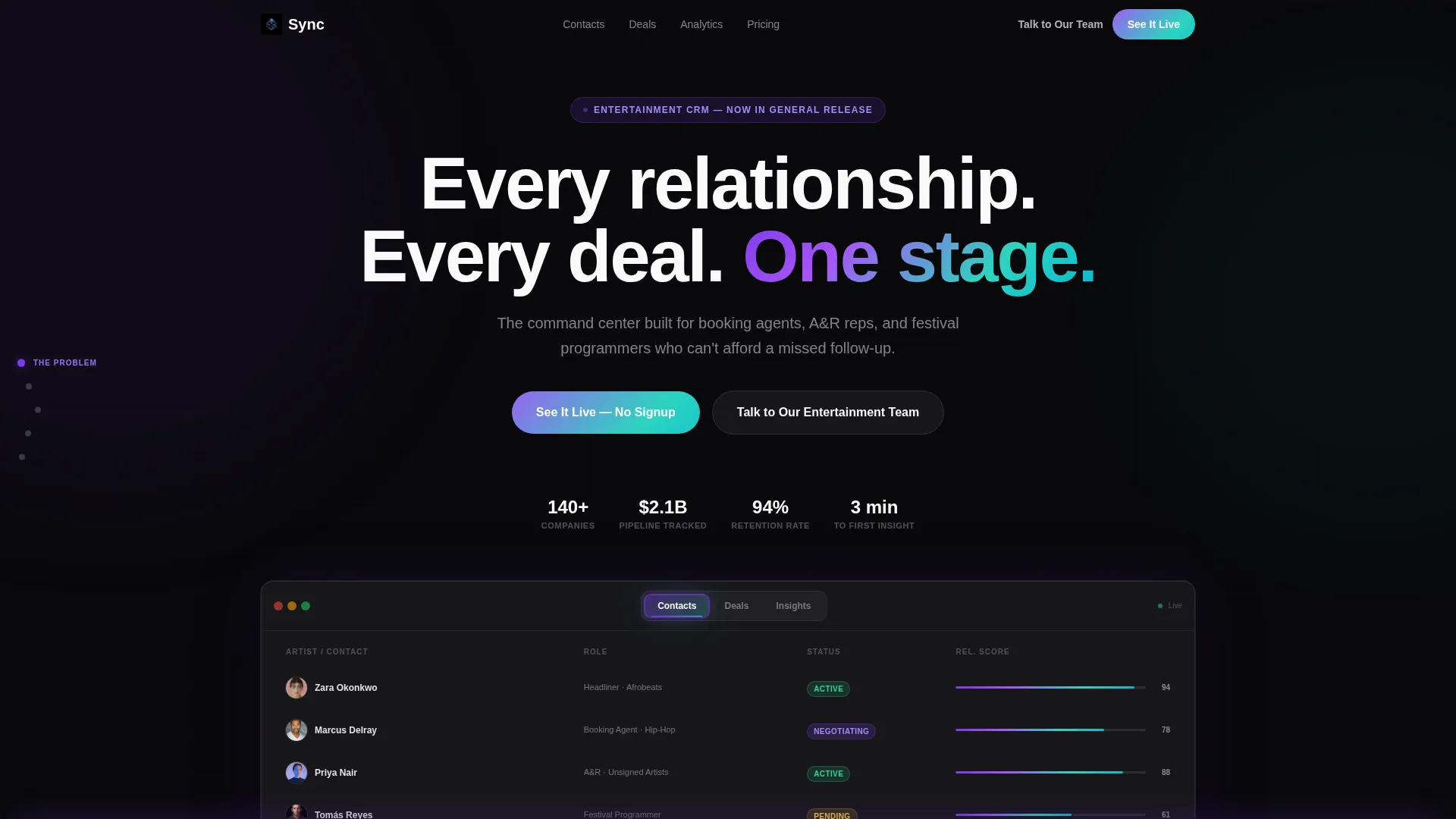
- A Feature Tab Switcher hero that previews three core CRM views: Contacts, Deals, and Insights
- Hub-and-spoke anchor navigation with persistent side nav for direct section jumping
- A Problem-to-Solution scroll arc with quantified pain points and feature-level resolutions
Feature list
This template delivers a focused set of visual and structural components drawn directly from the brief. Each one does specific work in the conversion flow.
Feature Tab Switcher Hero
Three glass-panel tabs labeled "Contacts," "Deals," and "Insights" sit across the top of a dark, layered user interface mockup. Each tab transitions the hero dashboard beneath it, showing a talent roster with contract status pills, a Kanban deal pipeline, or an audience heatmap overlaid on a venue circuit map. The active tab glows with the iridescent gradient edge, making the product feel alive before any scrolling begins.
Hub-and-Spoke Anchor Navigation
A persistent side navigation anchors the page structure. Visitors can jump directly to the spoke section that matches their specific frustration, whether that is contact data, deal tracking, or audience forecasting. This keeps bounce rates low by letting each visitor self-route to their relevant pain point.
Problem-to-Solution Scroll Arc
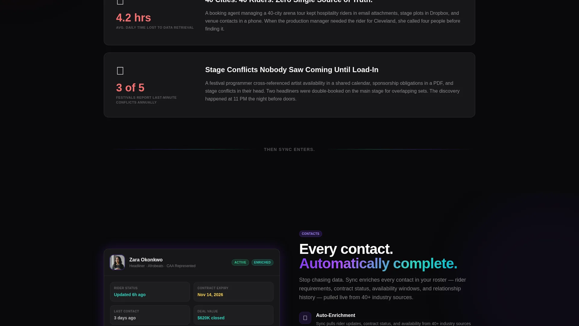
The page opens on recognizable industry chaos: fragmented spreadsheets, missed follow-ups, and a quantified lost opportunity of $340,000. Each subsequent spoke section sharpens the lens, pairing one problem with one precise feature resolution. The arc builds tension and releases it systematically, earning visitor trust spoke by spoke.
Dual Call-to-Action Path
The primary call to action, "See It Live," routes to a guided interactive demo requiring no signup. It appears first beneath the header tabs and resurfaces as a sticky bar after the second spoke. A secondary path, "Talk to Our Entertainment Team," serves enterprise buyers who need a white-glove walkthrough.
Tech Glass Visual Identity
The void black background, frosted glass panels, shifting violet, and holographic teal combine into a visual environment that feels like a professional backstage production board. Hover states and section dividers use an iridescent gradient that shifts between violet and teal. The effect keeps the layout visually rich without pulling attention away from the content.
Kanban Deal Pipeline Display
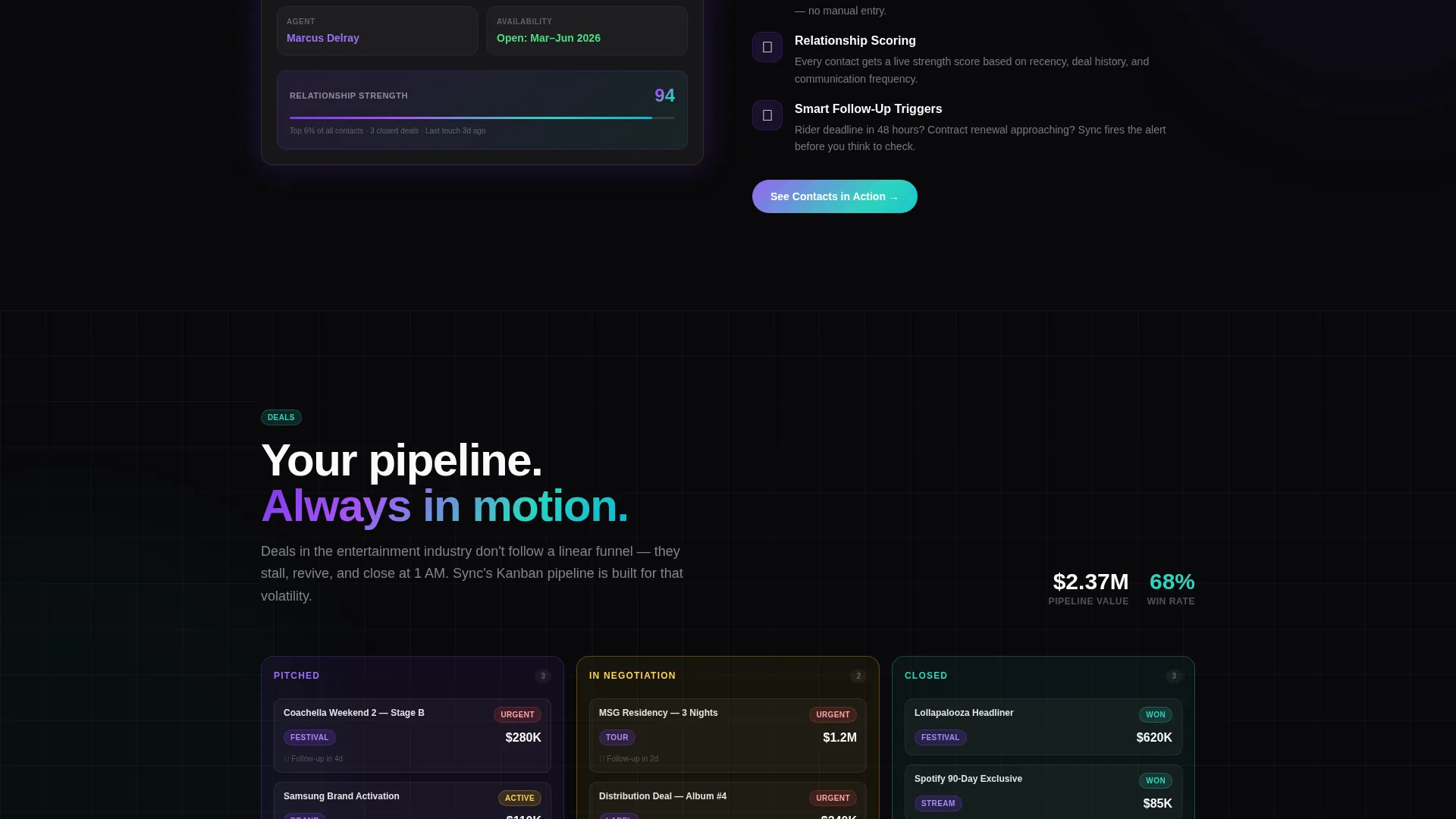
The Deals tab surfaces a Kanban board with cards that move between "Pitched," "In Negotiation," and "Closed" stages. This single view communicates the CRM's pipeline automation capability without a word of explanation. Visitors immediately understand how their deal flow would look inside the product.
Page sections overview
| Section | Purpose |
|---|---|
| Feature Tab Switcher Hero | Introduces three core CRM views with an interactive tab layout |
| Problem Spoke: Contacts | Frames fragmented data pain and presents automated contact enrichment |
| Problem Spoke: Deals | Addresses missed pipeline tracking with visual Kanban automation |
| Problem Spoke: Analytics | Resolves forecasting gaps with predictive audience insight visuals |
| Sticky call to action Bar | Resurfaces the primary demo call to action after the second spoke |
| Final Anchor Section | Closes the arc and presents both primary and secondary call to action paths |
Design & branding system
The visual language is built on a Tech Glass theme using an AI Iridescent color system. Every layer feels intentional, like light bleeding through smoked glass in a dark venue.
- Core palette: void black (#09090B) for backgrounds, frosted panel at 6% white opacity for cards, shifting violet (#7C3AED), holographic teal (#2DD4BF), and zinc white (#FAFAFA) for body text
- Interactive elements use a violet-to-teal iridescent gradient on hover states and section dividers, creating a sense of physical depth and motion
- The overall aesthetic references a backstage production board at curtain time: every element floating on translucent layers, colors shifting as the eye moves
Mobile & speed optimization
The layout is designed to translate its layered depth across screen sizes without losing the immersive visual quality. The spoke structure keeps content modular and easy to reflow.
- Hub-and-spoke anchor navigation adapts to keep section jumping accessible on smaller screens
- Frosted glass panels and dark backgrounds are defined through the color system rather than heavy image assets, supporting a lighter visual footprint
- Modular spoke sections can be scaled or reordered without breaking the overall page arc
How this template helps you convert
This template earns the click by letting the product demonstrate itself before asking for anything. The conversion architecture is intentional and layered.
- The Feature Tab Switcher shows the product in three real use-case states immediately on page load, building confidence before the visitor reads a single feature claim.
- The Problem-to-Solution arc mirrors the visitor's actual frustration, making each spoke section feel personally relevant and moving them closer to a decision with each scroll.
- The dual call to action strategy covers both self-serve buyers with the no-signup demo and enterprise buyers with the direct team conversation path, reducing friction for every visitor type.
Other information about this template
This template is positioned within the Entertainment Software and SaaS category under the broader Technology umbrella. It is purpose-built for entertainment CRM use cases and reflects the intersection of creative industry workflows with modern SaaS product marketing.
- The template style is Hub and Spoke with Anchor Navigation, suited for products with multiple distinct feature areas that benefit from direct, self-guided exploration
- The creative direction follows a Problem-to-Solution Arc, a narrative structure well matched to CRM products where the buyer pain is specific and the feature resolution is direct
- The header concept is a Feature Tab Switcher, which communicates product breadth in a compact, interactive format without requiring the visitor to scroll to understand the core value
- The landing page direction is Click-Through, optimized to route visitors to an interactive demo rather than a form-gated conversion event
Theme
Tech Glass
Creative direction
Problem→Solution Arc
Color system
AI Iridescent
Style
Hub & Spoke (Anchor Nav)
Direction
Click-Through
Page Sections
Feature Tab Switcher Hero
Hub-and-spoke Anchor Navigation
Problem-to-solution Scroll Arc
Dual Call-to-action Path
Kanban Deal Pipeline Display
Tech Glass Visual Identity
Related questions
Who is the Sync template designed for?
What makes the hero section stand out from a standard product screenshot?
How does the dual call-to-action structure work?
Can the spoke sections be updated to match a different feature set?
What visual style does this template use?



