Dynamic Inventory App Landing Page Template
Stash is a dynamic, single-page landing page template built for a storage mobile app. It combines a terminal-style code header, a modular feature card grid, and a frictionless app download flow. The design uses a high-contrast Acid Digital color system to communicate technical credibility and drive installs with near-zero friction.
by Rocket studio
Quick summary
Stash is a landing page template designed for a storage mobile app that turns a phone camera into a barcode scanner, shelf tracker, and real-time inventory dashboard. The layout leads with a code snippet header, moves through a modular feature matrix of flip cards, and closes with a full-width download section. The visual identity is bold, dark, and high-voltage.
Who this template is for
This template is built for makers and marketers launching an inventory or storage mobile app to a technically minded audience. It communicates depth and precision without resorting to generic product marketing language.
- E-commerce sellers managing large SKU counts across garage shelves or storage units
- Operations managers at mid-size warehouses handling receiving docks and pick lists
- Freelance organizers who catalog households or small business stockrooms quickly
What problem this template solves
Launching a utility app in a crowded market is hard when your landing page looks like every other app promo site. Stash solves the credibility gap by leading with real technical language and then proving capability through structured, animated feature cards.
- Generic app templates fail to speak the language of power users and warehouse operators
- Most landing pages bury the app download behind long scrolls and multiple form fields
- Visitors leave when they cannot quickly grasp what the app actually does at a system level
What you get with this template
You get a fully structured, single-page layout built around a modular card grid. Every section serves a specific conversion purpose, from first impression to final install tap.
- A terminal-style animated code snippet header that establishes technical credibility immediately
- A four-cluster feature matrix with hover-expand cards and a persistent sticky phone mockup
- A frictionless app download section with paired store badges, a live download counter, and a five-star rating snippet
Feature list
This template ships with purpose-built sections and interaction patterns. Each one is designed to move a visitor from curiosity to confident download.
Terminal Code Snippet Header
The header opens with a live-styled code block on a void black field. It shows a simple API call returning a JSON object with item name, location, quantity, and last-moved timestamp. Each line animates in sequence like a terminal printing output, with values lighting up in electric lime. A single headline sits below: "Your inventory, programmable."
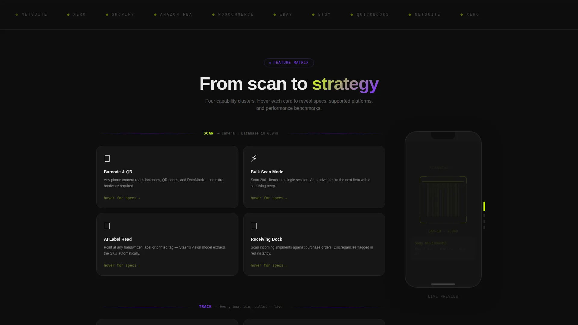
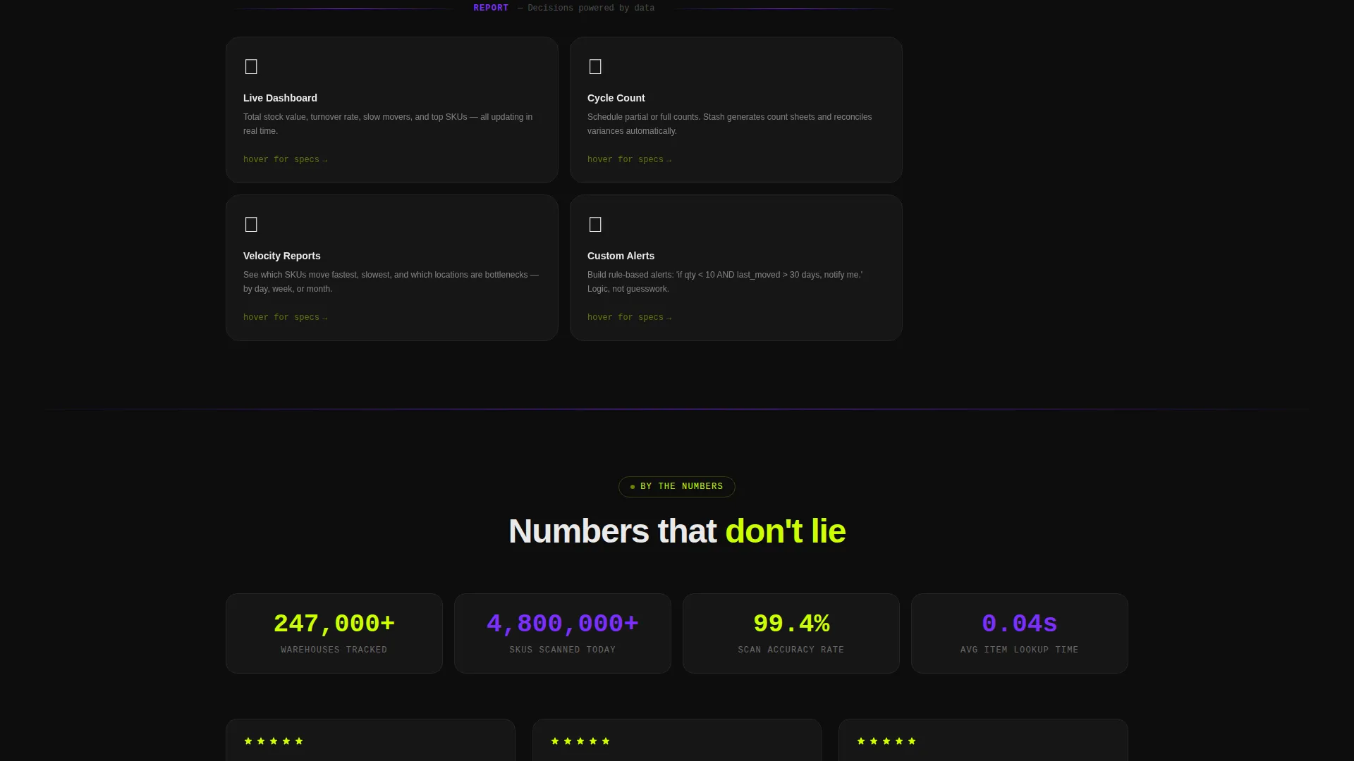
Modular Feature Card Grid
The core of the page is a four-cluster card grid covering Scan, Track, Sync, and Report capabilities. Cards flip or expand on hover to reveal specs, supported platforms, and micro-animations. The rhythm builds from basic scanning up to multi-warehouse analytics, showing product depth without overwhelming the visitor.
Persistent Sticky Phone Mockup
A phone mockup anchors the right edge of the page as visitors scroll through the feature matrix. Its screen updates to reflect whichever feature cluster is currently in view. This keeps the product tangible and grounded throughout the entire scroll journey.
Frictionless App Download Flow
The primary call to action reads "Download Stash Free" and appears three times: inside the header, as a floating bottom bar after the second card row, and in the final full-width section. App Store and Google Play badges pulse gently in electric lime. No form fields stand between the visitor and the install.
Live Social Proof Section
The final download section includes a live download counter that ticks upward and a five-star rating snippet. These elements reinforce trust at the exact moment a visitor is deciding whether to tap the store badge.
Web Demo Secondary Path
A secondary call to action offers "Try the Web Demo," linking to a browser-based sandbox. This gives technically cautious visitors a way to explore the app before committing to a download, lowering the barrier for skeptical users.
Page sections overview
| Section | Purpose |
|---|---|
| Code Snippet Header | Establish technical credibility with animated API output and primary headline |
| Primary call to action Block | Drive immediate app downloads with pulsing store badges |
| Scan Feature Cards | Showcase barcode scanning capability with hover-expand detail cards |
| Track Feature Cards | Present shelf and location tracking with animated mockup sync |
| Sync Feature Cards | Communicate multi-device and multi-location data sync features |
| Report Feature Cards | Demonstrate analytics and inventory reporting depth |
| Sticky Phone Mockup | Keep the product visible as visitors scroll through feature clusters |
| Floating Bottom Bar | Resurface the download call to action after the second card row |
| Download Counter Section | Reinforce download volume and rating with social proof elements |
| Web Demo call to action | Offer a no-install browser sandbox as a secondary conversion path |
Design & branding system
The Acid Digital color system creates a high-contrast, terminal-inspired environment. Void black dominates every background, making electric lime and UV violet pop with maximum visual impact.
- Void black (#0D0D0D) covers all backgrounds; electric lime (#CCFF00) fires on calls to action, progress bars, and stat counters; UV violet (#7B2FFF) marks section dividers and hover states; interface white (#EAEAEA) keeps card interiors legible
- Motion is constant but controlled: cards float subtly, counters tick upward, and the terminal header animates line by line
- The Dynamic Motion theme escalates energy as the visitor scrolls, matching the product's promise of turning chaos into organized, color-coded order
Mobile & speed optimization
The template is structured to feel native on the devices its audience already uses. A storage mobile app landing page that performs poorly on a phone undermines the product's core promise.
- The card grid is modular, so it stacks cleanly on smaller screens without losing the feature-cluster rhythm
- The floating bottom bar call to action ensures the download action is always reachable on mobile without scrolling back to the top
- The sticky phone mockup is positioned to remain visible on wider viewports and adapts gracefully within the layout on narrower ones
How this template helps you convert
Every layout and interaction decision in Stash pushes visitors toward a single outcome: tapping a store badge and downloading the app.
- The animated code header filters for the right audience instantly. Developers, warehouse operators, and serious e-commerce sellers recognize the API language and stay. Casual or mismatched visitors self-select out early, improving overall conversion quality.
- The floating bottom bar and triple call to action placement mean a visitor never has to hunt for the download button. At every stage of the scroll, the next step is visible and one tap away.
- The live download counter and star rating in the final section answer the last unspoken question before install: "Do other people trust this?" The social proof closes the loop without a single written testimonial.
Other information about this template
Stash is built at the intersection of the Technology category and the Storage Digital Presence subcategory. It is purpose-matched for the storage mobile app niche and carries an intersection match score of 13, indicating strong alignment between the template's design system and its intended use case.
- The template style is Card Grid (Modular), making it straightforward to rearrange or extend feature clusters as a product grows
- The header concept is Code Snippet, which distinguishes this template from lifestyle-focused app promo pages and positions the product as a serious utility tool
- The landing page direction is App Download, so every section prioritizes install actions over lead capture or newsletter signups
- The creative direction follows a Feature Matrix structure, proving product depth through layered card clusters rather than a single long feature list


Theme
Dynamic Motion
Creative direction
Feature Matrix
Color system
Acid Digital
Style
Card Grid (Modular)
Direction
App Download
Page Sections
Animated Terminal Code Header
Four-cluster Modular Card Grid
Sticky Scrolling Phone Mockup
Triple-placement Download Call to Action
Live Social Proof Download Section
Browser Demo Secondary Call to Action
Related questions
Who is the ideal audience for this landing page template?
Does this template require form fills or account creation to convert?
Can I adapt the four feature clusters to match my app's specific capabilities?
What makes the code snippet header different from a standard hero section?
Is the floating bottom bar a separate component from the main call to action?


