Stash - Dynamic Storage Landing Page Template
Stash is a dashboard-style storage booking landing page built for operators who want visitors searching, comparing, and reserving units fast. The interactive search module, live unit cards, category swim lanes, and a frictionless three-step booking flow all work together to move a first-time visitor toward a confirmed reservation in seconds.
by Rocket studio
Quick summary
Stash is a single-page storage booking landing page with a dashboard and data grid layout. It greets visitors with a fully interactive search module, pre-loaded unit results, scrollable category lanes, and a compressed booking timeline. The design runs on an Acid Digital color system that makes every available unit feel urgent and every action feel instant.
Who this template is for
This template is built for storage businesses that need a high-converting digital presence fast. It works equally well for a single-facility operator and a multi-location network.
- Apartment dwellers searching for short-term units between leases or seasonal storage
- Small business owners who need to warehouse inventory between pop-up events
- Military families staging cross-country moves who need a unit confirmed quickly
What problem this template solves
Most storage websites bury the search experience behind generic hero copy and form walls. Visitors leave before they find a unit because the path is unclear and slow.
- Visitors arrive with a specific need but no obvious way to act on it immediately
- Facility operators lose bookings because friction kills momentum before a reservation happens
- The booking flow feels long and unclear, discouraging first-time users from completing it
What you get with this template
You get a complete, ready-to-customize landing page designed around a single goal: getting visitors to find and reserve a storage unit without hesitation.
- A full-viewport interactive search module with a zip code field, unit size slider, and a calendar pre-set to tomorrow's date
- A stats ticker, scrollable category swim lanes, and a three-node animated booking timeline
- Three strategically placed calls to action that funnel both bookers and facility operators without interference
Feature list
This template ships with a tightly connected set of visual and interactive components, each one designed to keep a visitor oriented and moving toward a reservation.
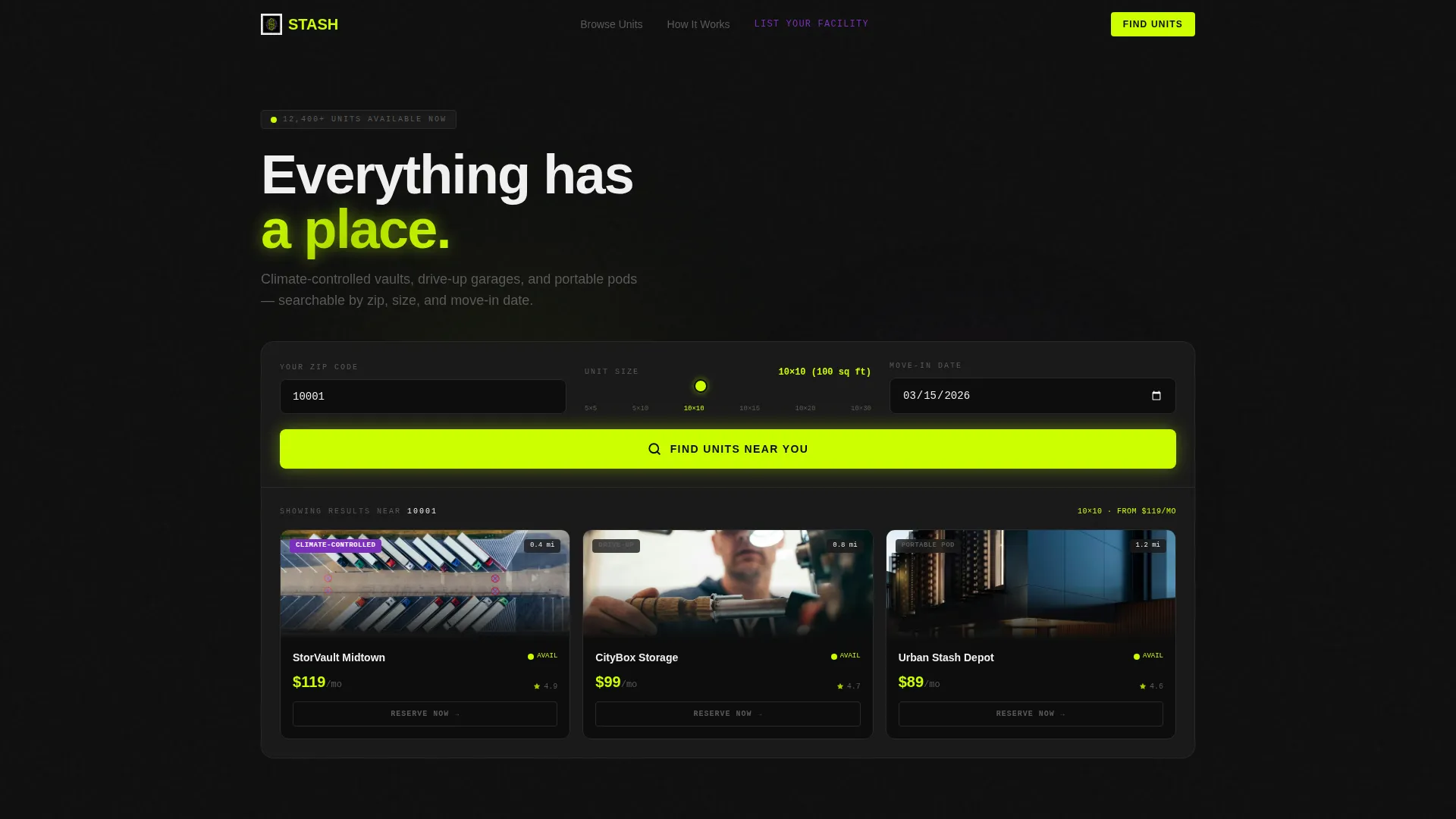
Full-Viewport Interactive Search Module
The header occupies the entire viewport width and drops visitors directly into an active search experience. It arrives pre-populated with a sample zip code, a unit size slider set to 10x10 feet, and a calendar with tomorrow's date highlighted in chartreuse. Three unit result cards are already visible beneath the module, each showing a facility photo, monthly price, a green availability dot, and a distance tag. The slider snaps, the calendar flips, and the cards re-sort with a micro-animation.
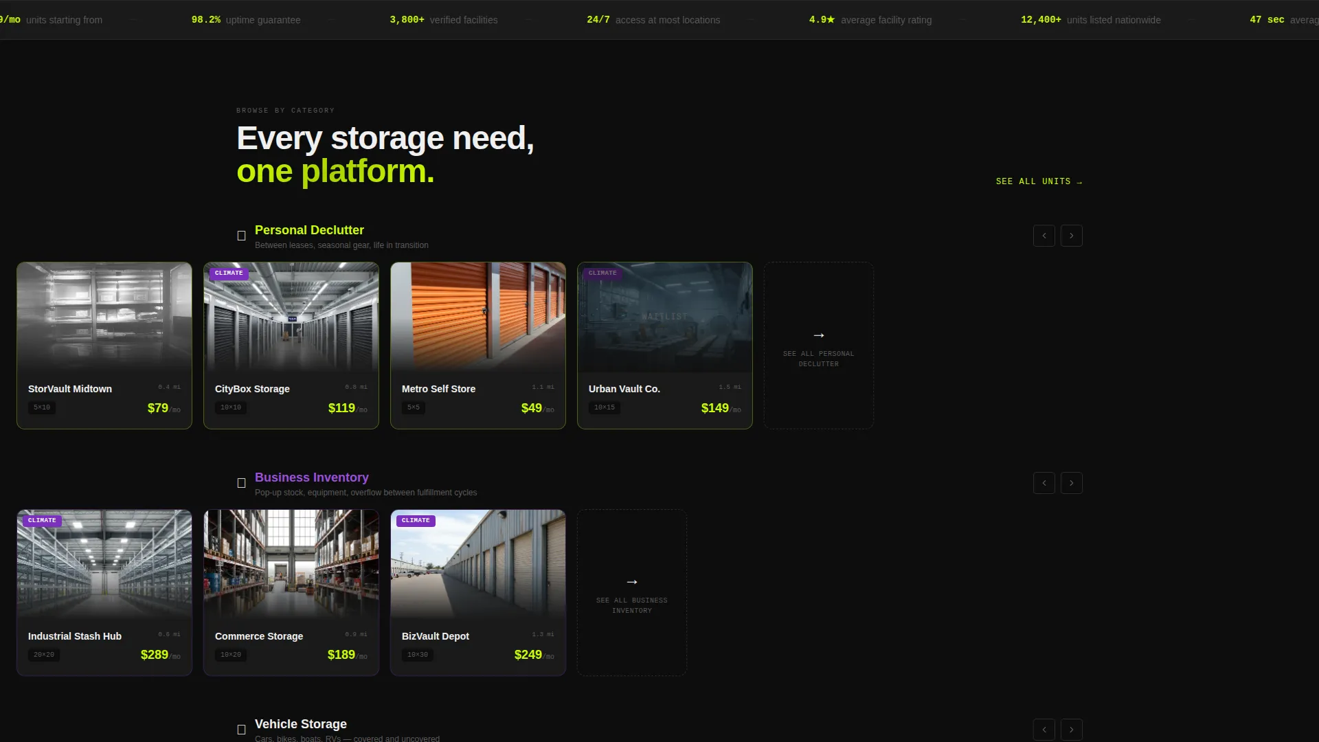
Horizontal Stats Ticker
A continuously scrolling stats bar runs beneath the search module. It displays live-feel metrics such as total units listed, same-day reservation availability, and average booking time of 47 seconds. This section injects velocity and social proof without requiring any additional clicks from the visitor.
Category Swim Lanes
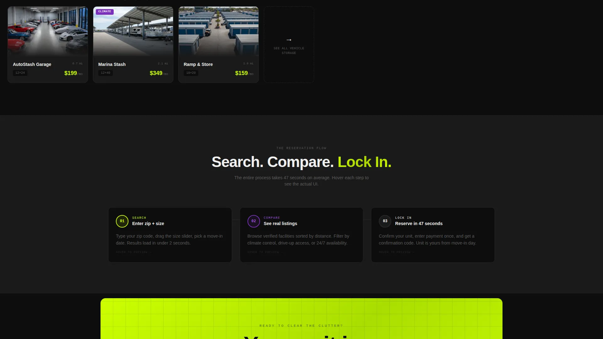
Three horizontally scrollable lanes organize unit listings by use case: vehicle storage, business inventory, and personal declutter. Each lane contains facility cards that fly in from the right as the visitor scrolls. This layout lets different visitor types find their relevant category without a full-page reload or extra navigation.
Three-Node Booking Timeline
A step-by-step animated section compresses the entire reservation flow into three nodes labeled Search, Compare, and Lock In. Each node expands on hover to reveal the actual interface screen for that step. This removes uncertainty about what happens after a visitor clicks the primary call to action.
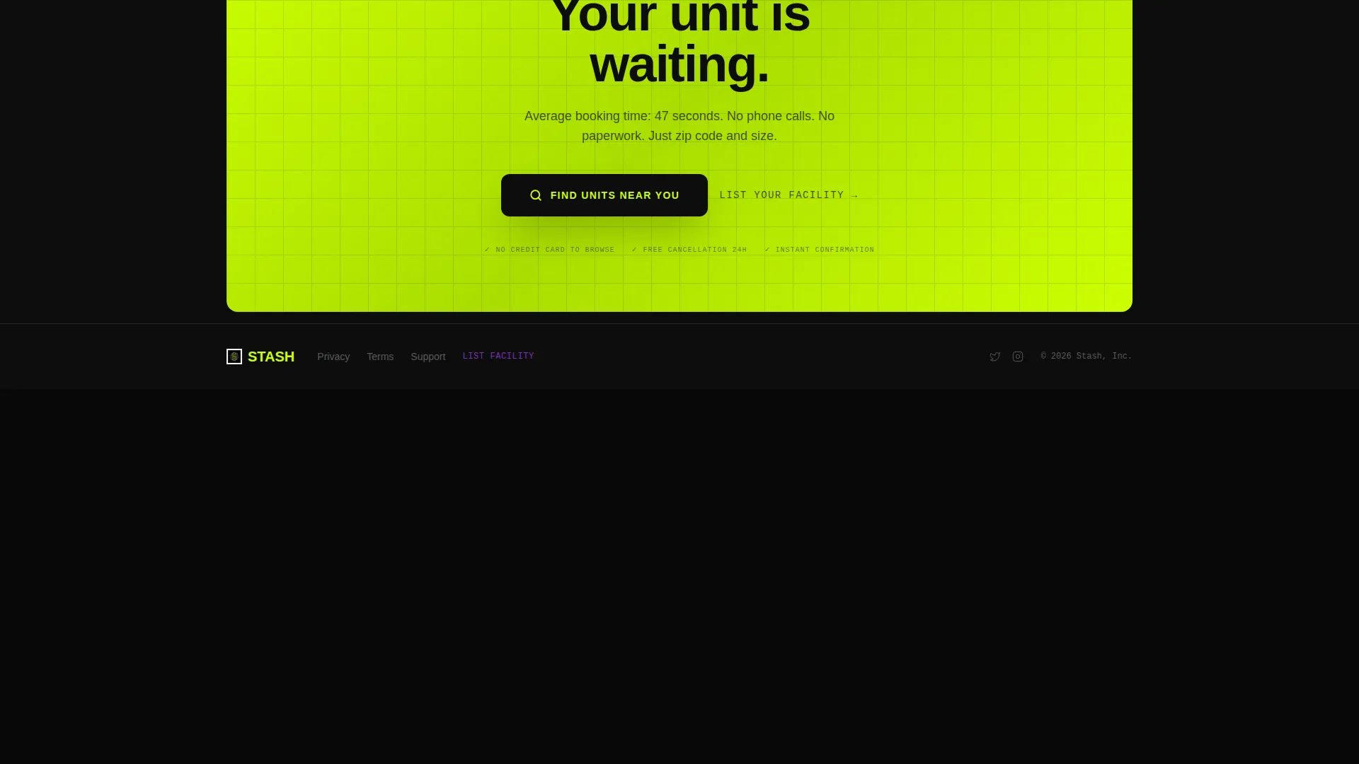
Multi-Instance Call-to-Action System
The primary call to action, "Find Units Near You," appears three times: inside the header search module, as a sticky bottom bar after the first scroll, and as an oversized chartreuse block at the page's end. Every instance routes to the full search results page with filters pre-applied. No form fields beyond zip code and unit size keep friction close to zero.
Dual-Path Navigation
The top navigation carries two distinct conversion paths. The primary path drives demand-side bookers toward unit search. A secondary text link in UV violet, "List Your Facility," quietly recruits supply-side operators without cluttering the main booking flow.
Page sections overview
| Section | Purpose |
|---|---|
| Interactive Search Header | Let visitors search units immediately on arrival |
| Stats Ticker Bar | Build urgency with live-feel platform metrics |
| Category Swim Lanes | Organize units by vehicle, business, and personal use |
| Booking Timeline Nodes | Show the three-step reservation flow visually |
| Final call to action Block | Drive last-chance conversions with an oversized button |
Design & branding system
The template runs on an Acid Digital color system built around industrial darkness and high-voltage highlights. Every color choice is intentional and tied to a specific function within the interface.
- Void black (#0D0D0D) and charcoal (#1A1A1A) alternate as grid backgrounds, giving each unit card its own visual pocket
- Electric chartreuse (#CCFF00) owns every interactive element including toggles, hover states, price tags, and availability badges
- UV violet (#7B2FBE) marks premium and climate-controlled listings, and appears on the "List Your Facility" navigation link
Mobile & speed optimization
The template is structured to perform across screen sizes. Its grid and swim-lane layout adapts to narrower viewports without losing the core booking flow.
- The unit size slider, calendar picker, and zip code field remain fully usable on mobile screen widths
- Sticky call-to-action bars persist on scroll across both desktop and mobile, keeping the primary conversion action always within reach
- Micro-animations on the result cards and booking timeline nodes are scoped to keep visual weight manageable on smaller devices
How this template helps you convert
Every section of this landing page is arranged to shorten the distance between a visitor's arrival and a confirmed reservation.
- The interactive header turns passive browsing into active searching before the visitor has consciously decided to engage, lowering psychological resistance from the first second on the page.
- The stats ticker and category swim lanes maintain scroll momentum so visitors do not pause or backtrack, and the three-node timeline removes uncertainty about what happens after clicking the call to action.
- Three instances of the primary call to action placed at the header, mid-scroll, and page end ensure that whenever a visitor is ready to act, the next step is always visible and one click away.
Other information about this template
This template sits within the Technology category under the Storage Digital Presence subcategory. It is purpose-built for the storage booking and scheduling site niche and carries a strong intersection match between its visual system, layout style, and conversion direction.
- The Directory and Discovery theme makes it well-suited for platforms listing multiple facilities or unit types across different locations
- The Dashboard and Data Grid template style supports dense, scannable information layouts without sacrificing visual clarity
- The Launch Energy creative direction means the page feels like a platform that is already in motion, which builds confidence in the product before a visitor reads a single line of copy
- The Click-Through landing page direction means every section exists to reduce hesitation and push toward a single measurable action rather than to educate at length
Theme
Directory & Discovery
Creative direction
Launch Energy
Color system
Acid Digital
Style
Dashboard/Data Grid
Direction
Click-Through
Page Sections
Full-viewport Interactive Search Module
Horizontal Stats Ticker
Category Swim Lanes
Three-node Booking Timeline
Multi-instance Call to Action System
Dual-path Navigation
Related questions
Can I customize the color system for my own brand?
Does the search module require a live database to function?
Is this template suited for a single facility or a multi-location network?
Can the 'List Your Facility' navigation link be removed?
What unit types does the template visually support?



