Complete Directory & Marketplace Platforms Comparison Website Template
Stash is a scroll-reveal landing page template built for storage facility directories. It guides visitors from a zip-code search through live comparison cards to a single highlighted recommendation. The Slate & Sky color system and progressive interactive layout make a complex decision feel fast, clear, and completely under the visitor's control.
by Rocket studio
Quick summary
Stash is a single-page, scroll-reveal landing page template designed for storage facility directories. It maps climate-controlled units, drive-up bays, and vehicle lots by zip code and ranks them by price, availability, and gate-hour flexibility. The layout guides visitors step by step from broad search to confident decision, all in one calm, filterable screen.
Who this template is for
This template suits anyone building or promoting a storage facility directory that serves time-pressed users. It works especially well when your audience needs to compare multiple options quickly and act within days, not weeks.
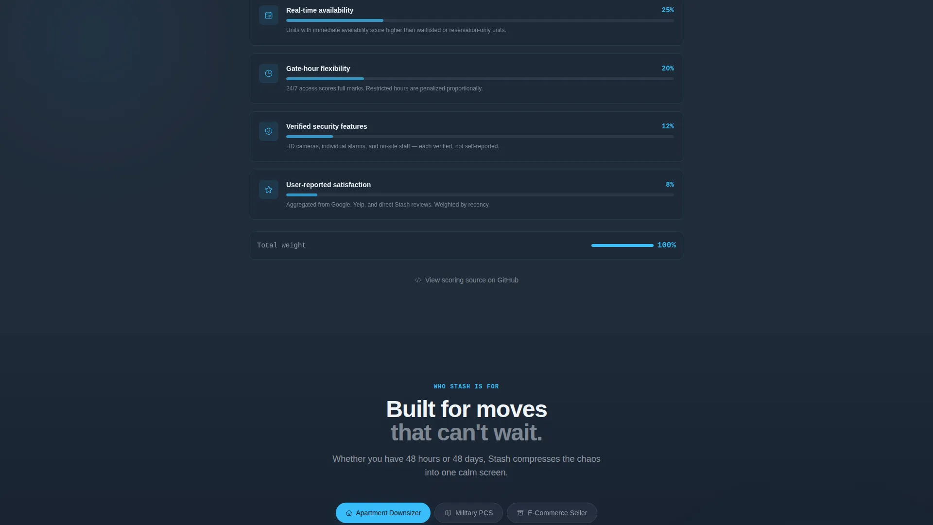
- Apartment downsizers who need to box up and move out within 48 hours
- Military families relocating across state lines with little advance notice
- Small e-commerce sellers who have outgrown their garage and need storage space fast
What problem this template solves
Finding a storage unit is surprisingly stressful. Prices vary, availability changes hourly, and gate hours rarely match a busy schedule. Most people end up calling three facilities and still feeling unsure. This template removes that friction by putting every relevant variable on one screen.
- No more tabbing between facility websites to compare rates and unit sizes
- No guesswork about real-time availability or after-hours gate access
- No hidden ranking logic that makes visitors distrust the results they see
What you get with this template
You get a complete scroll-reveal landing page built around a Comparison/Versus conversion model. Every section is purpose-built to move a visitor from curious to committed in a single scrolling session.
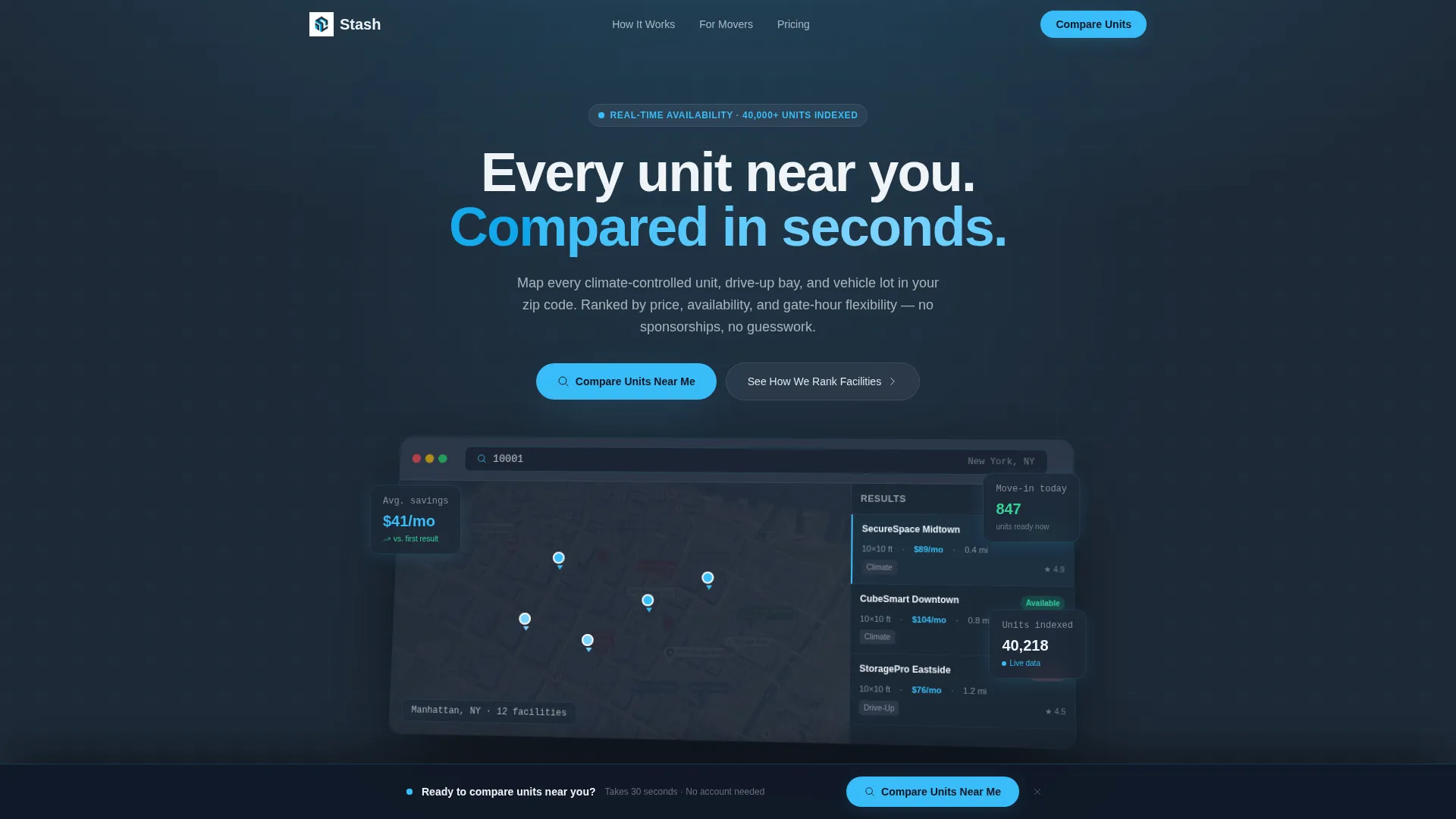
- A full-width product screenshot header showing the directory interface mid-query, complete with a 3D-tilted layout and a blinking cursor in the search bar
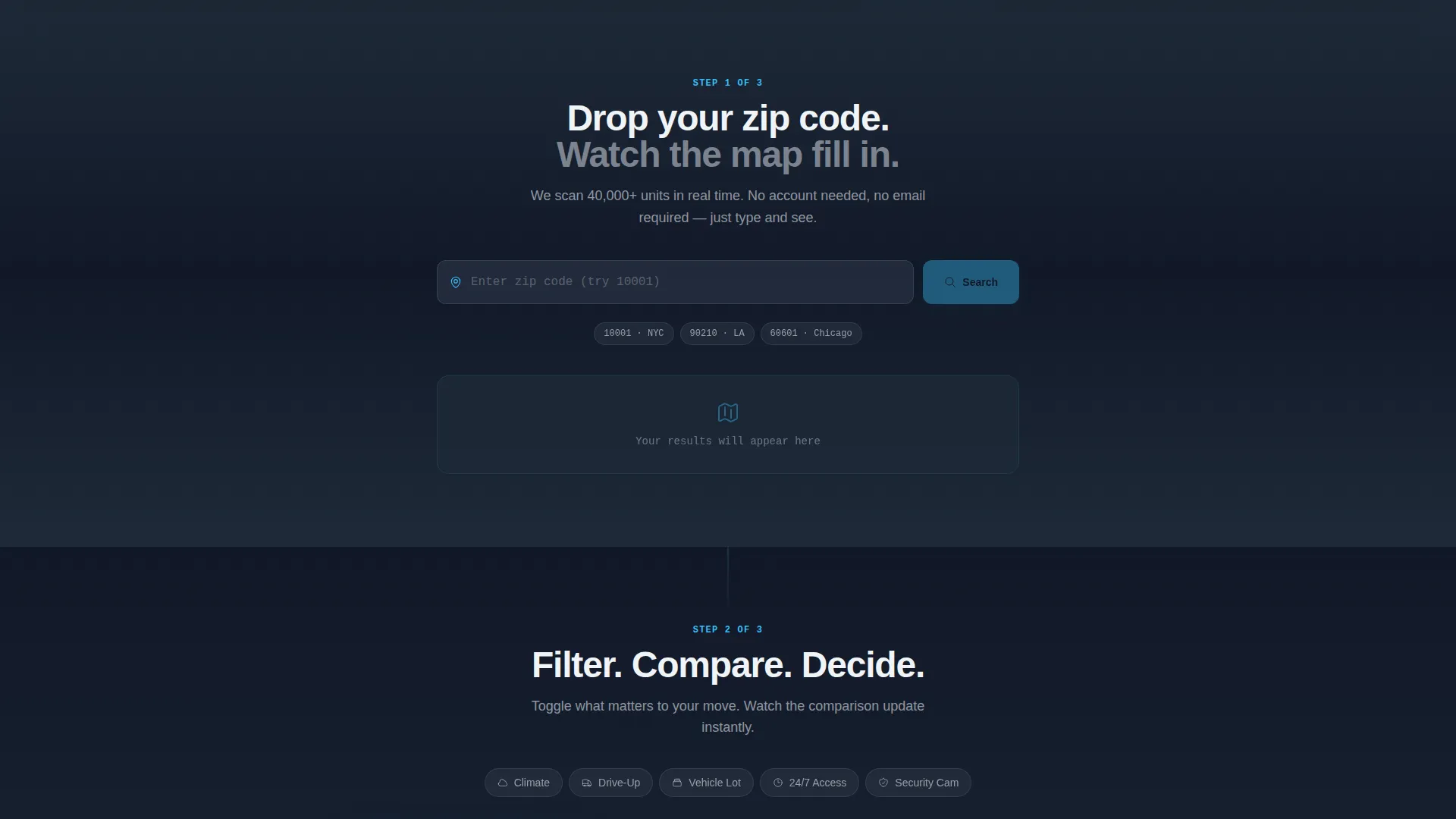
- An interactive zip-code input section that returns a live mini-result, followed by animated side-by-side comparison cards with toggle filters
- A sticky bottom bar call to action and a transparency section explaining the facility scoring algorithm
Feature list
This template ships with a focused set of purpose-built components that align with the directory and comparison use case.
Progressive Scroll Reveal Layout
Each section slides into view as the visitor scrolls. The experience teaches by doing: broad search first, then filtered comparison, then feature deep-dive, then a single highlighted winner. The scroll builds decision momentum naturally.
Interactive Zip-Code Search Section
The first interactive section below the header lets visitors type a real zip code and see a live mini-result. This immediate feedback loop makes the directory feel functional rather than promotional.
Animated Comparison Cards with Toggle Filters
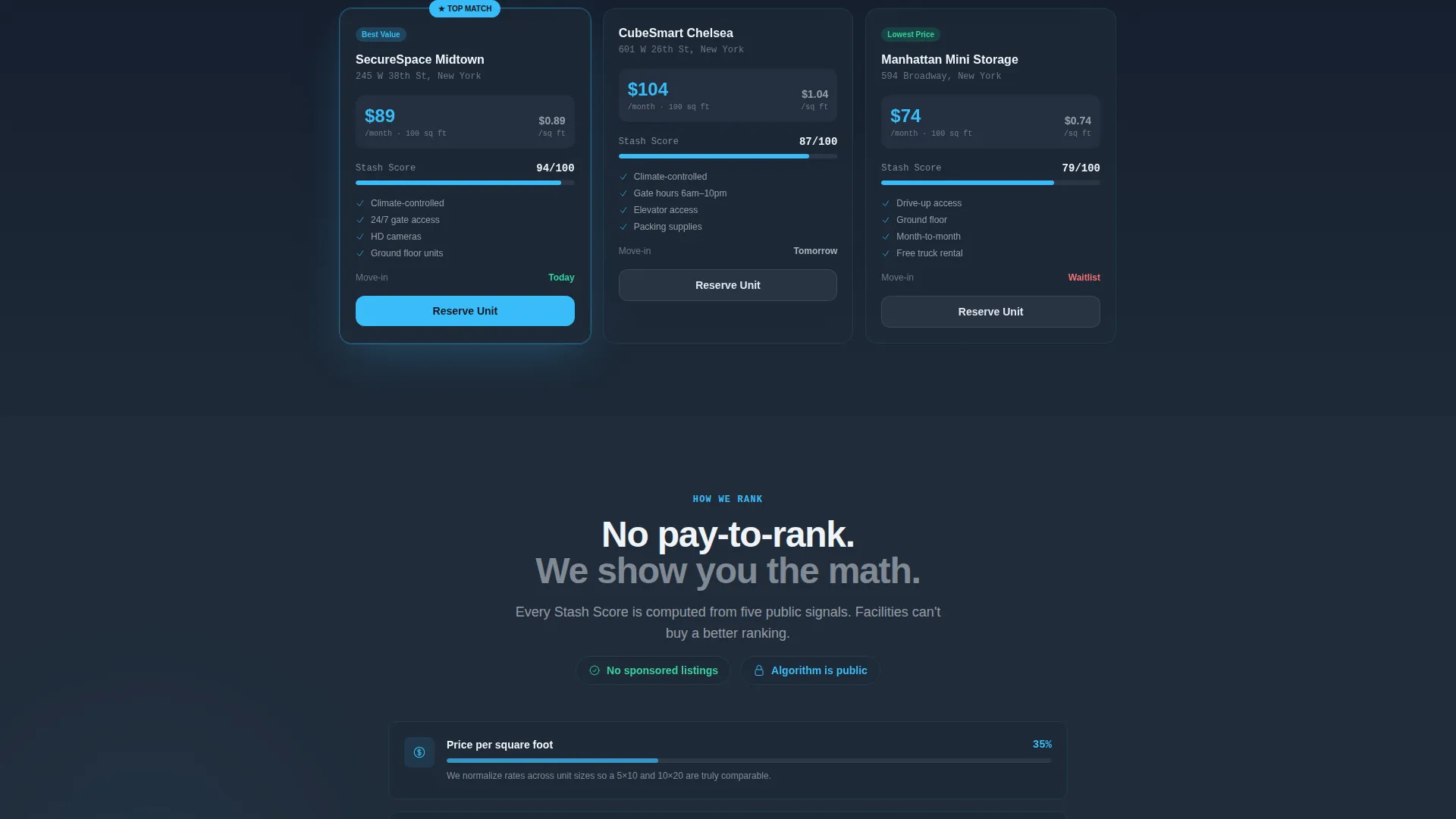
Comparison cards animate side by side and display price per square foot, security features, and access hours. Toggle filters let users flip between storage types, including standard, climate-controlled, and vehicle lots, without leaving the page.
Sticky Bottom Bar with Primary call to action
A sticky bottom bar appears after the first scroll interaction. It anchors the primary call to action, "Compare Units Near Me," and keeps it visible throughout the entire scrolling experience.
Transparency Scoring Section
A dedicated section explains how facilities are ranked: by real-time price, availability, and gate-hour flexibility. It explicitly states there is no hidden sponsorship and no pay-to-rank system, which builds trust without requiring a separate page.
Slate & Sky Visual Identity System
The color palette uses deep graphite slate for primary backgrounds, mid-tone steel for secondary surfaces, open-sky blue for action accents, and cirrus white for card faces and input fields. The result is a sharp, load-fast clean aesthetic that reinforces confidence.
Page sections overview
| Section | Purpose |
|---|---|
| Full-Width Header | Displays the directory interface screenshot on a 3D tilt with a headline and blinking search cursor |
| Zip-Code Input | Lets visitors type a real zip code and see an immediate live mini-result |
| Comparison Cards | Shows animated side-by-side unit cards with price, security, and access-hours data |
| Toggle Filter Bar | Lets users flip between storage types and narrow results without leaving the view |
| Feature Deep-Dive | Highlights individual unit features as the scroll funnel narrows toward a single winner |
| Scoring Transparency | Explains the ranking algorithm and confirms no pay-to-rank or sponsored results |
| Sticky Bottom Bar | Keeps the primary call to action anchored after the first scroll interaction |
Design & branding system
The Slate & Sky color system gives this template a sharp, weather-clearing-morning quality. Dark grounding tones sit at the base while open blue carries all the action energy upward through the page.
- Deep graphite slate (#1E2A38) on primary backgrounds, mid-tone steel (#4A5568) on secondary surfaces, open-sky blue (#38BDF8) on buttons, toggles, and highlighted rows, and cirrus white (#F0F4F8) on card faces and input fields
- The Startup Velocity theme means every element feels sharp-edged, fast, and purposeful rather than decorative
- The 3D-tilted product screenshot in the header and the blinking cursor detail reinforce a command-center feel from the very first view
Mobile & speed optimization
The scroll-reveal structure and lean visual system are designed to feel responsive and purposeful across screen sizes. The template keeps interactions tight and avoids heavy decorative elements that slow rendering or confuse smaller viewports.
- Toggle filters and comparison cards are laid out to reflow cleanly for narrower screens
- The sticky bottom bar is built to stay visible and tappable on mobile without obscuring key content
- Card faces use cirrus white fields and open-sky blue accents that maintain strong contrast at any screen size
How this template helps you convert
The Comparison/Versus conversion model is the structural backbone of this template. Every scroll interaction moves the visitor one step closer to a decision without feeling pushy.
- The progressive reveal flow walks visitors from a broad zip-code search through filtered comparison to a single highlighted recommendation, which compresses a multi-step decision into one session.
- The sticky bottom bar keeps the primary call to action, "Compare Units Near Me," in view at all times, reducing the effort needed to act when the visitor is ready.
- The scoring transparency section earns trust by showing the ranking math openly, so the final click feels like using a reliable tool rather than responding to a sales pitch.
Other information about this template
This template is categorized under Technology, specifically within the Directory and Marketplace Platforms subcategory, making it a strong fit for storage facility directory projects. It is built as a single-page scroll-reveal layout, not a multi-page site, so all conversion flow happens within one continuous scrolling experience.
- The comparison flow is structured in three steps: zip code input first, then storage type selection (standard, climate-controlled, or vehicle), then move-in date
- A secondary visitor path lets users tap "See How We Rank Facilities" to scroll directly into the transparency section, giving skeptical visitors an alternative entry point
- The template style is classified as Scroll Reveal (Progressive), and the creative direction is Interactive Explorer, meaning the layout is designed to activate engagement rather than passively present information
- The header concept is a Product Screenshot, which means the hero section shows the actual directory interface in use rather than a generic illustration or stock photo
Theme
Startup Velocity
Creative direction
Interactive Explorer
Color system
Slate & Sky
Style
Scroll Reveal (Progressive)
Direction
Comparison/Versus
Page Sections
Progressive Scroll Reveal Layout
Interactive Zip-code Search
Animated Comparison Cards
Sticky Bottom Bar Call to Action
Scoring Transparency Section
Slate & Sky Color System
Related questions
What type of business is this template designed for?
Is this a single-page template or a multi-page site?
Can I customize the color system and branding?
What is the primary call to action on this template?
Does the template include a section that explains how facilities are ranked?



