Self Storage Booking Landing Page Template
Stash is a dashboard-style self storage booking landing page built for storage businesses that want to convert visitors fast. The page leads with a live metrics wall, then drops visitors into a filterable unit comparison grid where every spec, price, and access detail is visible at a glance. Three fields and one click is all it takes to lock in a unit.
by Rocket studio
Quick summary
Stash is a data-command self storage landing page template designed for storage businesses ready to compete online. It replaces vague hero images with a precise metrics wall, then guides visitors through a filterable comparison grid that shows every unit, every price, and every spec on one screen. The result is a self storage website that feels authoritative, fast, and built to convert.
Who this template is for
This template is built for storage operators, marketplace founders, and self storage business teams who need a high-performance self storage website without building from scratch. It fits anyone who wants to turn ad traffic into booked units quickly and efficiently.
- Self storage facility owners who want to attract more customers online and reduce phone-based inquiries
- PropTech founders and self storage business developers launching a comparison marketplace
- Small businesses and e-commerce sellers who manage inventory and need a professional booking site to match their brand
What problem this template solves
Most self storage website templates bury pricing, hide availability, and force visitors to call before they can choose a unit. That friction kills conversion rates before a single booking is made. Renters today are comparison-driven and time-pressured. They search on their phones, scan results in seconds, and leave any site that makes them work too hard to find a number.
Stash solves this by putting every relevant data point on one landing page in plain sight:
- Hidden pricing and unclear availability drive visitors away before they convert
- Generic self storage website designs fail to create trust or urgency for price-sensitive renters
- Operators lose revenue when browsers leave without a lead capture fallback
What you get with this template
You get a complete, ready-to-launch self storage landing page built around a Data Command theme. Every section is purpose-built to move visitors from curious browser to confirmed booking in minutes. The design is dark, precise, and information-dense, giving your self storage website a look that feels more like a professional dashboard than a typical storage site.
- A live metrics wall header with pulsing stats, unit counts, uptime figures, and average booking time
- A filterable unit comparison grid with inline booking forms and a secondary price alert lead capture
- A How It Works section, a facility side-by-side bento grid, and a single-row footer
Feature list
Every feature in this template is grounded in one goal: help visitors search, compare, and book a self storage unit without friction. The sections below describe what each key component delivers and why it matters for your self storage business.
Live Metrics Wall Header
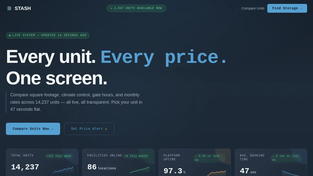
The header is a full-width dark dashboard, not a hero image. It displays real platform numbers: 14,237 units across 86 facilities, 97.3% uptime, and an average booking completed in 47 seconds. Each metric sits in its own card with a subtle sparkline. This approach builds immediate trust with visitors who scan search results and land on your self storage website expecting proof, not promises. The headline "Every unit. Every price. One screen." sits above the grid and anchors the brand message clearly.
Filterable Unit Comparison Grid
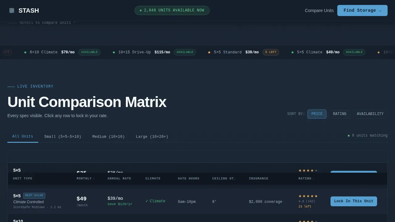
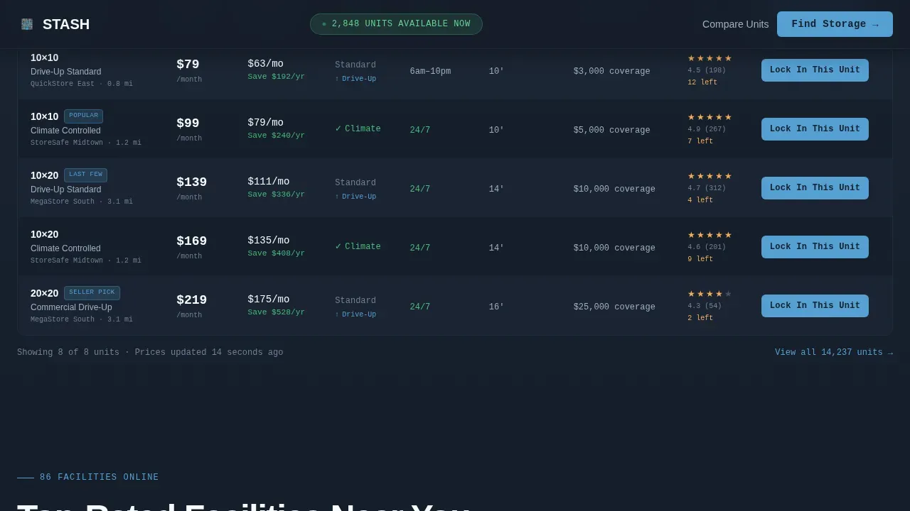
The comparison grid is the core of this landing page. Visitors can filter self storage units by size, climate control, access type, and price range. Each row in the grid shows monthly cost, insurance options, access hours, ceiling height, and user rating side by side. The grid covers unit types including 5x5 climate-controlled, 10x10 standard, and 10x20 drive-up options. Filters update results client-side so the page responds instantly without a full reload. This turns the self storage search into a competitive, data-led experience that rewards decisive visitors.
Inline "Lock In This Unit" Booking Flow
Every row in the comparison grid includes a "Lock In This Unit" call to action. Clicking it opens a slim inline form with three fields: move-in date, duration estimate, and zip code. No page change, no redirect. This design keeps visitors in context and reduces drop-off. Prominent clear calls to action guide users toward conversion on landing pages, and this template applies that principle at the row level so every data point becomes a booking entry point.
"Set a Price Alert" Lead Capture
Not every visitor is ready to book today. The price alert module captures email addresses from browsers who want a unit at a lower rate. This secondary path converts price-sensitive visitors into leads who return when the right unit becomes available. It is a practical way to grow your lead pipeline without adding complexity to the primary booking flow, and it works especially well for small businesses and individuals shopping around.
Facility Side-by-Side Bento Grid
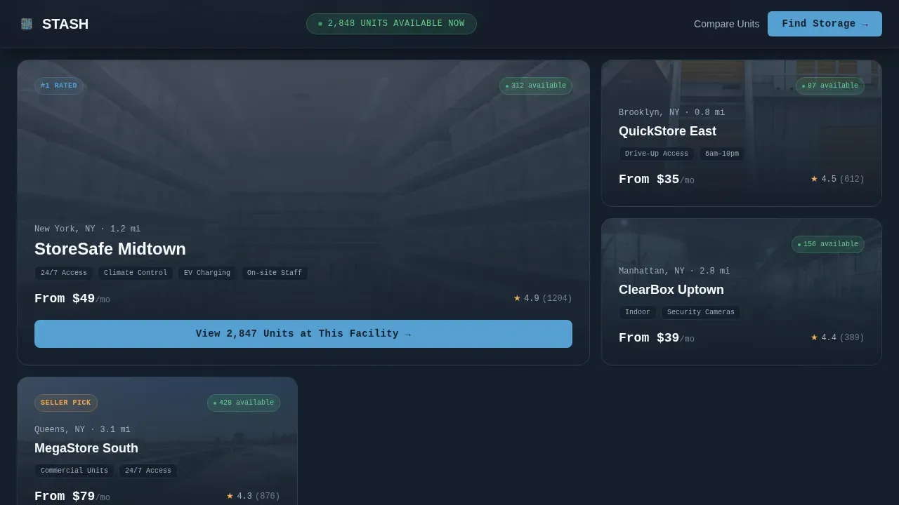
Below the unit grid, a bento-style layout lets visitors compare top self storage facilities directly. Each facility card displays key specs and ratings. Testimonials and reviews are woven into this section to build credibility with visitors who need social proof before committing. Customer testimonials and reviews build credibility on booking sites, and this layout makes them easy to scan without scrolling past walls of text. Facility details help visitors understand exactly what they are choosing before they click.
How It Works Visual Flow
A three-step section breaks the booking process into Find, Compare, and Lock. Each step is illustrated with a minimal icon and a short label. This section helps first-time visitors quickly understand the platform and reduces hesitation. It works as a trust checkpoint between the data-heavy comparison grid and the price alert section, keeping the page narrative logical and easy to follow.
Page sections overview
| Section | Purpose |
|---|---|
| Metrics Wall Header | Display live platform stats and headline |
| Unit Comparison Grid | Filter and compare self storage unit types |
| Facility Side-by-Side | Compare top facilities with ratings and reviews |
| How It Works | Explain the three-step Find, Compare, Lock flow |
| Price Alert Capture | Capture email leads from visitors not ready to book |
| Single-Row Footer | Provide links, contact info, and legal text |
Design & branding system
The Slate and Sky color system gives this self storage website the visual authority of a professional data platform. Deep charcoal backgrounds make white and sky blue numbers glow. The palette communicates precision and trust without relying on lifestyle photography or generic stock images. Typography uses DM Sans for headers and JetBrains Mono for data and numbers, creating a clear visual hierarchy between narrative content and live figures.
- Background colors stay in the charcoal-to-slate range, with interactive rows highlighting in sky blue on hover
- Alert white is used for primary header text and key figures, while muted silver handles secondary data labels
- The overall design is customizable, allowing your team to update brand colors, logo, and text to match your existing identity
Mobile & speed optimization
This template is built desktop-first because the comparison grid requires horizontal space to display all columns clearly. The layout uses a responsive collapse strategy so the grid adapts on smaller screens without losing key data. A large portion of users search on phones, and the mobile experience is designed to keep those visitors engaged rather than sending them back to the search results.
- The comparison grid collapses to a card-based layout on mobile, preserving key specs in a readable format
- The metrics wall and How It Works section reflow gracefully at smaller breakpoints so visitors can still check stats and follow the booking steps easily
- Animations, including pulsing metrics and staggered row reveals, are scoped to avoid heavy rendering on low-power devices
How this template helps you convert
Self storage businesses compete heavily in paid and organic search. A well-structured landing page turns ad clicks into revenue more efficiently than a generic website page. Personalized landing pages can lead to 34% higher conversions and lower cost-per-acquisition. This template is engineered around that principle, with every design decision tied to a specific conversion outcome.
- The inline booking form keeps visitors on the page and removes the friction of a separate checkout flow, improving conversion rates for visitors who are ready to commit in seconds
- The price alert module captures leads from visitors who are not yet ready, giving your marketing team a warm list to re-engage through future campaigns and improving overall revenue per visitor
- The filterable comparison grid teaches visitors to be expert self storage shoppers so the decision feels earned, building the kind of trust that turns one-time renters into happy customers who refer others
Other information about this template
The self storage industry is experiencing significant growth due to increasing urbanization and population density. More facilities are adopting smart technology for security and management, and customer preferences are shifting toward flexible, short-term storage solutions. Online marketing and digital presence are crucial for self storage businesses to attract and retain customers in a crowded market. This template is designed to sit at the center of that shift.
Self storage website templates help storage businesses create professional-looking websites quickly. Customizable self storage website templates allow operators to tailor their site to match their brand without rebuilding from scratch. A professional-looking self storage website helps develop trust with existing and potential customers, and the built-in SEO structure of this template supports better visibility in search results.
Self storage website builders that offer customizable pre-made blocks simplify the website creation process for teams without deep technical skills. Using an intuitive drag-and-drop landing page builder allows anyone to create beautiful, high-converting landing pages without technical expertise. Many self storage website builders include SEO optimization features to enhance search engine visibility, and this template is structured to support those goals out of the box. Users can build a self storage website quickly using a good website builder that eliminates the need for manual code editing.
A self storage website can automate several facility operations, providing real-time information about storage unit vacancies and prices. Having a self storage website enhances online visibility and provides a competitive edge in the market. Self storage website builders typically offer reliable hosting and the ability to connect custom domains for a professional online presence. Self storage website builders can help increase tenant bases and maximize occupancy rates through effective online presence.
Integrating landing pages with ad campaigns streamlines the process of turning ad clicks into conversions. Creating unique landing pages for different audiences can enhance marketing effectiveness and customer engagement. Analytics tools can help track landing page performance, including visitors, conversions, and conversion rates, so your team can optimize results over time. A/B testing is essential for optimizing landing pages and improving conversion rates based on user behavior data.
Storage security essentials are covered within the template content blocks: security highlights should include 24/7 surveillance and secure gated access. Name, Address, and Phone (NAP) information must be clearly visible, along with hours of operation and a Google Maps embed for local search visibility. A secure payment gateway with HTTPS encryption builds user trust. Promotions and discounts should be clearly displayed to attract potential renters, and this template includes a dedicated pricing display area within the comparison grid.
The Stash data command self storage booking landing page template is also worth considering if your team manages storage software, wants to connect a custom domain, or plans to run ads pointing to a dedicated landing page. Self storage website examples built on data-command themes like this one consistently outperform lifestyle-photography alternatives in competitive search results, because they give visitors the information they need to choose without hesitation. This template is free of unnecessary decorative sections and keeps every content block tied to a real conversion or lead goal.
Additional practical notes for teams using this template:
- Inventory management best practices, such as tiered hierarchies that categorize items by type or usage frequency, can inform how you label and describe unit size categories on the page
- Visual inventory management approaches, like zonal mapping that divides a storage unit into specific zones, can inspire how you structure facility map content within the bento grid section
- Customer reviews and rating data should be kept current so the comparison grid always reflects accurate social proof
- The price alert form can be linked to your preferred email marketing software to manage leads automatically
- Instant pricing for various unit sizes helps customers make quick decisions during the rental process, so keep the grid data up to date
Theme
Data Command
Creative direction
Feature Matrix
Color system
Slate & Sky
Style
Dashboard/Data Grid
Direction
Comparison/Versus
Page Sections
Live Metrics Wall with Sparklines
Filterable Unit Comparison Grid
Inline Booking Form Per Row
Price Alert Lead Capture Module
Facility Side-by-side Bento Grid
Three-step How It Works Section
Related questions
Can I customize the colors and typography in this template?
Does this template work for a single facility or a multi-facility marketplace?
How does the price alert section capture leads?
Is the comparison grid filterable out of the box?
Can I connect this landing page to my existing storage management software?



