Micro-SaaS & Developer Tools Reviews Website Template
Stash is a hub-and-spoke landing page template built for a code snippet manager desktop tool. It opens with a live interactive search preview, stacks stats-first evidence sections, and runs visitors through four head-to-head comparison spokes. The Monochrome Steel palette and Data Command theme make it feel like a well-tuned IDE from the first scroll.
by Rocket studio
Quick summary
Stash is a single-page, anchor-nav landing page template designed for a code snippet manager desktop tool. It leads with a functioning search bar that demonstrates the product instantly, then builds conviction through typographic stat callouts and four comparison spokes. The dark Monochrome Steel palette keeps every element focused on the evidence in front of the reader.
Who this template is for
This template is built for developers and DevOps professionals who need to launch a credible, conversion-focused landing page for a technical desktop tool. It suits teams or solo builders who want the product to sell itself through demonstration rather than marketing copy.
- Senior developers managing multiple repositories and microservices who need a fast way to surface reusable code
- DevOps engineers with years of accumulated Bash scripts and utility functions scattered across machines
- Freelancers who rebuild the same utility code on every new client project and want to stop the cycle
What problem this template solves
Finding a reusable snippet inside a growing codebase takes longer than rewriting it. Developers lose time to grep searches, stale bookmarks, and disorganized notes. This template frames that pain precisely and lets the product answer it before the visitor scrolls past the header.
- No hero image or illustration means zero seconds wasted on visuals that do not prove anything
- Comparison spokes address the specific tools developers already use, cutting through skepticism directly
- The interactive header turns the landing page itself into a product demo, removing friction before the first call to action
What you get with this template
You get a fully structured, anchor-navigated landing page with a clear conversion architecture. Every section has a defined role, from the live search preview at the top to the benchmark email gate at the bottom.
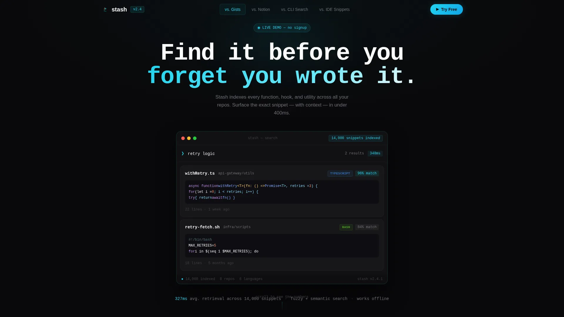
- An interactive header section with a centered search bar, syntax-highlighted result cards, language badges, and match-confidence scores
- Four comparison spoke sections covering distinct competitor categories, each anchored from a persistent navigation bar
- A stats-first layout pattern where large typographic numbers open every spoke before any explanation lands
Feature list
This template is built around a small set of tightly integrated layout decisions. Each one serves the conversion goal directly.
Interactive Search Header
The header places a functioning search bar at the center of a black viewport. Visitors type a real query and watch syntax-highlighted snippet cards populate with language badges and match-confidence scores. A single stat fades in below: "327ms avg. retrieval across 14,000 snippets." The product demonstrates itself in the first three seconds, before any copy asks for trust.
Stats-First Spoke Sections
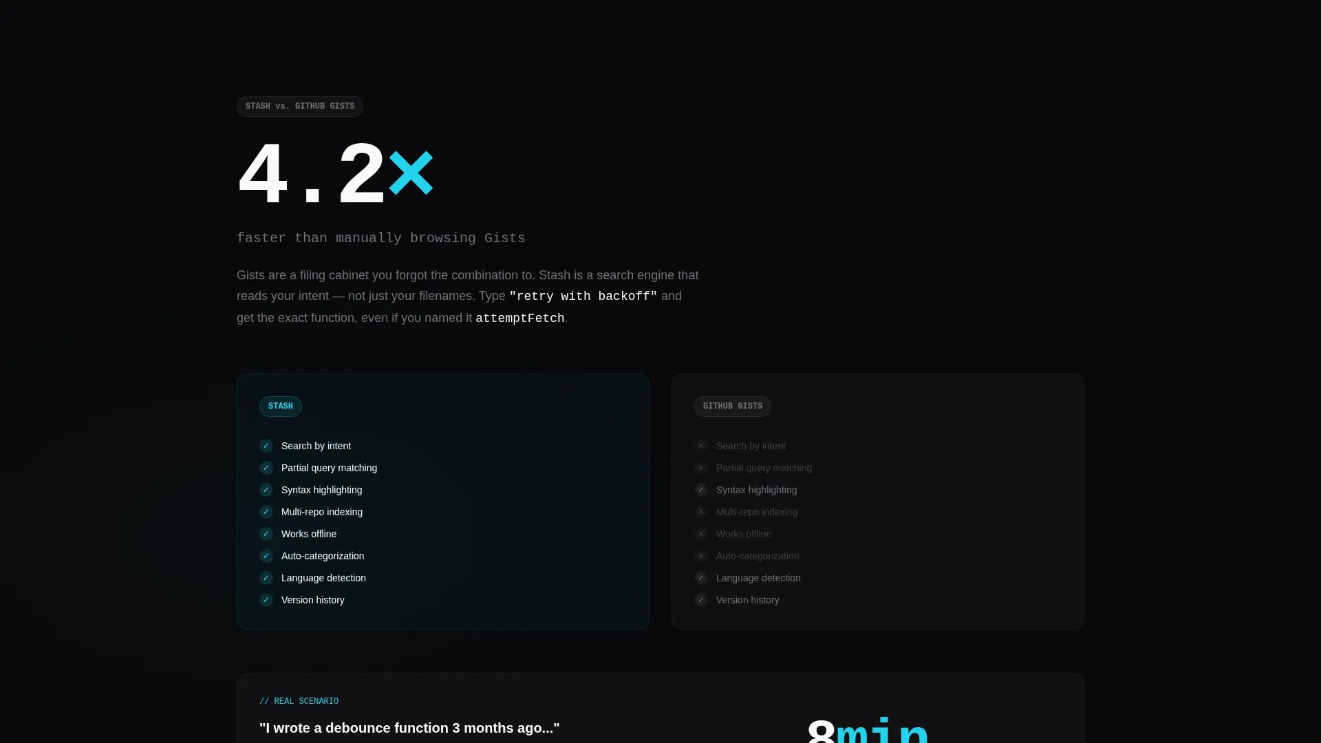
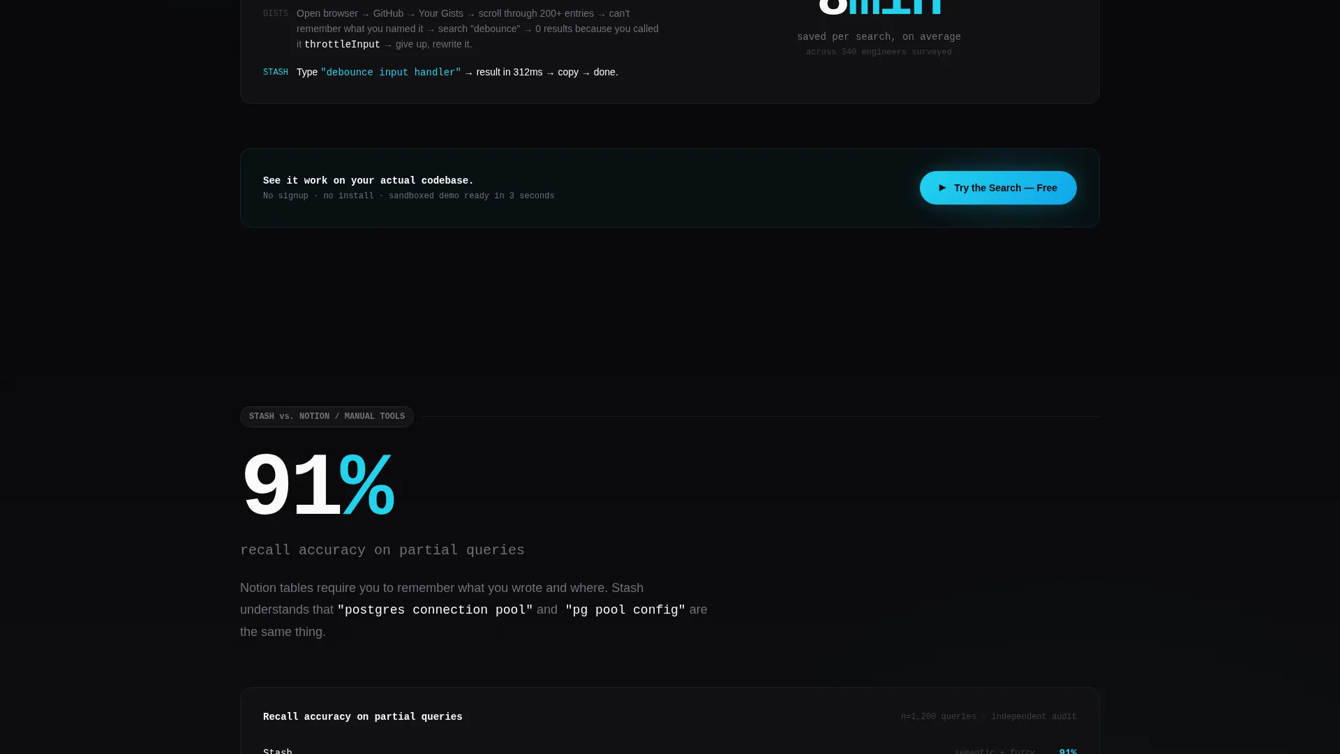
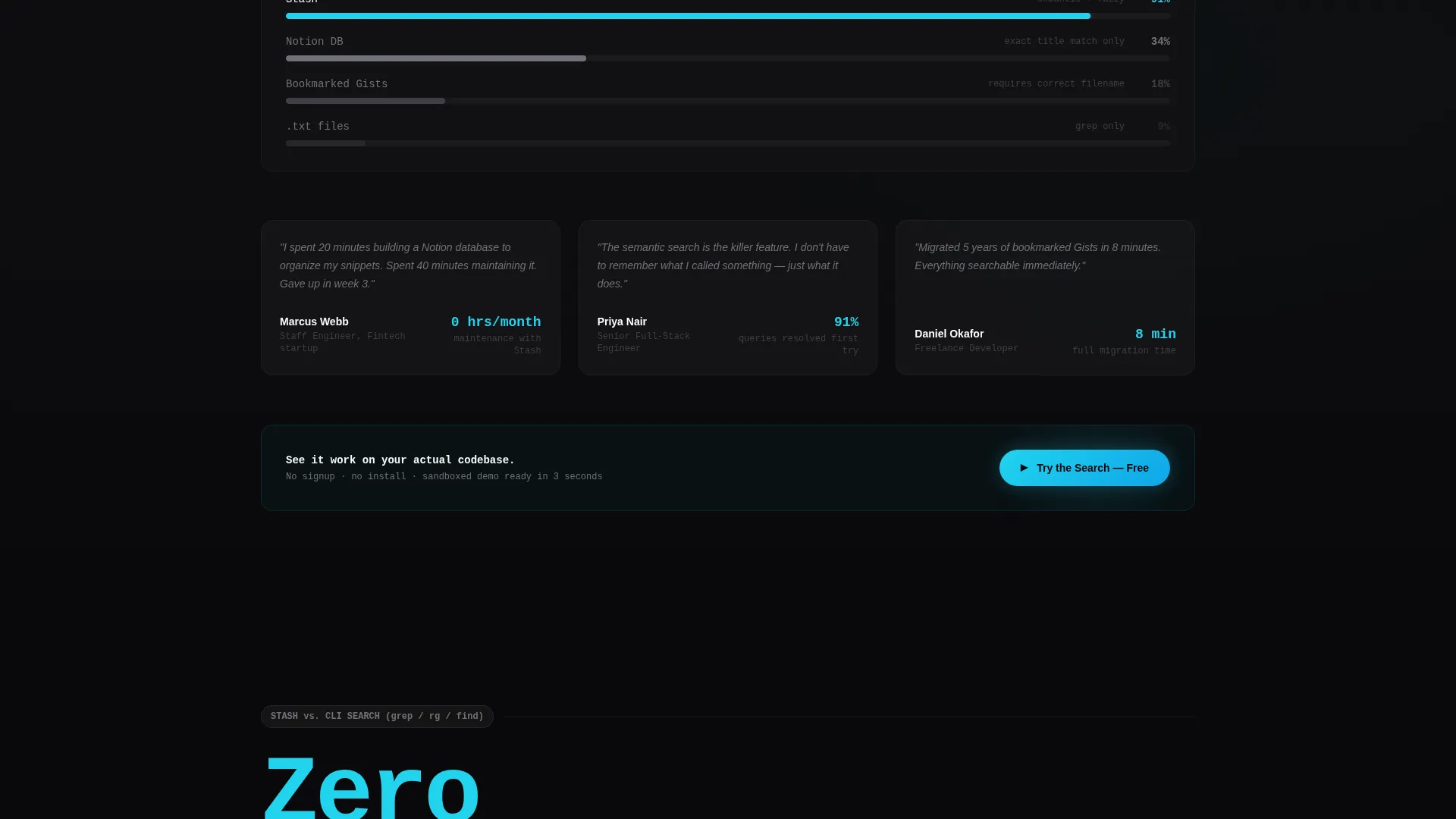
Every comparison spoke opens with a large typographic number before any explanatory text appears. Examples include "4.2x faster than manual search," "91% recall accuracy on partial queries," and "Zero snippets lost across 3 OS migrations." This layout pattern stacks evidence progressively, making each section harder to dismiss than the last.
Persistent Anchor Navigation
A fixed anchor nav bar sits at the top of the page and labels each spoke by competitor category. Visitors jump directly to the comparison most relevant to their current workflow, reducing scroll fatigue and keeping attention on the argument they came to evaluate.
Comparison Versus Sections
Four spoke sections each position the tool against a specific alternative: Gists, Notion tables, command-line search, and IDE-native snippet managers. Each section follows the same structure, opening with a stat, then delivering a direct versus comparison that quantifies the difference.
Dual Conversion Path Layout
A primary call-to-action button labeled "Try the Search, Free" appears after every spoke section, linking to a sandboxed demo. A secondary compact form offers "See Full Benchmark Data" for team leads who need documentation before committing. Both paths are present throughout the page without competing for visual space.
Electric Cyan Accent System
The single accent color, electric cyan at #22D3EE, is reserved strictly for interactive states, active anchor nav indicators, and call-to-action pulse effects. Nothing decorative uses it. This discipline makes every cyan element feel immediately actionable and keeps the dark palette from feeling flat.
Page sections overview
| Section | Purpose |
|---|---|
| Interactive Search Header | Demonstrates product value instantly through a live search experience |
| Persistent Anchor Nav | Lets visitors jump to their preferred comparison spoke without scrolling |
| versus. Gists Spoke | Compares snippet retrieval speed and organization against GitHub Gists |
| versus. Notion Spoke | Contrasts searchability and developer workflow fit against Notion tables |
| versus. CLI Search Spoke | Stacks retrieval accuracy against grep and Bash history searches |
| versus. IDE Snippets Spoke | Benchmarks cross-repo availability against IDE-native snippet tools |
| Post-Spoke call to action Block | Places "Try the Search, Free" after each spoke to capture ready visitors |
| Benchmark Email Gate | Offers detailed benchmark data to team leads via a compact email form |
Design & branding system
The visual identity follows a Data Command theme built on a Monochrome Steel color system. Every color decision reinforces the terminal-like atmosphere and keeps the reader focused on numbers and results rather than decoration.
- Core palette: void black (#09090B) as the base, brushed gunmetal (#1C1C1E) for surface layers, mid-steel (#71717A) for secondary text, and cold white (#FAFAFA) for primary body copy
- Electric cyan (#22D3EE) used exclusively for interactive states, active navigation indicators, and call-to-action pulse effects
- Typography follows a monospaced or code-adjacent style that reinforces the IDE aesthetic and makes stat callouts feel like output, not marketing
Mobile & speed optimization
The layout is designed to stay readable and functional at smaller viewport sizes. The anchor nav compresses cleanly, and the search header scales without losing its centered focus.
- Spoke sections reflow into single-column stacks so stat callouts and comparison text remain legible on phone screens
- The compact email gate for benchmark data maintains its form usability at all common breakpoints
How this template helps you convert
The page is structured so that visitors interact with the product before they are ever asked to sign up. Each layout decision reduces the distance between skepticism and action.
- The interactive search header lets visitors experience retrieval speed firsthand, creating a product memory before any copy lands
- Stats-first spoke sections deliver hard numbers early, giving technically minded visitors the evidence they need to evaluate the tool on their own terms
- The "Try the Search, Free" call-to-action after every spoke catches visitors at peak conviction, right after a comparison has resolved their specific objection
Other information about this template
This template is designed specifically for the code snippet manager category within the Micro-SaaS and developer tools space. It covers the full range of buyer types from solo freelancers to engineering team leads evaluating tooling at scale.
- The template style is hub and spoke with anchor navigation, making it easy to extend with additional comparison spokes for new competitor categories
- The email gate conversion path is suited for team leads who need a benchmark data report before presenting a tool to their organization
- The sandboxed demo call to action path is designed for individual developers who want to evaluate retrieval quality before creating an account
- The page structure supports the full evaluation journey: awareness through the header, consideration through the spokes, and decision through the dual call to action paths
Theme
Data Command
Creative direction
Stats-First Impact
Color system
Monochrome Steel
Style
Hub & Spoke (Anchor Nav)
Direction
Comparison/Versus
Page Sections
Interactive Search Header
Stats-first Spoke Layout
Persistent Anchor Navigation
Four Comparison Versus Sections
Dual Conversion Path Design
Monochrome Steel Color System
Related questions
What kind of tool is this landing page template built for?
Can I add more comparison spokes beyond the four included?
Who is the target audience this landing page is designed to reach?
Does the template include the actual sandboxed demo or email gate functionality?
Why is the electric cyan accent color used so sparingly?



