Church Management Landing Page Template
Steward is a split-screen church management landing page template built for operations-focused church leaders. It pairs a data-command visual identity with a scroll-driven feature matrix, a qualifier form, and a lead-magnet scorecard. The layout is designed to convert executive pastors, district supervisors, and small-church admins who are ready to replace spreadsheets with a mission-critical dashboard platform.
by Rocket studio
Quick summary
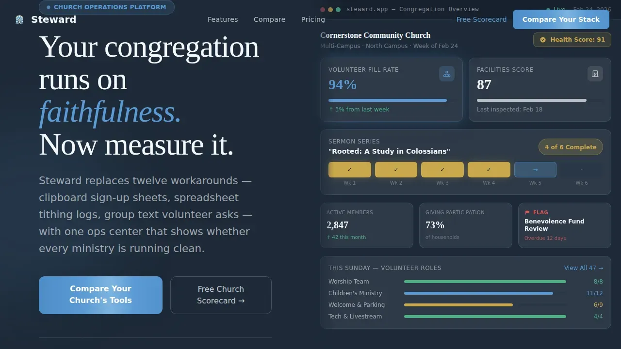
Steward is a purpose-built church landing page template that positions a church operations platform as a mission-critical command center. The 50/50 split-screen layout places a high-fidelity dashboard image on the right and a bold headline on the left. Every scroll section adds one more row to a feature matrix, building an undeniable case for replacing outdated workarounds.
Who this template is for
This template is designed for software founders, product marketers, and church technology teams who need to connect with serious church operations buyers. It targets decision-makers who manage complexity every day and are ready to act.
- Executive pastors overseeing multi-campus megachurches with hundreds or thousands of members
- Denominational district supervisors who audit compliance across dozens of congregations
- Small-church administrators wearing multiple roles who need one clear screen to find status across ministries, funds, and facilities
What problem this template solves
Church leaders rely on a lot of overlapping workarounds: spreadsheet tithing logs, group-text volunteer asks, paper visitor cards, and clipboard sign-up sheets. None of these tools communicate with each other, and critical details fall through the cracks. This church landing page solves that disconnect at the marketing layer by showing, row by row, that every recognized problem has a purpose-built answer waiting.
- Visitors arrive with tool fatigue and no clear frame of reference for what a unified platform looks like
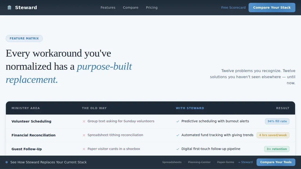
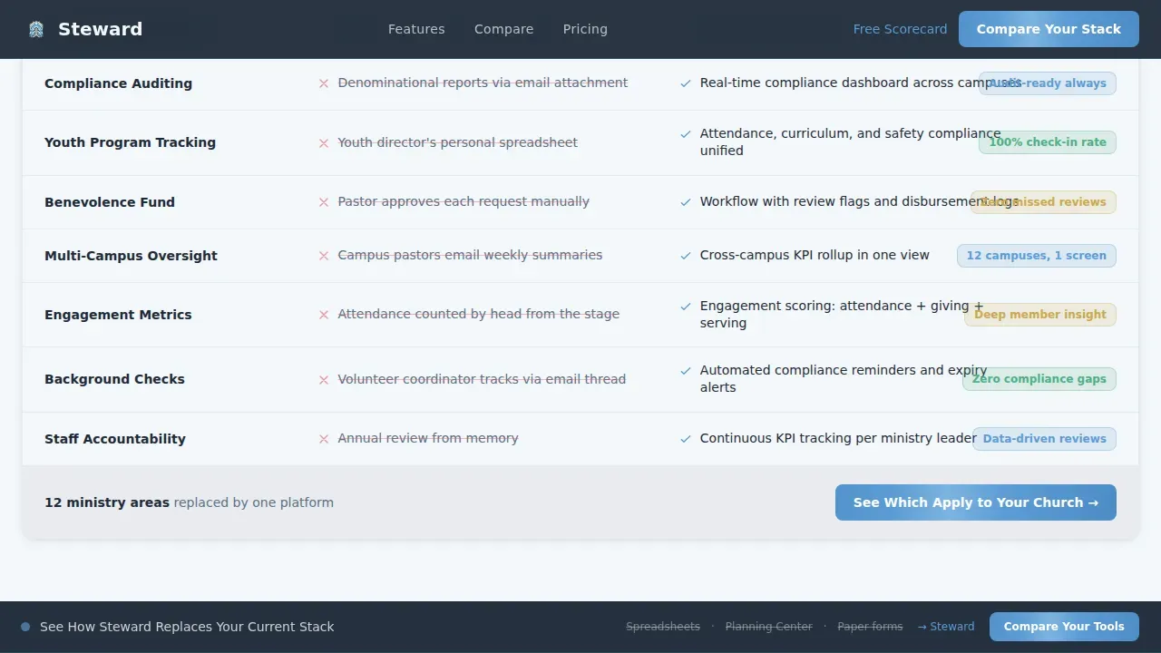
- The page builds that frame through a scroll-accumulating comparison matrix that names each old way and displays the replacement
- The qualifier form and free scorecard lead magnet capture segmented leads and prime them for demo follow-up
What you get with this template
This template delivers a complete, structured church landing page ready to customize and launch. Every section is designed for a specific conversion goal, keeping the page concise and free of distractions.
- A 50/50 split-screen hero with a product screenshot layout and a headline-first left panel
- A scroll-driven feature matrix that adds comparison rows as the visitor reads, building accumulated proof
- A qualifier call-to-action form, a scorecard lead magnet with email capture, and a sticky persistent bar
Feature list
This template packages several high-impact sections designed to build trust and drive action. Each component serves a clear purpose inside the church landing page flow.
Split-Screen Hero Layout
The hero divides the viewport evenly. The left panel displays the headline "Your congregation runs on faithfulness. Now measure it." on a deep charcoal slate background. The right panel is a full-height product screenshot image showing a live congregation dashboard with a 94% volunteer fill rate, a sermon series tracker, a facilities inspection score, and a flagged benevolence fund review column.
Scroll-Accumulating Feature Matrix
Each scroll section splits the screen between the platform capability on the right and the old-way comparison on the left. Rows are displayed one at a time as the visitor scrolls, so the matrix build feels earned. By the final row, the visitor has counted twelve recognized problems and twelve replacements waiting for them.
Qualifier Call-to-Action Form
The primary call-to-action button reads "Compare Your Church's Tools" and leads to a short qualifier. It asks for church size, current tools in use, and biggest pain point. This segmentation helps the platform team respond with the right follow-up message and add the lead to the correct nurture path.
Scorecard Lead Magnet Section
A secondary conversion path offers a free downloadable Church Quality Management Scorecard. The PDF audit template is gated behind an email capture form. It is designed to help church admins self-assess their current operations and primes them for a demo conversation.
Sticky Persistent Comparison Bar
A sticky bar remains visible throughout the entire page scroll. It reads "See How We Replace Your Current Stack" and keeps the comparison goal front of mind. This persistent element reinforces the Comparison/Versus page direction without interrupting the reading flow.
Page sections overview
| Section | Purpose |
|---|---|
| Hero Split Screen | Introduce platform with dashboard image and headline |
| Feature Matrix Rows | Compare old workarounds to platform capabilities |
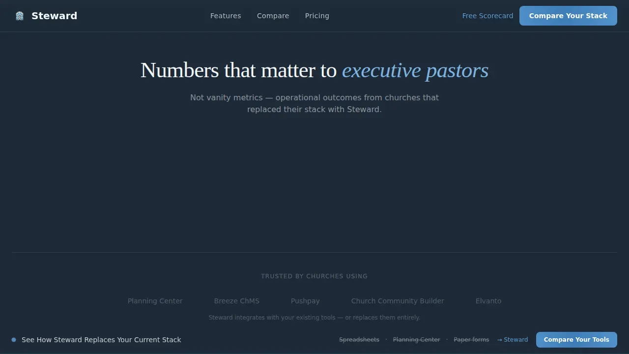
| Metrics and Stats | Display count-up numbers that prove platform value |
| Qualifier call to action Form | Segment leads by church size, tools, and pain point |
| Scorecard Lead Magnet | Capture emails with a free PDF audit download |
| Sticky Comparison Bar | Keep conversion message visible during full scroll |
| Footer Linear Row | Provide essential links in a single-row layout |
Design & branding system
The visual identity follows a Data Command theme. The palette feels like stained-glass light wired into a control room: reverent but razor-sharp. Every color serves a specific role and nothing is decorative.
- Charcoal slate (#1E2A38) anchors left panels and navigation; cathedral-ceiling sky blue (#5B9BD5) illuminates active states and progress indicators shown in the dashboard image
- Cloud-white (#F4F7FA) keeps right-panel backgrounds open and readable; muted gold (#C9A84C) is reserved for completion badges and trust seals displayed across the matrix
- Typography pairs Fraunces for headlines with DM Sans for body and interface text, producing calm authority without stiffness
Mobile & speed optimization
The template is built desktop-first to match how executive pastors and district supervisors work, while remaining fully responsive for tablet and mobile browsing. More than 60% of donors give via mobile, so the page keeps forms thumb-friendly and fast-loading across all screen sizes.
- Responsive layout adapts the 50/50 split to a stacked single-column view on smaller screens, keeping all content readable and calls-to-action visible
- Server Components handle static sections while Client Components power animations including count-up stats, scroll-triggered matrix rows, and progress bars
How this template helps you convert
This church landing page is structured to move each visitor from recognition to action. The design and content work together to protect attention and direct it toward the qualifier form or the scorecard download.
- The scroll-accumulating feature matrix builds trust incrementally. Each row the visitor reads adds another familiar problem to the list, making the platform feel essential rather than optional.
- The qualifier form segments every lead before they leave the page. Church size, current tools, and pain point details are collected upfront, so the follow-up message can be specific and relevant.
- The free scorecard create a low-risk entry point for visitors not yet ready to book a demo, capturing the email and giving the platform team an opportunity to nurture the lead toward conversion.
Other information about this template
The Steward mission critical church management landing page template is built around a clear philosophy: the data is the visual. No decorative stock imagery is used. Instead, authentic dashboard screenshots and real metrics are displayed throughout the page, which builds more trust with visitors than generic images ever could.
- The page is designed to help church leaders explore online giving improvements, volunteer participation tracking, sermons completion rates, and benevolence funds oversight in a single view
- Security-related visual elements such as trust badges help communicate that financial data is protected; a brief stewardship statement can be added to reinforce integrity of fund management
- The template supports announcements, videos, and content updates through its customizable layout, so teams can update the page and publish changes without rebuilding the website
- The layout is structured so that each section serves one goal, keeping the message concise and helping visitors connect the platform value to their specific church size and context
- Teams can choose to add or update details in the qualifier form, adjust the scorecard lead magnet messaging, and build out the feature matrix with their own comparison rows today
Theme
Data Command
Creative direction
Feature Matrix
Color system
Slate & Sky
Style
Split Screen (50/50)
Direction
Comparison/Versus
Page Sections
Split-screen Hero with Dashboard Image
Scroll-driven Feature Matrix
Segmented Qualifier Call to Action Form
Scorecard Lead Magnet with Email Capture
Sticky Persistent Comparison Bar
Data Command Visual Identity System
Related questions
Who is this template built for?
Does this template include the actual platform dashboard?
Can I customize the feature matrix comparison rows?
Is this template suitable for smaller churches?
What is the Church Quality Management Scorecard section?



