Church Inventory Management Landing Page Template
Steward is a hub-and-spoke landing page template built for church inventory and warehouse management platforms. It combines dark-glass panel headers, an interactive campus-map navigator, and a live comparison table to show operations directors exactly what they gain. The design channels Midnight Blue depth with electric-blue accents, turning a complex logistics pitch into a confident, explorable experience.
by Rocket studio
Quick summary
Steward is a single-page, hub-and-spoke landing page template designed for church and religious warehouse management platforms. It guides executive pastors, operations directors, and denomination logistics coordinators from chaotic storage rooms to scannable, trackable inventories. The layout pairs deep Midnight Blue visuals with an interactive explorer flow and a built-in comparison engine that builds the case as visitors scroll.
Who this template is for
This template speaks directly to the people responsible for keeping multi-campus ministry operations running. They know the pain of a lost pallet and a missing chair count.
- Executive pastors managing three or more campuses plus a portable church plant
- Operations directors who lose a full weekend every quarter to manual inventory counts
- Denomination logistics coordinators shipping disaster-relief supplies from regional warehouses
What problem this template solves
Church storage is notoriously hard to manage. Items move between campuses, volunteers borrow equipment without logging it, and no single person holds the full picture. A generic landing page cannot communicate the depth of that problem or the relief of solving it.
- Visitors arrive skeptical that any software truly understands religious warehouse complexity
- A static page cannot show multi-campus transfers, check-out feeds, or bin-location maps in action
- Operations buyers need to feel the product working before they commit to a sign-up form
What you get with this template
Steward delivers a fully structured, interactive landing page layout ready to represent a church inventory platform. Every section is designed to move a cautious operations buyer toward a confident decision.
- A fixed anchor navigation with five clickable spoke nodes: Inventory, Transfers, Check-Out, Reporting, and Integrations
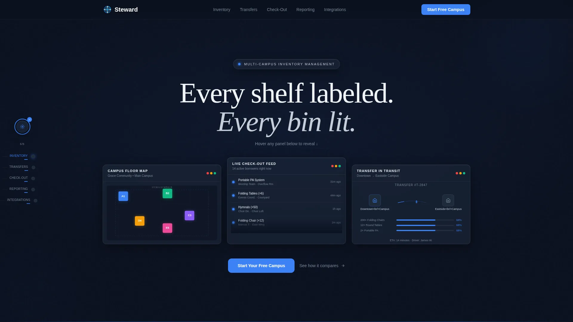
- Three dark-glass panel header cards showing live dashboard previews with parallax depth and a hover-reveal tagline
- A persistent split-view comparison table that auto-fills platform advantages as visitors explore each spoke
Feature list
This template packages several purposeful design and interaction systems, each grounded in the platform's core promise of organized, trackable church inventory.
Dark Glass Panel Header
Three translucent, frosted-glass cards float over a deep navy background. Each card displays a different real-time dashboard view: a campus floor map with bin locations, a scrolling item check-out feed, and a cross-campus transfer with a pulsing route line. A parallax shift on cursor movement gives each panel physical depth, as if mounted on a command-center wall. The hover-reveal tagline materializes in altar-cloth silver only when a visitor engages.
Hub and Spoke Anchor Navigation
A fixed left-rail navigator holds five labeled nodes: Inventory, Transfers, Check-Out, Reporting, and Integrations. Clicking any node animates the main viewport like a camera dolly moving between warehouse rooms. A progress ring around the hub icon fills gradually as visitors explore each spoke, rewarding curiosity and signaling completeness.
Interactive Micro-Demo Sections
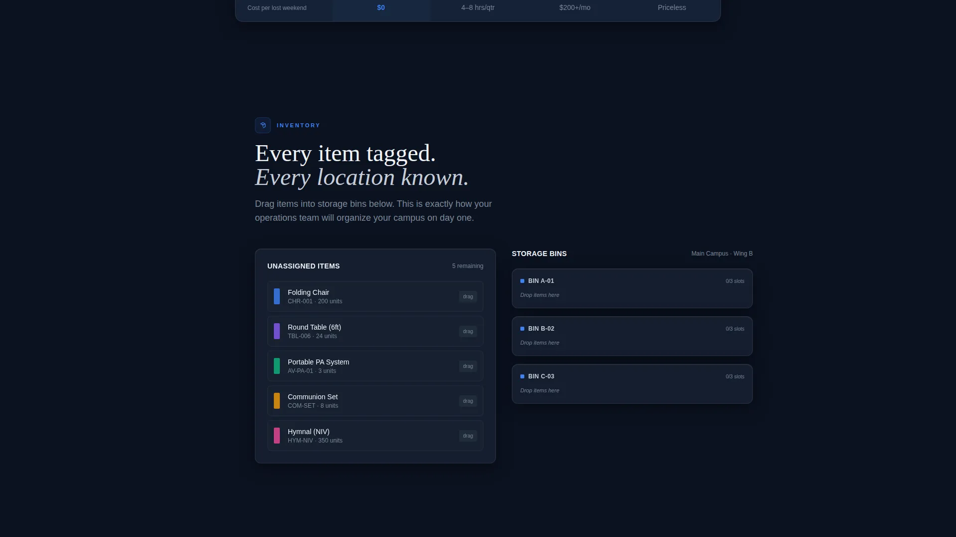
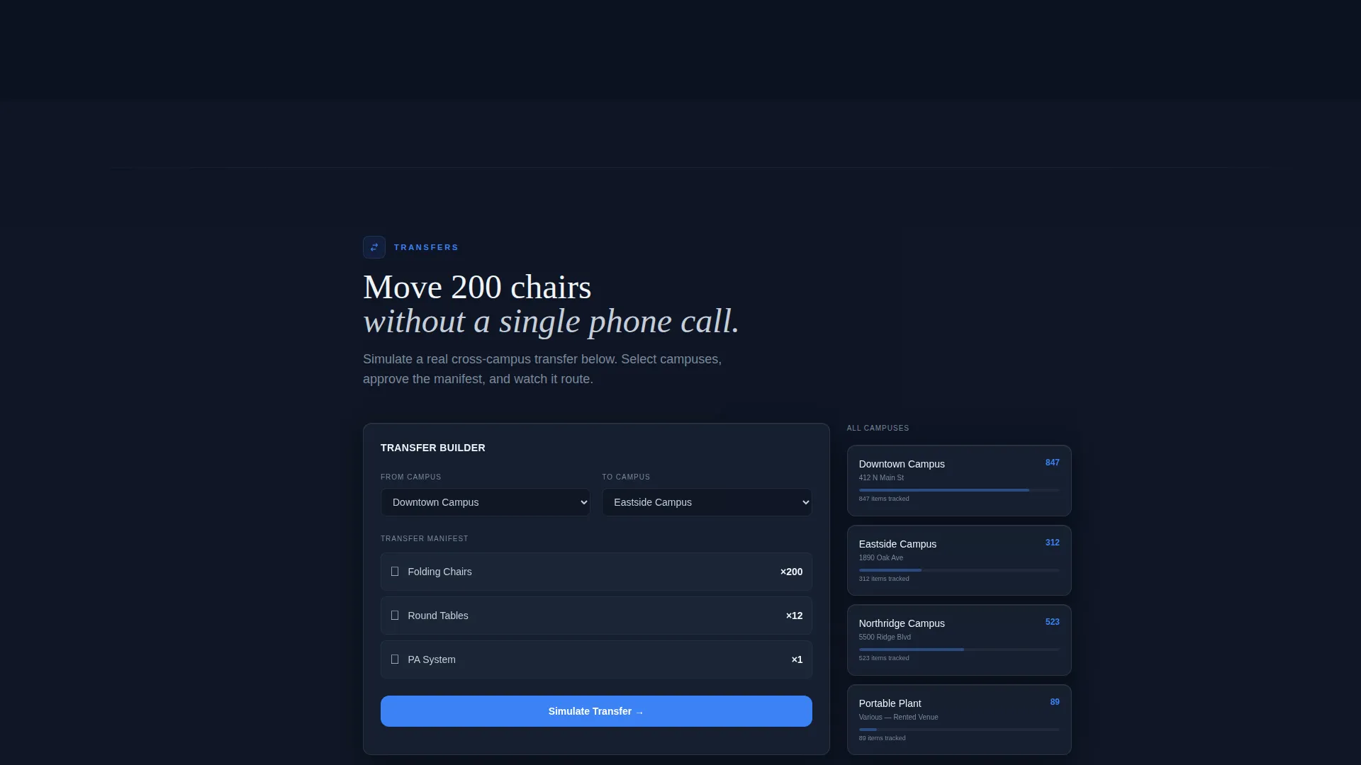
Each spoke section contains a functional micro-demo relevant to its topic. The Inventory spoke lets visitors drag items into bins. The Transfers spoke runs a live simulation moving 200 chairs between campuses. These interactions let operations directors experience the product before reaching a sign-up form.
Persistent Comparison Table
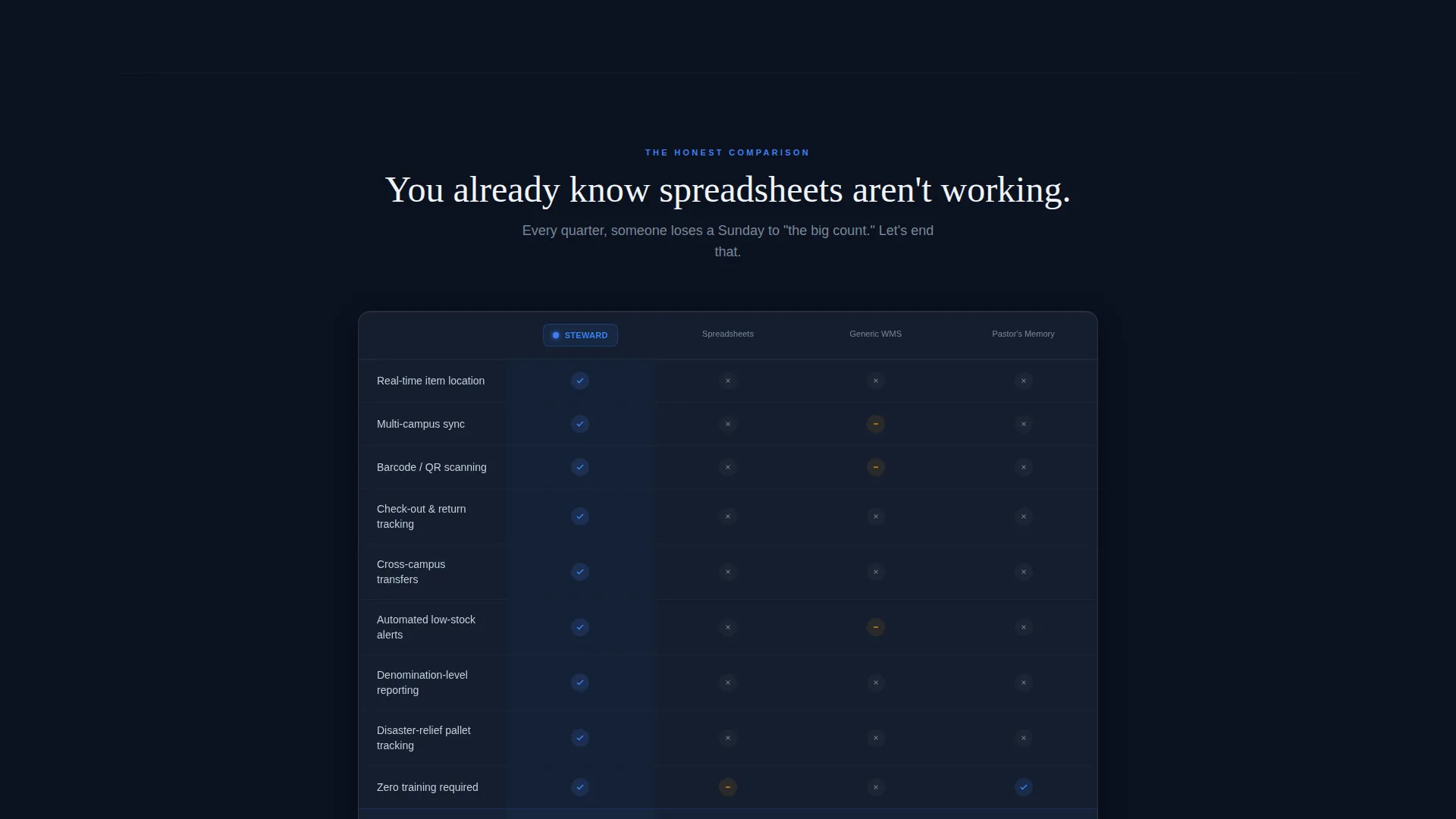
A split-view table anchors the middle of the page, contrasting the platform against spreadsheets, generic warehouse tools, and manual memory. The platform column auto-fills green checkmarks as visitors explore each spoke. The case builds itself through interaction rather than through static assertion.
Dual Conversion Path
Every spoke section and the fixed navigation share the same primary call-to-action: "Start Your Free Campus," a single-field email capture. A secondary path reads "See How [Church Name] Switched" and routes visitors to a denomination-specific case study selector. Both paths appear consistently so the conversion opportunity is never far away.
Startup Velocity Visual Theme
The Midnight Blue color system uses four precise values: deep sanctum navy for full-bleed backgrounds, steel-steeple slate for card surfaces, altar-cloth silver for body text and divider lines, and electric conviction blue for every clickable element, progress bar, and hover state. The result feels like a cathedral nave after dark with a single strip of modern LED lighting overhead.
Page sections overview
| Section | Purpose |
|---|---|
| Dark Glass Header | Introduces three live dashboard previews with parallax depth and hover-reveal tagline |
| Anchor Nav Rail | Fixed left-rail hub with five spoke nodes and a gamified progress ring |
| Inventory Spoke | Drag-and-drop bin demo showing scannable item placement |
| Transfers Spoke | Live simulation of a 200-chair cross-campus transfer with route animation |
| Check-Out Spoke | Interactive check-out feed demonstrating borrowable inventory tracking |
| Reporting Spoke | Section revealing reporting views across multi-campus ministries |
| Integrations Spoke | Overview of platform connection points within the logistics workflow |
| Comparison Table | Persistent split-view table auto-filling platform advantages per spoke |
| Primary call to action Block | Single-field email capture repeating at every spoke and in fixed nav |
| Case Study Selector | Secondary call to action linking to denomination-specific switch stories |
Design & branding system
The visual identity runs on four precise color values drawn from the Midnight Blue system. Every element earns its place against the dark background, and nothing competes with the electric-blue action layer.
- Background and surface: deep sanctum navy (#0B1120) for full-bleed sections, steel-steeple slate (#1E2A3A) for card and panel surfaces
- Text and dividers: altar-cloth silver (#C5CED8) applied consistently to body copy, labels, and section dividers
- Action layer: electric conviction blue (#3B82F6) reserved exclusively for buttons, links, progress bars, hover states, and the progress ring
Mobile & speed optimization
The template is structured to translate its desktop command-center experience into a clear, scrollable format on smaller screens. The interaction-heavy layout has been considered for progressive delivery.
- The fixed left-rail navigation adapts to a top or bottom anchor bar on mobile viewports, keeping spoke access within thumb reach
- Micro-demo sections are designed to degrade gracefully, presenting static visual states when full interaction is unavailable on a device
How this template helps you convert
Steward earns the conversion by making visitors feel productive before they reach the sign-up field. By the time someone submits an email, they have already organized a virtual closet and watched a simulated transfer complete.
- The interactive micro-demos remove the abstract from the pitch. Visitors drag, click, and simulate real tasks, building genuine confidence in the platform before any commitment is asked.
- The auto-filling comparison table removes objections progressively. Each spoke explored adds another green checkmark to the platform column, turning passive scrolling into active persuasion.
- The dual conversion path serves two buyer mindsets at once. The direct "Start Your Free Campus" email capture serves the ready buyer, while the case study selector serves the cautious one who needs peer proof first.
Other information about this template
Steward fits into the broader church technology landscape where platform-specific landing pages often outperform generic software pages. A few additional points worth noting:
- The template style is Hub and Spoke with Anchor Navigation, classified under the Startup Velocity theme
- The creative direction is Interactive Explorer, meaning the layout is built around guided discovery rather than static scrolling
- The header concept is Dark Glass Panels, a design pattern suited to data-rich platform presentations
- The landing page direction follows a Comparison and Versus narrative structure, making it well-suited for buyers evaluating multiple options
- This template falls under the Church and Religious Software subcategory within the broader Technology category
- The Intersection Match Score for this template is 13, indicating a strong alignment between niche, style, and creative direction
Theme
Startup Velocity
Creative direction
Interactive Explorer
Color system
Midnight Blue
Style
Hub & Spoke (Anchor Nav)
Direction
Comparison/Versus
Page Sections
Dark Glass Panel Header with Parallax Depth
Hub and Spoke Anchor Navigation
Interactive Micro-demo Sections
Persistent Split-view Comparison Table
Dual Conversion Path System
Midnight Blue Visual Identity System
Related questions
Who is this template designed for?
Can I rename the five spoke navigation nodes?
Does the comparison table need a live data connection to work?
How does the dual call-to-action system work?
What makes this template different from a generic software landing page?



