Church & Religious Software Reviews Website Template
Steward is a comparison table landing page built for a church and religious claims management platform. It combines an interactive claims dashboard preview, scroll-animated statistics, and a frosted glass visual system to guide executive pastors, diocesan risk managers, and church treasurers toward downloading the app and understanding their coverage gaps.
by Rocket studio
Quick summary
Steward is a single-page, conversion-focused landing page template for a religious property claims management platform. It opens with a live dashboard preview, leads into three high-impact statistics, and builds a row-by-row comparison table that makes the cost of unmanaged claims impossible to ignore. The page drives every visitor toward one clear action: downloading the app.
Who this template is for
This template is built for teams marketing a church claims management platform to faith-based organizations of all sizes. The audience spans institutional decision-makers and small-church administrators alike.
- Executive pastors managing multi-site campuses and million-dollar property portfolios
- Diocesan and denominational risk managers overseeing hundreds of parishes
- Small-church treasurers navigating property damage claims with little insurance knowledge
What problem this template solves
Most religious organizations discover their coverage gaps only after disaster strikes. A burst pipe, a liability dispute, or an undisclosed mold problem can turn into a prolonged, costly settlement. This template gives the platform a landing page that makes those risks vivid before a visitor ever signs up.
- Churches lack visibility into whether their denominational policy actually covers their specific loss
- Managing claims across spreadsheets and broker emails creates delays, lost documents, and missed deadlines
- Visitors arrive skeptical and need hard proof before committing to a new tool
What you get with this template
You get a fully structured, single-page layout with every section pre-built for a church claims platform. The layout moves visitors from awareness to action in a deliberate, escalating sequence.
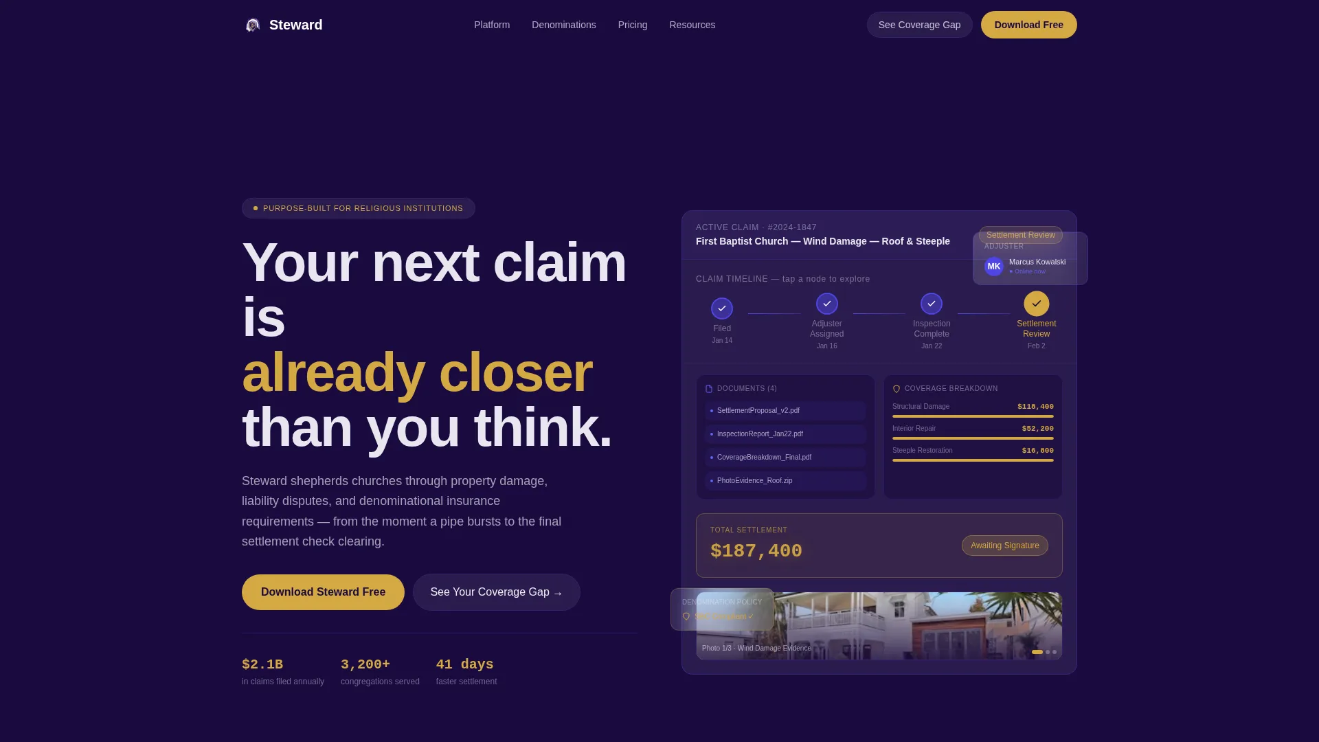
- An interactive header dashboard showing a real claim scenario with a live status timeline
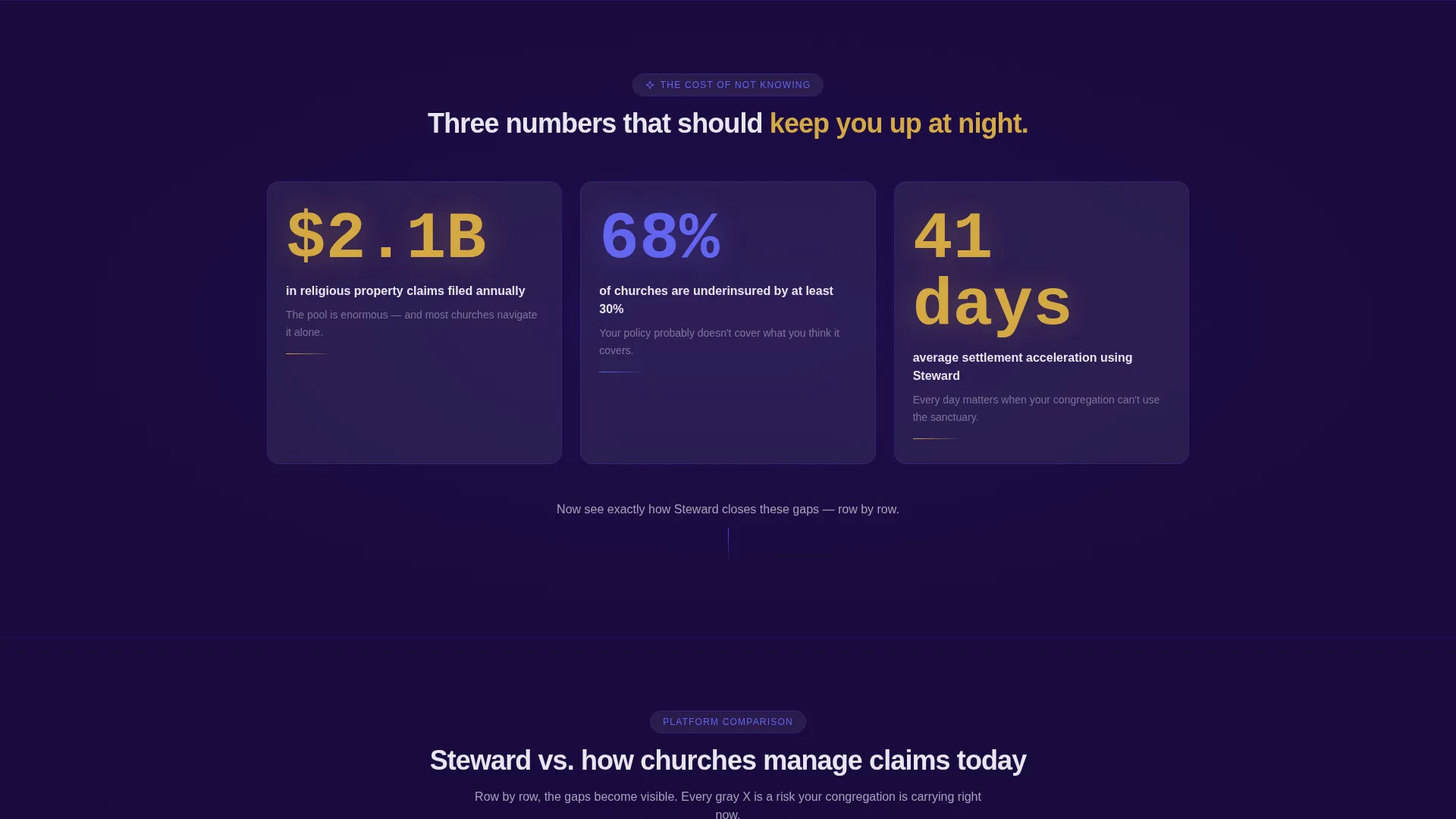
- Three scroll-animated impact statistics that establish credibility immediately
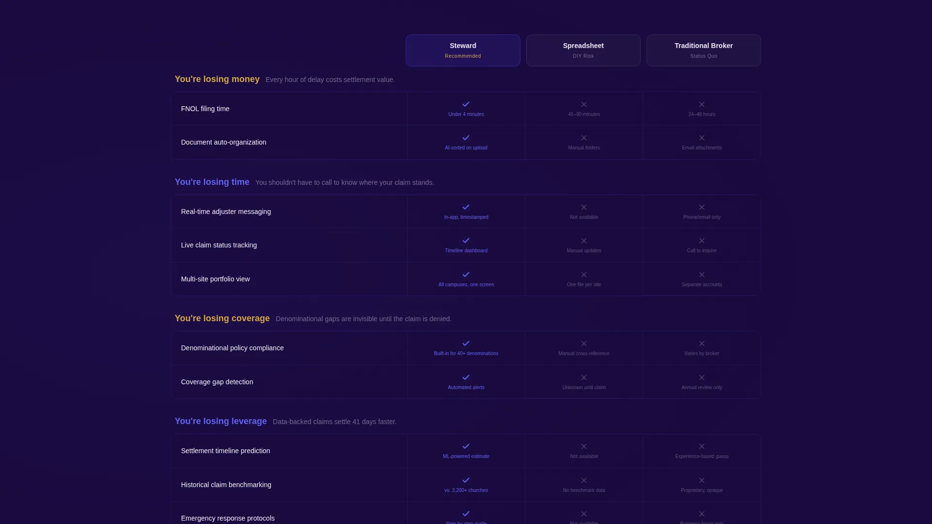
- A multi-row comparison table contrasting the platform against spreadsheet tracking and traditional broker management
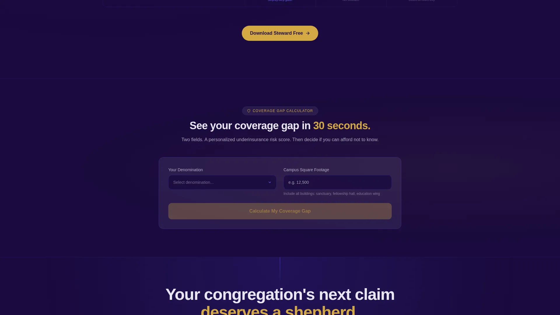
- A two-field coverage gap calculator that delivers a personalized underinsurance risk score
- Repeating gold-on-indigo call-to-action blocks and app store download badges with a desktop QR code
Feature list
This template is built around a set of purpose-designed components that work together to convert a skeptical religious administrator into a confident downloader.
Interactive Claims Dashboard Header
The header renders a functioning miniature of the app's claims dashboard directly in the browser. It shows a real scenario, "First Baptist Wind Damage Roof and Steeple," with a status timeline moving from Filed through Adjuster Assigned to Settlement Review. Visitors tap status nodes to watch documents populate, coverage amounts reveal, and a damage photo carousel rotate. The gold settlement figure pulses gently at the final node.
Scroll-Animated Impact Statistics
Three oversized figures animate into view on scroll, each one establishing a distinct layer of urgency. The stats cover the scale of religious property claims filed annually, the percentage of churches that are underinsured, and the average settlement acceleration the platform delivers. These figures are designed to earn the scroll down to the comparison table.
Frosted Glass Comparison Table
The comparison table runs Steward against spreadsheet tracking and traditional broker management across rows covering claim filing speed, document organization, denominational policy compliance, multi-site portfolio views, and real-time adjuster communication. Each row uses frosted glass cards that elevate on hover, with indigo checkmarks against muted gray marks making the platform's advantages clear at a glance.
Coverage Gap Calculator
A two-field interactive calculator lets visitors select their denomination from a dropdown and enter their estimated campus square footage. The tool returns a personalized underinsurance risk score, making the abstract threat of being underinsured feel immediate and specific. After the result appears, the page prompts the visitor to download the app.
Repeating call to action Architecture
The primary call-to-action, "Download Steward Free," appears in celestial gold on indigo, pinned to the header preview and repeated after every third comparison row. A secondary call-to-action, "See Your Coverage Gap," leads into the calculator. App store badges and a QR code for desktop visitors sit inside a frosted glass card, reducing friction for every device type.
Page sections overview
| Section | Purpose |
|---|---|
| Interactive Dashboard Header | Opens the page with a live claim scenario and pulsing settlement figure to create immediate platform credibility |
| Stats Impact Row | Animates three large figures on scroll to establish the scale of the problem and the platform's proven results |
| Comparison Table Block | Compares the platform row by row against spreadsheets and broker management to make switching feel obvious |
| Coverage Gap Calculator | Delivers a personalized underinsurance risk score using two inputs to turn a general fear into a specific number |
| App Download call to action Card | Closes the page with app store badges, a desktop QR code, and the primary download call to action |
Design & branding system
The visual identity follows a Tech Glass theme built on an Electric Indigo color system. Every design choice is meant to feel like light passing through a cathedral window and landing on a glass tablet.
- Deep sanctuary violet (#1A0A3E) forms the primary background, giving the page devotional weight
- Pulsing indigo (#4F46E5) activates on interactive table rows and hover states; frosted glass white (#E8E6F0) surfaces the comparison cards and cells
- Celestial gold (#D4A843) is reserved exclusively for calls to action and status indicators, making every action point unmissable
- Table borders use a 1px indigo at 20% opacity, creating a frosted-panel depth where rows appear to float above the background
Mobile & speed optimization
The layout is built to function cleanly on any screen size, which matters because a church treasurer discovering mold on a Tuesday morning is likely on a phone, not a desktop.
- The interactive dashboard header and status timeline are touch-responsive, allowing visitors to tap status nodes on mobile devices
- The comparison table cards stack and scroll cleanly on smaller screens without losing the hover-elevation behavior
- The app store badges and QR code coexist in one frosted glass card, serving both mobile and desktop visitors from the same section
How this template helps you convert
The page is structured as a deliberate escalation from problem awareness to confident action, with no dead ends.
- The animated statistics and interactive dashboard create immediate trust and make the stakes tangible before any sales message appears.
- The comparison table builds a row-by-row case that moves visitors emotionally from "I'm losing money" to "I'm losing visibility," arriving at the platform as the only logical resolution.
- The coverage gap calculator delivers a personalized result that makes the visitor feel seen, then channels that feeling directly into the download call to action.
Other information about this template
This template is designed specifically for the church and religious software market, where trust is slow-earned and the audience is sensitive to anything that feels corporate or impersonal. The stained glass visual metaphor runs throughout the design, connecting the platform's modern precision to the devotional weight of the institutions it serves.
- The template uses a single-page, section-led flow with no external page links required to complete the conversion journey
- The scroll narrative is deliberately structured: urgency builds across three phases before the download call to action appears
- The QR code inside the app download card bridges the gap for desktop visitors who prefer to install the app on a mobile device
- The celestial gold color is used sparingly and intentionally, appearing only on calls to action and status indicators so every gold element signals action
Theme
Tech Glass
Creative direction
Stats-First Impact
Color system
Electric Indigo
Style
Comparison Table
Direction
App Download
Page Sections
Interactive Claims Dashboard Header
Scroll-animated Impact Statistics
Frosted Glass Comparison Table
Coverage Gap Calculator
Repeating Call to Action Architecture
Related questions
Who is this landing page template designed for?
Can I customize the comparison table rows?
Does the interactive dashboard header require coding skills to set up?
How does the coverage gap calculator work inside this template?
Is the Electric Indigo color system editable for a different brand identity?



