Church & Religious Software Advanced Cost Calculator Website Template
Steward is a split-screen landing page template built for church and religious field service management platforms. It pairs a live dispatch dashboard screenshot with an interactive Cost-of-Downtime Calculator, guiding facility directors from their own numbers straight to a free trial signup. The design uses a deep navy and iridescent violet-teal palette that feels as purposeful as the platform it presents.
by Rocket studio
Quick summary
Steward is a single-page, split-screen landing page template designed for facility management platforms serving churches, dioceses, and religious campuses. It leads with a product screenshot header, flows into an interactive cost calculator, and closes with social proof and feature deep-dives. Every section earns trust before asking for a click.
Who this template is for
This template is built for software teams and founders marketing a church or religious facility management platform to operations-focused buyers. The ideal user already has a product and needs a landing page that speaks the language of facilities work.
- Operations directors managing twenty or more buildings across a diocese or denominational network
- Megachurch facility managers who handle emergency calls, work orders, and vendor scheduling in real time
- Denominational headquarters teams coordinating deferred-maintenance backlogs across hundreds of rural parishes
What problem this template solves
Facility directors at religious organizations deal with a specific kind of chaos: scattered work orders, reactive maintenance spending, and no single view across multiple campuses. A generic software landing page does not speak to that reality. Steward gives the platform a page that mirrors the buyer's Monday morning and shows how the product organizes it.
- No way to communicate multi-campus dispatch and budget tracking in one clear visual story
- Calculator-less pages that ask for a signup before showing any value to a skeptical operations buyer
- Generic design that feels disconnected from the daily pressure of managing century-old buildings on tight budgets
What you get with this template
Steward delivers a complete, conversion-focused landing page layout built around a Calculator/Tool First creative direction. Every section is pre-structured so a development team can drop in real content without rethinking the flow.
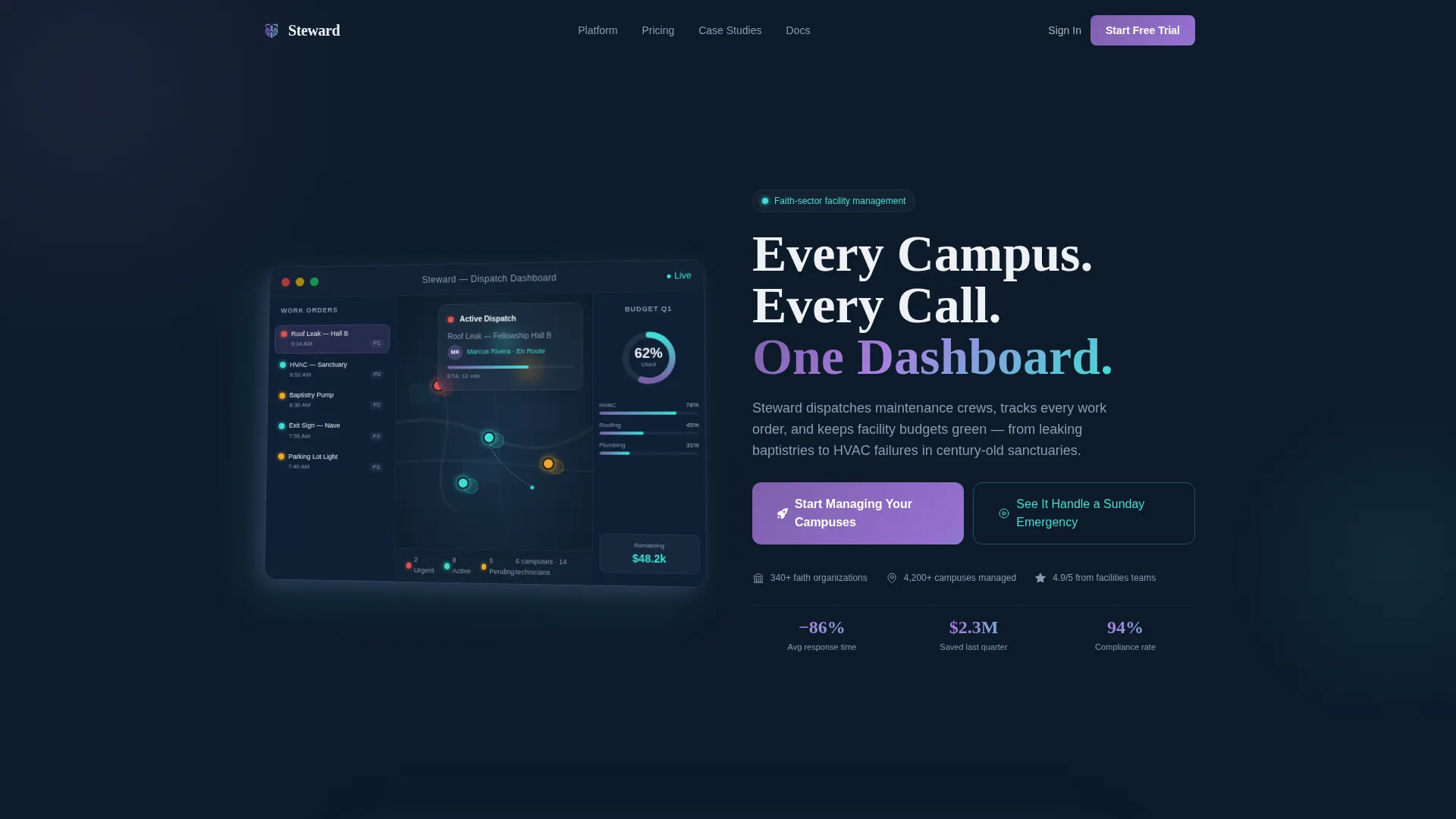
- A split-screen header pairing a pixel-crisp dashboard screenshot with a headline built for immediate recognition
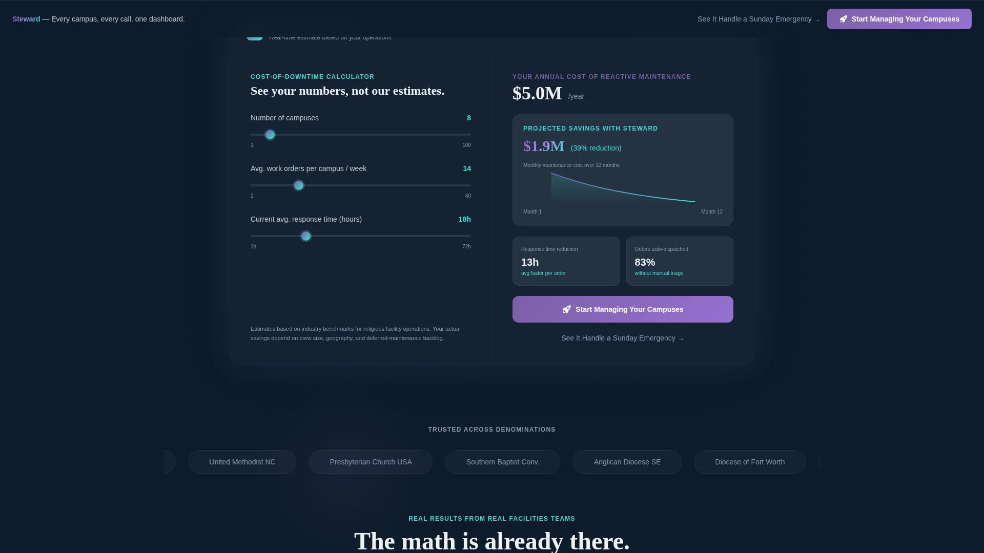
- An interactive Cost-of-Downtime Calculator with real-time results panel, sparkline output, and a primary call-to-action embedded inside the results
- Scroll-sequenced social proof blocks, pain-point and product-screen pairs, a sticky bottom bar, and a secondary demo video text link
Feature list
This section describes the core built-in components and layout capabilities included in the Steward template.
Split-Screen Header with Dashboard Screenshot
The header divides the viewport into two equal panels. The left side displays a product screenshot of the live dispatch dashboard: a map view with colored campus pins, an open work order card for a roof leak, a technician avatar shown en route, and a budget utilization ring chart at 62 percent. The right side carries the headline and primary framing copy. The screenshot sits on a shallow 3D plane with a faint iridescent drop shadow for depth.
Interactive Cost-of-Downtime Calculator
Immediately below the header fold, the left panel becomes a live input tool. Visitors enter their number of campuses, average weekly work orders, and current response time in hours. The right panel updates in real time with three outputs: estimated annual cost of reactive maintenance, projected savings with automated dispatch, and a twelve-month efficiency sparkline. The primary call-to-action button appears inside this results panel once numbers render.
Scroll-Sequenced Social Proof Section
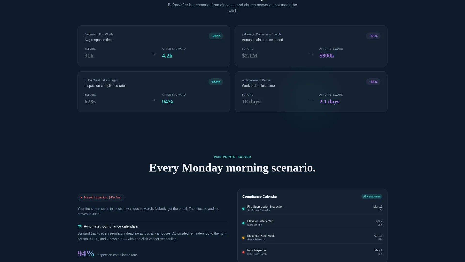
After the calculator, the page shifts into a before-and-after metrics section. This block presents quantified results from real dioceses and church networks. The layout is designed so each proof point lands as the visitor scrolls, building credibility through data before moving into product features.
Pain-Point and Product-Screen Feature Pairs
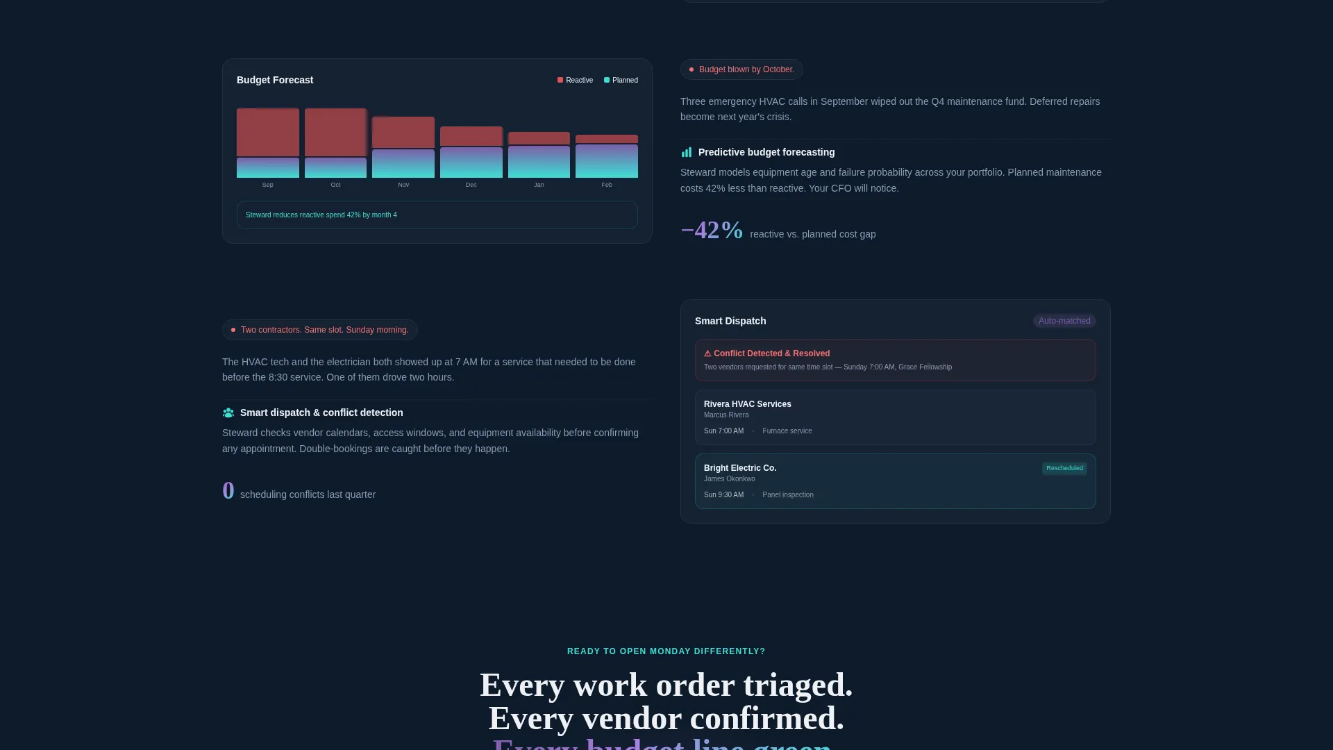
Each feature deep-dive uses a split frame. The left side names a specific operational failure: a missed inspection, a blown budget line, or a double-booked contractor. The right side shows the product screen that resolves it. This pairing keeps the value proposition concrete and grounded in recognizable scenarios.
Sticky Bottom Bar with Primary Call-to-Action
A sticky bar anchors to the bottom of the viewport as visitors scroll past the calculator. It carries the primary call-to-action, "Start Managing Your Campuses," ensuring the signup path is always visible. No form appears on this page; the button clicks through directly to the trial registration flow.
Secondary Demo Video Link
A text link labeled "See It Handle a Sunday Emergency" sits alongside the primary call-to-action. It leads to a guided product demo video, giving buyers who want to see the product in action a low-commitment next step before committing to a trial.
Page sections overview
| Section | Purpose |
|---|---|
| Split-Screen Header | Pair dashboard screenshot with headline |
| Cost-of-Downtime Calculator | Turn visitor inputs into savings estimates |
| Calculator Results Panel | Render real-time outputs and primary call to action |
| Social Proof Metrics | Show before-and-after data from real clients |
| Feature Deep-Dive Pairs | Match pain points to product screens |
| Sticky Bottom Bar | Keep primary call to action visible on scroll |
Design & branding system
The visual identity follows a Dashboard Pro theme built on an AI Iridescent color system. The palette is deliberate: dark backgrounds anchor authority, while iridescent accents signal interactivity without decorating every surface.
- Core colors: vestry navy (#0D1B2A) for backgrounds, holographic violet (#7B5EA7) for depth, soft stained-glass teal (#3EDFD7) for highlights, and celestial white (#F0F1F6) for card surfaces
- Iridescent gradient usage is scoped to interactive elements only: buttons, sliders, chart fills, and progress bars shift between violet and teal on hover states, referencing the effect of light refracting through cathedral glass
- Data cards float on celestial white against the navy background, keeping the dashboard feel readable and purposeful rather than decorative
Mobile & speed optimization
The Steward template is structured to translate its split-screen desktop layout into a clean, stacked single-column flow on smaller screens. The calculator remains functional and the results panel stays legible at all viewport widths.
- Split panels stack vertically on mobile so the screenshot and calculator inputs each occupy full-width sections without crowding
- The sticky bottom bar adapts to mobile viewports, keeping the primary call-to-action reachable without covering key content
- Interactive elements including the calculator inputs and hover-state gradients are sized and spaced for touch use
How this template helps you convert
Steward is structured as a Click-Through landing page. The persuasion sequence is intentional: math first, then proof, then product, then action.
- The Cost-of-Downtime Calculator personalizes the value proposition before any feature claim is made. A facility director who sees a six-figure savings estimate built from their own inputs is already persuaded before the call-to-action appears.
- The sticky bottom bar and the embedded calculator call to action give two distinct conversion touchpoints across the scroll journey, so the click opportunity is present whether a visitor stops early or reads to the end.
Other information about this template
Steward is a single landing page template, not a multi-page site. It is designed for technology companies operating in the church and religious software space, specifically platforms targeting field service management workflows for religious facility operations.
- The template style is Split Screen (50/50), meaning every major section uses a two-panel layout at desktop widths
- The header concept is Product Screenshot, which means the visual anchor is the platform's own dashboard rather than an illustration or stock image
- The creative direction is Calculator/Tool First, a high-intent approach suited to buyers who evaluate software on measurable return before committing to a trial
- The landing page direction is Click-Through, meaning no lead capture form appears on the page itself; the call-to-action routes directly to trial registration
- The theme is Dashboard Pro and the color system is AI Iridescent, both of which inform the palette, gradient behavior, and card surface treatment described in the design section
Theme
Dashboard Pro
Creative direction
Calculator/Tool First
Color system
AI Iridescent
Style
Split Screen (50/50)
Direction
Click-Through
Page Sections
Split-screen Header with Dashboard Screenshot
Interactive Cost-of-downtime Calculator
Scroll-sequenced Social Proof Blocks
Pain-point and Product-screen Feature Pairs
Sticky Bottom Bar with Primary Call to Action
Secondary Demo Video Text Link
Related questions
Is this template suitable for a single-product software launch?
Can the Cost-of-Downtime Calculator be customized for different inputs?
Does this template include a lead capture form?
How does the split-screen layout adapt on mobile devices?
What kind of social proof content does the template support?



