Church & Religious Software Directory Website Template
Steward is a bold brutalist bento grid landing page template built for a church and religious project management app. It presents dark glass panels, violet data visualizations, and staggered feature reveals to drive app downloads. The design speaks directly to executive pastors, facilities directors, and mission coordinators who manage complex ministry projects from a single dashboard.
by Rocket studio
Quick summary
Steward is a single-page bento grid landing page template designed for a church and religious project management platform. It pairs a bold brutalist visual identity with a launch-energy scroll experience to communicate real ministry capability. The page moves visitors from awareness to app download through layered storytelling, live-feeling dashboard previews, and a clear three-step quick-start flow.
Who this template is for
This template is built for teams launching or marketing a church and religious project management app. It speaks the practical language of ministry operations and addresses the people actually running them.
- Executive pastors coordinating building funds alongside weekly service logistics
- Facilities directors managing contractor bids, renovation timelines, and budget approvals
- Mission coordinators syncing volunteer teams across time zones with limited connectivity
What problem this template solves
Ministry project management is complex. Capital campaigns, sanctuary renovations, mission trips, and volunteer builds each carry their own moving parts. A generic project management landing page fails to earn trust from church administrators who need to know the tool understands their world.
- No single landing page format addresses the overlap of spiritual context and structural complexity
- Church decision-makers need visual proof of capability before they will download or request a demo
- Committees require a secondary path, a demo request, before approving any installation
What you get with this template
This template delivers a fully structured bento grid landing page with every section, animation direction, and content block mapped to the app download goal. Nothing is generic; every element is calibrated to the ministry audience.
- A dark glass panel header with parallax motion and embedded app interface glimpses
- Three staggered feature card rows, a dashboard visualization cell, scrolling testimonials, and a mobile app showcase cell
- A primary download call to action with App Store and Google Play badges, a sticky bottom bar, and a secondary demo request path
Feature list
This template is organized around six core capabilities, each designed to move a ministry professional from curiosity to confident download.
Dark Glass Panel Header
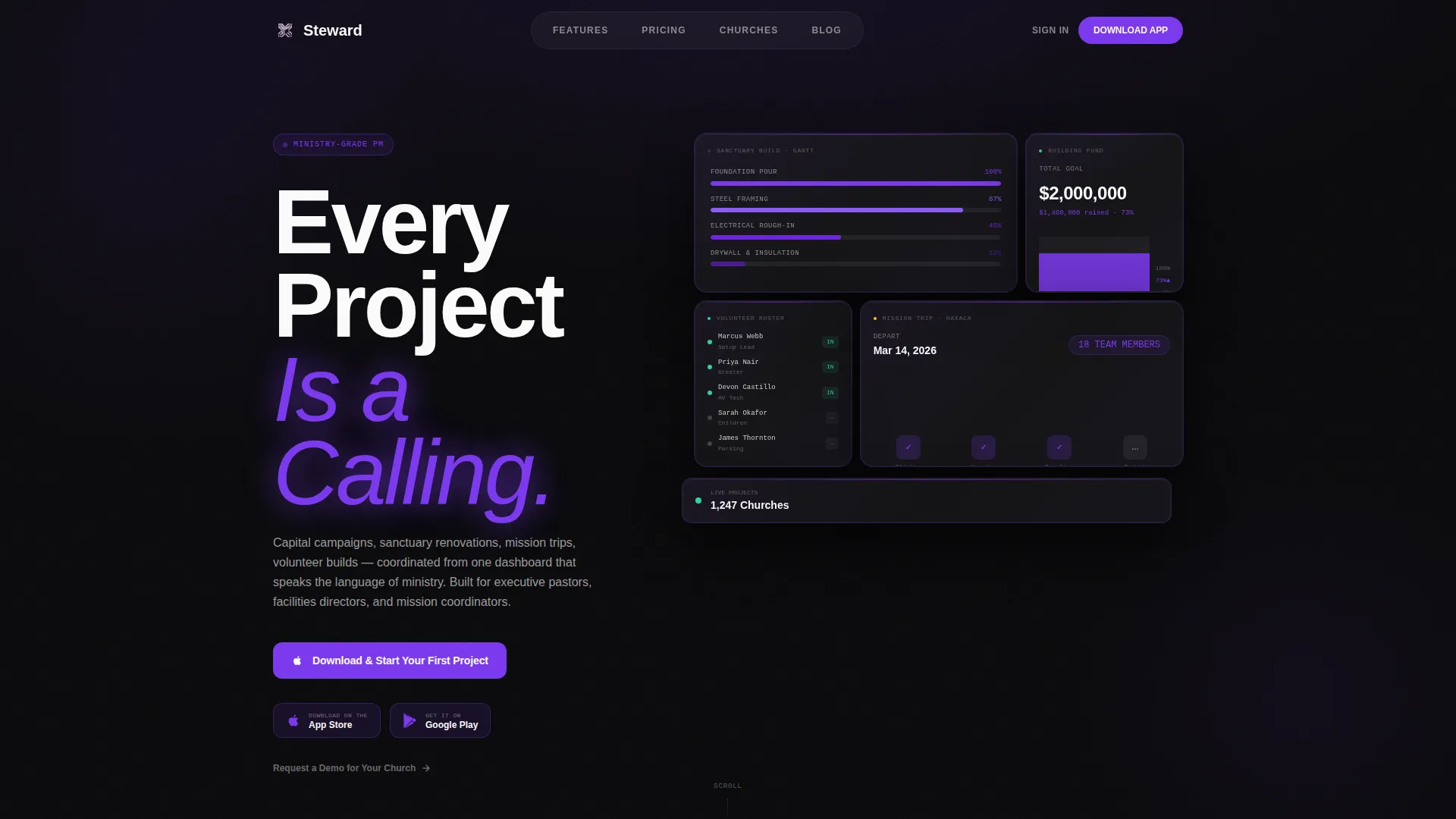
The header floats frosted, semi-transparent cards over a pure black void. Each panel shows glimpses of the app interface: a Gantt chart tracking a sanctuary build, a volunteer roster with glowing check-ins, and a budget thermometer at 73%. A subtle parallax shift follows cursor movement, creating the feeling of peering through the glass walls of a command center.
Staggered Bento Feature Grid
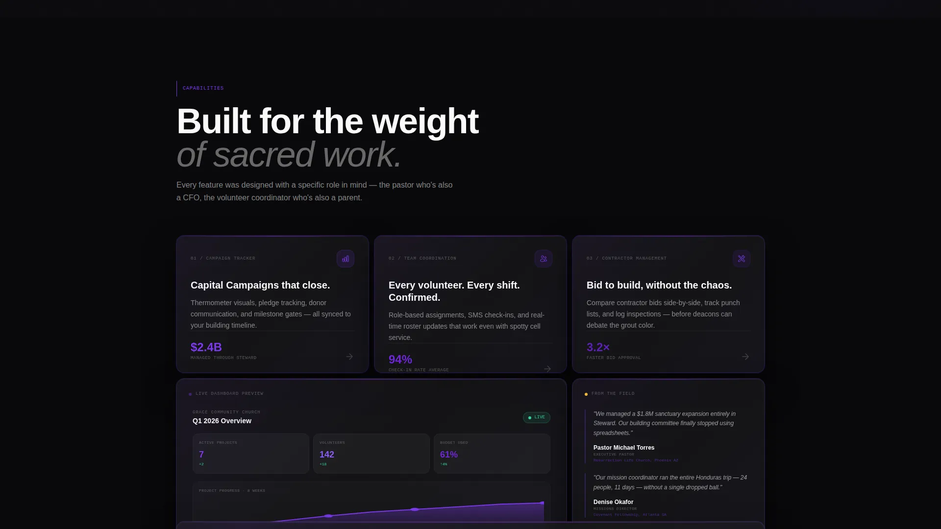
The first bento row delivers three feature cards that animate into place with staggered timing. Campaign Tracker, Team Coordination, and Contractor Management each arrive with momentum. The stagger communicates capability without overwhelming the reader.
Live Dashboard Visualization Cell
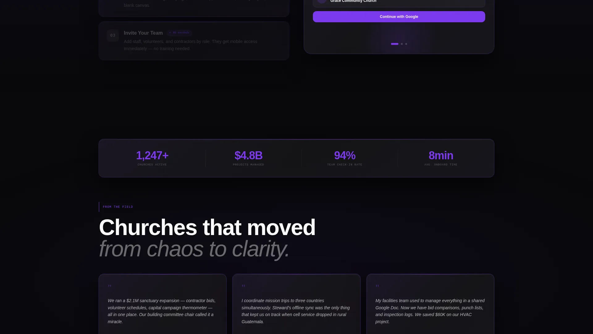
The second bento row features a wide cell showing a live-feeling dashboard with violet data visualizations. It sits beside a tall testimonials cell that scrolls through real church administrator voices. Together they provide both proof of function and proof of trust.
Three-Step Quick-Start Animation
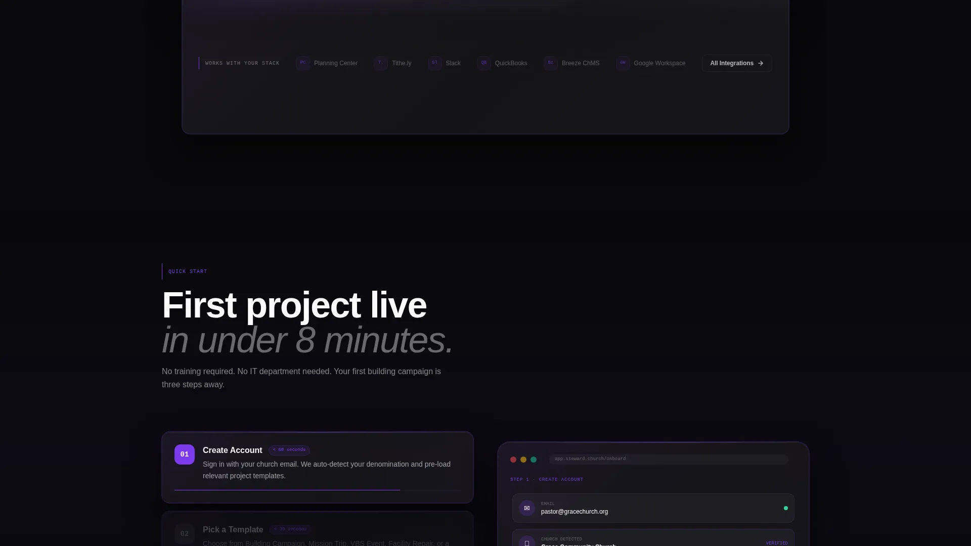
Before the primary call to action asks for a download, the page earns it. A looping animation walks through account creation, first project template selection (Building Campaign, Mission Trip, or VBS Event), and team invite, completing the full cycle in under eight seconds.
Sticky Download Call to Action
The primary call to action, "Download and Start Your First Project," appears first inside the header grid. It resurfaces as a sticky bottom bar after the second scroll section. App Store and Google Play badges are rendered in violet on black, keeping the conversion path always visible.
Secondary Demo Request Path
Not every church committee is ready to install immediately. A secondary path, "Request a Demo for Your Church," gives decision-making groups a lower-commitment entry point. This path coexists with the primary download flow without competing for visual priority.
Page sections overview
| Section | Purpose |
|---|---|
| Dark Glass Header | Establish platform credibility and present the primary download call to action |
| Staggered Feature Cards | Introduce Campaign Tracker, Team Coordination, and Contractor Management with momentum |
| Dashboard Preview Cell | Show violet data visualizations that prove the app works at scale |
| Testimonials Cell | Build trust through scrolling church administrator voices alongside the dashboard |
| Integration Logo Strip | Display compatible tool logos to signal ecosystem fit |
| Mobile App Showcase | Prove field usability with a hand-held device mid-notification |
| Quick-Start Animation | Reduce friction with a looping three-step onboarding preview |
| Sticky Download Bar | Keep the primary call to action visible after the second scroll section |
| Demo Request Section | Offer a low-commitment path for committees evaluating before install |
Design & branding system
The visual identity follows a Bold Brutalist theme built on the Void and Violet color system. Dark architectural volumes are pierced by a single ultraviolet wash that makes the interface feel both ancient and contemporary.
- Core palette: absolute void black (#09090B), raw concrete charcoal (#1C1C1E), electric violet (#7C3AED), and communion white (#FAFAFA) for body text
- Typography uses massive brutalist sans-serif type for headlines; the hero headline reads "Every Project Is a Calling"
- Violet refractions appear at card edges, and violet data visualizations pulse through the dashboard cell like stained glass backlit by stadium floods
Mobile & speed optimization
The template is built with field use in mind. Mission coordinators and facilities directors need a page that works as well on a phone in a parking lot as it does on a desktop in a board meeting.
- The bento grid layout reflows cleanly for smaller screens, preserving the hierarchy of feature cells and call-to-action elements
- The sticky bottom download bar is particularly effective on mobile, keeping the conversion path accessible without requiring a scroll back to the top
- The looping quick-start animation is designed to be lightweight in visual weight and short in duration, completing its cycle in under eight seconds
How this template helps you convert
Every design and content decision in Steward is oriented toward a single outcome: getting the right ministry professional to download the app or request a demo.
- The launch energy scroll structure stacks reasons to act with increasing speed, ensuring momentum never plateaus between the header and the final call to action.
- The three-step quick-start animation removes the single biggest barrier to app downloads by showing exactly what the first eight seconds of onboarding look like.
- The dual conversion path, a direct download and a demo request, means the page captures both the ready individual and the committee that needs buy-in before moving forward.
Other information about this template
Steward is built specifically for the church and religious software category. It reflects the operational reality of ministries running capital campaigns and multi-team project logistics simultaneously.
- The template style is Bento Grid, suited to organizing dense capability information into scannable, visually distinct cells
- The integration logo strip references ecosystem tools common in church operations, showing the platform fits into an existing workflow
- The page is a single-page landing page structure, not a multi-page website, keeping the path to download direct and uninterrupted
- The template ships with the Bold Brutalist theme and Void and Violet color system applied, so the visual identity is ready to use without additional configuration
Theme
Bold Brutalist
Creative direction
Launch Energy
Color system
Void & Violet
Style
Bento Grid
Direction
App Download
Page Sections
Dark Glass Panel Header with Parallax
Staggered Bento Feature Card Row
Live Dashboard Visualization Cell
Three-step Quick-start Animation
Dual Conversion Path Structure
Mobile App Showcase Cell
Related questions
Who is this landing page template designed for?
What is the primary conversion goal of this template?
Can the template support a committee-style buying process?
What does the bento grid layout offer over a standard layout?
Does the template include placeholder content or just the design structure?



