Nonprofit Software Pricing Website Template
Steward is a single-page comparison landing page template built for nonprofit asset management firms. It leads with an interactive fee comparison calculator, moves through detailed side-by-side comparison tables, and closes with a dual-call to action conversion flow. The design uses a Teal Catalyst color system to project fiduciary credibility while keeping every section focused on moving finance-minded nonprofit leaders toward action.
by Rocket studio
Quick summary
Steward is a high-converting comparison landing page template designed for nonprofit asset management firms. It opens with a live dashboard preview header, flows through an interactive fee calculator, and builds trust through structured comparison tables. The Teal Catalyst palette and Startup Velocity theme give it the visual weight of a serious financial product.
Who this template is for
This template is built for boutique and mid-size asset management firms serving the nonprofit sector. It speaks directly to the decision-makers those firms are trying to reach.
- Chief Financial Officers at mid-size nonprofits evaluating their current investment advisor
- Development directors whose planned giving programs are slowed by legacy custodians
- Board treasurers who want clearer, more frequent reporting and lower blended fees
What problem this template solves
Nonprofit financial decision-makers rarely switch advisors because of a brochure. They switch because something shows them a number they cannot unsee. This template is built around that moment of clarity.
- Generic firm websites bury fee structures and avoid direct comparisons with competitors
- Nonprofit leaders need proof before a conversation, not after
- Legacy advisor relationships persist because switching costs feel vague and the upside feels abstract
What you get with this template
You get a fully structured single-page layout that earns attention before it asks for anything. Every section is sequenced to deepen commitment from first scroll to final form submission.
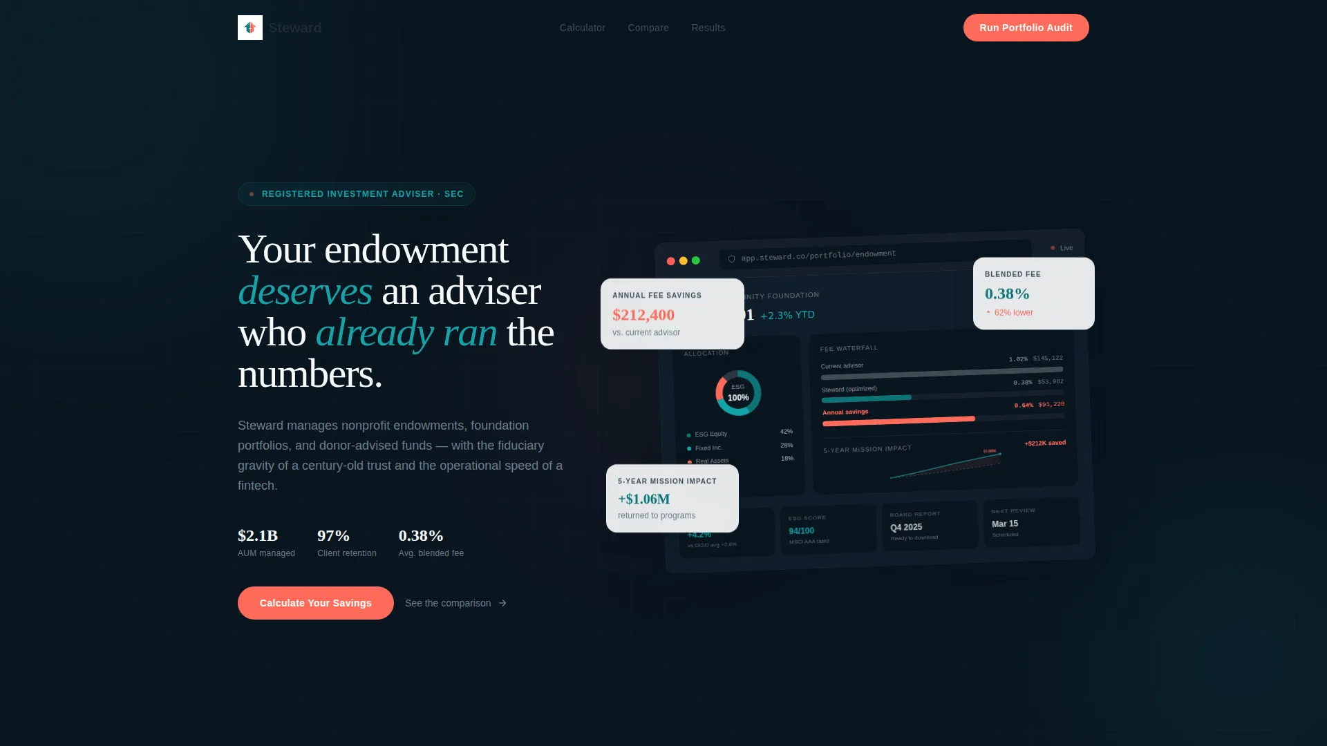
- A browser-frame dashboard preview header with specific portfolio data points, including a $14.2M endowment balance, a 0.38% blended fee indicator, and a $212K annual fee savings callout in signal coral
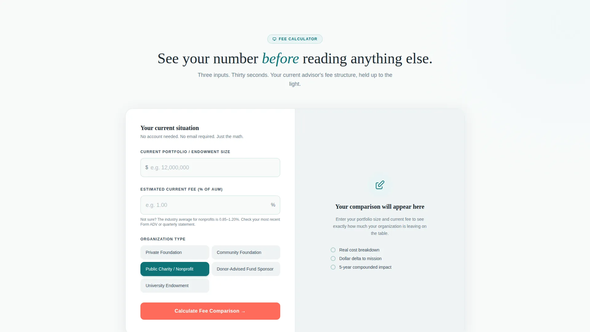
- An interactive fee comparison calculator with three inputs and an instant side-by-side output showing dollars returned to mission annually
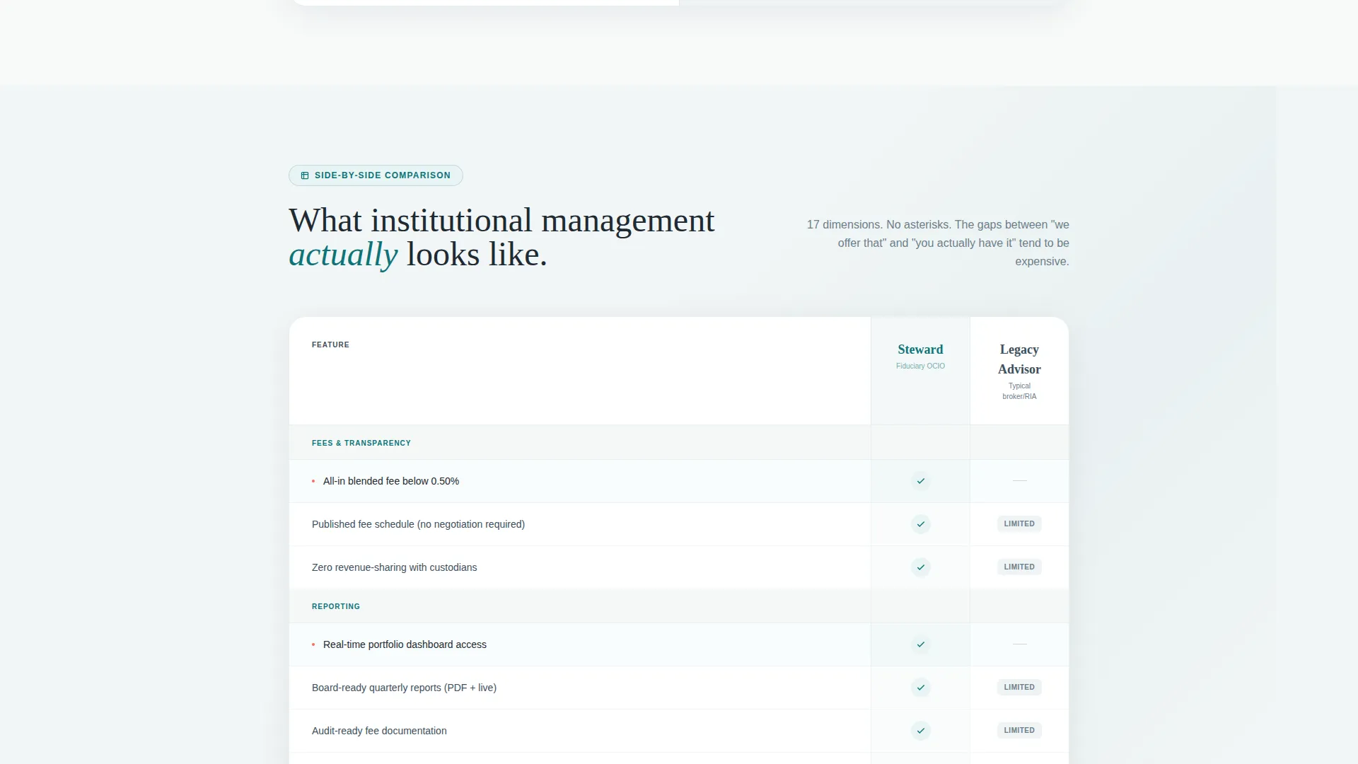
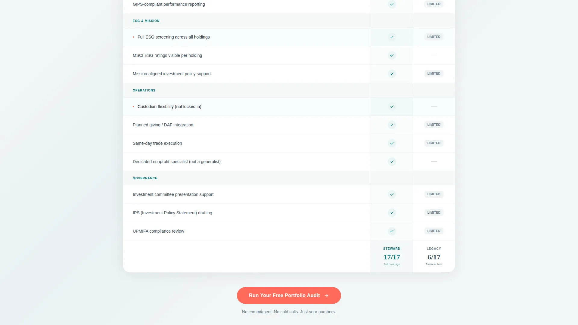
- Progressive comparison tables covering investment philosophy, reporting format, ESG integration depth, board-ready reporting, and custodian flexibility
- A dual-call to action conversion flow with a primary "Run Your Free Portfolio Audit" form and a secondary "Download the Nonprofit Fee Benchmark Report" email capture
Feature list
This section walks through the core functional and visual components built into the Steward template.
Interactive Fee Comparison Calculator
The calculator appears before any body copy. It asks for current portfolio size, estimated current fee percentage, and organization type. The output renders a live side-by-side cost comparison with the delta labeled as "dollars returned to your mission annually." This earned-attention mechanic primes every visitor before they reach the main comparison tables.
Live Dashboard Preview Header
The header uses a browser-frame mockup showing a nonprofit portfolio dashboard in an active session. It displays an endowment balance ticker, an asset allocation donut chart segmented by ESG-screened holdings, a fee waterfall visualization, and a projected five-year impact line. The figures are specific enough to feel operational, not illustrative.
Progressive Comparison Table System
Below the calculator, the page unfolds a sequence of detailed comparison tables. Each table covers a distinct evaluation dimension: investment philosophy, reporting frequency and format, ESG integration depth, board-ready reporting capabilities, and custodian flexibility. Teal checkmarks against empty or "limited"-tagged cells communicate advantage without mocking competitors.
Dual Conversion Path Design
The template includes two distinct conversion paths. The primary path, "Run Your Free Portfolio Audit," collects organization name, approximate assets under management, optional current advisor, and work email. It appears three times across the page. The secondary path offers a downloadable Nonprofit Fee Benchmark Report gated behind email only, lowering the commitment threshold for board members still building their internal case.
Teal Catalyst Color System
The visual system uses deep mission teal as the primary brand anchor, catalyst white for open background fields, graphite ledger for all body text and table headers, and signal coral exclusively for calls to action and outperformance indicators. The result is a layout that reads as financially rigorous without feeling cold or inaccessible.
Proof and Social Validation Block
After the comparison tables, the page includes a proof section featuring client retention rate data, portfolio benchmark results, and a testimonial from a foundation director who switched advisors. This block converts analytical credibility into emotional confirmation before the final call to action.
Page sections overview
| Section | Purpose |
|---|---|
| Dashboard Preview Header | Opens with a live portfolio mockup showing real-feel data |
| Fee Calculator Tool | Captures attention with personalized cost comparison output |
| Side-by-Side Results | Displays calculator output as a formatted comparison table |
| Investment Philosophy Table | Compares advisor approach across key decision criteria |
| Reporting Comparison Table | Shows reporting frequency, format, and board-readiness gaps |
| ESG Integration Table | Illustrates depth of ESG screening versus legacy advisors |
| Custodian Flexibility Table | Highlights operational advantages over legacy custodians |
| Proof and Retention Block | Presents retention rates, benchmarks, and a client testimonial |
| Primary call to action Form | Collects audit request with org name, AUM, and work email |
| Secondary Email Capture | Gates the fee benchmark report behind a low-friction form |
| Final call to action Section | Closes the page with a third "Run Your Free Portfolio Audit" prompt |
Design & branding system
The Steward template follows a Startup Velocity theme executed through the Teal Catalyst color system. Every color choice carries a deliberate role in the visual hierarchy.
- Deep mission teal (#0D7377) anchors the brand and appears in navigation, section dividers, and checkmark icons throughout the comparison tables
- Catalyst white (#F7FAFA) fills open background fields, keeping the layout airy and readable between dense data blocks
- Graphite ledger (#1E2A32) handles all body text and table headers, providing print-grade contrast without harsh pure black
- Signal coral (#FF6B5A) is reserved exclusively for calls to action and outperformance indicators such as the $212K fee savings callout, making every conversion prompt instantly visible
Mobile & speed optimization
The Steward template is structured so that its data-rich sections remain fully usable on smaller screens. Comparison tables and the calculator output are built to reflow cleanly rather than truncate.
- The browser-frame dashboard header scales responsively so the portfolio data remains legible without horizontal scrolling
- Comparison tables adapt to a stacked or scrollable format on mobile, preserving the teal checkmark versus empty-cell contrast that drives the conversion argument
- The calculator input fields and results output are touch-friendly and maintain their side-by-side layout logic across screen sizes
How this template helps you convert
Steward is designed around a single insight: the visitor who sees their own fee number first is not evaluating a vendor. They are confirming a decision the calculator already made for them.
- The fee calculator personalizes the value proposition before any marketing copy appears, meaning visitors arrive at the comparison tables already invested in the outcome they just generated.
- The triple placement of the primary call to action, once anchored below the calculator, once floating at the bottom of the comparison tables, and once in the final section, catches visitors at every natural decision point without interrupting the scroll rhythm.
- The secondary email capture for the Nonprofit Fee Benchmark Report creates a parallel conversion path for board members or committee members who are not yet ready to request an audit but are willing to share an email for credible third-party data.
Other information about this template
The Steward template sits at the intersection of nonprofit software and financial technology design. A few additional details are worth noting for teams evaluating it.
- The template is categorized under Technology with a Nonprofit Software subcategory, making it well-suited for firms positioning themselves as modern alternatives to traditional registered investment advisors
- The Comparison Table template style is purpose-built for high-consideration purchase decisions where the visitor needs structured evidence before acting
- The Calculator/Tool First creative direction is particularly effective in the nonprofit sector because it replaces vague claims about savings with a visitor-specific figure, which is far more persuasive for CFOs and treasurers managing fiduciary responsibilities
- The no-stock-photography directive built into the design keeps the page focused on data visualization and interface elements, reinforcing the fintech-grade positioning
- The template supports donor-advised fund managers, endowment managers, and foundation portfolio advisors equally, since the calculator and comparison structure is flexible enough to address each audience's primary concern
Theme
Startup Velocity
Creative direction
Calculator/Tool First
Color system
Teal Catalyst
Style
Comparison Table
Direction
Comparison/Versus
Page Sections
Interactive Fee Comparison Calculator
Live Dashboard Preview Header
Progressive Comparison Table System
Dual Conversion Path Design
Proof and Social Validation Block
Signal Coral Call to Action Placement System
Related questions
Can I customize the calculator inputs for my firm's fee structure?
Is this a single-page layout or a multi-page website?
How many calls to action does the template include?
What types of nonprofit organizations is this layout suited for?
Can the comparison table rows be edited to match my firm's positioning?



