Church & Religious Org Reviews Website Template
Steward is a card grid landing page template built for religious facility management apps. It guides visitors from the chaos of untracked maintenance to the calm of a fully organized campus. With a problem-to-solution scroll arc, a live-looking dashboard preview header, and app download calls to action, it turns first-time visitors into confident users.
by Rocket studio
Quick summary
Steward is a single-page template designed for religious facility management applications. It opens with a floating dashboard preview showing real work orders and volunteer schedules. A modular card grid then walks visitors through common maintenance problems and their solutions, building momentum toward a primary app download call to action.
Who this template is for
This template is built for teams and individuals who manage the physical upkeep of religious facilities. It speaks directly to people who are stretched thin across multiple buildings with no dedicated facilities staff.
- Executive pastors overseeing multiple church buildings with no facilities team
- Mosque operations directors coordinating multi-campus maintenance and event preparation
- Synagogue board treasurers who need clear reporting on how maintenance budgets are spent
What problem this template solves
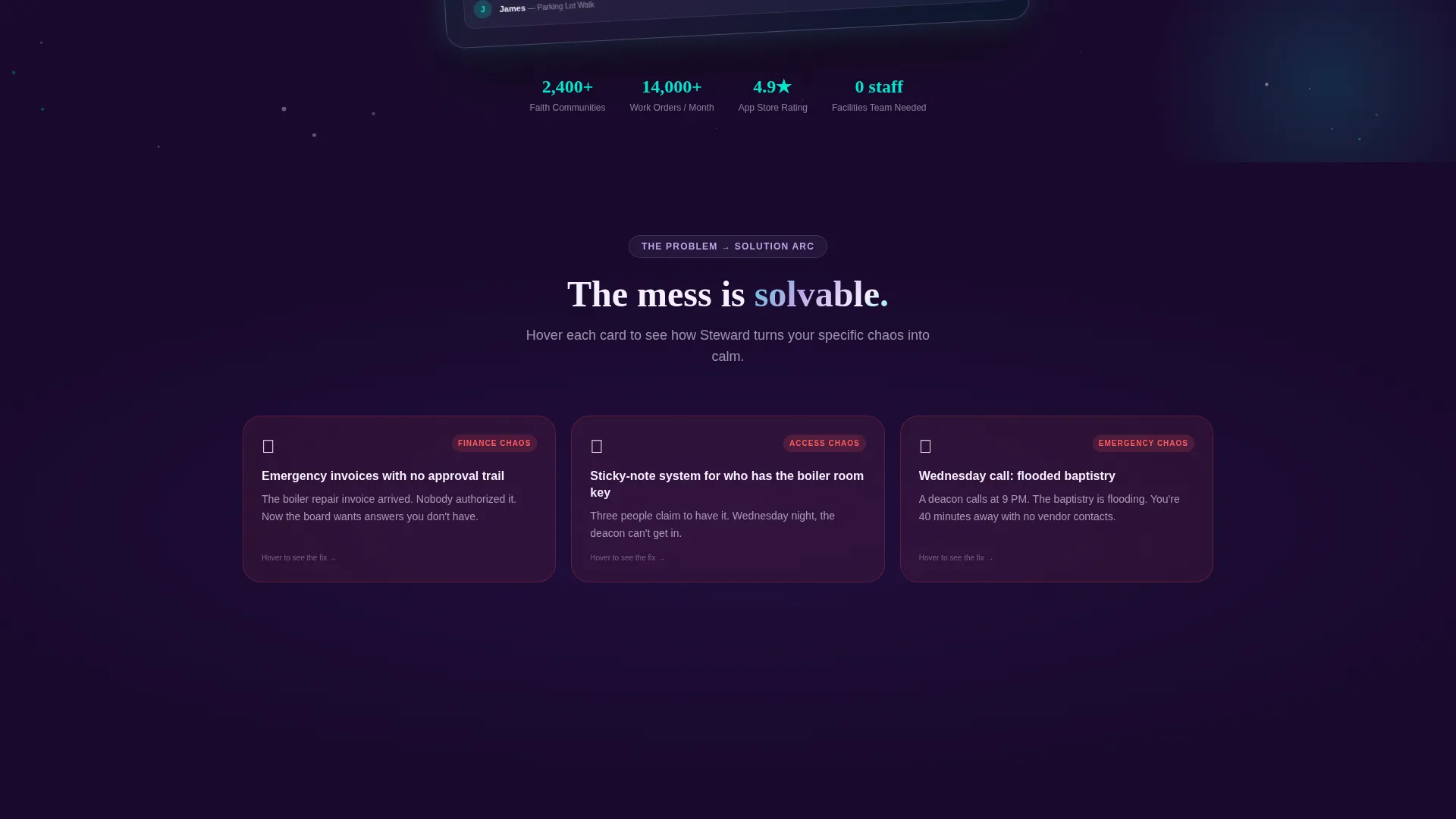
Managing sacred spaces involves constant reactive firefighting. Emergency invoices arrive with no approval trail, volunteers are scheduled on sticky notes, and a Sunday morning crisis can start with a Wednesday night phone call. This template gives a religious facility management app the right visual language to show overwhelmed administrators that their daily chaos has a solution.
- No clear system for tracking vendor approvals, work order history, or who holds access to restricted areas
- Volunteer coordination spread across informal messages and paper lists with no central view
- Maintenance issues discovered too late, after they have already disrupted services or events
What you get with this template
You get a fully structured, single-page landing page template with a modular card grid layout. Every section is pre-built to match the visual logic of a facility management product, from the attention-grabbing header all the way to the download call to action.
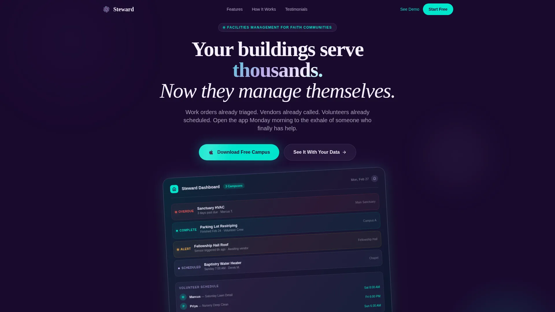
- A floating dashboard preview header with realistic work order data and volunteer name entries
- A problem-to-solution card arc that flips from red-status chaos cards to cyan-status resolved cards
- Paired app store badge calls to action and a live demo secondary path for hesitant visitors
Feature list
This template includes a focused set of components designed to build trust and drive app downloads for a religious facility management product.
Floating Dashboard Preview Header
The header features a slightly rotated app screen showing live-looking maintenance data. Entries like an overdue HVAC filter alert and a completed parking lot task give visitors an immediate sense of what the app delivers. Subtle iridescent edge lighting and a particle drift effect set the visual tone.
Problem-to-Solution Card Grid
Each problem card transitions into its corresponding solution card as visitors scroll. Status indicators shift from red to cyan, and card brightness increases as the grid moves toward resolution. The sequence ends with a single wide card showing a fully green dashboard and the line "Sunday morning. Everything ready."
App Download Call to Action
The primary call to action reads "Download and Start Your Free Campus" and pairs App Store and Google Play badges styled in iridescent cyan. A secondary option, "See It With Your Data," links visitors to a live demo preloaded with a sample church campus.
Modular Card Layout
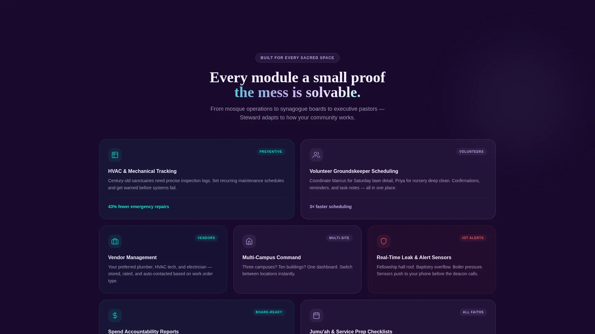
The template uses a card grid structure that keeps each problem and solution as a self-contained module. Cards can be scanned independently, making the page easy to skim and easy to update when the product evolves.
AI Iridescent Visual System
The color palette uses deep sanctuary violet as the primary background, holographic lavender on card surfaces, divine spark cyan for active states, and soft communion white for text. The result feels like stained glass light refracted through a modern interface.
Page sections overview
| Section | Purpose |
|---|---|
| Dashboard Preview Header | Opens with a floating app screen showing real-looking work orders and volunteer entries |
| Problem Cards Row | Displays common facility management pain points in red-status modular cards |
| Solution Cards Row | Flips each problem card into its resolved state with cyan status indicators |
| Final Wide Card | Shows a calm, fully green dashboard with the closing message "Sunday morning. Everything ready." |
| App Download Section | Delivers primary and secondary calls to action with app store badges and demo link |
Design & branding system
The visual identity follows a Startup Velocity theme powered by an AI Iridescent color system. The palette draws from the aesthetic of stained glass light hitting a modern tablet screen, blending ancient reverence with something unmistakably contemporary.
- Deep sanctuary violet (#1A0A2E) as the primary background, shifting holographic lavender (#B8A9E8) on card surfaces, divine spark cyan (#00E5CC) for active states and progress indicators, and soft communion white (#F4F0FF) for text
- Iridescent edge lighting on the dashboard preview screen, with a subtle particle drift suggesting intelligence in motion
- Card brightness and status color shift from red to cyan as the scroll arc moves from problem to solution, giving the page a visual rhythm that mirrors the product's core promise
Mobile & speed optimization
The card grid layout is structured to adapt naturally across screen sizes. Each module stands alone, so the reading experience stays clear whether a visitor is on a desktop browser or a mobile device.
- Modular cards reflow cleanly on smaller screens without breaking the problem-to-solution narrative arc
- The floating dashboard preview header is designed to remain legible and visually impactful at mobile viewport widths
- App store badge calls to action are placed for easy thumb access on mobile, reducing friction at the conversion point
How this template helps you convert
Every visual and structural decision in this template is built to earn the app download before the call to action even appears.
- The dashboard preview header shows the app doing real work in the first few seconds, giving visitors immediate proof of value before they read a single feature claim.
- The problem-to-solution card arc mirrors the emotional journey of the target visitor, moving from the stress of unmanaged facilities to the relief of a fully organized campus, so the download feels like a natural next step rather than a sales ask.
- The "See It With Your Data" secondary call to action gives hesitant visitors a low-commitment path into the product, reducing the barrier for those who are not ready to download immediately.
Other information about this template
This template is categorized under Technology and is specifically designed for the Church and Religious Organization maintenance page niche. It is built using a Card Grid (Modular) template style and follows the Startup Velocity theme with an AI Iridescent color system. The creative direction is a Problem-to-Solution Arc, the header concept is a Dashboard Preview, and the landing page direction is App Download.
- This is a single landing page, not a multi-page website, making it fast to deploy and easy to maintain
- The template is suited for any faith community context, including churches, mosques, synagogues, and multi-campus religious organizations
- The Steward template is designed to position a facility management app as an immediate, practical solution rather than a long-term software commitment
Theme
Startup Velocity
Creative direction
Problem→Solution Arc
Color system
AI Iridescent
Style
Card Grid (Modular)
Direction
App Download
Page Sections
Floating Dashboard Preview Header
Problem-to-solution Card Grid
App Download Call to Action
AI Iridescent Color System
Modular Card Structure
Related questions
Who is the Steward landing page template designed for?
What kind of layout does this template use?
Can I use this template for a mosque or synagogue, or is it only for churches?
What does the problem-to-solution arc mean in practice?
Does this template include both App Store and Google Play calls to action?



