Spa & Wellness Center Booking Website Template
Stillness is a bold brutalist landing page template built for spa and wellness centers that lead with clinical evidence, not ambient mood. A modular card grid layout powers a filterable treatment comparison engine, complete with a dashboard-style header, protocol quiz bar, and chunky brutalist tab navigation. It is built for audiences who want data before they book.
by Rocket studio
Quick summary
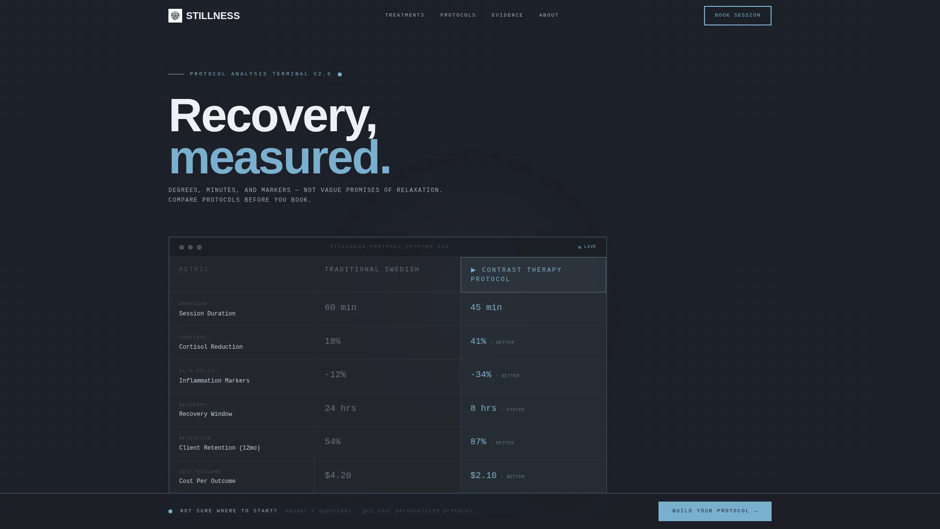
Stillness is a single-page brutalist wellness landing page template designed for spa and wellness centers. It uses a modular card grid to present treatment comparisons in a filterable, data-forward layout. The header doubles as a dashboard preview showing protocol metrics side by side. Every section is built to inform skeptical, high-performance visitors and move them toward booking.
Who this template is for
This template is built for wellness centers that serve results-driven clients. It works best when the audience values specificity over atmosphere. If your brand communicates in outcomes, durations, and recovery data rather than vague promises, this template fits.
- Spa and wellness centers offering contrast therapy, infrared sauna, cryotherapy, or deep-tissue treatments
- Practitioners targeting overworked professionals, endurance athletes, and chronic pain patients who want evidence before booking
- Wellness brands that publish educational blog content and want to turn that archive into an interactive comparison engine
What problem this template solves
Most wellness landing pages rely on soft imagery and aspirational language. That approach loses high-performance visitors in the first few seconds. Clients who track inflammation markers or schedule recovery sessions like business meetings need something different.
- There is no structure for presenting treatment comparisons in a clinical, scannable format
- Standard blog archives offer passive scrolling with no way to filter by condition, intensity, or treatment type
- Conversion paths are vague, forcing visitors to hunt for relevant information rather than being guided to it
What you get with this template
You get a fully structured, single-page layout with every major component pre-built and ready to customize. The design system is consistent throughout, so every card, button, and data row shares the same visual language.
- A dashboard preview header showing two treatment protocols side by side with monospace metrics and an active column glow effect
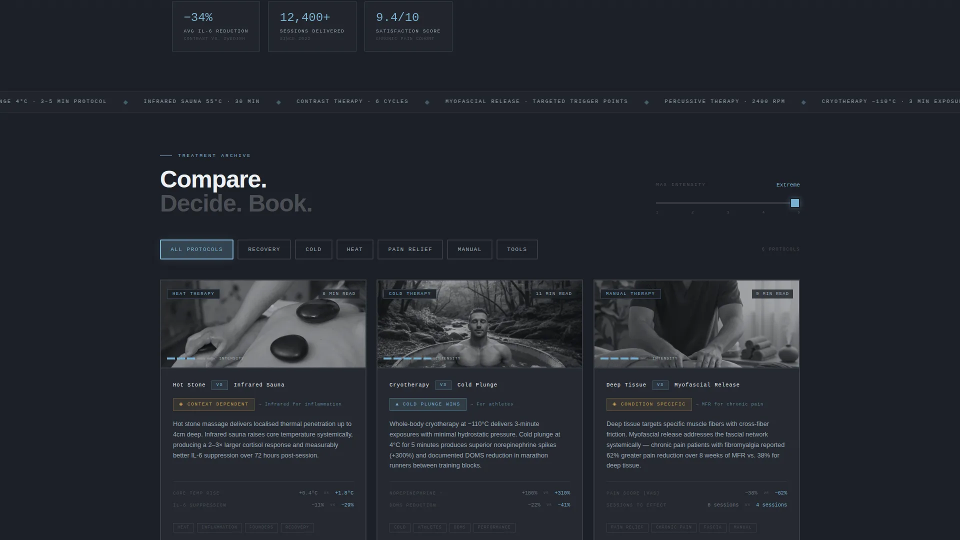
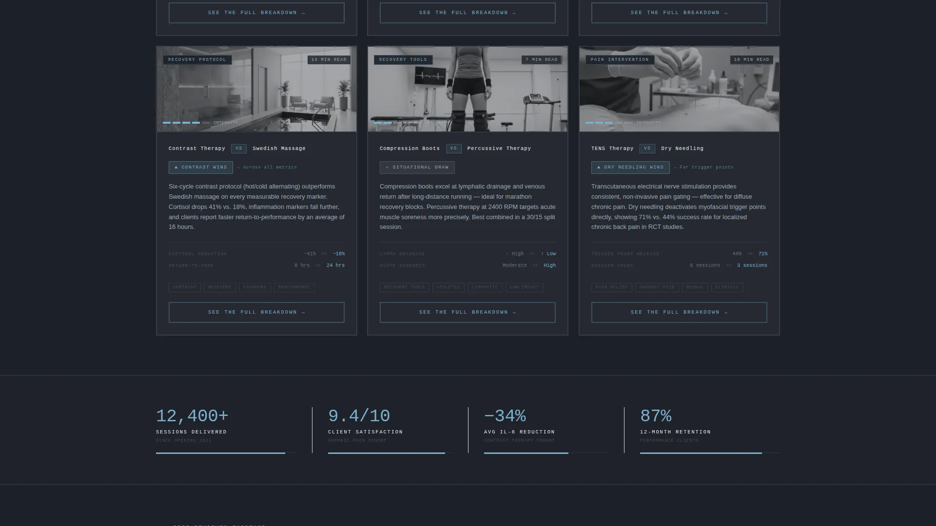
- A filterable card grid with chunky brutalist tab buttons, condition-type sliders, and treatment matchup cards carrying verdict badges and read-time stamps
- A persistent bottom conversion bar with a three-step protocol quiz covering treatment goal, frequency, and budget, outputting personalized treatment recommendations with a booking button
Feature list
This section covers the core functional and design capabilities built into the Stillness template.
Dashboard Preview Header
The header presents a stylized wellness comparison interface. Two columns show "Traditional Swedish" versus "Contrast Therapy Protocol" with visible data rows for session duration, recovery metrics, client satisfaction scores, and cost-per-outcome. Numbers are large and set in monospace type. The active column pulses with a faint sky-blue glow, making it read like a clinical performance terminal.
Filterable Card Grid Layout
The blog archive section becomes an interactive comparison engine. Visitors use chunky brutalist tab buttons to toggle between treatment categories. Sliders let them filter by condition type or intensity level. The card grid rearranges with each interaction, surfacing the most relevant treatment matchups without a page reload.
Treatment Matchup Cards
Each card in the grid is a thick-bordered module presenting a direct treatment comparison, such as "Hot Stone versus. Infrared Sauna" or "Cryotherapy versus. Ice Bath." Every card carries a verdict badge and a read-time stamp. The primary call to action on each card reads "See the Full Breakdown," linking directly to the corresponding deep-dive article.
Persistent Protocol Quiz Bar
A fixed bottom bar stays visible as visitors scroll. It offers a secondary conversion path labeled "Build Your Protocol." Clicking it opens a three-step quiz that asks for treatment goal, frequency preference, and budget range. The output is a personalized comparison of recommended treatments, with a "Book Your First Session" button pre-filled with the visitor's selections.
Bold Brutalist Typography System
Oversized sans-serif headings are set in exposed concrete gray with generous letter spacing. The tracking gives large type room to breathe, mimicking the spatial quality of a brutalist corridor. Monospace numerals appear in data-heavy sections to reinforce the clinical, metrics-first personality of the design.
Slate and Sky Color System
The palette uses four intentional tones: exposed concrete gray for primary type, deep charcoal for card backgrounds, open sky blue for active states and hover interactions, and sharp cloud white for card surfaces. The contrast between architectural weight at the base and atmospheric lightness at the surface is built into every component.
Page sections overview
| Section | Purpose |
|---|---|
| Dashboard Preview Header | Compare two treatment protocols using clinical metrics in a monospace data layout |
| Tab Filter Navigation | Let visitors toggle between treatment categories using chunky brutalist tab buttons |
| Condition Slider Controls | Filter the card grid by condition type or intensity level using draggable sliders |
| Treatment Matchup Grid | Display modular comparison cards with verdict badges and read-time stamps |
| Card call to action Links | Direct each card to a full treatment breakdown blog post |
| Protocol Quiz Bar | Capture visitor goals, frequency, and budget through a persistent three-step quiz |
| Booking Button Output | Surface a pre-filled booking action based on personalized quiz results |
Design & branding system
The Stillness template uses a Slate and Sky color system built around four deliberate tones. The visual weight moves from heavy and architectural at the base to light and atmospheric at the surface, mimicking the feeling of stepping from a steam room onto a cool open terrace.
- Color palette: exposed concrete gray (#4A4E54) for body type, deep charcoal (#1C1F26) for card backgrounds, open sky blue (#7AAFCF) for active and hover states, and sharp cloud white (#EDF1F5) for card surfaces
- Typography: oversized sans-serif headings with generous letter tracking, monospace numerals in data rows, thick visible card borders throughout
- Interactive states: sky-blue glow on the active comparison column, satisfying visual weight on tab button and card hover interactions
Mobile & speed optimization
The modular card grid is built to reflow cleanly across screen sizes. Each card module scales independently, so the comparison layout stays readable on smaller viewports without losing its architectural density.
- Thick-bordered cards maintain visual structure on mobile screens without relying on background imagery or decorative layers
- Chunky tab buttons and slider controls are sized for touch interaction, keeping the filter experience usable on phones and tablets
- The persistent bottom bar adapts to viewport height, staying accessible without obscuring card content on smaller screens
How this template helps you convert
Stillness is designed around two distinct conversion paths that work at different stages of visitor intent. Both paths are visible from the moment the page loads.
- The "See the Full Breakdown" call to action on each treatment card moves engaged readers directly into long-form content, building trust and extending session depth before a booking decision is made.
- The "Build Your Protocol" quiz bar captures visitors who are ready to act but need guidance. By collecting goal, frequency, and budget in three steps, it delivers a personalized recommendation and surfaces a pre-filled booking button, reducing friction at the moment of highest intent.
Other information about this template
Stillness is categorized under spa and wellness center website templates and is specifically designed for the spa and wellness center blog page niche. The Intersection Match Score for this template is 13, reflecting a tight alignment between the Bold Brutalist theme, Interactive Explorer creative direction, Card Grid modular template style, Comparison/Versus landing page direction, and Dashboard Preview header concept. This combination is uncommon in wellness design and gives the template a distinct positioning advantage for centers that want to stand apart from softer, mood-driven competitors.
- Template style: Card Grid (Modular), single-page layout
- Theme: Bold Brutalist with a Slate and Sky color system
- Creative direction: Interactive Explorer with filterable comparison mechanics
- Header concept: Dashboard Preview with side-by-side protocol data
- Landing page direction: Comparison/Versus with dual conversion paths
Theme
Bold Brutalist
Creative direction
Interactive Explorer
Color system
Slate & Sky
Style
Card Grid (Modular)
Direction
Comparison/Versus
Page Sections
Dashboard Preview Header
Filterable Treatment Card Grid
Treatment Matchup Cards
Persistent Protocol Quiz Bar
Bold Brutalist Typography System
Related questions
Who is this landing page template best suited for?
Can I customize the treatment categories and card content?
How does the three-step protocol quiz work?
Is this template designed as a single-page layout?



