Stillness - Scalable Meditation Landing Page Template
Stillness is a dashboard-style landing page template built for white-label meditation app platforms. It combines an interactive cost estimator, a live feature matrix, and a client metrics panel inside a deep charcoal and teal visual system. The result is a single-page experience that feels like a product cockpit, designed to convert wellness brands, HR teams, and health systems into demo-app signups.
by Rocket studio
Quick summary
Stillness is a single-page, dashboard-driven landing page template for white-label meditation app platforms. It opens with a live cost estimator inside a device mockup, moves through an interactive feature matrix and client metrics panel, and closes with a demo-app conversion flow. The design blends clinical command-center clarity with warm wellness intent.
Who this template is for
This template is built for businesses that sell or operate white-label meditation app platforms. It speaks directly to buyers who need to demonstrate value quickly and close deals with sophisticated audiences.
- Startup founders building mental health products on tight timelines who need to prove unit economics fast
- Enterprise wellness directors sourcing mindfulness tools for large employee populations before a quarterly deadline
- Yoga studio owners and wellness brand operators who want a branded app under their own name on the App Store
What problem this template solves
Selling a white-label app platform is hard when prospects cannot visualize what the finished product looks like for their brand. A static brochure page rarely earns trust from enterprise buyers or founders who have seen too many vague SaaS pitches.
- Visitors cannot picture the branded output until they interact with the actual variables that shape it
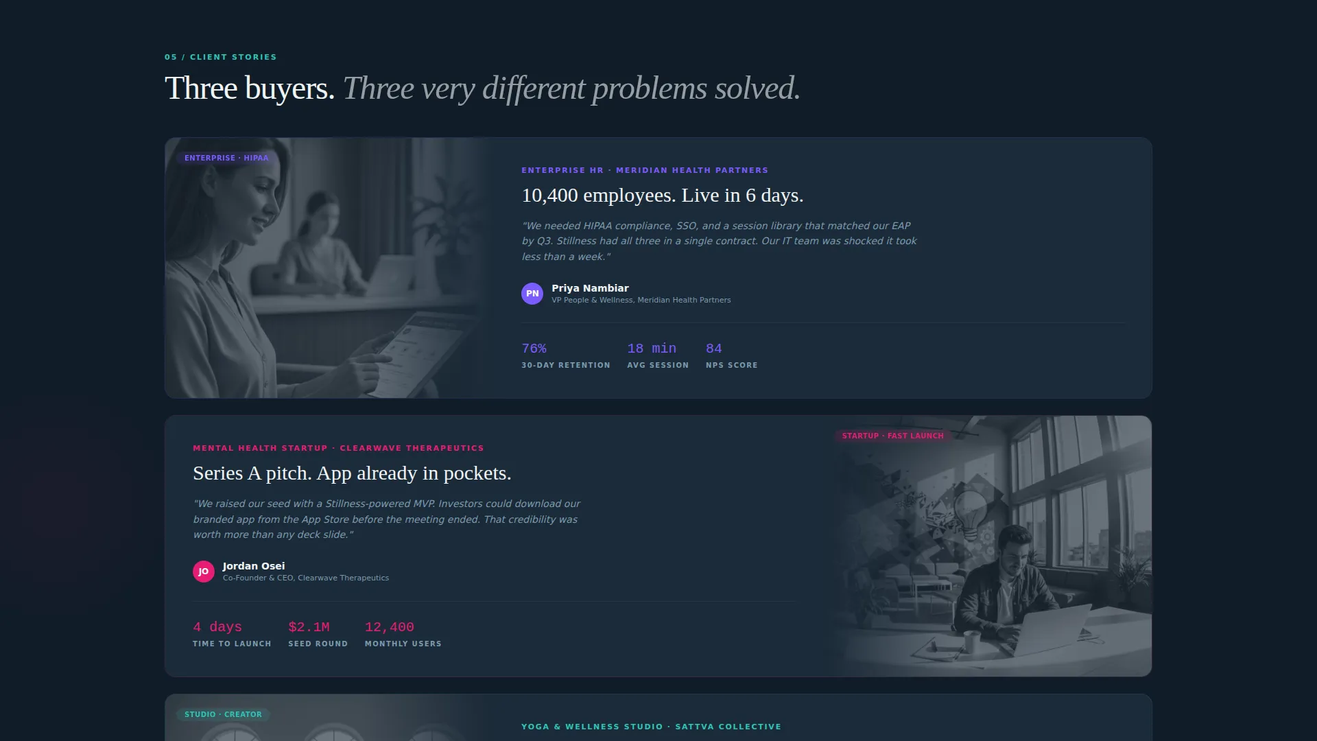
- Enterprise procurement teams need proof of real engagement data before they enter a sales conversation
- The gap between "interested" and "ready to demo" is too wide when the only call to action is a generic contact form
What you get with this template
You get a complete, fully structured landing page layout that covers every stage of the buyer journey from curiosity to conversion. Each section is designed to respond to visitor input, rewarding exploration with concrete proof rather than static claims.
- An interactive cost estimator with slider controls, a live device mockup preview, and a real-time cost-per-user readout
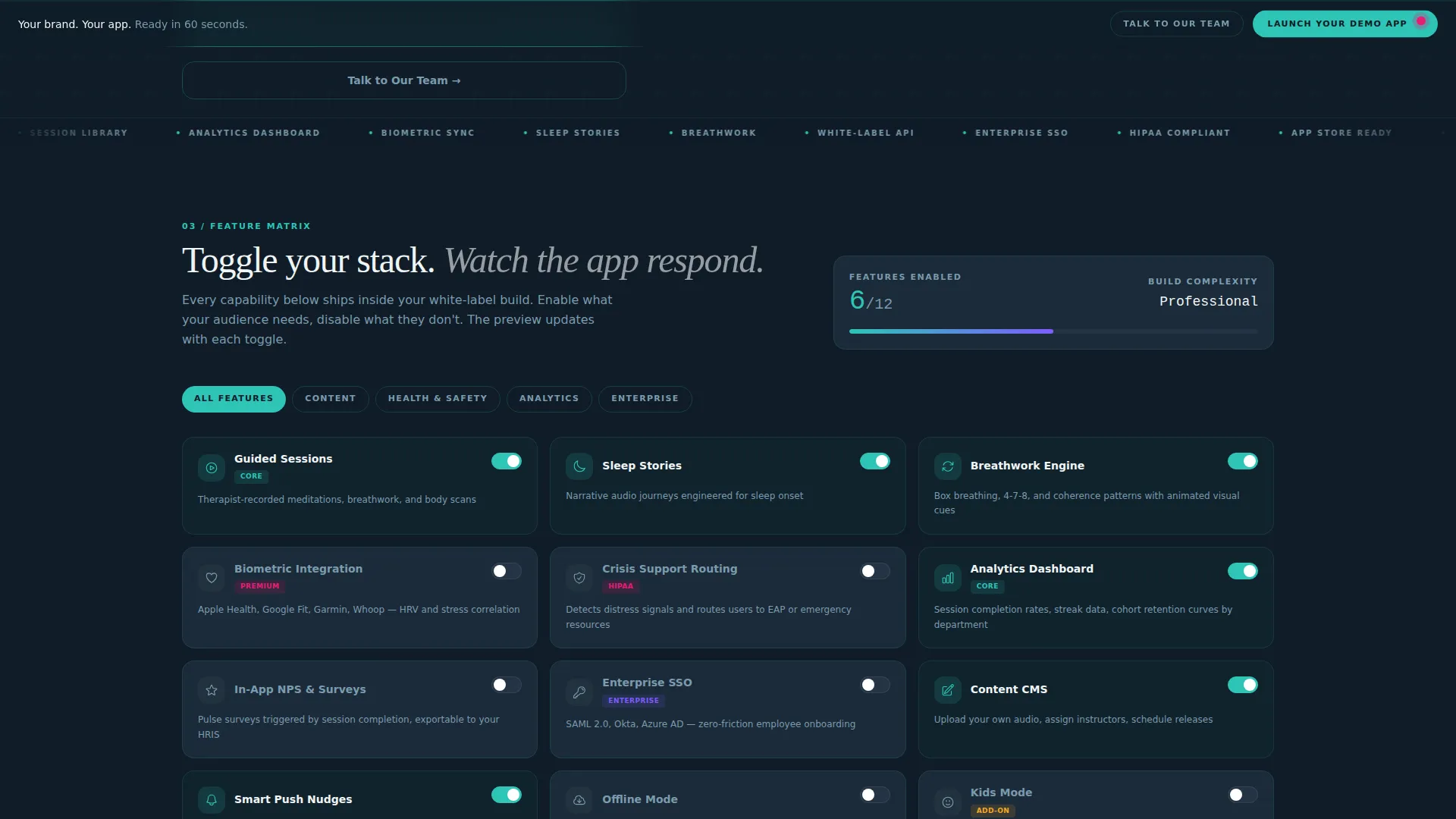
- A toggleable feature matrix that updates the app preview as visitors switch capabilities on and off
- A client metrics panel with filterable engagement data, a persistent demo call to action bar, and a three-field demo-launch form
Feature list
This template ships with purpose-built interactive components that turn a landing page into a working product demonstration.
Interactive App Cost Estimator
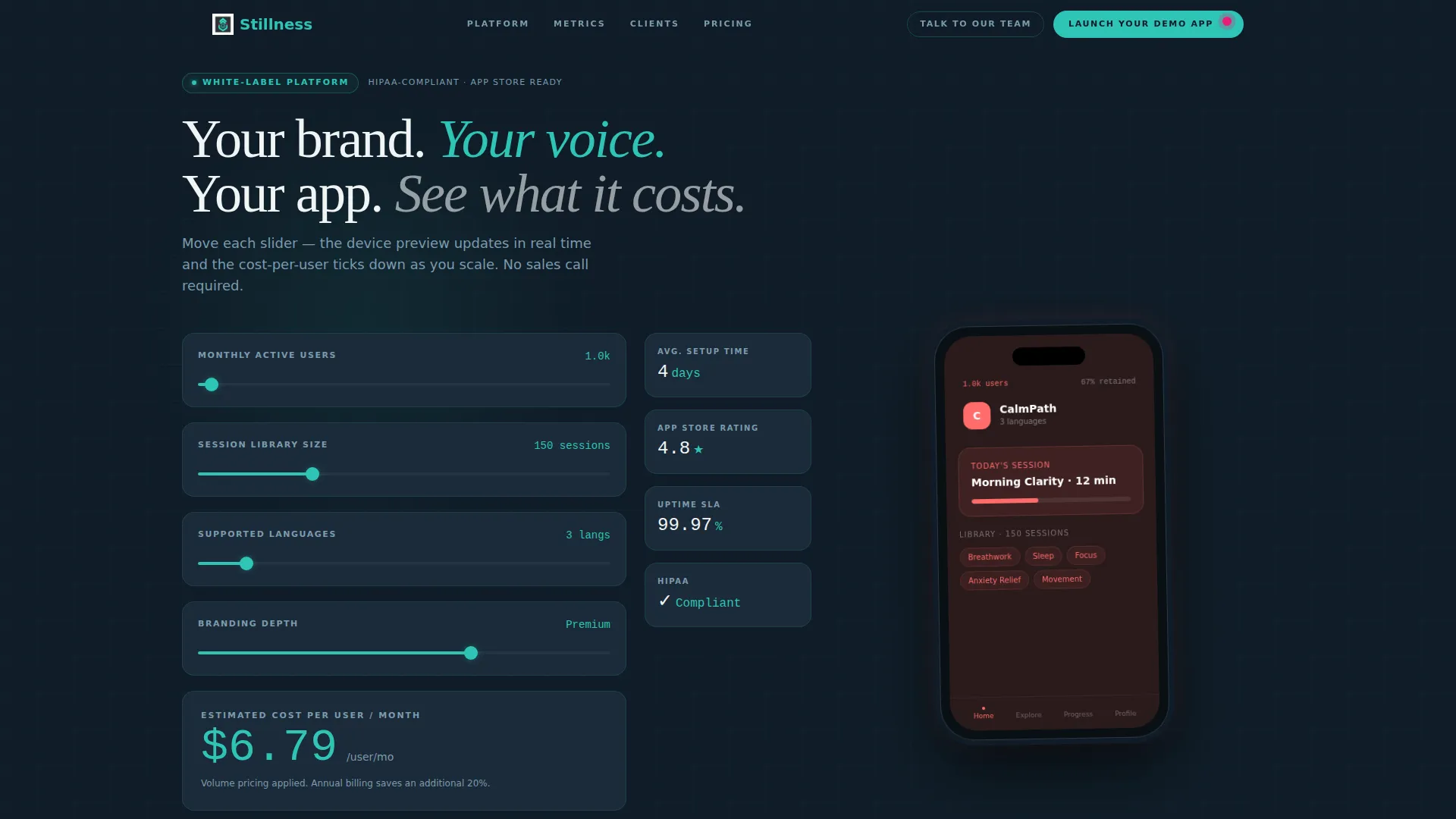
The header section contains a live calculator with four sliders: number of users, session library size, supported languages, and custom branding depth. As each slider moves, a teal-outlined phone preview on the right updates in real time, swapping logo, accent color, and session count. A large monospaced cost-per-user figure ticks downward with each adjustment, giving prospects immediate proof of unit economics.
Live Device Mockup Preview
A realistic phone mockup sits inside the estimator and updates dynamically as visitors configure their options. It swaps the displayed logo, primary accent color, and session count to reflect the visitor's current slider selections. This turns abstract pricing into a tangible branded output the prospect can see before they sign anything.
Toggleable Feature Matrix
Below the estimator, a data-grid feature matrix lets visitors switch individual capabilities on and off. Options include guided sessions, sleep stories, biometric integrations, and analytics dashboards. The app preview morphs with each toggle, making the platform's flexibility visible rather than just described.
Client Metrics Panel
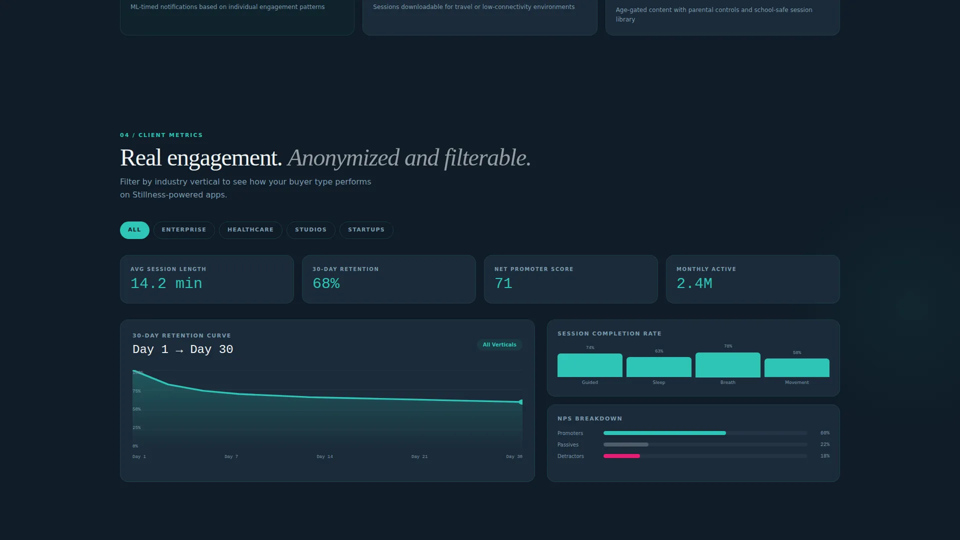
A dedicated panel displays real anonymized engagement data including average session length, 30-day retention curves, and net promoter scores. Each metric is filterable by industry vertical, letting prospects self-select evidence that is relevant to their own sector. The section feels less like marketing copy and more like a live product dashboard.
Persistent Demo call to action Bar
After the visitor scrolls past the second section, a fixed bottom bar appears carrying the primary call to action: "Launch Your Demo App." The bar stays visible throughout the rest of the page scroll, keeping the conversion path accessible without interrupting the exploration flow.
Three-Field Demo Launch Form
Clicking the primary call to action opens a minimal form asking only for brand name, primary hex color, and work email. Within seconds the visitor receives a link to a live, temporarily branded demo app on their own phone. The download itself becomes the proof of conversion.
Page sections overview
| Section | Purpose |
|---|---|
| Header Estimator | Interactive cost calculator with live device mockup and slider controls |
| Feature Matrix | Toggleable capability grid that updates the app preview in real time |
| Client Metrics Panel | Filterable engagement data displayed as an industry-vertical dashboard |
| Persistent call to action Bar | Fixed bottom conversion bar that appears after the second scroll |
| Demo Launch Form | Three-field form that delivers a live branded demo app link instantly |
Design & branding system
The visual identity follows a Dashboard Pro theme built on the Teal Catalyst color system. The palette is designed to feel clinical enough for enterprise procurement while remaining warm enough to reflect a human wellness product.
- Deep command-center charcoal (#1B2A38) as the primary background, primary teal (#2EC4B6) for active states and outlines, and soft cloud white (#F0F4F5) for card surfaces and data cells
- Catalyst magenta (#E71D73) used exclusively for interactive hotspots and notification badges, creating clear visual hierarchy for calls to action
- Monospaced typography for cost figures and data readouts, reinforcing the dashboard and data-grid aesthetic throughout the layout
Mobile & speed optimization
The template layout is structured to work across screen sizes, keeping the interactive estimator and data panels functional on smaller viewports. The single-page architecture reduces navigation friction for mobile visitors who arrive from a direct link or a demo invitation.
- Slider controls and toggle switches are sized for touch interaction, making the estimator and feature matrix usable on phones and tablets
- The persistent call to action bar is optimized for bottom-of-screen placement on mobile, matching the natural thumb-reach zone for conversion actions
How this template helps you convert
Every design and layout decision in Stillness is built to close the gap between a curious visitor and a committed demo request.
- The cost estimator in the header delivers instant, personalized proof of value before the visitor reads a single marketing claim, reducing the time to the first "I want this" moment.
- The toggleable feature matrix and filterable metrics panel let prospects build their own case for the platform, so they arrive at the demo call to action already convinced rather than still uncertain.
- The three-field demo form and instant branded app link collapse the traditional sales cycle step by making the demo itself the first conversion event, not a calendar booking three days later.
Other information about this template
Stillness is built inside the Dashboard Pro theme framework, which means the data-grid layout structure, color token system, and interactive component patterns all follow a consistent design language. This makes customization straightforward for designers and developers working inside that theme ecosystem.
- The template is categorized under Technology and Consumer App and Platform, making it well suited for SaaS product launches and platform marketing pages in the wellness and health technology space
- The Teal Catalyst color system is a named design token set within the Dashboard Pro theme, giving teams a documented palette to extend or retheme without rebuilding from scratch
- The Interactive Explorer creative direction used throughout the template is specifically designed for products where hands-on demonstration outperforms passive reading, which is common in white-label and platform-as-a-service markets
Theme
Dashboard Pro
Creative direction
Interactive Explorer
Color system
Teal Catalyst
Style
Dashboard/Data Grid
Direction
App Download
Page Sections
Interactive App Cost Estimator
Live Device Mockup Preview
Toggleable Feature Matrix
Filterable Client Metrics Panel
Persistent Demo Call to Action Bar
Three-field Demo Launch Form
Related questions
Who is this landing page template designed for?
Can I customize the color palette and branding?
What does the demo conversion flow look like?
Is this template suitable for enterprise sales cycles?
How does the interactive estimator work?



