Spa & Wellness Center Pre-Launch Website Template
Stillness is a coming soon landing page template built for spa and wellness centers preparing to open. It pairs a cinematic dark visual identity with a treatment comparison table, an interactive visit-builder module, and a founding member sign-up form. The design guides visitors through a sensory journey that makes the unreleased space feel personal and worth waiting for.
by Rocket studio
Quick summary
Stillness is a single-page coming soon template for a spa and wellness center that hasn't opened yet. It uses a dark Carbon Fiber color system, a Feature Tab Switcher header, and a scrollable comparison table to turn pre-launch curiosity into founding member sign-ups. Visitors leave with a visit already imagined and a reason to protect it.
Who this template is for
This template is designed for wellness businesses building anticipation before launch day. It works best when you want visitors to feel the experience before the doors open.
- Spa owners and wellness directors preparing a pre-launch or coming soon page
- Treatment centers offering tiered packages who want visitors to compare and self-select
- Founders who need to collect early interest without committing to a hard opening date
What problem this template solves
Most coming soon pages ask visitors to wait with nothing to do. That passive experience loses people who are ready to commit now. This template replaces passive waiting with active discovery.
- Visitors have no way to feel connected to a space that doesn't exist yet
- Treatment menus are invisible until launch, so high-intent visitors leave without converting
- Pre-launch forms feel generic, making early sign-ups low quality and low commitment
What you get with this template
The template delivers a complete single-page layout structured to move visitors from curiosity to commitment. Every section is purpose-built and prompt-backed.
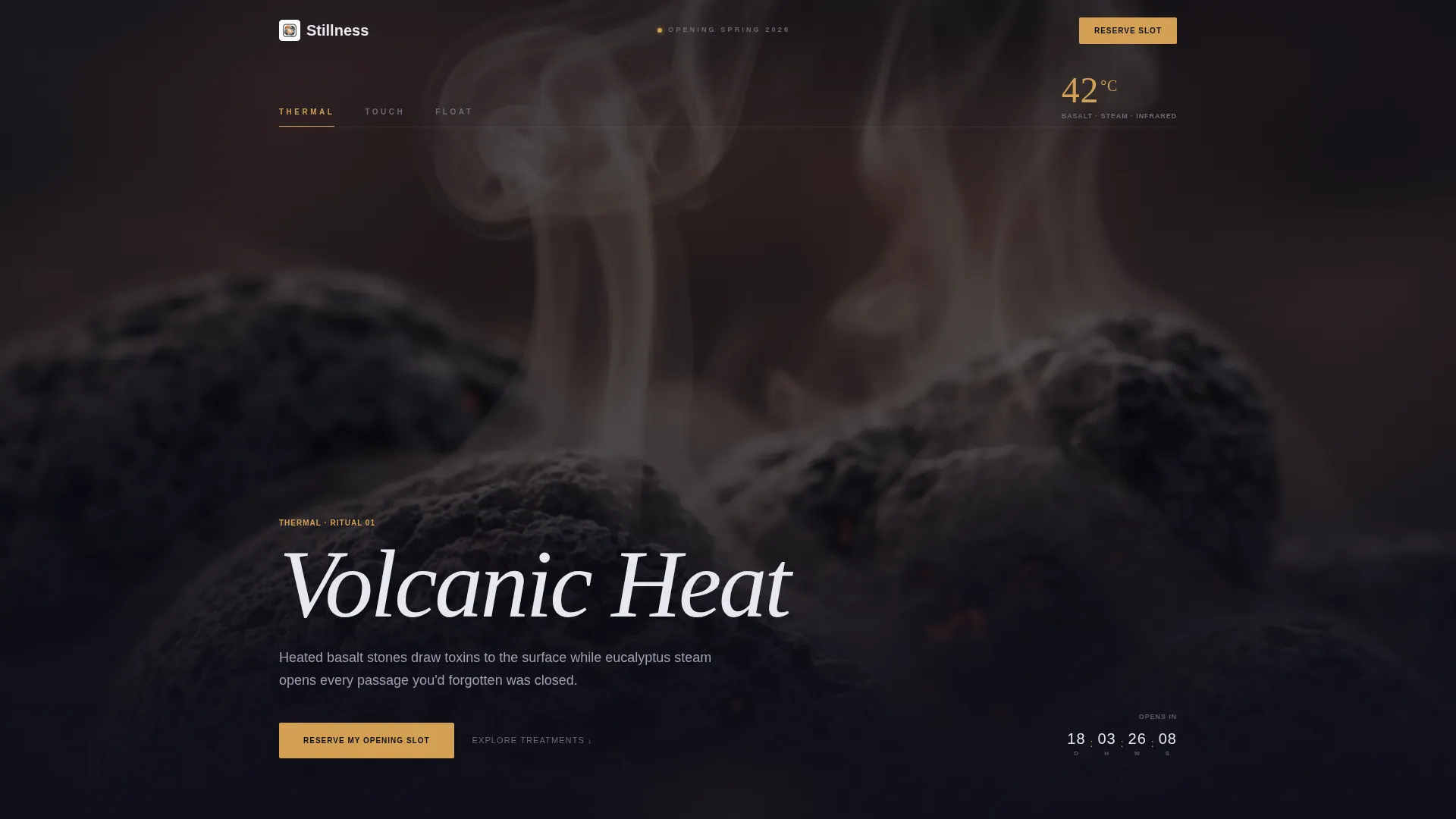
- A cinematic Feature Tab Switcher header with three treatment-category tabs and slow crossfade transitions
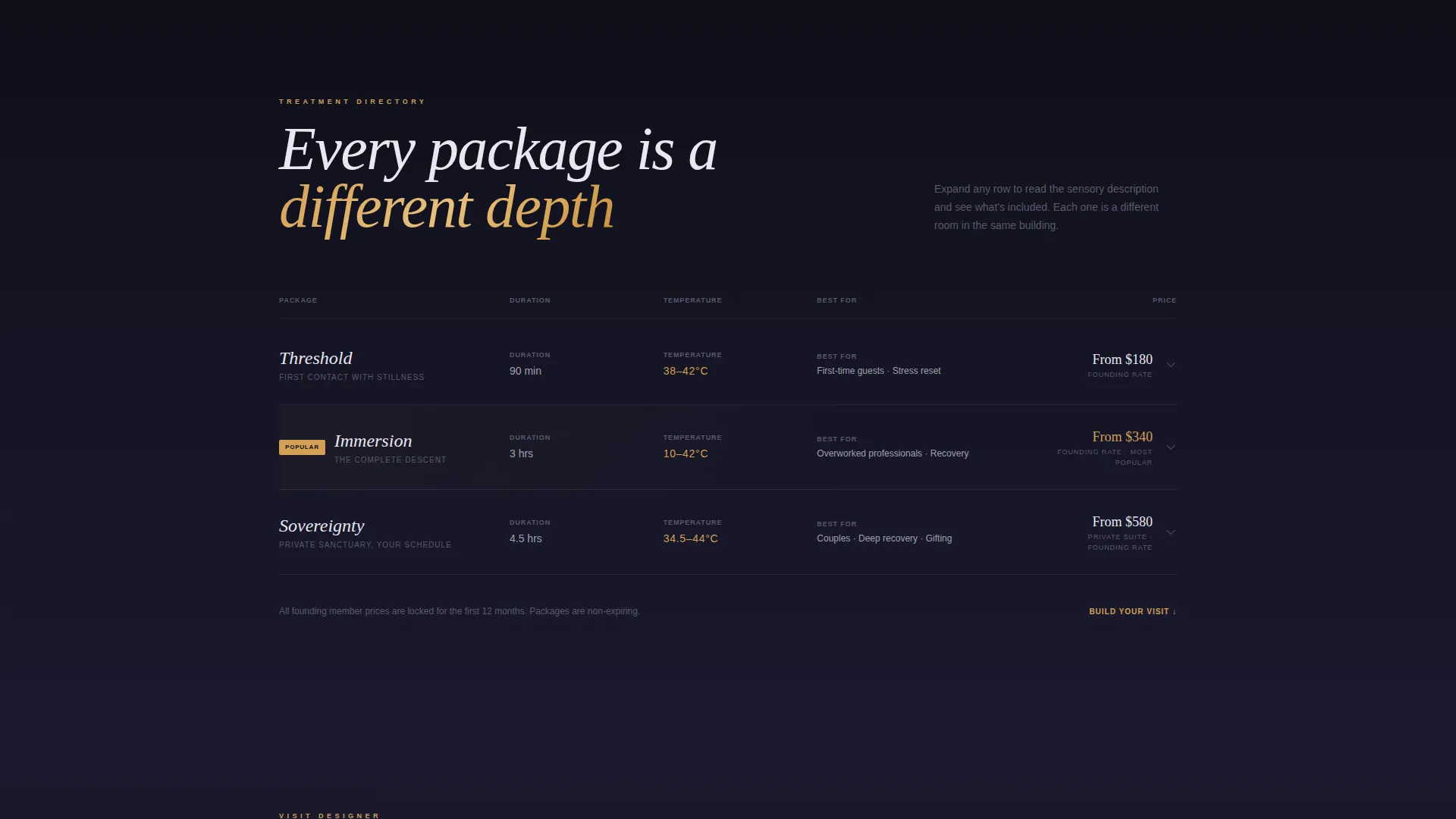
- A scrollable comparison table with expandable rows, atmospheric photography, and sensory descriptions
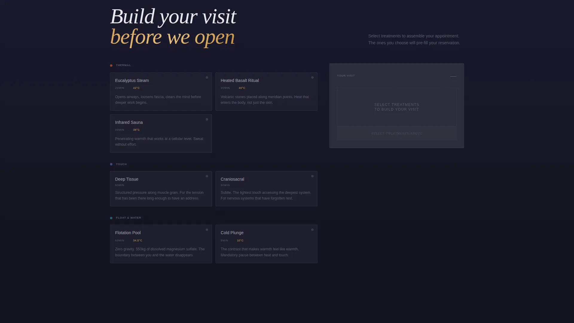
- A "Build Your Visit" interactive module and two conversion paths: a founding member form and a downloadable treatment menu
Feature list
This template ships with six purpose-built components. Each one contributes to the pre-launch conversion flow described in the brief.
Feature Tab Switcher Header
Three tabs labeled "Thermal," "Touch," and "Float" sit across a dark cinematic viewport. Each tab reveals a close-cropped vignette with a treatment temperature displayed in the corner. The active tab glows in heated amber while inactive tabs hold a polished titanium tone. Switching triggers a slow crossfade that grounds visitors in physical sensation before any copy appears.
Treatment Comparison Table
The core content block compares wellness packages across session length, modalities included, temperature ranges, and recovery protocols. Each row is expandable and reveals atmospheric photography alongside a sensory description written like a whispered instruction. The scroll progression moves darker, warmer, and slower to mirror the journey from reception to the deepest treatment room.
Build Your Visit Module
A midpage interactive module lets visitors toggle individual treatments on and off. A visual timeline assembles in real time, showing a personalized appointment as it takes shape. By the time visitors reach the sign-up form, they are protecting a visit they have already designed.
Founding Member Form
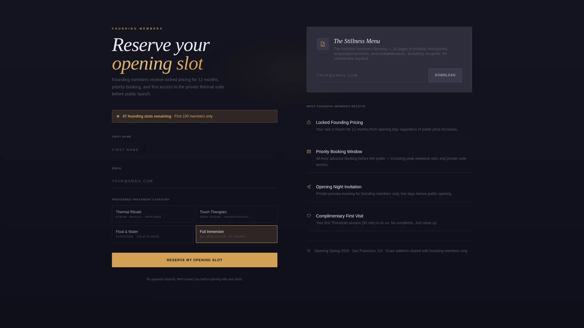
The primary conversion form asks only for first name, preferred treatment category, and email. The treatment category field pre-selects based on the visitor's interactions in the explorer section. This reduces form friction and increases the relevance of each lead captured.
Downloadable Treatment Menu
A secondary conversion path offers a beautifully designed PDF preview of the full treatment directory. It captures email with zero commitment, giving low-intent visitors a soft entry point without pressuring them toward the founding member path.
Carbon Fiber Color System
The visual palette uses deep graphite black, woven carbon gray, polished titanium, and a single heated amber accent. Amber is reserved for interactive states and countdown elements only. The result feels like the interior of a luxury vehicle at night: dark surfaces that absorb light, metallic threads that catch it, and one warm glow from the instrument panel.
Page sections overview
| Section | Purpose |
|---|---|
| Tab Switcher Header | Introduces three treatment categories with cinematic vignettes and temperature readings |
| Treatment Comparison Table | Lets visitors explore and compare wellness packages with expandable rows |
| Sensory Scroll Progression | Deepens immersion as the page grows darker and quieter toward the lower sections |
| Build Your Visit | Lets visitors assemble a personalized appointment timeline interactively |
| Founding Member Form | Captures first name, treatment preference, and email as the primary conversion action |
| Menu Download Path | Offers a PDF treatment preview as a low-commitment secondary conversion option |
Design & branding system
The visual identity follows a Directory and Discovery theme expressed through a Carbon Fiber color system. Every palette choice reinforces the sense of precision engineering beneath calm surfaces.
- Deep graphite black (#1A1A2E) and woven carbon gray (#2D2D3A) form the background layer, absorbing light and creating depth
- Polished titanium (#A0A0B0) carries inactive interface states and supporting text with a cool metallic tone
- Heated amber (#D4A054) appears only on active tabs, call-to-action buttons, and countdown elements, functioning as the single warm signal in an otherwise cool environment
Mobile & speed optimization
The layout is designed to translate its immersive desktop experience cleanly to smaller screens. The scroll-driven structure suits touch navigation naturally.
- The tab switcher and comparison table are structured for vertical stacking on mobile viewports
- Expandable rows in the comparison table keep mobile screens uncluttered until the visitor chooses to go deeper
- The "Build Your Visit" module and conversion forms are positioned to remain fully accessible without horizontal scrolling
How this template helps you convert
The template earns conversions by letting visitors invest in the experience before asking for anything. Every interaction builds ownership before the form appears.
- The Feature Tab Switcher creates immediate sensory engagement, giving visitors a felt reason to stay and explore rather than bounce
- The comparison table and interactive visit-builder make the pre-launch offering feel real and personally relevant, so the founding member form feels like protecting a reservation rather than filling out a cold sign-up
Other information about this template
This template fits within the broader category of spa and wellness center website templates. It is specifically tuned for the coming soon phase of a spa and wellness center's launch journey.
- The template style is a Comparison Table, making it useful beyond wellness: any service with tiered packages and a pre-launch audience can adapt the structure
- The Freemium and Trial landing page direction means it supports two conversion paths simultaneously without forcing visitors into a single funnel
- The Interactive Explorer creative direction is central to the experience; the scroll is designed to descend in atmosphere, not just information
- This template is built for founders who want their pre-launch page to do real conversion work, not simply hold a placeholder
Theme
Directory & Discovery
Creative direction
Interactive Explorer
Color system
Carbon Fiber
Style
Comparison Table
Direction
Freemium/Trial
Page Sections
Feature Tab Switcher Header
Treatment Comparison Table
Build Your Visit Module
Founding Member Form
Downloadable Treatment Menu
Carbon Fiber Color System
Related questions
Can I use this template if my spa hasn't set a firm opening date yet?
How does the Build Your Visit module work for visitors?
Can I update the three treatment tab categories to match my own offerings?
What are the two conversion paths this template supports?
Who is this landing page template best suited for?



