Nonprofit Software & SaaS Professional Website Template
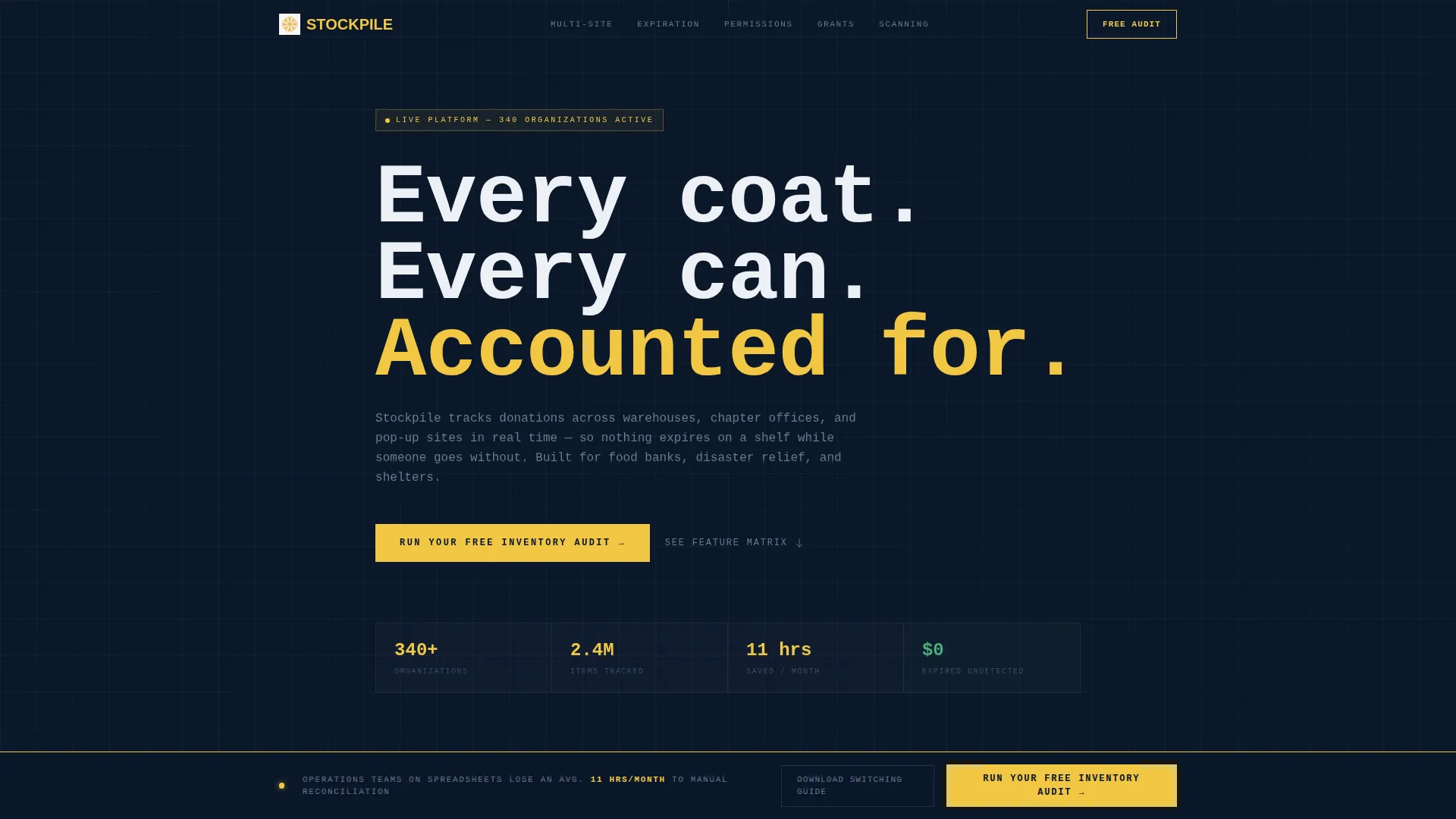
Stockpile is a Bold Brutalist nonprofit inventory management landing page template built as a hub and spoke layout with anchor navigation. It showcases a live-feel interactive dashboard, a spoke-by-spoke feature comparison grid, and two conversion paths, a free audit form and a gated switching guide, designed to make the cost of not switching immediately visible.
by Rocket studio
Quick summary
Stockpile is a single-page template for nonprofit inventory management platforms. It opens with an interactive mock dashboard, then walks visitors through a brutalist feature comparison grid across five capability spokes. Two conversion paths capture leads at different stages of buying intent. The design runs on a Midnight Blue color system with signal yellow call-to-action elements throughout.
Who this template is for
This template is built for teams selling or marketing software that tracks donated goods, equipment, and supplies across multiple nonprofit sites. It speaks directly to the people who live inside inventory problems every day.
- Operations directors at food banks managing pallet intake logs and warehouse reconciliation
- Disaster relief coordinators who stage supplies across multiple states from one dashboard
- Volunteer managers who need to check out and return equipment without a training manual
What problem this template solves
Nonprofit inventory teams lose hours every month to manual reconciliation, expired stock, and disconnected spreadsheets. Generic inventory tools do not account for multi-site nonprofit operations, volunteer access levels, or grant reporting requirements. This template makes those gaps impossible to ignore.
- Visitors cannot easily compare what they have now versus what a purpose-built platform offers
- The cost of staying on spreadsheets is invisible until every alternative is laid out side by side
- Most landing pages list features; this one systematically disqualifies every competing option before asking for a click
What you get with this template
You get a complete, conversion-focused landing page layout built around five thematic spokes. Each section is ready to receive your copy, brand, and product details without structural changes.
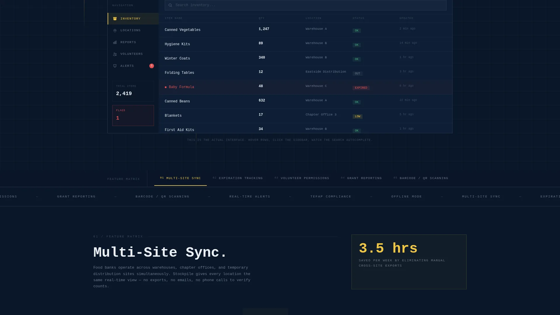
- An interactive header preview section showing a fictional food bank dashboard with hover states, a live-feeling search bar, and a red-flag expired item indicator
- A five-spoke anchor navigation driving visitors through comparison grids covering Multi-Site Sync, Expiration Tracking, Volunteer Permissions, Grant Reporting, and Barcode and QR Scanning
- Two conversion components: a sticky bottom-bar audit form and a secondary gated PDF download for visitors still evaluating
Feature list
This template is built around specific structural and visual components drawn from the brief. Each feature below reflects what is included in the layout.
Interactive Mock Dashboard Header
The header drops visitors into a functioning preview of the product before any marketing copy appears. A fictional food bank inventory shows live-style numbers, a checked-out item tied to a location, and a red flag on expired stock. Hover states, a highlighted sidebar nav, and a search bar that auto-completes a partial query all make the product tangible on first contact.
Hub and Spoke Anchor Navigation
A persistent anchor navigation bar labels each of the five capability spokes. Visitors can jump directly to the comparison section most relevant to their role. The nav stays visible as the page scrolls, giving the layout a command-center feel that matches the Midnight Blue visual system.
Brutalist Comparison Grid
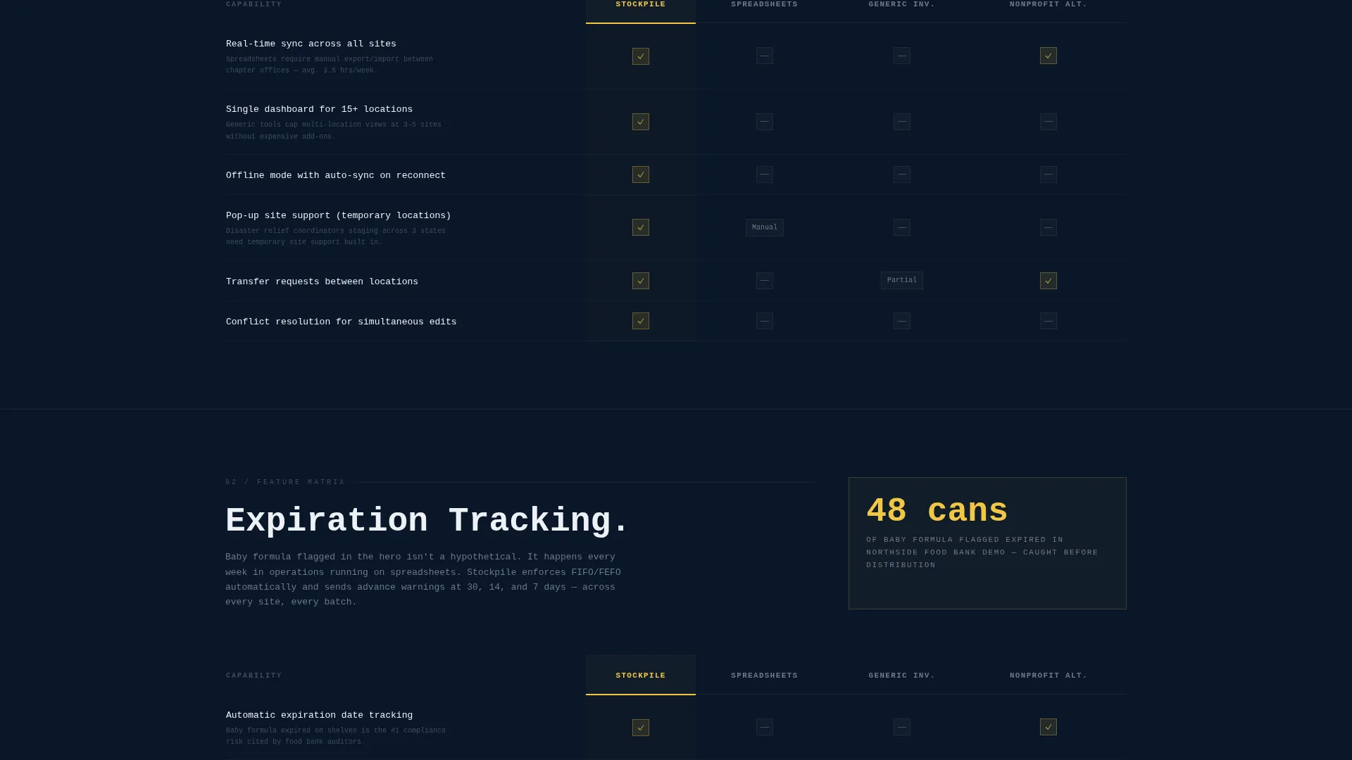
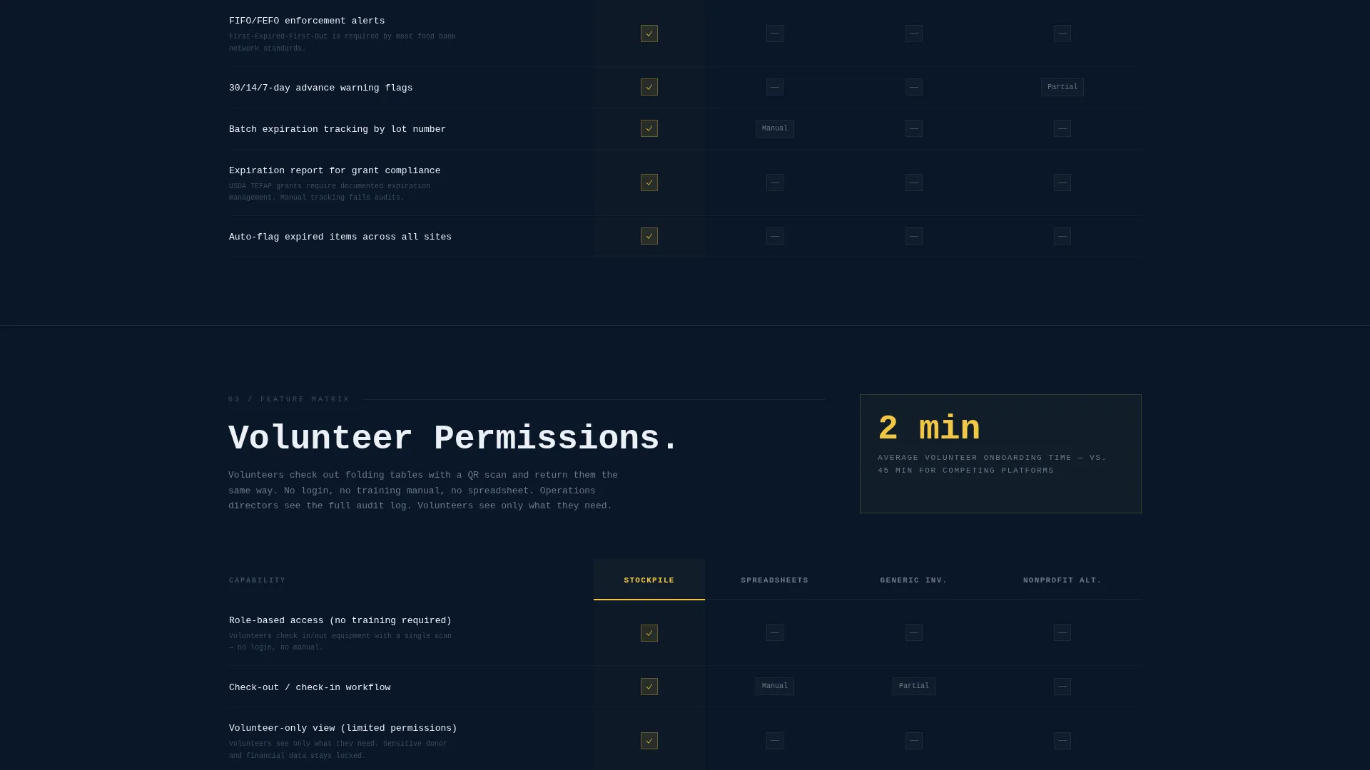
Each spoke expands into a structured grid comparing this platform against spreadsheets, generic inventory software, and a leading nonprofit competitor. Signal yellow checkmarks mark supported capabilities. Empty dark gray cells mark gaps. Footnotes cite specific pain points, such as manual reconciliation across chapters averaging eleven hours per month.
Sticky Conversion Bar
After the visitor passes the second spoke, a brutalist bar locks to the bottom of the viewport. It carries the primary call to action: "Run Your Free Inventory Audit." Clicking opens a three-field form asking for organization type, number of storage locations, and work email.
Gated Switching Guide Download
A secondary conversion path offers a downloadable PDF guide for visitors still in the evaluation stage. It requires only an email address and organization name. This path captures leads who are not yet ready for the primary audit form.
Expiration and Flag Indicators
The dashboard preview and comparison grid both surface expiration tracking as a visible, functional element. A red-flag indicator on expired baby formula in the header preview makes the consequence of poor tracking tangible before a single feature bullet is read.
Page sections overview
| Section | Purpose |
|---|---|
| Interactive Dashboard Header | Immerses visitors in a live-feel product preview before any marketing copy |
| Anchor Nav Bar | Lets visitors jump to any of the five spoke sections instantly |
| Multi-Site Sync Spoke | Compares cross-location tracking against spreadsheets and generic tools |
| Expiration Tracking Spoke | Shows how item expiration is monitored and flagged across sites |
| Volunteer Permissions Spoke | Demonstrates role-based checkout and check-in without training overhead |
| Grant Reporting Spoke | Contrasts structured grant-ready data output against manual alternatives |
| Barcode and QR Scanning Spoke | Highlights scanning capability absent in spreadsheet workflows |
| Sticky Audit call to action Bar | Locks primary conversion action to viewport bottom after spoke two |
| Switching Guide Download | Secondary gated lead capture for visitors still comparing options |
Design & branding system
The visual identity is Bold Brutalist, built around a Midnight Blue color system that reads like a well-funded command center running late into the night. Every color has a specific assigned role, and none are decorative.
- Deep terminal navy (#0A1628) as the dominant background, steel-panel gray (#1E2A3A) for card surfaces, and stark clinical white (#EDF0F5) for all body text and data labels
- Signal yellow (#F2C744) used exclusively for interactive states, active anchor nav indicators, primary buttons, and checkmarks inside comparison grids
- Large mono-spaced type, visible structural borders, and generous institutional spacing that keeps the layout open without feeling light or friendly
Mobile & speed optimization
The template is designed with layout considerations that support clean rendering across screen sizes. The brutalist grid system is inherently structured, which helps maintain visual integrity at smaller viewports.
- The anchor navigation and sticky call to action bar are positioned to remain functional and readable on mobile screen sizes
- The comparison grid columns are designed to reflow without losing the visual contrast between supported and unsupported cells
How this template helps you convert
This template is engineered around the Comparison and Versus conversion model. Every scroll action is tied to a conversion moment, not just a content block.
- The interactive header creates product familiarity before the visitor reads a single claim, lowering skepticism and shortening time to trust
- The spoke-by-spoke comparison grid makes the cost of every alternative visible row by row, so the decision to convert feels rational rather than pressured
- Two separate conversion paths capture visitors at different readiness levels, with the sticky audit bar catching action-ready visitors and the switching guide holding evaluators in the funnel
Other information about this template
This template sits at the intersection of nonprofit software, technology marketing, and purpose-driven SaaS. It is suited for teams positioning a product against entrenched habits like spreadsheet tracking or generic inventory tools not built for donation-based operations.
- The template style is Hub and Spoke with Anchor Navigation, making it well-suited for products with multiple distinct capability areas that each need room to breathe
- The creative direction is Feature Matrix, meaning the primary persuasion mechanism is structured comparison rather than narrative storytelling
- The header concept is Interactive Preview, a format that replaces traditional hero copy with a hands-on product moment that builds confidence through touch rather than text
- The landing page direction is Comparison and Versus, which means every section is structured to eliminate alternatives rather than simply describe benefits
- This template is categorized under Technology, Nonprofit Software and SaaS, with a specific niche focus on nonprofit inventory management
Theme
Bold Brutalist
Creative direction
Feature Matrix
Color system
Midnight Blue
Style
Hub & Spoke (Anchor Nav)
Direction
Comparison/Versus
Page Sections
Interactive Mock Dashboard Header
Hub and Spoke Anchor Navigation
Brutalist Feature Comparison Grid
Sticky Viewport Conversion Bar
Gated Switching Guide Download
Related questions
Can I adapt this template for a shelter or disaster relief organization?
Is the interactive dashboard a real working feature?
What are the two conversion paths included in this template?
How many feature comparison spokes does this template include?
Can the Midnight Blue color system be replaced with a different brand palette?



