Healthcare Software & SaaS Directory Website Template
Stockroom is a healthcare inventory management landing page template built for platforms that track medical supplies across hospital systems in real time. It combines a code-snippet header, a modular card grid, and a comparison-driven layout to show perioperative directors, materials managers, and healthcare CFOs exactly how automated par-level intelligence replaces manual counting and costly stockouts.
by Rocket studio
Quick summary
Stockroom is a single-page template designed for healthcare inventory management platforms. It opens with a live-styled API code block, flows into a feature comparison card grid, and closes with a conversion-focused assessment form. The layout is built to show hospital supply chain buyers the measurable gap between legacy processes and intelligent, automated inventory control.
Who this template is for
This template is built for SaaS companies and platform teams selling inventory management solutions into healthcare. It speaks directly to the buyers who live inside the problem every day.
- Materials managers overseeing dozens of supply closets across a health system
- Perioperative directors who cannot risk a stockout during a procedure
- Healthcare CFOs tracking supply spend and looking to reduce waste and emergency orders
What problem this template solves
Hospital supply chains run on manual counts, clipboard audits, and reactive reordering. That process creates expired-lot surprises, overstocked shelves, and last-minute overnight shipments that drain budgets. This template gives platforms a ready-made page structure to show buyers exactly why that status quo is costing them.
- Visitors arrive without a clear sense of how large the gap is between their current process and automated inventory intelligence
- Generic SaaS pages fail to speak the language of materials managers and perioperative teams
- Platforms need a comparison-led layout that makes the "before" column feel uncomfortable before the call to action ever appears
What you get with this template
This template delivers a fully structured, modular card-grid landing page with a clear visual hierarchy and a conversion path designed for healthcare buyers. Every section is purposeful and mapped to a specific stage in the decision journey.
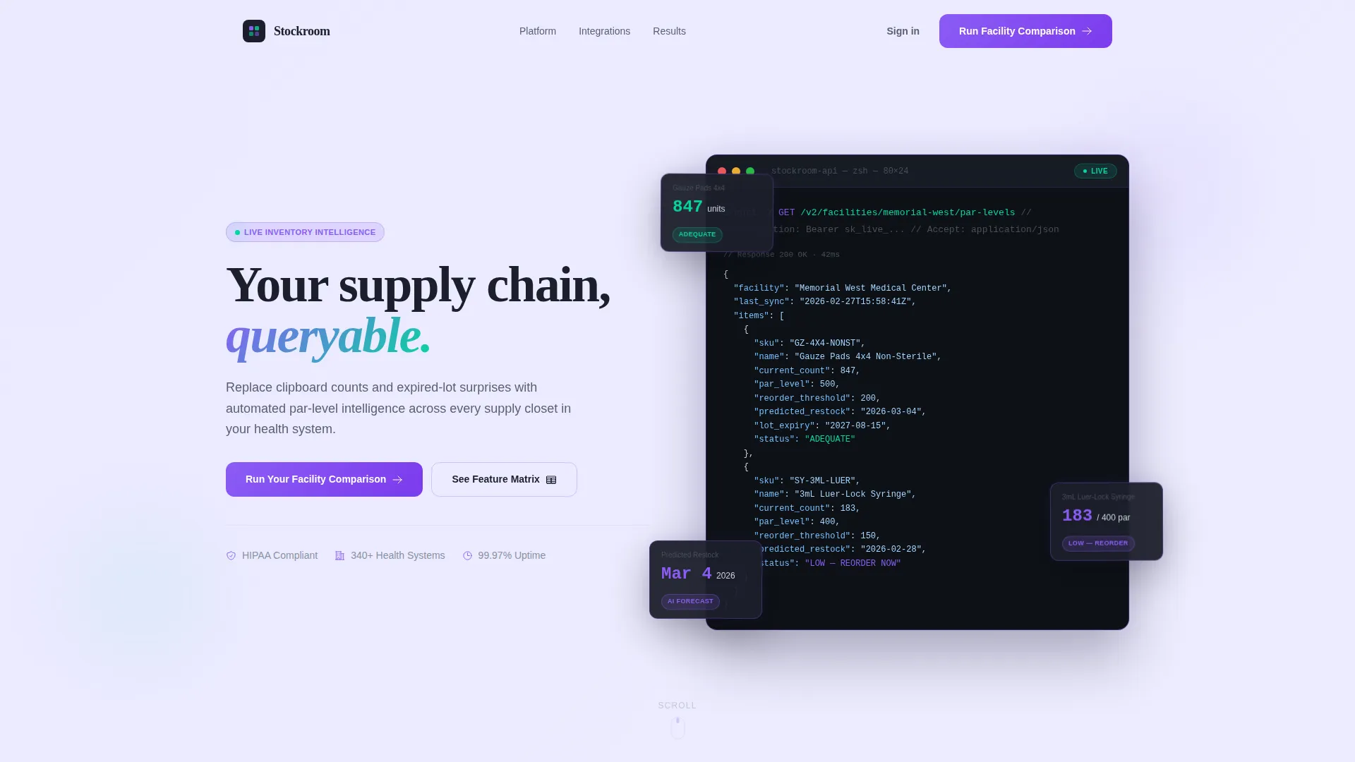
- A code-snippet hero header with a character-by-character terminal animation and animated JSON response cards
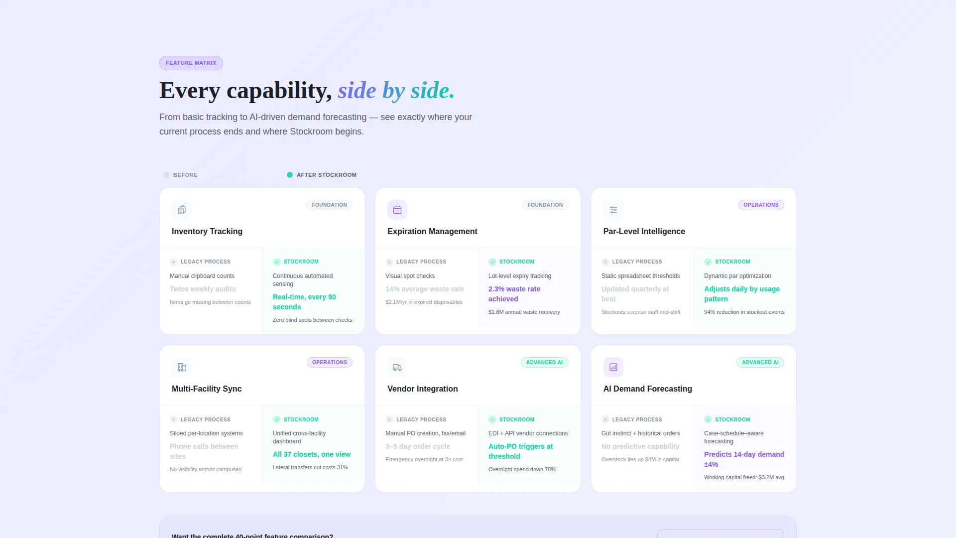
- A feature matrix grid where each card contrasts legacy process metrics against platform capabilities with specific numbers
- A dual-call to action conversion section including a facility assessment form and a gated PDF download path
Feature list
This template is built around six core capabilities, each represented as a distinct card in the feature matrix grid. The progression moves from foundational tracking to AI-driven forecasting, building a layered case for category-level change.
Animated Code Snippet Header
The header opens with a styled API call rendered character by character, syntax-highlighted in violet and teal against a deep charcoal background. The JSON response animates outward, with each data field becoming a floating card that settles into the grid below, bridging the technical proof and the feature story in a single visual moment.
Feature Comparison Card Grid
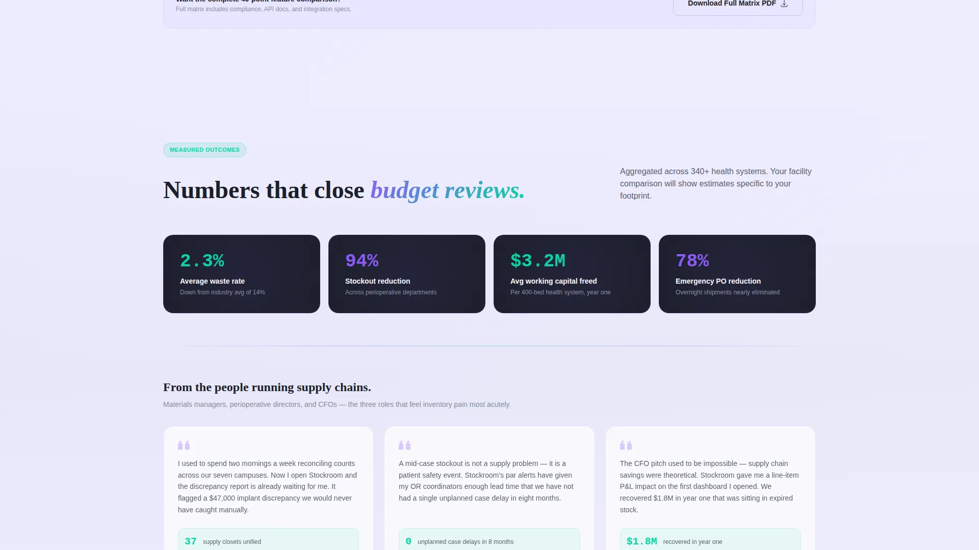
Each modular card in the grid contains two internal columns: one representing the legacy process and one representing the platform capability. Cards include specific metrics such as manual counts twice weekly versus continuous automated sensing, and 14 percent average waste versus 2.3 percent, giving buyers concrete numbers to hold against their own operations.
Progressive Complexity Scroll
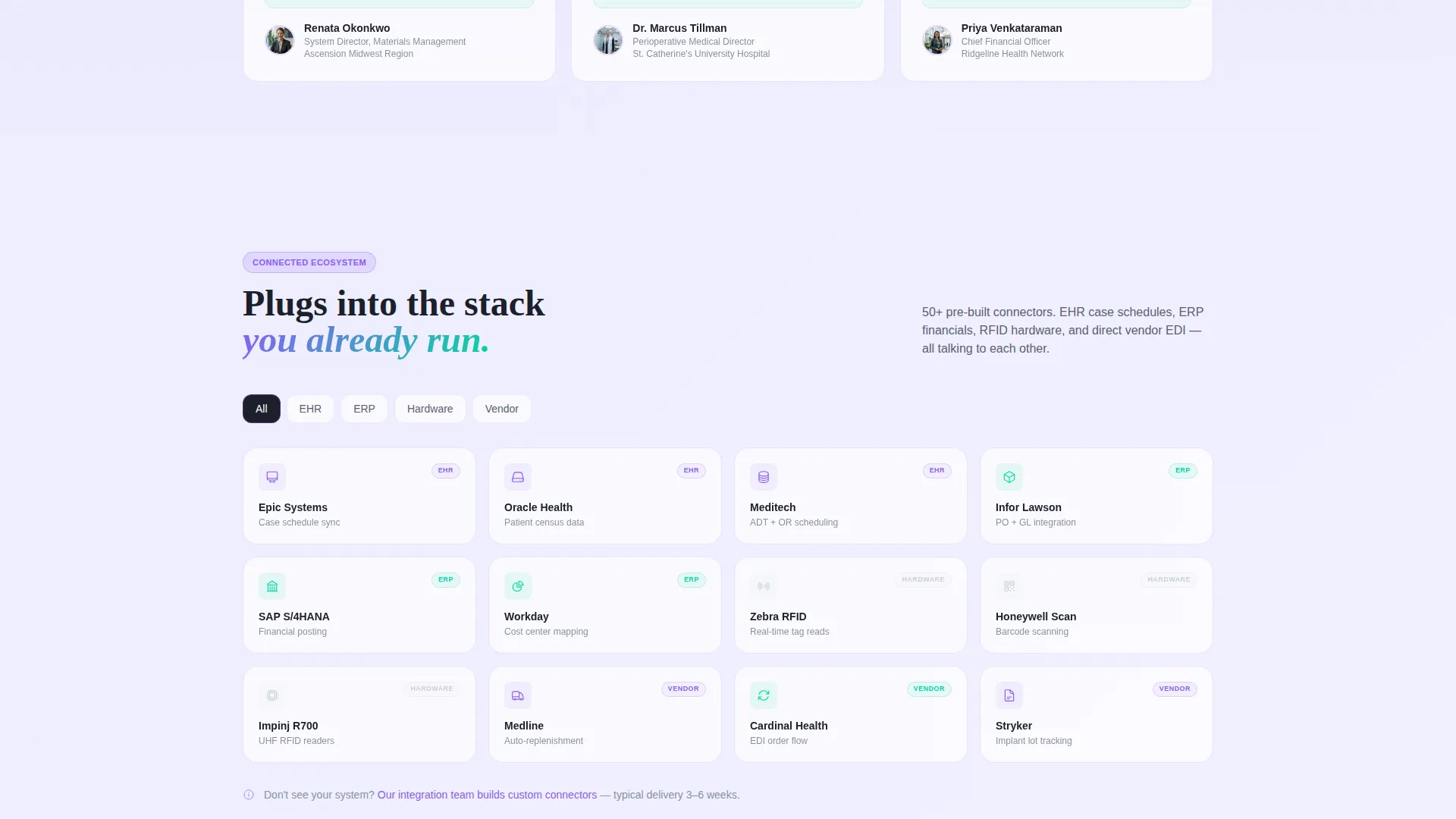
Cards increase in depth as visitors scroll. The sequence moves from basic supply tracking through expiration management, multi-facility synchronization, vendor integration, RFID and barcode scanning, and on to AI-driven demand forecasting. This builds the argument that the platform represents a category shift, not just an incremental upgrade.
Dual Conversion Path
The primary call to action, "Run Your Facility Comparison," triggers a lightweight assessment form. It asks for facility count, current inventory system type, monthly supply spend range, and work email. A secondary path offers a downloadable full feature matrix PDF gated by email only, giving buyers two natural entry points based on where they are in their decision process.
Directory-Style Card Layout
The modular card grid follows a Directory and Discovery theme. Cards are self-contained, scannable, and structured so buyers can navigate the capability set the way they would browse a well-organized supply catalog. Each card is visually consistent while carrying distinct content, making the grid easy to read at a glance.
Comparison-Led Conversion Flow
The entire page is structured around a Comparison and Versus framing. Every card positions the visitor's current process as the "before" column. By the time a visitor reaches the call to action, they have already measured the gap themselves, which makes the conversion feel like a natural next step rather than a sales push.
Page sections overview
| Section | Purpose |
|---|---|
| Code Snippet Header | Opens with animated API call and JSON response that dissolves into feature cards |
| Headline and Subtext | Types in beside the code block to frame the platform's core value |
| Feature Matrix Grid | Comparison cards showing legacy metrics versus platform capabilities |
| Capability Progression | Cards scaling from basic tracking to AI demand forecasting as users scroll |
| Primary call to action Form | Facility assessment form with dropdown, spend range, and work email fields |
| PDF Download Gate | Secondary conversion path offering full feature matrix in exchange for email |
Design & branding system
The visual identity follows a Directory and Discovery theme built on an AI Iridescent color system. The palette is clinical and forward-looking, grounding technical credibility in a futuristic finish.
- Deep surgical charcoal (#1B1F2A) anchors card backgrounds; cool instrument silver (#C9D1D9) defines borders and secondary text; shimmer white (#F0F0FF) provides the ambient, lightly shifting backdrop
- Holographic violet (#8B5CF6) and iridescent teal (#06D6A0) pulse through feature badges, syntax highlights, and hover states to draw attention to key comparisons and data points
Mobile & speed optimization
The modular card grid is designed to reflow cleanly across screen sizes. Each card is a self-contained unit, which means the layout adapts without losing the comparison structure that drives the page's argument.
- Card columns stack vertically on smaller screens so the legacy-versus-platform contrast remains readable on mobile
- The animated code snippet header is built to render legibly at any viewport width, keeping the opening visual intact across devices
How this template helps you convert
This template converts by making the cost of inaction visible before asking for anything. The layout is engineered so that every scroll deepens the buyer's awareness of their own process gap.
- The comparison card grid turns passive browsing into active self-assessment, with each card showing a specific metric the visitor can measure against their own facility
- The dual-path call to action meets buyers at two different readiness levels, capturing both the decision-ready visitor through the assessment form and the research-phase visitor through the gated PDF download
Other information about this template
This template sits at the intersection of healthcare software and SaaS go-to-market design. It is well-suited for teams building in the healthcare inventory management space and looking for a page structure that speaks the language of clinical operations buyers.
- The template style is a Card Grid (Modular) layout, consistent with directory and discovery browsing patterns common in B2B SaaS evaluation contexts
- The header concept and grid animation are designed to signal technical sophistication to buyers who evaluate platforms on API depth and real-time data capability
- This template can support use cases across health system supply chain software, surgical supply tracking tools, and multi-facility inventory platforms
Theme
Directory & Discovery
Creative direction
Feature Matrix
Color system
AI Iridescent
Style
Card Grid (Modular)
Direction
Comparison/Versus
Page Sections
Animated Code Snippet Hero
Feature Comparison Card Grid
Progressive Capability Scroll
Dual-path Conversion Section
Directory-style Modular Layout
AI Iridescent Visual System
Related questions
Who is this landing page template designed for?
What makes the comparison card grid effective for conversion?
Can I update the metrics shown inside each comparison card?
What does the primary assessment form collect from visitors?
Is the gated PDF download path included in this template?



