Restaurant Inventory Management Landing Page
Stockroom is a modular card-grid landing page template built for restaurant inventory management platforms. It uses a Tech Glass visual identity, live-metric header panels, an industry-report scroll structure, and a head-to-head comparison grid. A built-in cost calculator lets visitors enter their own numbers and leave with a projected annual savings figure.
by Rocket studio
Quick summary
Stockroom is a single-page, card-grid landing page template designed for restaurant inventory management software. It opens with three live-metric glass panels, flows through an industry-report-style problem narrative, and lands on a versus comparison grid. A three-field cost calculator closes the page by giving every visitor a personalized dollar figure before they leave.
Who this template is for
This template is built for software teams and founders selling inventory tools to the restaurant industry. It speaks directly to the operators who feel the pain every day.
- Multi-unit restaurant operators running ten or more locations who track food cost across properties
- Executive chefs and kitchen managers who currently hand-count proteins and reconcile spreadsheets overnight
- Franchise owners watching shrinkage and waste eat into profit faster than comped meals do
What problem this template solves
Generic software landing pages fail when the buyer is a skeptical kitchen manager who has seen every promise before. This template leads with hard industry data, not marketing language, so the reader feels audited rather than pitched.
- Food cost reports that never match the profit-and-loss statement create distrust in manual inventory systems
- Hours spent on physical counts per location represent a hidden labor cost most operators never calculate
- Multi-unit operators have no easy way to visualize variance across locations without a purpose-built dashboard view
What you get with this template
You get a complete, section-led landing page that moves a visitor from "I recognize this problem" to "I want to see my number." Every layout decision is made for high-stakes B2B buyers in the food service industry.
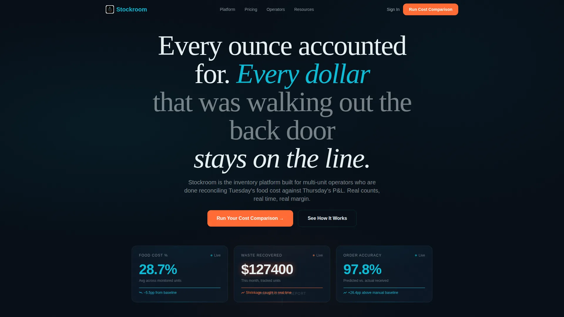
- A dark-glass header row with three animated metric panels showing food cost percentage, waste dollars, and order accuracy
- A modular card grid structured as an industry report, with problem cards followed by matched feature cards
- A full-width comparison grid contrasting manual and spreadsheet workflows against the platform's approach, capped by a three-field savings calculator
Feature list
This template's layout is purpose-built around conversion for a data-driven, skeptical buyer. Each feature below maps directly to a specific section or component in the page.
Live Metric Header Panels
Three frosted-glass cards float over a pitch-black background and display a single data point each. Food cost percentage ticks downward, a waste dollar figure shrinks, and an order accuracy score climbs. The middle card's savings figure pulses in catalyst orange to draw the eye immediately.
Industry Report Card Grid
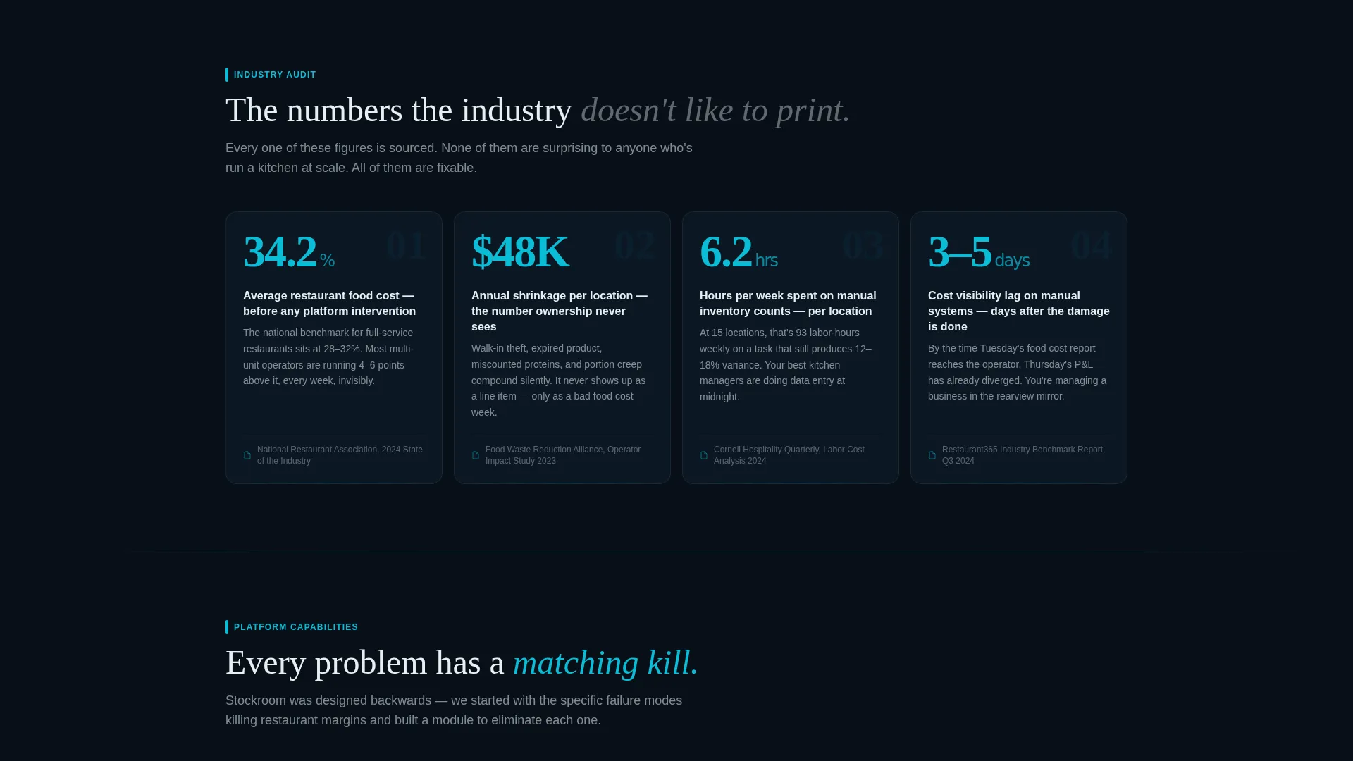
The first scrollable section presents the industry's inventory problem using sourced statistics on national food cost averages, shrinkage rates, and hours lost to manual counting. Each card reads like a trade-publication data point, building credibility before a single feature is mentioned.
Problem-to-Feature Card Matching
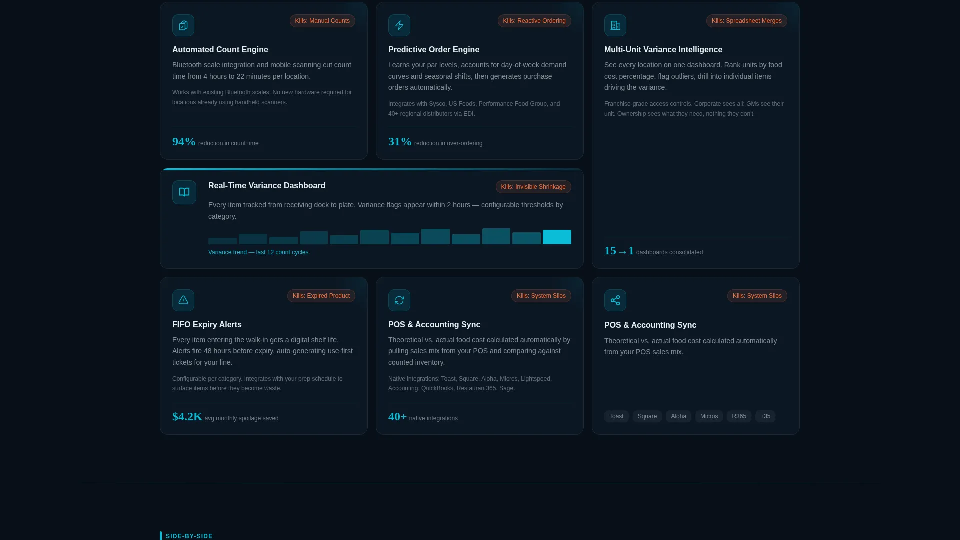
The second card row answers each problem card with a direct feature card. Cards escalate from basic count automation through predictive ordering to multi-unit variance dashboards. Each glass module is visually self-contained so the reader can mentally map it to their own operation.
Manual versus. Platform Comparison Grid
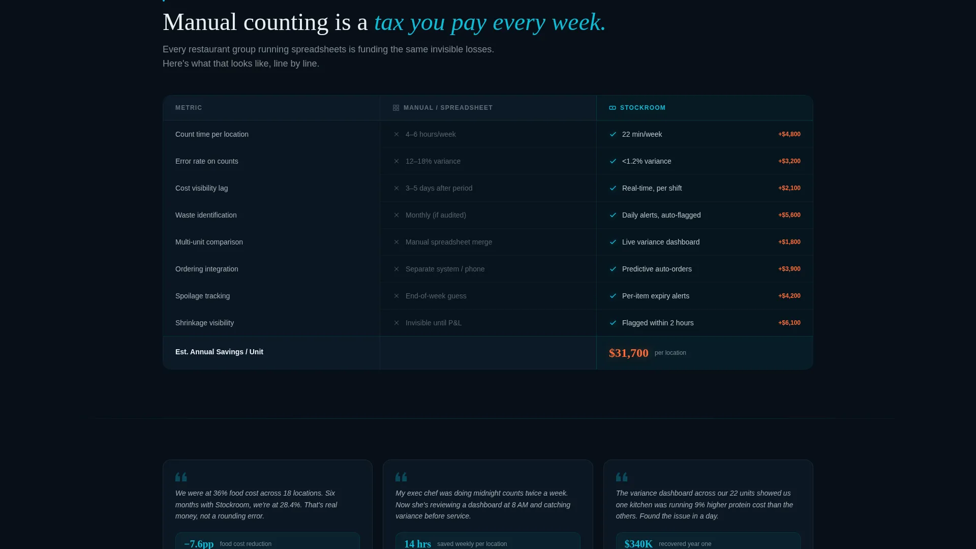
A full-width two-column grid lines up manual and spreadsheet workflows against the platform side by side. Line items include count time per location, error rate, cost visibility lag, and integration depth. Teal checkmarks on the right column contrast against dimmed gray marks on the left, with a running annual savings counter accumulating at the column's base.
Three-Field Cost Calculator
The primary call to action opens a calculator with three inputs: number of locations, average monthly revenue per unit, and current food cost percentage. The tool instantly returns a projected annual savings figure rendered in catalyst orange. A secondary button follows: "See Full Demo for Your Numbers."
Teal Catalyst Color System
Every data line, graph axis, and interactive card edge uses operational teal to guide the eye through the page. Catalyst orange appears exclusively on calls to action and alert-state data points, keeping the color's urgency signal clean and unambiguous throughout the layout.
Page sections overview
| Section | Purpose |
|---|---|
| Dark Glass Header | Displays three live-metric panels showing food cost, waste savings, and order accuracy |
| Industry Crisis Cards | Presents sourced national statistics on food cost, shrinkage, and manual count hours |
| Feature Response Cards | Matches each problem card with a direct platform capability card |
| Comparison Grid | Side-by-side manual versus platform breakdown with teal and gray visual indicators |
| Cost Calculator | Three-field input tool returning a personalized projected annual savings figure |
| Demo call to action | Secondary button following calculator output, directing visitors to a full demo |
Design & branding system
The visual identity follows a Tech Glass theme built on the Teal Catalyst color system. Every design choice references the aesthetic of a commercial kitchen's pass window at night.
- Core palette: deep kitchen dark (#0D1B2A) for backgrounds, operational teal (#0BBCD6) for data lines and interactive edges, cooler-fog white (#E8F0F2) for card text, and catalyst orange (#FF6B35) reserved exclusively for calls to action and alert-state figures
- Cards use frosted-glass surfaces with subtle translucency and light refraction at their edges, giving each data module physical depth without relying on photography
- No hero images or stock kitchen photography appear anywhere in the layout; data and numbers do the visual selling throughout
Mobile & speed optimization
The modular card-grid structure adapts naturally to narrower viewports. Each glass card is a self-contained unit, so the grid reflows into single-column stacks on smaller screens without breaking the visual hierarchy.
- The comparison grid collapses from two columns to a stacked card view on mobile, keeping line-item comparisons readable without horizontal scrolling
- The cost calculator's three input fields and the orange output figure remain prominent and tappable on touch devices
- The dark background and teal accent system maintain strong contrast ratios across screen sizes and display conditions
How this template helps you convert
This layout is built around a single conversion philosophy: give the visitor a dollar figure that belongs to them before asking for anything in return.
- The live-metric header panels establish credibility in the first three seconds by showing real operational numbers moving in the right direction, before any feature copy appears.
- The industry-report card structure positions the platform as the logical solution to a documented problem, reducing sales resistance by the time the visitor reaches the comparison grid.
- The cost calculator makes the call to action personal and specific. A visitor who has just seen their own projected annual savings figure is far more motivated to click "See Full Demo for Your Numbers" than one who read a generic benefits list.
Other information about this template
This template is designed as a single-page landing experience, not a multi-page website. It is built for SaaS and software products in the restaurant technology space, particularly inventory and food cost management tools.
- The template style is Card Grid (Modular), meaning individual card blocks can be reordered, removed, or duplicated to match a specific product's feature set
- The creative direction follows an Industry Report structure, which works especially well for buyers who respond to data and peer-benchmarking over feature lists
- The header concept uses Dark Glass Panels with no reliance on stock photography, making it easy to deploy without a custom image library
- This template is well suited to restaurant inventory management software, food cost tracking platforms, and multi-unit operational tools targeting kitchen managers, executive chefs, and franchise operators
Theme
Tech Glass
Creative direction
Industry Report
Color system
Teal Catalyst
Style
Card Grid (Modular)
Direction
Comparison/Versus
Page Sections
Live Metric Dark Glass Header
Industry Report Problem Cards
Problem-to-feature Card Matching
Manual Versus. Platform Comparison Grid
Three-field Cost Calculator
Related questions
Does this template include the cost calculator as a working interactive component?
Can I rearrange or remove individual card sections?
Is this template suitable for a single product or a multi-product suite?
Can the color system be changed to match a different brand?
Who is the ideal end user for this template?



