Specialist Optometry Software Comparison Website Template
Stockroom is a comparison table landing page template built for optometry warehouse management platforms. It targets regional optical chains, independent optometrists, and wholesale lens distributors who need to demonstrate the real cost of manual inventory tracking. The template pairs hard industry data with animated comparison tables and two conversion-focused calls to action.
by Rocket studio
Quick summary
Stockroom is a single-page, click-through landing page template designed for an optometry warehouse management platform. It opens with a live-coded API terminal, scrolls through industry data on optical inventory waste, and organizes that evidence into animated comparison tables. Two conversion points capture visitors at different stages of readiness.
Who this template is for
This template speaks directly to the people who feel the cost of bad inventory management every day. It is built for businesses that move optical products at scale and need a page that earns trust before asking for a click.
- Regional optical chains running six to forty locations tracking frames, lens blanks, and contact lens cases
- Independent optometrists managing annual physical inventory counts and expiration-date compliance
- Wholesale optical distributors shipping thousands of CR-39 lens blanks weekly who lose margin to miscounts and expired stock
What problem this template solves
Optical inventory problems are expensive and hard to quantify for a skeptical buyer. A generic product page does not close that gap. This template is built around the "prove it first" principle, showing shrinkage rates, expired stock costs, and labor hours before asking anyone to commit.
- Visitors arrive doubting whether a new platform is worth the disruption, and the page answers that doubt with hard data
- Generic warehouse software pages fail to speak the language of optometry, losing credibility with specialist buyers
- Without a structured comparison, prospects cannot see why purpose-built optometry inventory software outperforms ERP bolt-ons or manual tracking
What you get with this template
The template delivers a complete single-page layout structured around evidence-first persuasion. Every section earns the next scroll rather than asking for trust upfront.
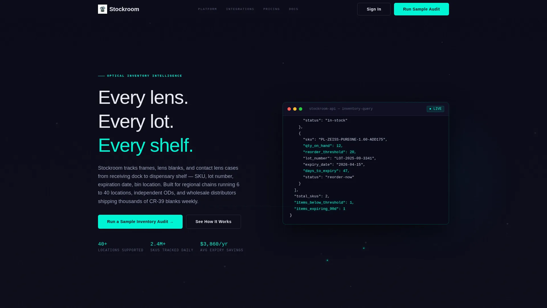
- A live-rendered terminal header animating real API calls with scanner-laser green highlights and titanium-gray particle lines tracing warehouse-to-store pathways
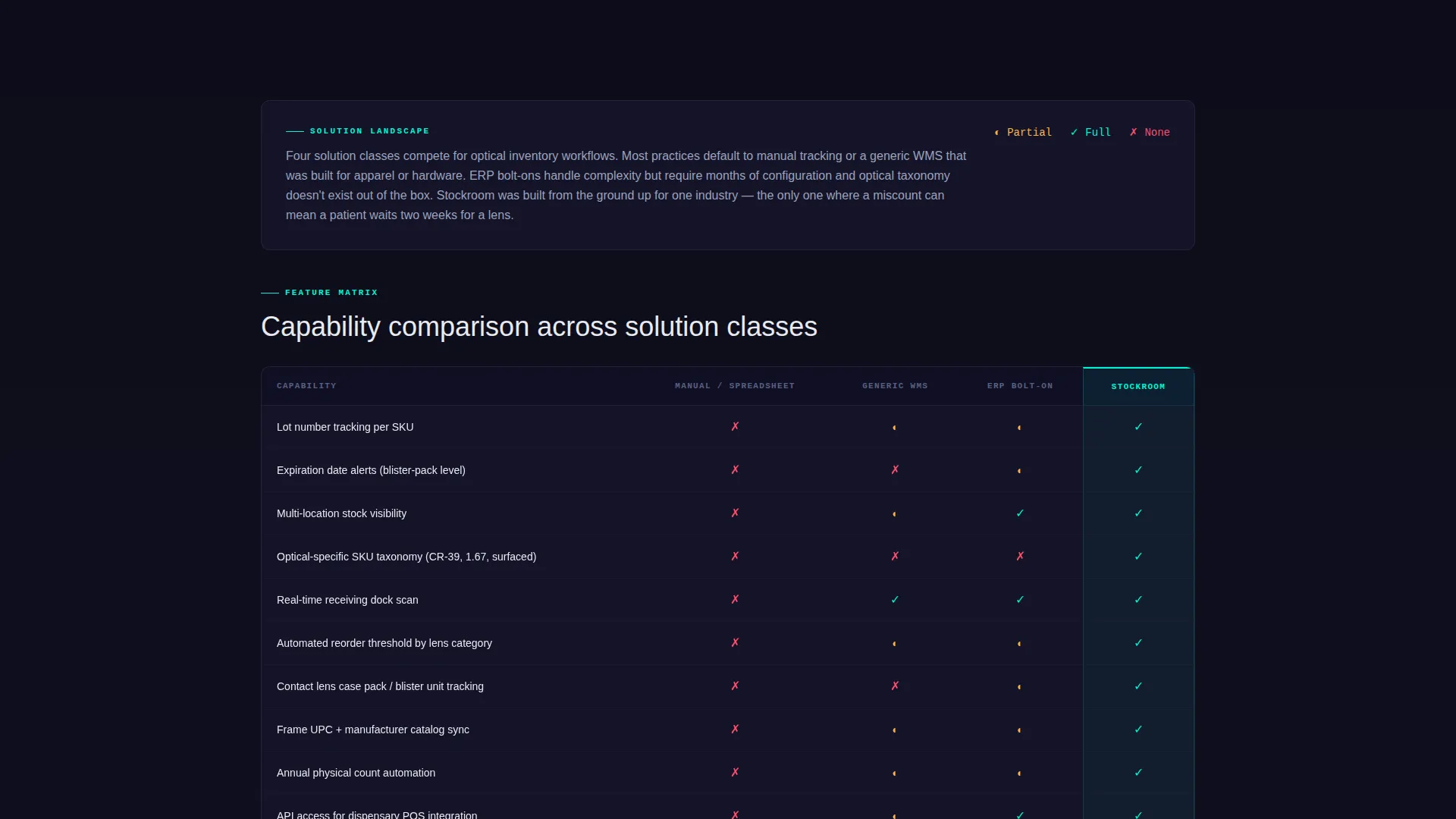
- Two animated comparison tables that measure the platform against manual tracking, generic warehouse software, and ERP bolt-ons, with rows that animate in with motion-blurred entrances
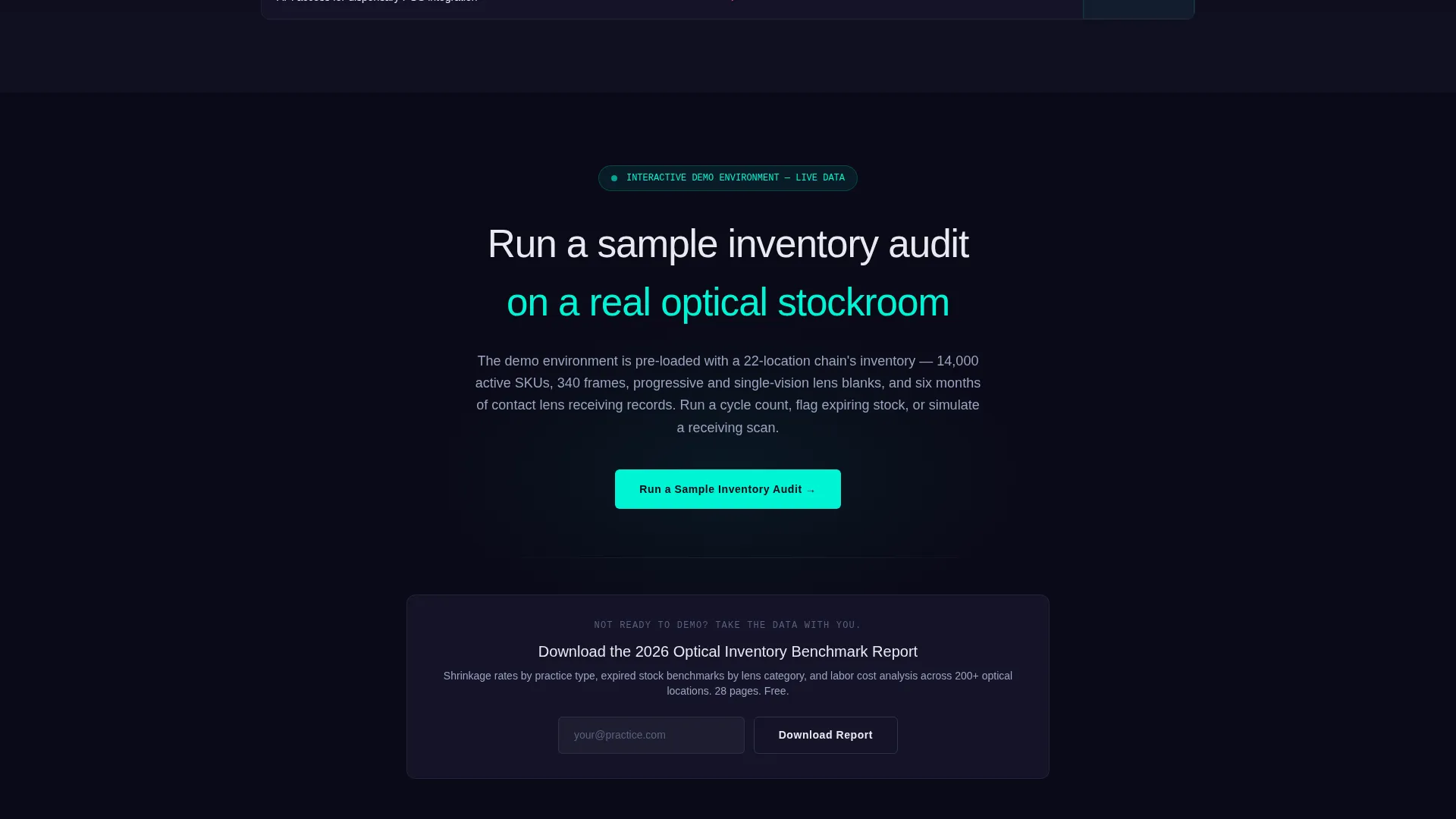
- A primary call to action ("Run a Sample Inventory Audit") and a secondary email-capture call to action ("Download the Optical Inventory Benchmark Report") placed strategically after the second table
Feature list
This template is built from specific components described in the brief. Each one serves the click-through conversion goal directly.
Live API Terminal Header
The header opens with a code snippet rendered as a terminal window. It displays a real GET request pulling inventory data by location, category, and status, with a JSON response showing quantities, lot numbers, reorder thresholds, and days to expiry. Each line animates in as if typed in real time, with response objects highlighting in scanner-laser green as they populate.
Animated Comparison Tables
Two comparison tables structure the core argument of the page. Rows animate in with motion-blurred entrances that sharpen into focus, reinforcing the Dynamic Motion theme. Each table benchmarks the platform against manual tracking, generic warehouse software, and ERP bolt-ons across specific performance criteria.
Industry Report Scroll Flow
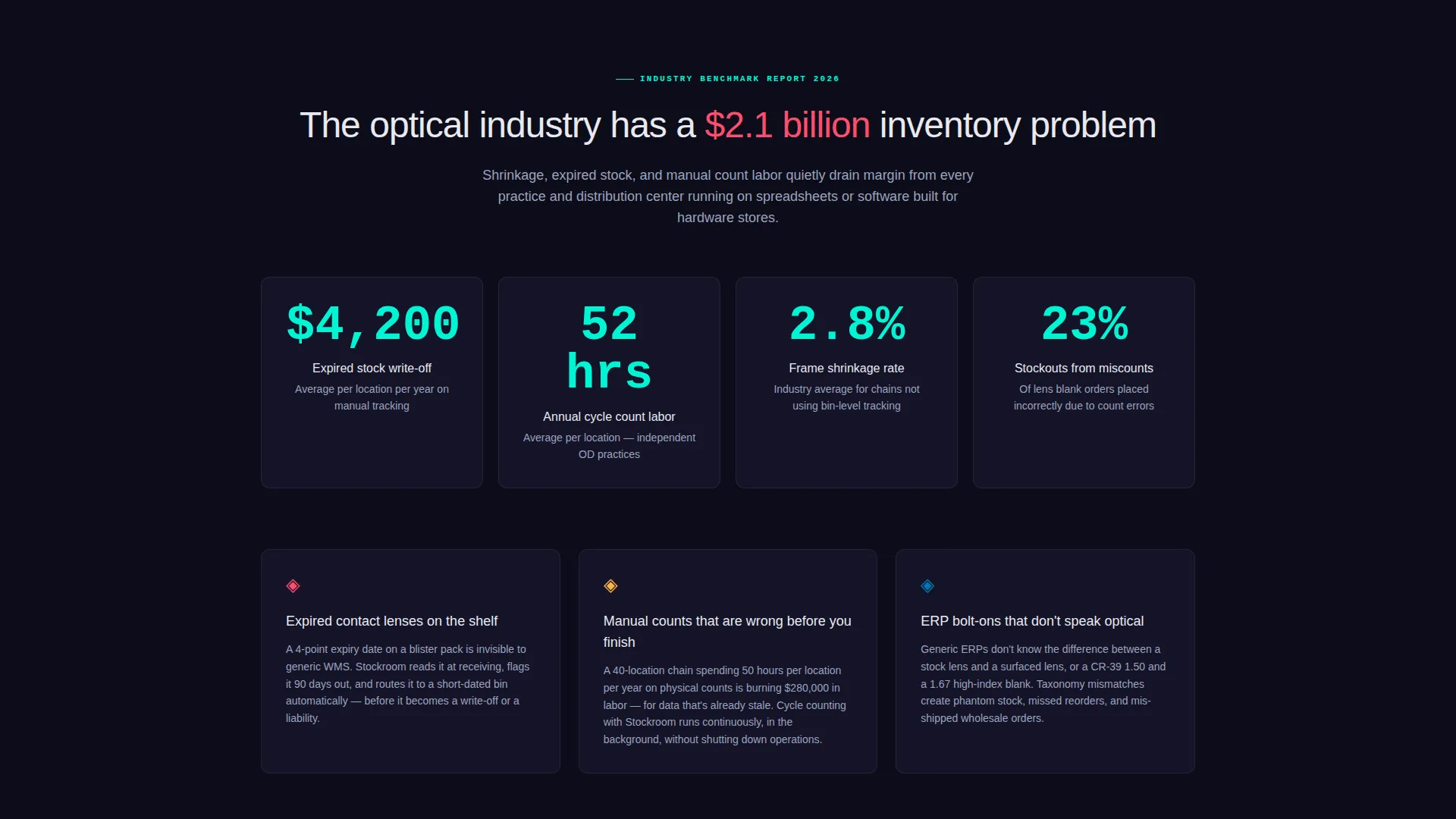
The page uses a scrolling Industry Report creative direction. Hard statistics on optical inventory waste anchor each table section, escalating from problem severity to solution comparison to autonomous inventory outcomes. This structure keeps visitors reading rather than bouncing.
Dual Conversion Architecture
Two calls to action serve two distinct visitor states. The primary call to action pushes visitors into a live interactive demo environment after they have processed enough data. The secondary call to action captures email addresses from visitors who want the benchmark data before committing to a demo.
Carbon Fiber Visual System
The color palette uses deep carbon black, machined titanium, clinical lens-coat blue, and scanner-laser green. Scanner-laser green is reserved for live data points and hover states. The visual result resembles the inside of a diagnostic instrument, with intentional glow and matte-dark surfaces that reduce visual noise.
Particle Line Background Motion
Behind the terminal header, subtle particle lines animate in titanium gray, tracing warehouse-to-store supply chain pathways. This gives the coded data visible context and reinforces the platform's core positioning as an end-to-end inventory system.
Page sections overview
| Section | Purpose |
|---|---|
| API Terminal Header | Opens with live-coded inventory data to establish platform fluency immediately |
| Industry Waste Statistics | Presents shrinkage rates, expired stock costs, and labor hours to anchor buyer pain |
| First Comparison Table | Benchmarks manual tracking and generic software against the platform |
| Second Comparison Table | Compares ERP bolt-ons and purpose-built optometry inventory software |
| Primary call to action Block | Drives qualified visitors into a live interactive demo environment |
| Email Capture call to action | Captures contacts not yet ready for demo with a benchmark report offer |
Design & branding system
The visual identity follows a Dynamic Motion theme built on the Carbon Fiber color system. Every design decision is engineered to reduce visual noise and direct attention to data.
- Color palette: deep carbon black (#1A1A2E) as the base, machined titanium (#4A4E69) for structural elements, clinical lens-coat blue (#0077B6) for interface components, and scanner-laser green (#00F5D4) reserved strictly for live data points and hover states
- Motion style: rows animate in with motion-blurred entrances that settle into sharp focus, and particle lines trace supply chain pathways behind the terminal header
- Overall aesthetic: matte-dark housing with precision-lit readouts, designed to feel like the interior of a diagnostic optical instrument rather than a generic SaaS product page
Mobile & speed optimization
The Dynamic Motion theme is implemented with intentional restraint so the layout stays functional across screen sizes. Animation complexity is calibrated to serve the scroll flow without overwhelming the structure.
- Table layouts and the terminal header are designed to reflow cleanly for narrower viewports
- Motion-blurred row entrances and particle line animations are scoped to the hero and table sections so they do not disrupt readability in body copy areas
How this template helps you convert
The page is built to earn each conversion step before presenting it. Visitors are not asked to act until they have seen enough evidence to understand what they are clicking into.
- The API terminal header establishes immediate credibility by showing real-world inventory data structures, SKU-level detail, and lot-number tracking before any marketing claim appears on the page.
- The Industry Report scroll sequence escalates from industry-wide pain data to head-to-head comparisons, so by the time the primary call to action appears after the second table, the visitor has the full context needed to trust the demo invitation.
Other information about this template
This template is part of a specialized set designed for technology-sector and optometry software use cases. It is particularly well-suited to teams positioning a platform against legacy or generic alternatives.
- Template style: Comparison Table with Dynamic Motion theme
- Header concept: Code Snippet with live-typed terminal animation
- Creative direction: Industry Report with escalating data narrative
- Landing page direction: Click-Through optimized
- Color system: Carbon Fiber palette
- The template is designed to work for optometry-specific warehouse contexts where terminology precision (stock lens versus surfaced lens, CR-39 blanks, blister pack lot numbers) matters to buyer trust
Theme
Dynamic Motion
Creative direction
Industry Report
Color system
Carbon Fiber
Style
Comparison Table
Direction
Click-Through
Page Sections
Live-typed API Terminal Header
Animated Comparison Tables
Industry Report Data Narrative
Dual Call-to-action Conversion Points
Carbon Fiber Color System
Particle Line Background Animation
Related questions
Who is the target buyer for this landing page template?
What are the two calls to action included in the template?
Can I edit the comparison table data to match my platform's actual benchmarks?
What does the animated terminal header display?
Is this template suitable for a single-page layout or a multi-page site?



