Bold Brutalist Automotive Warehouse Management Landing Page
Stockyard is a bold brutalist automotive warehouse management landing page template built around a live parts inventory calculator. It targets aftermarket distributors, salvage yard operators, and OEM parts managers who need to show buyers exactly what disorganized warehousing costs them. The page drives clicks into a sandbox demo using hard-snapping data grids, monospaced display typography, and a full-dark Slate and Sky color system.
by Rocket studio
Quick summary
Stockyard is a dashboard and data grid landing page template for automotive warehouse management platforms. It opens with an interactive parts inventory calculator that renders personalized pick-time and labor projections in real time. The page layout escalates through brutalist data blocks, animated workflow visualizations, and integration logo grids before driving visitors to a sandbox demo with a single bold call-to-action (call to action) click.
Who this template is for
This landing page is built for software teams and marketing managers promoting automotive warehouse operating systems. It speaks directly to the people running parts operations where every mispick costs money and every idle forklift burns margin.
- Aftermarket parts distributors running multi-shift warehouse operations
- Salvage yard operators managing thousands of vehicles with no reliable bin location system
- Original equipment manufacturer (OEM) parts managers whose legacy enterprise resource planning (ERP) system predates modern barcode workflows
What problem this template solves
An automotive landing page needs to do more than describe a product. It needs to make the visitor's own inefficiency undeniable in their own numbers. Stockyard solves the hardest problem in industrial software marketing: turning abstract capability claims into personalized operational evidence before the visitor has a chance to bounce.
- Warehouse managers skim generic software pages and leave because nothing reflects their floor
- Distributors and salvage operators cannot visualize pick-path or bin-location improvements from screenshots alone
- Legacy ERP users need to see their own SKU count and square footage translated into projected savings before they trust a demo request
What you get with this template
You get a fully structured, single-page landing template designed specifically for automotive warehouse software. Every section has a defined role in the conversion sequence, from calculator hook to demo click. The template is fully customizable, so your team can adapt colors, copy, and data fields to match your platform without rebuilding from scratch.
- A live parts inventory calculator section in the header, pre-wired to render a personalized data grid of pick-time reduction, bin utilization rate, and labor hours saved
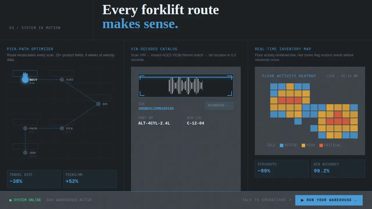
- Animated pick-path visualization blocks, barcode scan workflow panels, and a real-time inventory heatmap section
- A fixed brutalist bottom bar with the primary "Run Your Warehouse" call to action and a secondary "Talk to Operations" text link for direct calendar booking
Feature list
This landing page template packages a precise set of design and structural capabilities. Each feature is built to serve the automotive warehouse management use case directly.
Live Inventory Calculator Header
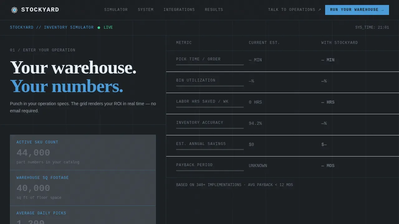
The header section replaces a traditional hero image with a functional parts inventory simulator. Users enter SKU count, warehouse square footage, and average daily picks. The interface instantly renders a steel-dark data grid showing projected operational improvements, with numbers snapping into place like a departures board. This interactive element is the product demonstration itself.
Brutalist Data Grid Layout
The page layout uses a neo brutalism design language throughout. Steel-dark cells, sky-blue progress bars, and monospaced figures at display scale make every data point feel painted on a warehouse wall. The grid structure is an exposed, unapologetic page design choice that reinforces the operational seriousness of the platform. Brutalist design in landing pages emphasizes raw aesthetics and functionality over polished visuals, and this template applies that principle to every data card and section divider.
Escalating Launch Energy Scroll Sequence
Each scroll section powers up like a system module coming online. The sequence moves from calculator results to a disorganization cost wall, then to animated workflow visualizations, then to integration logo grids. The rhythm is percussive: dense data block, breathing room, then another hit. This approach keeps the number of visitors who engage with the full page high and reduces the chance of drop-off mid-scroll.
Fixed call to action Bottom Bar
A brutalist bottom bar stays fixed as users scroll the entire landing page. The primary call to action reads "Run Your Warehouse" and routes to a sandbox demo pre-loaded with the visitor's own calculator inputs. A secondary text link labeled "Talk to Operations" routes to a direct calendar booking. No form appears on this page, keeping the path to conversion fast and uncluttered.
Slate and Sky Color System
The full-dark Slate and Sky palette runs deep asphalt (#1B1F23) as the base, with warehouse concrete (#3D4349) for floating data cards, open-sky blue (#4A9BD9) for active metric borders and progress bars, and high-visibility accent (#E8F1F8) for data highlights and hover states. The color system is fully customizable and carries a consistent graphic design identity across every section without needing custom code.
Integration Logo Grid Section
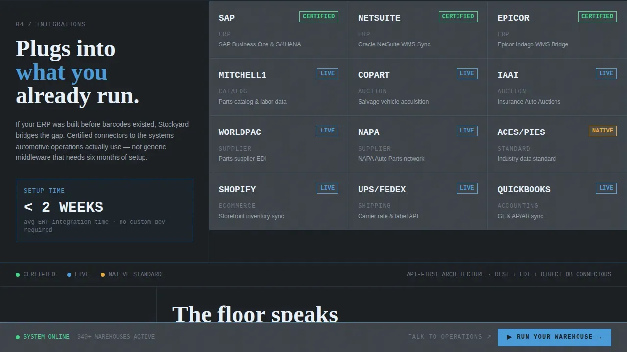
A dense integration logo grid section displays partner system logos with zero padding between cells. This section makes a bold statement about platform compatibility and builds trust quickly. The grid is fully customizable for your actual integration partners.
Page sections overview
| Section | Purpose |
|---|---|
| Calculator / Estimator Header | Renders personalized pick-time and labor-savings data grid on visitor input |
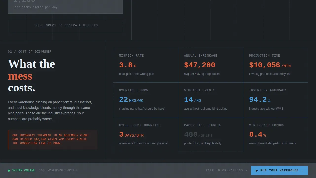
| Disorganization Cost Wall | Displays shrinkage dollars, mispick rates, and overtime hours as brutalist data blocks |
| Pick-Path Visualization | Animated workflow showing optimized forklift routing and bin navigation |
| Barcode Scan Workflows | Panel illustrating step-by-step barcode scanning and inventory update process |
| Inventory Heatmap | Real-time visual of bin utilization density across the warehouse floor |
| Integration Logo Grid | Compact grid of compatible enterprise system logos with minimal spacing |
| Fixed call to action Bottom Bar | Persistent "Run Your Warehouse" button and secondary calendar booking link |
Design & branding system
The ui ux direction for this template is built around industrial density and operational legibility. Typography ui choices are intentionally oversized and monospaced, rendering figures at display scale so data feels authoritative rather than decorative. The overall ui design rejects soft gradients and rounded corners in favor of hard edges, exposed structure, and high-contrast type stacks.
- Slate and Sky color palette: deep asphalt base, concrete-gray cards, sky-blue active borders, and high-vis accent for hover states and data highlights
- Monospaced display typography stacked brutally, with numbers scaled to warehouse-wall proportions for immediate visual impact
- Neo brutalism grid structure with zero padding on integration blocks and full-bleed dark backgrounds throughout every section
Mobile & speed optimization
This landing page is designed so that users on any screen size can interact with the warehouse calculator and scroll through the data grid sequence without friction. The page layout adapts for smaller viewports while preserving the brutalist design weight and typography ui hierarchy. Ensuring the landing page is mobile-friendly is essential, as many visitors will access it from their smartphones.
- Responsive grid and card layout that maintains data legibility at mobile viewport widths
- No video autoplay or heavy hero assets; the calculator and data grid are the primary visual load, keeping page weight lean
- Fixed call to action bottom bar remains accessible and tappable on mobile, so the primary conversion path stays clear throughout the scroll
How this template helps you convert
This landing page is built around a single conversion insight: visitors commit to a demo when they have already seen their own numbers. The page structure leads every user through a personalized evidence sequence before the call to action appears.
- The calculator header captures the visitor's actual operational context (SKU count, square footage, daily picks) and immediately renders a data grid showing projected improvements, making the value proposition concrete and personal before any marketing copy does the work.
- The escalating scroll sequence uses a cost wall, workflow visualizations, and an integration grid to answer the three remaining objections (does it solve my problem, does it actually work, does it connect to my systems) in the exact order warehouse managers ask them, reducing friction before the "Run Your Warehouse" click.
Other information about this template
This template is fully customizable without needing coding skills, making it practical for marketing teams and no-code developers alike. No-code development platforms enable users to build applications without extensive coding knowledge, and this template fits naturally into that workflow. Vibe coding approaches, where users describe changes in plain language and apply them through intuitive editors, are compatible with the template's straightforward structure.
The Stockyard bold brutalist automotive warehouse management landing page template is designed for use in targeted ad campaigns promoting warehouse management software. It can serve as a homepage landing page or as a dedicated campaign landing page connected to paid traffic. Because the calculator personalizes the experience, it is well-suited to visitors arriving from specific ad campaigns where audience segmentation already filters by warehouse size or parts volume.
A strong ui ux web experience depends on helping users navigate efficiently and perform the one action the page is built for. This template keeps the ui uiux hierarchy clean: one primary input, one results grid, one call to action. The ux web flow removes every detour between calculator results and demo click. Users who interact with the website calculator are already pre-qualified, which supports a better user experience and a higher-intent conversion path.
From a website design perspective, the template follows neo brutalism principles that reject conventional web design website conventions. The brutalist design style rejects traditional web layouts, opting for distinctive and unconventional structures that make a bold statement. Brutalist templates are fully customizable, allowing users to adapt the design to their brand's identity without needing custom code. This makes the template practical for teams who want a strong webdesign website identity without commissioning entirely custom graphic design work.
The page is classified into a category of industrial software marketing templates where the data grid itself functions as the product preview. The homepage landing structure gives users a clear, singular path from input to action. To understand how visitors interact with the calculator and scroll sequence, teams can connect analytics tools to analyse the key performance indexes of the website, including the number of visitors, bounce rate, traffic source, and conversion events.
- The template supports connection to analytics tools so teams can analyse the key performance metrics of the landing page and understand how visitors interact with the full scroll sequence
- Analytical cookies are used and performance cookies are used by connected analytics platforms to track the number of visitors bounce patterns and rate traffic source data
- Advertisement cookies are used by ad platforms to measure the effectiveness of the ad campaigns driving traffic to this landing page
- Teams can customise consent preferences for their site using a cookie consent layer; functional cookies help perform certain core behaviors like save my preferences and log in or adjusting user settings
- Necessary cookies are required to enable the basic features of this site, while other cookies are classified into a category based on their purpose
- Cookies help perform certain functionalities like storing pages you visited previously and to analyse the bounce rate traffic source data; these cookies do not store any personally identifiable data
- Analytical cookies are used to understand how visitors interact with the website on social media referral paths and direct traffic; the rate traffic source breakdown helps teams identify which ad campaigns drive qualified warehouse managers to the page
- Performance cookies are used to provide visitors with customised advertisements based on the pages you visited previously and to analyse campaign effectiveness; advertisement cookies are used to measure the effectiveness of the ad campaigns and provide visitors with customised content
- Adjusting your consent preferences through the consent layer lets users control which cookies under each consent category are active; the banner can be configured to help you navigate efficiently and perform certain functionalities like saving preferences across sessions
- Social media platforms collecting engagement data and media platforms collecting feedback from warehouse management audiences can be connected to the landing page via tracking pixels; the template structure is compatible with social media campaign traffic from platforms where visitors with customised advertisements arrive pre-segmented by job role or fleet size
- The website ui is built to deliver a clear ux design web experience; the ui ux website hierarchy keeps users focused on the calculator and call to action without visual distraction
- The design landing page structure is practical for teams building their first automotive software campaign or refining an existing one; the design web approach prioritizes function over decoration, consistent with neo brutalism values
- Delivering a better user experience for warehouse operations buyers means making the platform's value tangible before the demo; this template's design ui and ux website structure are built around that principle
- The template can support social media traffic from platforms where targeting is based on industry and job function, making it compatible with social media platforms collecting audience data for retargeting
- Features of this site are built to efficiently and perform certain conversion objectives without bloating the page with unnecessary interactive elements or copy
Theme
Bold Brutalist
Creative direction
Launch Energy
Color system
Slate & Sky
Style
Dashboard/Data Grid
Direction
Click-Through
Page Sections
Live Inventory Calculator Header
Brutalist Data Grid Page Layout
Escalating Launch Energy Scroll Sequence
Fixed Brutalist Call to Action Bottom Bar
Slate and Sky Color System
Integration Logo Grid Section
Related questions
Who is this landing page template designed for?
Can I customize the colors and typography without coding?
Does the calculator section send data anywhere?
Can this template be used for paid ad campaign traffic?
Is this template suitable as a homepage or only for campaigns?



