Construction Warehouse Management Landing Page
Stockyard is a bold, brutalist-styled construction warehouse management landing page template built for industrial software platforms. It features a three-tab header switcher, fixed anchor navigation across six warehouse workflow sections, and a stats-first layout that leads every section with a headline metric. The design is built to drive demo sign-ups through contextual, repeat call-to-action placements.
by Rocket studio
Quick summary
Stockyard is a single-page, hub-and-spoke landing page template for construction warehouse management platforms. It opens with a Feature Tab Switcher showing inventory maps, delivery timelines, and reporting dashboards. A fixed anchor nav guides visitors through six workflow sections. Every section leads with a bold metric before any explanation, creating a foreman's report card feel that moves visitors toward a guided product demo.
Who this template is for
This template is built for software teams selling warehouse management platforms to construction operations teams. It speaks directly to the people who live inside those systems every day.
- Site logistics managers coordinating materials across multiple active pours
- Procurement officers tracking back-ordered materials and reorder triggers
- Operations directors who need real-time inventory counts across regional yards
What problem this template solves
Construction warehouse operations run on speed and accuracy. Most software landing pages bury the proof inside walls of marketing copy. Stockyard fixes that by putting the numbers first and the explanation second.
- Visitors can jump directly to their specific pain point using the fixed anchor nav
- Stats like pick accuracy and receiving-to-shelf time are presented before feature explanations
- Every call to action leads to a demo environment, not a form, removing friction from the conversion path
What you get with this template
You get a complete, single-page layout designed to present a construction warehouse management platform with industrial confidence. Every component is defined and purposeful.
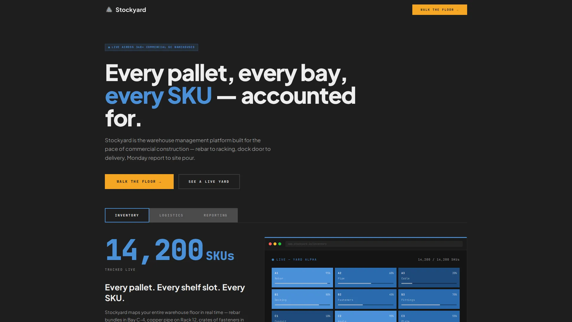
- A three-tab Feature Tab Switcher header with product screenshots for inventory, logistics, and reporting views
- Six anchor-linked spoke sections covering Receiving, Storage, Picking, Shipping, Reporting, and Integrations
- A stats-first layout structure with oversized metrics, supporting paragraphs, and contextual screenshots throughout
Feature list
This template is built around components that support an industrial-strength product story. Each one is described below.
Three-Tab Feature Switcher Header
The header holds three brutalist concrete-textured tabs labeled INVENTORY, LOGISTICS, and REPORTING. Each tab reveals a distinct product screenshot: a color-coded warehouse bay map, a live delivery timeline with truck GPS pins, and a reporting dashboard showing turnover rates and reorder triggers. Switching between tabs uses hard cuts, no animation.
Oversized Stats Stamps
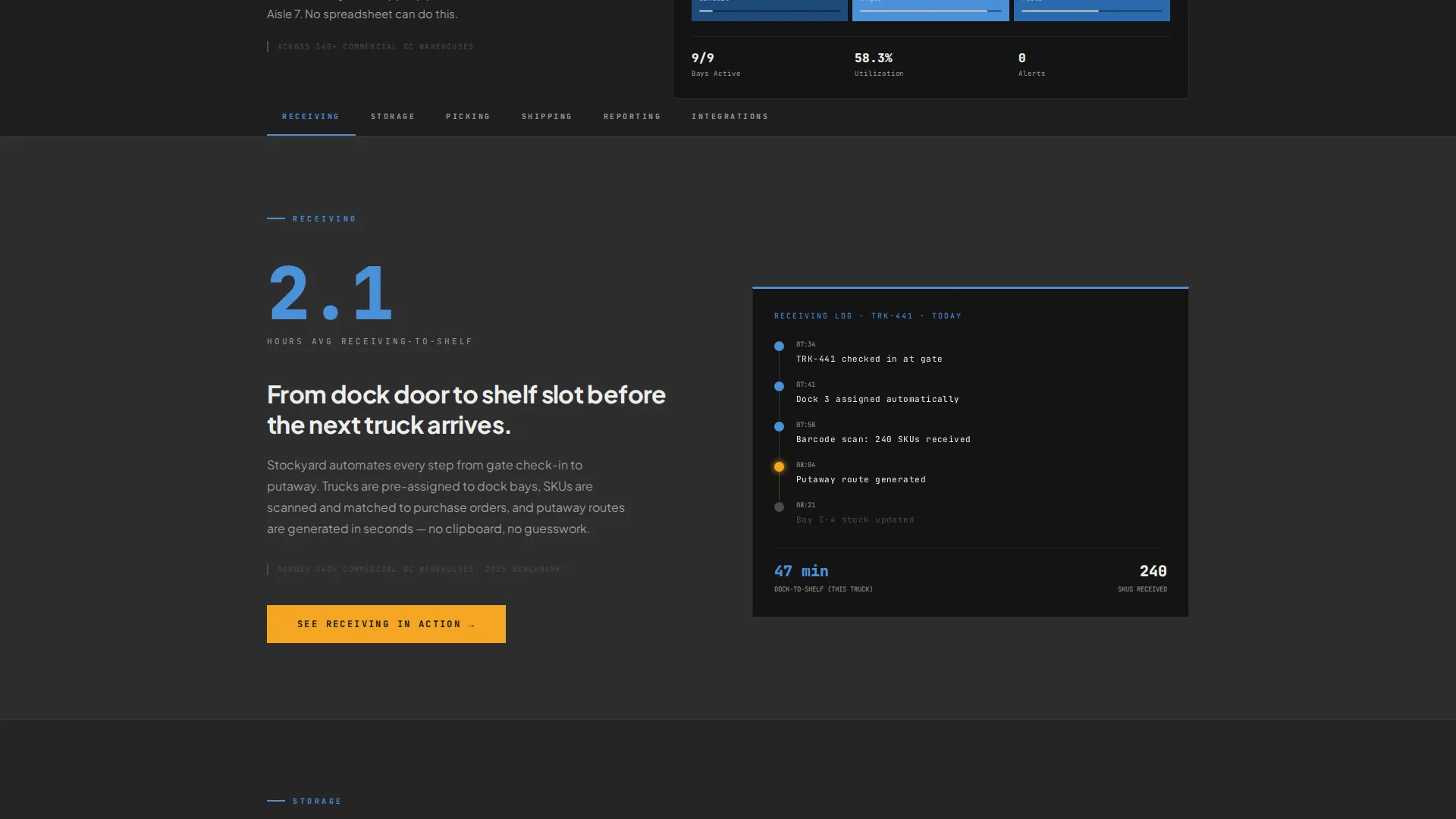
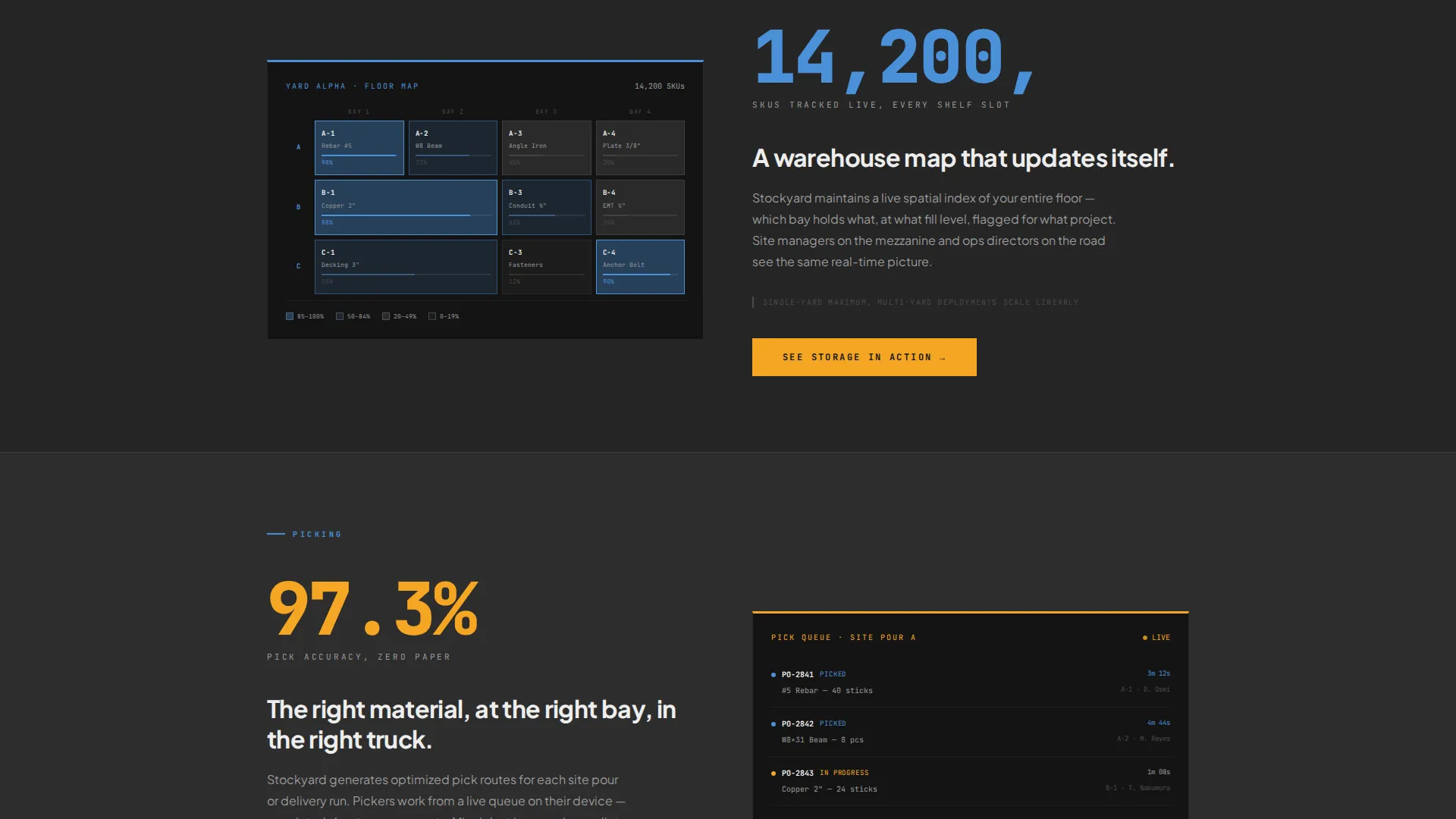
Every section below the header opens with a single large metric before any supporting copy. Examples include "97.3% pick accuracy," "2.1 hours average receiving-to-shelf," and "38% reduction in dead stock." Numbers are presented at 96-pixel scale, making each figure land like a stamp on the page.
Fixed Anchor Navigation Bar
A sticky nav bar runs across the top of the page with six warehouse-vocabulary anchors: Receiving, Storage, Picking, Shipping, Reporting, and Integrations. Visitors can jump directly to the section most relevant to their role or scroll the full story in order.
Contextual Repeat calls to action
The primary call-to-action phrase "Walk the Floor" appears after the header stats and repeats at the close of every spoke section. Each instance is reworded to match its context, such as "See Picking in Action" or "Open a Live Report," keeping the invitation specific and relevant.
Stats-First Section Layout
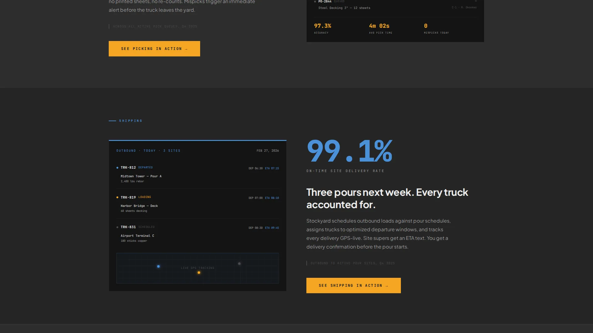
Each spoke section follows the same rhythm: an outsized metric, a tight explanatory paragraph, and a supporting screenshot. This structure mirrors the way a foreman presents results and makes the product's impact easy to scan and trust.
Customer-Segment Attribution
Every major stat is anchored to a named customer segment, for example "across 340+ commercial general contractor warehouses." This specificity makes claims feel verifiable and positions the demo as the natural next step.
Page sections overview
| Section | Purpose |
|---|---|
| Tab Switcher Header | Introduce three core product views with hard-cut tab switching |
| Header Stats Block | Display oversized platform metrics before any feature copy |
| Fixed Anchor Nav | Let visitors jump to any of six workflow sections instantly |
| Receiving Section | Cover inbound materials flow and receiving-to-shelf time stat |
| Storage Section | Show bay occupancy mapping and SKU-level shelf slot tracking |
| Picking Section | Present pick accuracy metrics and the picking workflow view |
| Shipping Section | Detail outbound logistics and live delivery timeline feature |
| Reporting Section | Showcase turnover rates, reorder triggers, and dashboard view |
| Integrations Section | Address platform connectivity for construction ops workflows |
| Demo call to action Footer | Close the page with a final "Walk the Floor" conversion prompt |
Design & branding system
The visual identity follows a Bold Brutalist theme built around a Slate and Sky color system. The palette draws from construction materials and open-sky industrial settings to create a surface that feels heavy, practical, and alive.
- Core colors: poured-concrete charcoal (#2D2D2D) for backgrounds, rebar dark gray (#4A4A4A) for secondary surfaces, open-sky blue (#4A90D9) for active states and live data, and safety-stripe amber (#F5A623) reserved strictly for calls to action and alert states
- Typography: large, blunt off-white (#EDEDED) type on dark backgrounds with 96-pixel headline numbers used for stat stamps
- Texture and tone: concrete-textured tab elements, no animation flourishes, and hard cuts between states to reinforce the industrial, no-nonsense character of the platform
Mobile & speed optimization
The template is structured to remain usable and scannable across screen sizes. The hub-and-spoke layout with a fixed anchor nav is particularly valuable on mobile, where users may want to jump directly to a relevant section.
- The fixed anchor nav collapses cleanly for smaller viewports, preserving direct section access
- Oversized stat stamps and large type are designed to remain legible and impactful at reduced sizes
- The single-page structure keeps all content accessible without multi-page navigation overhead
How this template helps you convert
Stockyard is a click-through landing page designed with one goal: moving the right visitor into a self-serve interactive demo. Every structural and visual decision supports that conversion path.
- Stats-first sections build credibility before any sales copy appears, so visitors arrive at each call to action already convinced by the numbers
- Contextual call-to-action variants at the close of every section keep the demo invitation relevant to what the visitor just read, reducing drop-off
- The no-form click-through model removes the biggest friction point in demo funnels by letting visitors enter the demo environment directly from any call to action on the page
Other information about this template
Stockyard is categorized under Technology and Construction Software, making it a strong fit for platforms serving the construction warehouse management niche. The template is built as a hub-and-spoke single-page layout, meaning all content lives on one scrollable page connected by anchor links rather than separate routes.
- The template style is Hub and Spoke with Anchor Navigation, suitable for product-led platforms that need to tell a structured story across multiple operational domains
- The creative direction is Stats-First Impact, which means numerical proof points drive the narrative rather than feature lists or testimonials
- The landing page direction is Click-Through, meaning the page is not designed to capture leads directly but to route qualified visitors into a demo environment
- The header concept is a Feature Tab Switcher, a component that lets a single above-the-fold section carry three distinct product stories without requiring the visitor to scroll
Theme
Bold Brutalist
Creative direction
Stats-First Impact
Color system
Slate & Sky
Style
Hub & Spoke (Anchor Nav)
Direction
Click-Through
Page Sections
Three-tab Feature Switcher Header
Oversized Stats-first Metrics
Fixed Anchor Navigation Bar
Contextual Repeat Call-to-action
Stats-first Section Structure
Customer-segment Attribution Layer
Related questions
Does this template include a contact form or lead capture form?
Can I change the tab labels in the Feature Tab Switcher header?
How many anchor sections does the template include?
Is the color palette customizable?
Who is this template best suited for?



