Industrial Storage Certification Landing Page Template
Provision is a hub-and-spoke course landing page template built for enterprise storage training platforms. It pairs a Tech Glass visual identity with a Feature Matrix layout to help potential students compare curriculum depth, lab specs, and certification coverage at a glance. The landing page is specifically designed for infrastructure engineers who need to see proof before they commit.
by Rocket studio
Quick summary
Provision is an engineer-grade course landing page template built for storage training platforms. It uses a hub-and-spoke anchor navigation layout and a Feature Matrix creative direction to convert visitors through structured comparison. The visual design channels a NOC dashboard aesthetic with frosted glass panels, sky-blue accents, and animated progress indicators that make the course feel live before a single scroll.
Who this template is for
This landing page template is built for a very specific target audience: infrastructure engineers who troubleshoot storage systems for a living. It is not a generic online course page. It speaks directly to practitioners who already know their protocols and need proof that a course can match their depth.
- Mid-career SAN administrators, NetApp ONTAP engineers, and VMware architects with five to twelve years of experience
- Engineers preparing for technical certifications in enterprise storage who want hands-on lab access alongside structured curriculum
- Training platform operators who need a professional landing page that explains complex educational offerings without dumbing them down
What problem this template solves
Most course landing page examples built for general audiences fail technical buyers. They highlight outcomes without showing evidence. They list module names without explaining scope. They bury the lab environment specs that engineers actually care about. Potential students with real infrastructure experience leave the page unconvinced.
- Engineers cannot find a clear breakdown of course content, protocols covered, or lab environment details without clicking away
- The landing page fails to build trust with social proof, trust badges, or instructor credentials that mean something to a senior engineer
- Generic page templates lack comparison tables, so visitors cannot see where the course outperforms alternatives on specific feature rows
What you get with this template
This page template gives you a complete, structured course landing page with every section mapped to a stage in the customer journey. From the hero section to the pricing comparison table, every element is placed to guide visitors toward one desired action: starting a free lab session. You do not need to figure out layout logic from scratch.
- A full-viewport hero section with a 3D glass-plane dashboard preview, anchor navigation, and a prominent call to action button
- Five structured spoke sections covering curriculum depth, lab environment specs, certification coverage, plan comparison, and instructors
- Comparison tables with row-level highlights, sticky bottom bar, a minimal developer-style footer, and repeating call to action buttons after each section
Feature list
This template packages several purpose-built components that work together to increase conversions and reduce friction throughout the page.
3D Dashboard Hero Section
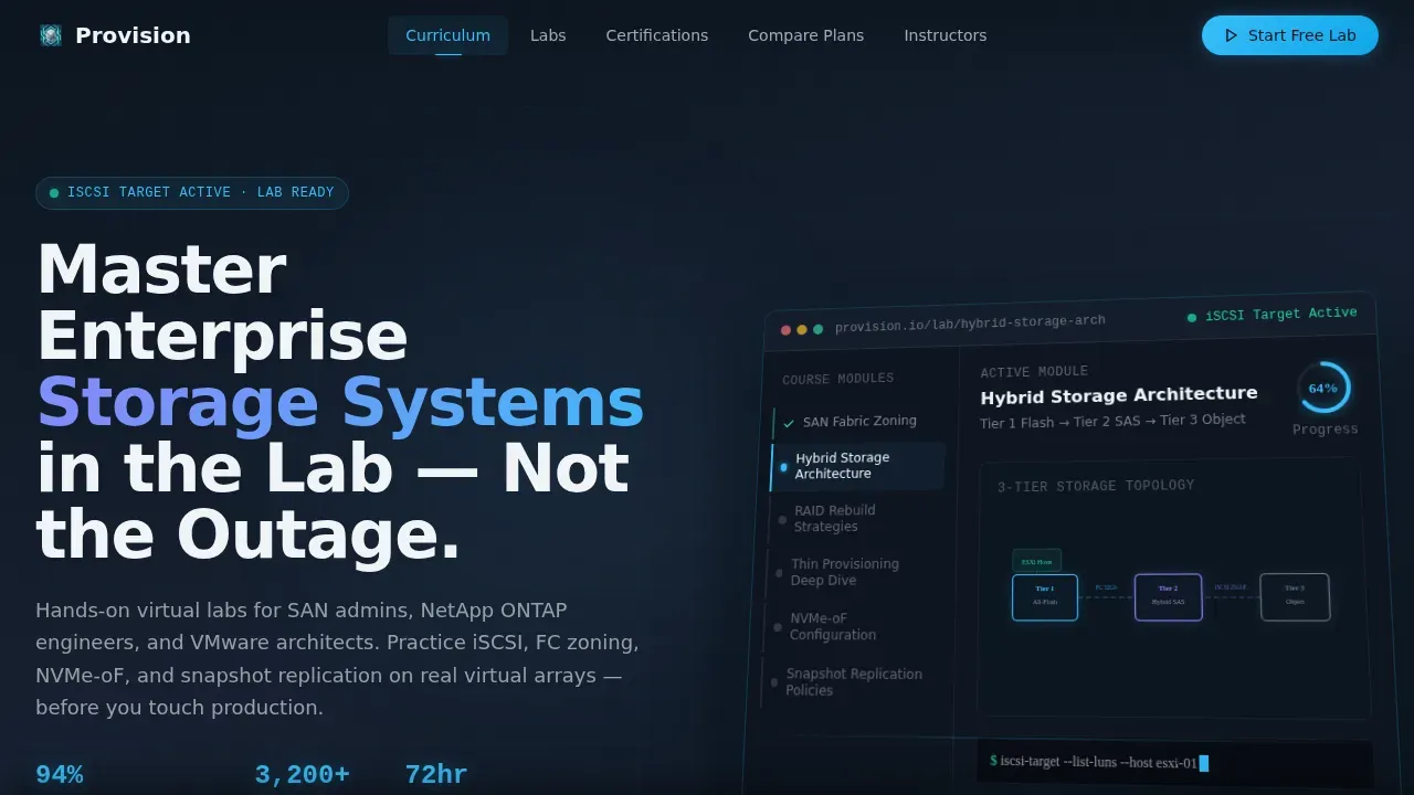
The hero section renders a stylized course platform interface at full viewport width. It shows a learner mid-path through a Hybrid Storage Architecture module, with a topology diagram, a progress ring at 64%, a green-glowing lab indicator reading "iSCSI Target Active," and a sidebar listing modules like "RAID Rebuild Strategies." The interface sits on a tilted glass plane with a soft parallax drift, giving the page depth before any scrolling begins. This hero image communicates course content immediately and sets the right tone for a technical audience.
Anchor Navigation Hub
A sticky anchor navigation bar pins to the top of the page with spoke labels for Curriculum, Labs, Certifications, Compare Plans, and Instructors. This navigation acts as both a wayfinding tool and a trust signal, showing visitors that the page is organized and complete. It lets potential students jump directly to the section most relevant to their decision without losing context.
Feature Matrix Comparison Tables
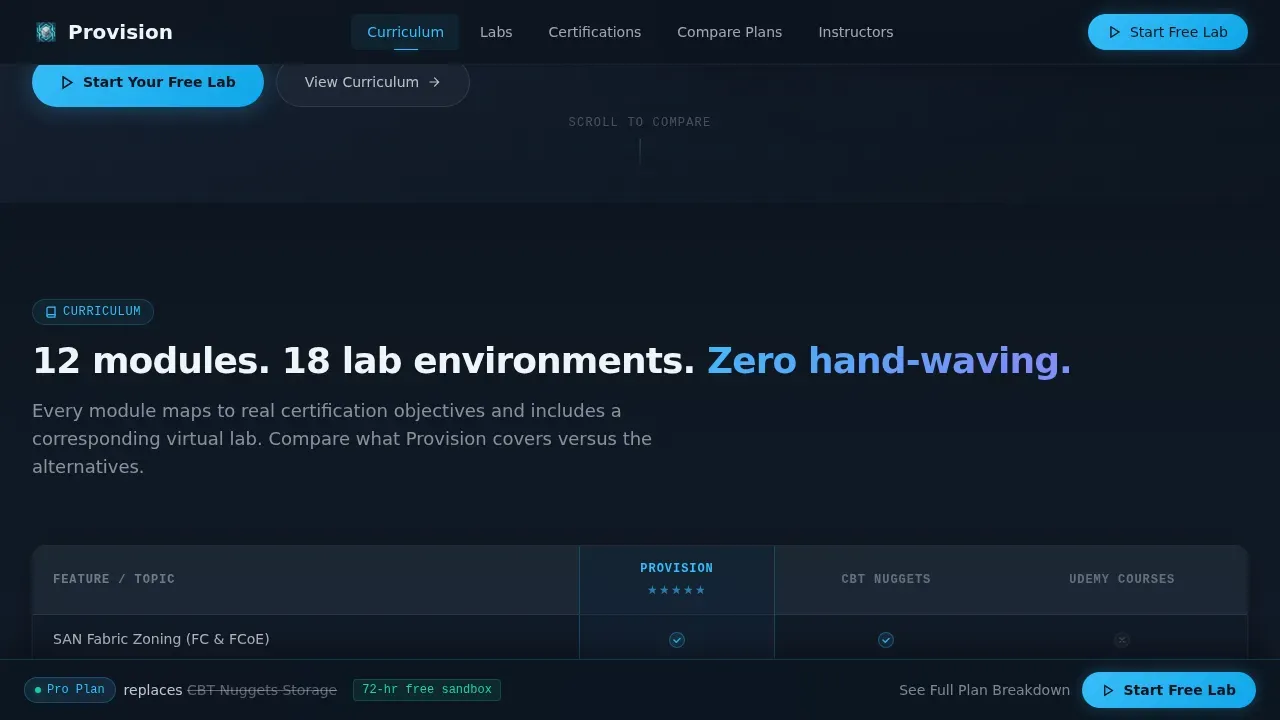
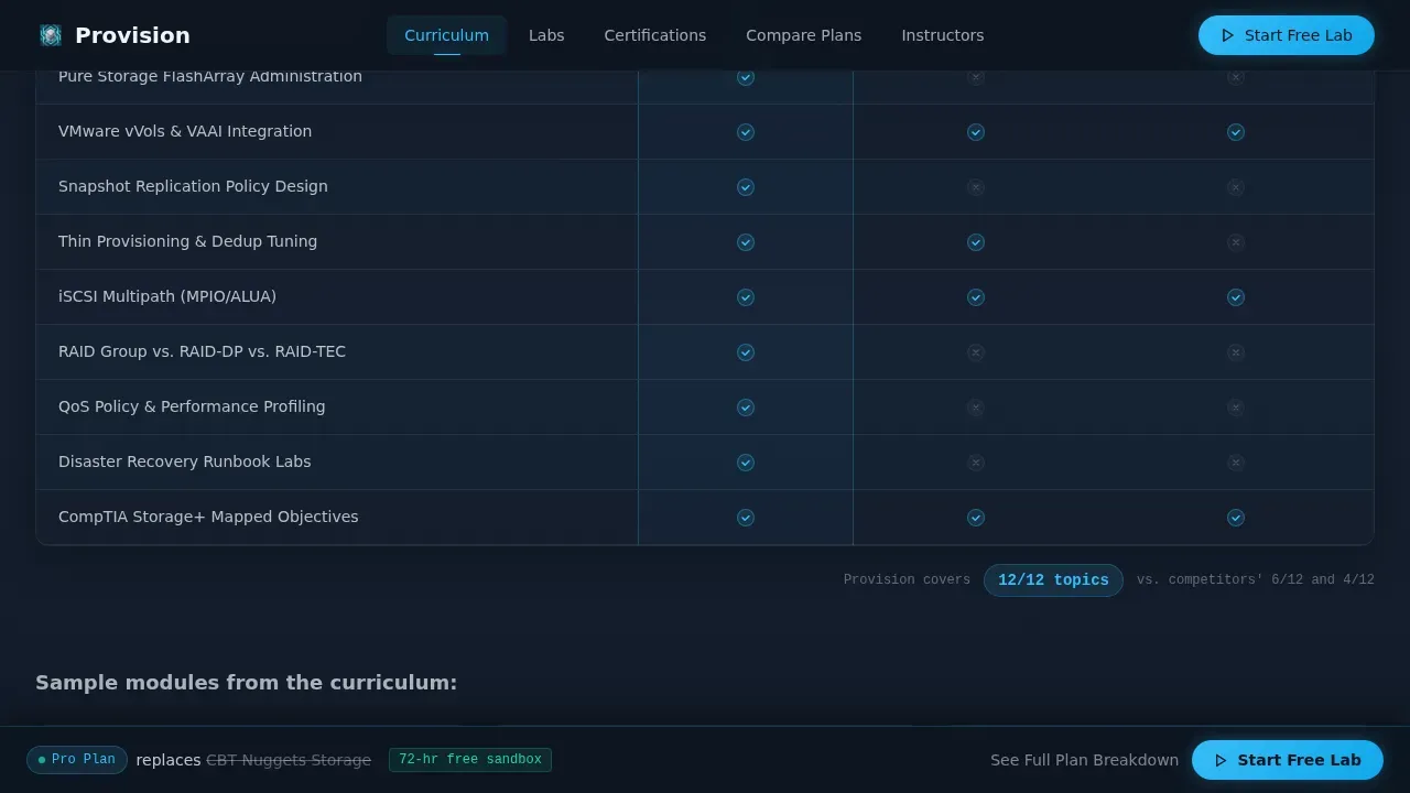
Each spoke section includes a structured comparison table that places the platform's capabilities side by side with alternative courses. Rows highlight where competitors show empty cells and the platform shows filled check marks glowing in sky blue. This layout does the persuasion work without marketing language, letting the data build trust and increase conversions naturally.
Sticky Bottom Conversion Bar
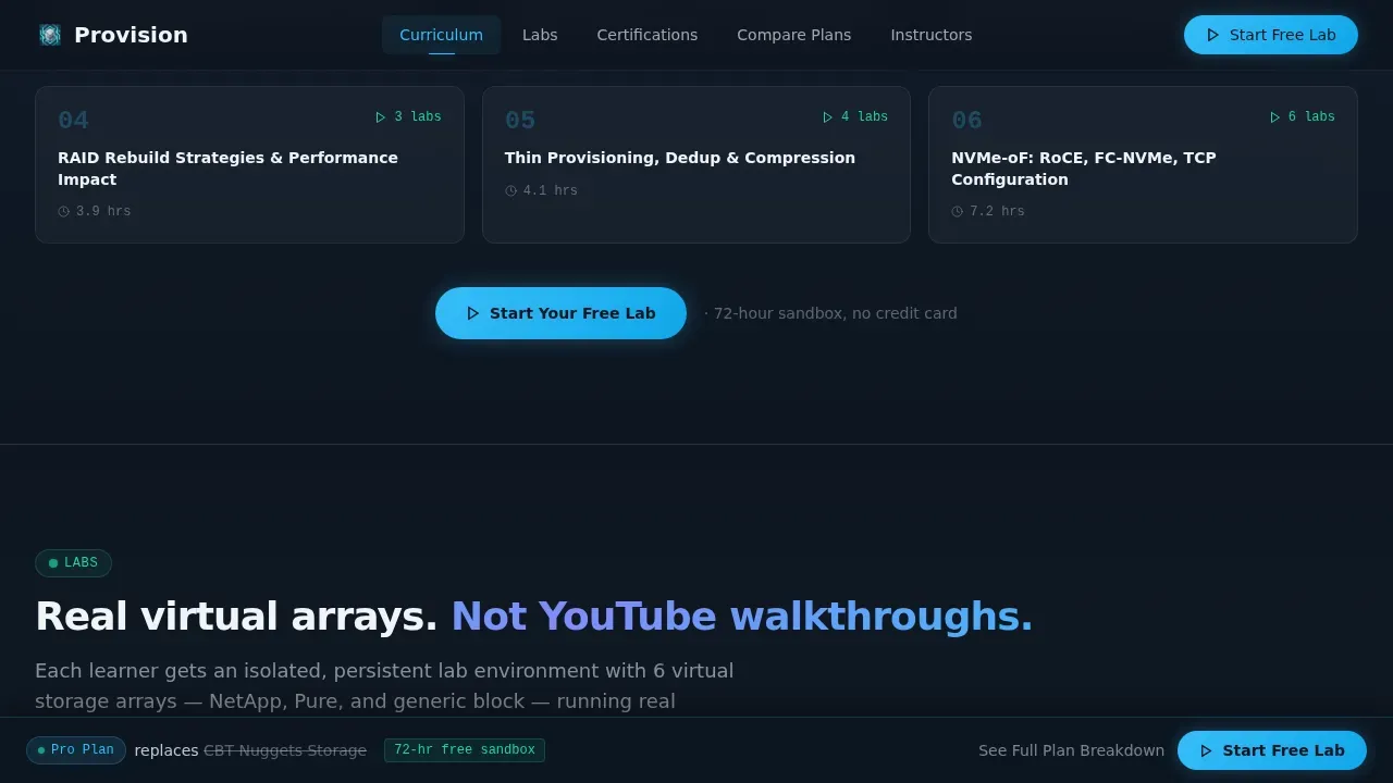
After the first scroll, a sticky bottom bar appears showing the most popular plan and the competitor it replaces. It includes a secondary call to action button labeled "See Full Plan Breakdown." This component keeps the desired action visible throughout the entire scroll without interrupting the comparison flow.
Social Proof and Credibility Blocks
The template includes dedicated blocks for pass rate percentages, enrolled engineer counts, lab hours completed, and instructor credentials. These trust signals function as social proof that speaks directly to engineers. Student testimonials can highlight career impact and specific skills gained. Trust badges can display certification logos relevant to the course, and written reviews from past students add further credibility alongside positive testimonials.
Minimal Lead Capture Form
Placed after the comparison tables, the lead generation form asks only for an email address and a current role selected from a dropdown. The dropdown options include SAN Admin, Cloud Architect, Student, and Other. Keeping the form short helps reduce friction and focus the visitor on the desired action: unlocking a 72-hour sandbox environment.
Page sections overview
| Section | Purpose |
|---|---|
| Hero Dashboard Preview | Establish credibility and show course depth immediately |
| Anchor Navigation Hub | Let visitors jump to any spoke section instantly |
| Curriculum Feature Matrix | Compare module depth against competitor courses |
| Labs Environment Specs | Highlight virtual array specs and protocol coverage |
| Certifications Coverage | Display pass rate data and certification scope |
| Compare Plans Table | Show pricing tiers with a repeating call to action button |
| Instructors Credentials | Build trust through named instructor experience |
| Sticky Bottom Bar | Keep the conversion path visible throughout the scroll |
| Lead Capture Form | Collect email and role to unlock sandbox access |
| Developer Minimal Footer | Close the page cleanly with essential links |
Design & branding system
The visual design is built around a Tech Glass theme using the Slate and Sky color system. Every layer uses opacity and translucency rather than hard shadows to create depth. The overall effect feels like a glass-fronted monitoring dashboard in a dim network operations center: cool, backlit, and precise. This professional appearance signals technical authority to engineers who spend their days looking at real infrastructure dashboards.
- Primary background in deep rack-mount charcoal (#1E2A38), secondary surfaces in brushed aluminum midtone (#64748B), sky-blue accent (#38BDF8) for interactive elements and glowing check marks, and frosted panel white (#F0F4F8) for card surfaces and text regions
- Typography uses DM Sans for headings and body text, with JetBrains Mono for code labels, metrics, and data values to reinforce a technical, engineer-grade visual design
- High-motion animation layer includes CSS 3D perspective tilt on the hero, cursor parallax, scroll-linked blur transitions, staggered section reveals, and a progress ring SVG animation in the hero dashboard
Mobile & speed optimization
The template is built desktop-first to match how infrastructure engineers typically work, with a responsive layout that adapts cleanly to tablet viewports. On smaller screens, comparison tables reformat into scrollable cards and the sticky bottom bar stays visible on mobile devices. A technical audience is sensitive to performance, so the template separates static sections from interactive ones to keep render logic focused.
- Desktop-first layout with tablet-responsive breakpoints; comparison tables reformat for smaller viewports so visitors can still read every row
- Static sections use server-rendered components while animated and parallax sections use client-side components, keeping the interactive hero and sticky bar smooth on mobile devices
- Sticky anchor navigation and sticky bottom bar both adapt to narrower viewports so call to action buttons remain accessible throughout the scroll on any screen size
How this template helps you convert
A high converting landing page for a technical course does not rely on persuasive copy alone. It builds a case through evidence. This page template is structured so that every section adds a new axis of proof, compounding visitor confidence before they reach the form. By the time potential customers arrive at the lead capture section, they have already worked through twelve feature comparison rows where the platform wins.
- The hero section delivers the first point of trust immediately, showing a live-looking course interface with real module names and a progress indicator, giving visitors a sneak peek of the learning environment before they read a single headline
- Each comparison table row functions as a mini call to action, guiding visitors through a structured customer journey where every empty competitor cell builds the case for enrollment, while repeating call to action buttons placed after each spoke section keep the desired action within reach
- Social proof blocks showing pass rates, enrolled engineer counts, and student testimonials from satisfied students reduce the final objection at the form, and the minimal two-field lead generation form removes the last barrier so visitors can start learning today
Other information about this template
This section covers additional practical details that help you get the most value from the template across different use cases and platforms.
- The provision engineer grade storage course landing page template is fully customizable, so you can swap in your own course title, module names, instructor bios, pricing tiers, and comparison data without rebuilding any layout logic
- A course landing page built on this template acts as a detailed technical resource rather than a generic marketing brochure, which is especially important when your target audience includes engineers who distrust vague claims
- The page is designed to support search engine optimization practices: clean heading hierarchy, structured section flow, and a scannable layout all contribute to a professional landing page that performs well for organic discovery
- Trust badges, written reviews, and instructor certification logos can all be placed in the dedicated credibility blocks without custom code, making it straightforward to build trust with potential students at every scroll depth
- The sticky bottom bar and the repeating call to action buttons after each section function as multiple lead generation touchpoints, helping you capture more leads from visitors who decide at different points in the scroll
- The comparison table creative direction makes this template an excellent way to reframe the value proposition of a technical course: instead of explaining what the course covers, you show visitors exactly where it outperforms alternatives on every relevant dimension
- The video trailer slot in the curriculum section provides a sneak peek of the lab environment and key lessons, giving potential students a concrete preview that builds confidence and can significantly increase conversions from visitors who are still evaluating
- If you want to attract more students who are comparison-shopping between platforms, this landing page gives you a tailored experience that speaks their language, highlights your educational offerings on their terms, and presents your core value proposition through data rather than claims
- Satisfied customers and satisfied students from past cohorts can have their testimonials displayed in the social proof blocks, including written reviews and positive testimonials that highlight career-impact outcomes such as cutting provisioning time or passing a certification on the first attempt
- The template can support a broad set of landing page examples across B2B EdTech use cases: from certification prep courses to hands-on lab subscriptions to enterprise training bundles, the hub-and-spoke layout scales to any number of spoke sections without losing clarity
Theme
Tech Glass
Creative direction
Feature Matrix
Color system
Slate & Sky
Style
Hub & Spoke (Anchor Nav)
Direction
Comparison/Versus
Page Sections
3D Glass Hero Dashboard
Hub-and-spoke Anchor Navigation
Feature Matrix Comparison Tables
Sticky Bottom Conversion Bar
Social Proof and Trust Blocks
Minimal Two-field Lead Capture Form
Related questions
Can I use this template for a course on a different technical subject?
How does the comparison table row highlight work?
Does the sticky bottom bar come included out of the box?
What social proof formats does this template support?
Is this template suitable for a desktop-first audience?



