Inventory Management Landing Page Template
Depot is a single-page warehouse management landing page template built for home services companies. It uses a dark Tech Glass visual system, a stat-driven comparison table, and a freemium conversion flow to show operations managers exactly what they are losing to spreadsheets and what they gain the moment they start their free warehouse account.
by Rocket studio
Quick summary
Depot is a comparison table landing page template for home services warehouse management platforms. It targets operations managers at plumbing, electrical, and HVAC companies. The design pairs a void-black and electric violet color system with scroll-triggered stat callouts and an interactive comparison table that builds the case for a free account before the visitor reaches the sign-up form.
Who this template is for
This template is built for software founders, product teams, and marketers launching a warehouse management platform aimed at the home services industry. If your users run multi-truck service businesses and lose money to phantom stock and manual parts tracking, this template speaks their language directly.
- Operations managers at plumbing, electrical, and HVAC companies managing multiple service vans
- Software teams building freemium or trial-led warehouse management products for field service businesses
- Founders who need a high-converting landing page that earns sign-ups through evidence, not just claims
What problem this template solves
Home services companies bleed money through disorganized inventory. Techs drive across town for a part already sitting on a van. Double-orders stack up because no one knew the bin was full. The template frames this reality visually and then presents the platform as the solution.
- Phantom stock losses, manual spreadsheet counts, and zero reorder alerts costing thousands weekly
- No visibility into which parts are on which van at any given moment
- Friction between the visitor recognizing their problem and committing to a free sign-up
What you get with this template
The template delivers a fully structured, single-page layout with every section purpose-built to move a skeptical operations manager from scroll to sign-up. The design does the heavy lifting so your copy does not have to start from scratch.
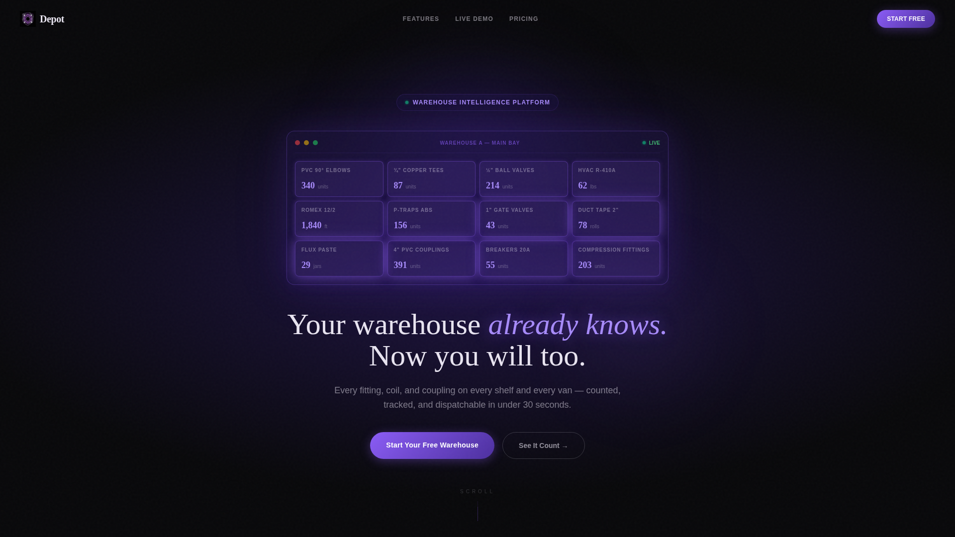
- A dark full-bleed header with a 3D warehouse shelf grid animation and a headline that phases in on load
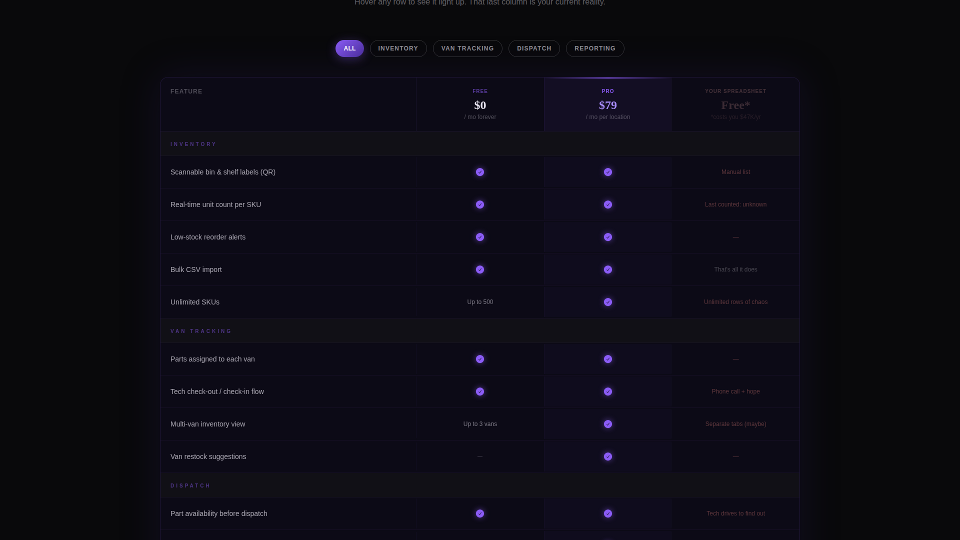
- A three-column comparison table contrasting your free tier, your pro tier, and the visitor's current spreadsheet reality
- A floating bottom bar with a primary call-to-action button and a three-field sign-up form requiring no credit card
Feature list
This section covers the core built-in components that define what Depot delivers out of the box.
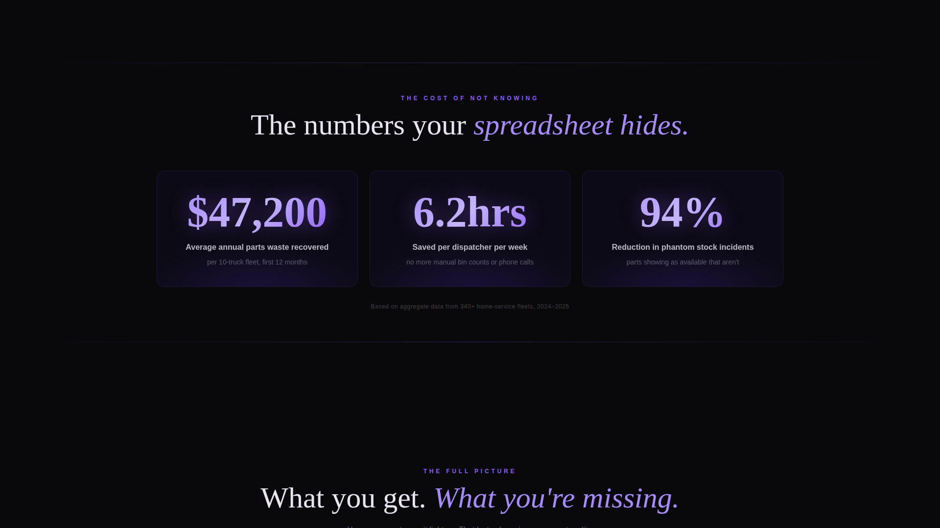
Animated Stat Callouts on Scroll
Three oversized stat blocks open the scroll experience. Each number animates from zero as the section enters the viewport. The stats cover inventory shrink reduction, dispatch time saved, and annual parts waste recovered in dollars.
Three-Column Comparison Table
The comparison table is the page's conversion engine. It stacks your free tier, your pro tier, and a deliberately broken "Your Spreadsheet" column side by side. Each row lights up in electric orchid on hover, and the spreadsheet column stays dim with red-flagged cells to emphasize the gap.
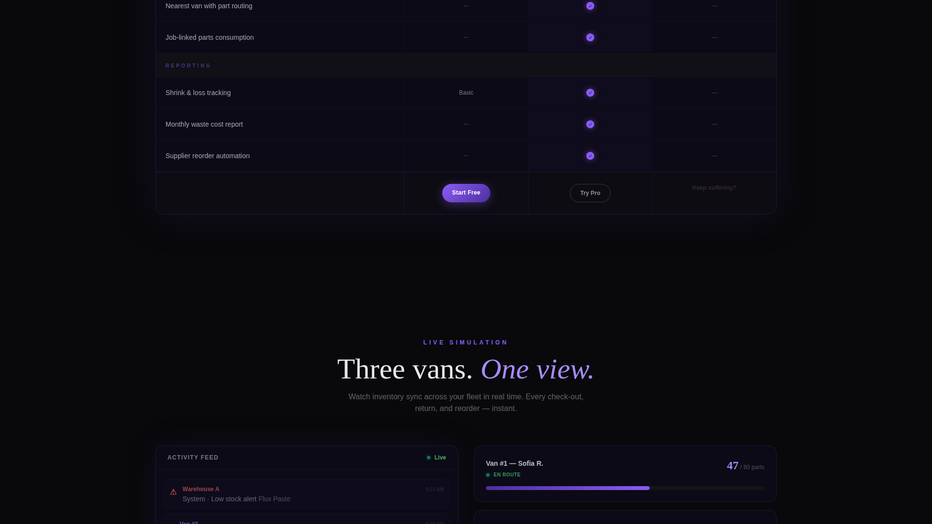
Live-Ticker Van Sync Simulation
A scrollable simulation section shows a mock warehouse syncing inventory across three service vans in real time. The ticker-style display communicates the platform's core value without requiring a live demo environment.
Floating Call-to-Action Bar
After the comparison table, a bottom bar locks into view and stays visible as the visitor continues scrolling. It carries the primary sign-up button and remains accessible without interrupting the reading experience.
Freemium Sign-Up Form
The sign-up form asks for three fields only: company name, number of service trucks via a dropdown (1 to 5, 6 to 15, or 16 and above), and a work email address. No credit card is required at any step.
Secondary Demo Path
A "See It Count" link routes visitors to a 90-second interactive demo. In the demo, visitors drag parts onto virtual shelves and watch the dashboard respond. This path captures visitors who want proof before committing to any form.
Page sections overview
| Section | Purpose |
|---|---|
| Dark Header Hero | Introduce the platform through a glowing 3D warehouse shelf grid and a phasing headline |
| Scroll Stat Block | Deliver three animated impact numbers that open the evidence sequence |
| Comparison Table | Show free tier versus. pro tier versus. spreadsheet reality row by row |
| Van Sync Simulation | Demonstrate live inventory tracking across multiple service vans via a ticker display |
| Floating call to action Bar | Lock the primary sign-up button in view after the comparison table |
| Secondary Demo Link | Offer a no-commitment interactive demo as an alternative conversion path |
| Page-End call to action | Close with a final sign-up prompt reinforcing the free, no-card offer |
Design & branding system
The visual identity runs on a Tech Glass theme using the Void and Violet color system. The palette is built around near-black backgrounds that make every glowing element feel like data materializing from darkness. Glass-morphism panels and violet gradient pulses create depth without adding visual noise.
- Absolute void black (#09090B) for backgrounds, deep interstellar violet (#2D1B69) for gradient layers, electric orchid (#8B5CF6) for hover states and active comparison rows, and frosted glass white (#E8E4F0) for text and surface overlays
- Violet gradients pulse behind key metric blocks; orchid traces every hover, toggle, and active table row
- No stock photography or lifestyle imagery; the interface itself is the visual, with data populating against darkness
Mobile & speed optimization
The layout is structured to remain scannable and functional on smaller screens. The comparison table and floating call-to-action bar are the two most layout-sensitive components, and both are built with responsive stacking in mind.
- The comparison table is designed to scroll horizontally on narrow viewports so all three columns remain visible without collapsing content
- The floating bottom bar adapts to mobile screen widths, keeping the sign-up button reachable without covering critical content
- Scroll-triggered animations are tied to viewport entry, so they fire at the right moment regardless of device height
How this template helps you convert
The page is structured as an escalating evidence sequence. Each section builds the case one layer deeper before the call-to-action appears. By the time the visitor sees the sign-up form, the comparison table has already answered the objections.
- The stat block opens with three numbers that quantify the cost of the current problem, making the visitor's pain concrete and measurable before any feature is mentioned.
- The comparison table then places the platform's free tier directly next to the visitor's broken spreadsheet, making the decision feel obvious rather than effortful.
- The floating call-to-action bar and the secondary demo path offer two exit ramps calibrated to two buyer types: those ready to sign up and those who need one more proof point.
Other information about this template
Depot is built specifically for the home services warehouse management niche, where the buyer is typically a practical, time-pressed operations manager rather than a technical evaluator. The template's language, layout, and conversion flow are all calibrated for that reader.
- The template style is Comparison Table, meaning the central persuasion mechanism is a structured side-by-side layout rather than a feature list or testimonial grid
- The creative direction is Stats-First Impact, so evidence appears before explanation throughout the scroll sequence
- The header concept is Dark Full-Bleed with a glow element, meaning the first impression is atmospheric and data-forward rather than image-led
- The freemium conversion direction means the form is deliberately low-friction: three fields, no credit card, and a secondary demo path for visitors who are not yet ready to commit
Theme
Tech Glass
Creative direction
Stats-First Impact
Color system
Void & Violet
Style
Comparison Table
Direction
Freemium/Trial
Page Sections
Scroll-triggered Stat Callouts
Three-column Comparison Table
Van Sync Live Ticker
Floating Sign-up Bar
Low-friction Freemium Form
Interactive Demo Entry Point
Related questions
What type of business is this template designed for?
Does the sign-up form require a credit card?
What is the 'See It Count' demo path?
Can the comparison table columns and rows be customized?
Why does the template use no photography or lifestyle imagery?