Storecommand - Intelligent Campus Store Landing Page Template
Storecommand is a bento grid landing page template built for higher education online stores. It combines a Data Command visual theme with an AI Iridescent color system to present campus merchandise, real-time inventory, and AI-driven product recommendations in a single, high-impact layout. Designed for bookstore managers, campus marketers, and student organization leaders who need a modern merch portal fast.
by Rocket studio
Quick summary
Storecommand is a single-page bento grid landing page template purpose-built for campus merchandise platforms. It surfaces real-time stock counts, AI-recommended bundles, and persona-driven feature cards inside a dark, iridescent interface. The page is designed to earn a free trial sign-up by letting visitors interact with the product before they commit.
Who this template is for
This template speaks directly to the people managing campus commerce day to day. It is built for operators who know what a crowded SKU spreadsheet feels like and need a storefront that matches the pace of a product launch.
- University bookstore managers handling large product catalogs and live inventory
- Campus marketing directors who need a merch portal that looks current and professional
- Student government officers running limited-edition drops for events like homecoming week
What problem this template solves
Campus stores often run on outdated interfaces that bury products, frustrate shoppers, and make merchandising feel like a manual chore. Storecommand replaces that friction with a command-center layout that surfaces the right product to the right buyer automatically.
- Products go unnoticed when catalog pages are disorganized and unfiltered
- Managers waste time updating merchandise manually with no live inventory visibility
- Student organizations struggle to run time-sensitive drops without a dedicated merch portal
What you get with this template
You get a fully structured bento grid landing page with every major section pre-built and ready to customize. The layout moves visitors from curiosity to conversion through interactive modules, persona toggles, and a lightweight three-step sign-up flow.
- A hero section built around a large product screenshot with animated interaction states
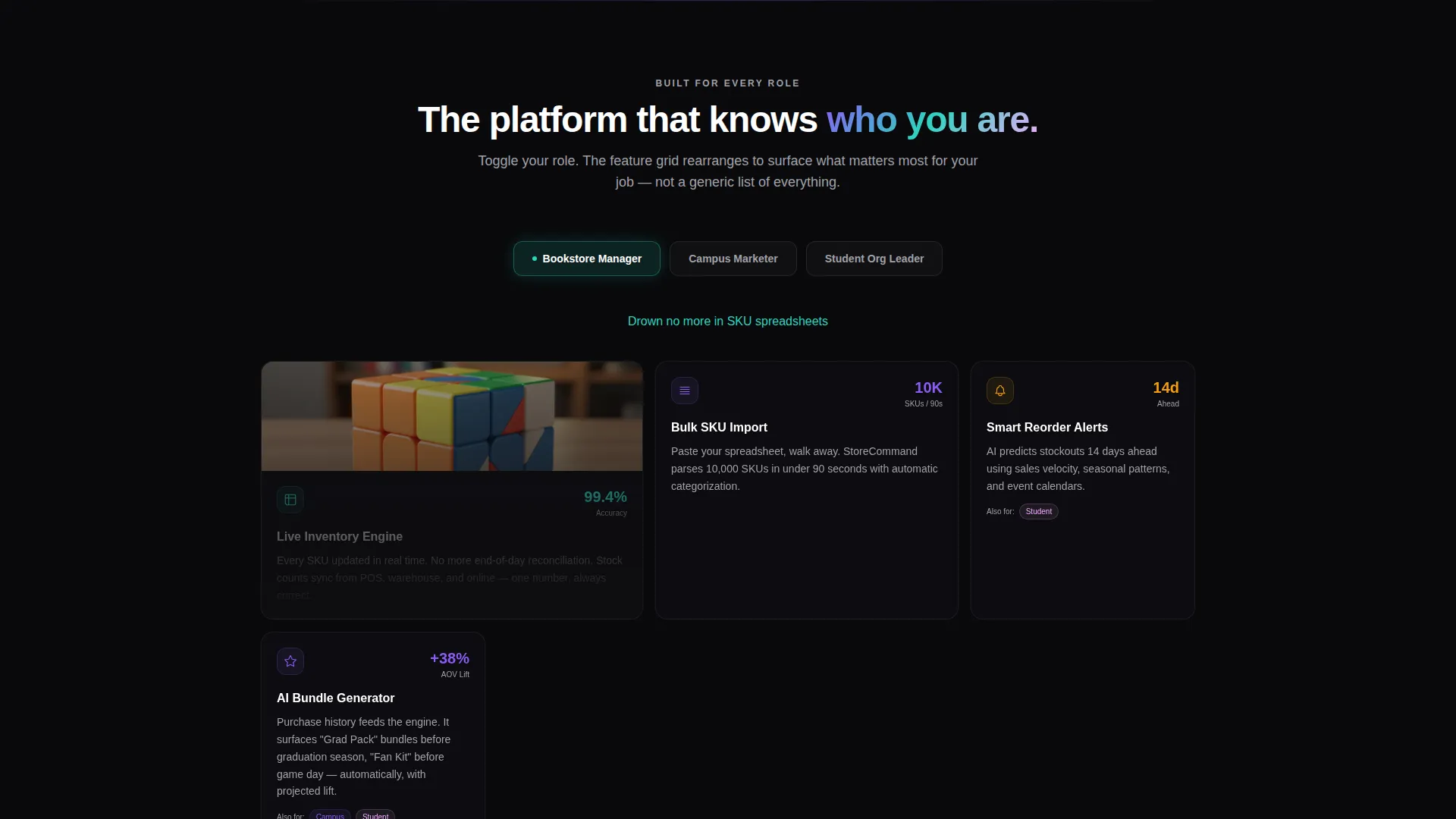
- A persona-switching feature grid that rearranges cards based on the selected visitor role
- A mini product configurator for logo preview rendering directly on merchandise
Feature list
This template packs a focused set of interactive and visual capabilities. Each feature is grounded in the source brief and designed to serve a specific part of the campus store conversion journey.
Bento Grid Feature Cards with Persona Toggle
A dynamic grid of feature cards sits just below the hero. Visitors toggle between "Bookstore Manager," "Campus Marketer," and "Student Org Leader" to surface the capabilities most relevant to their role. The grid physically rearranges to match each persona, making the template feel tailored rather than generic.
Hero Product Screenshot at Scale
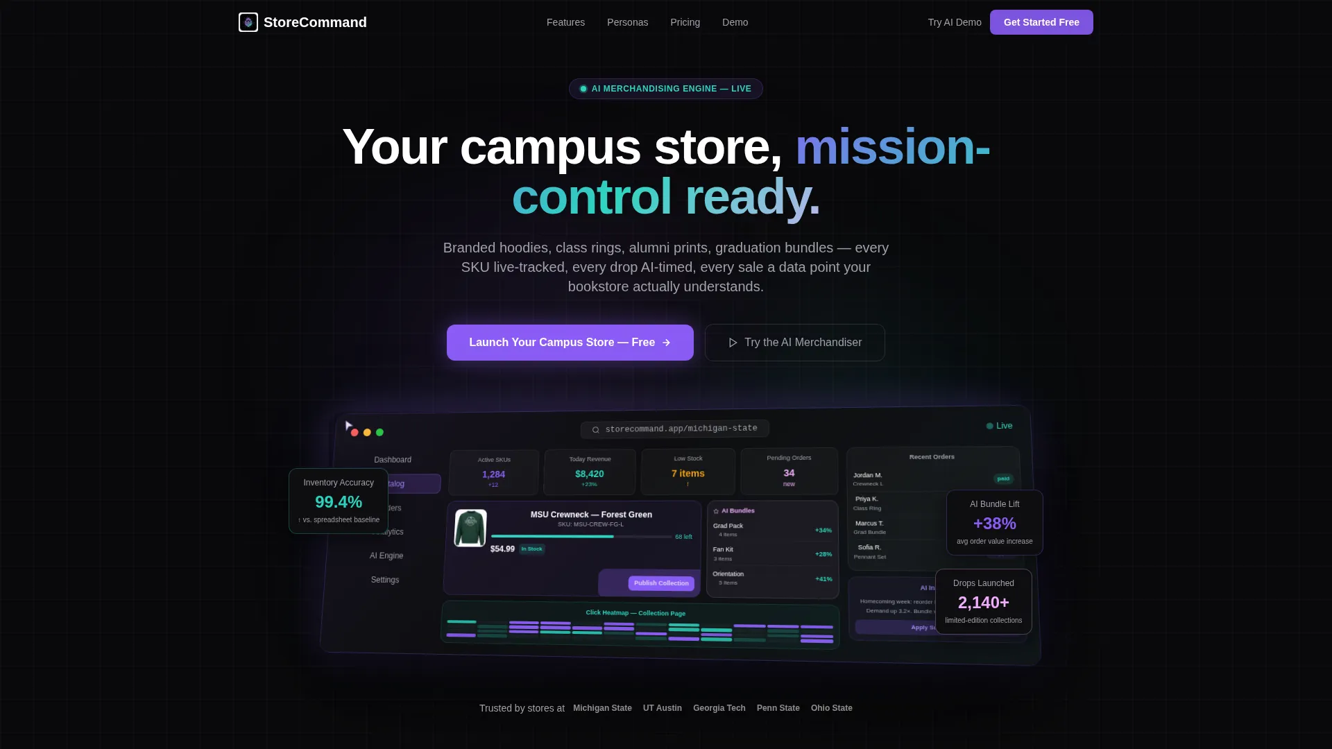
The header uses a blown-up, pixel-perfect product screenshot of the store dashboard mid-session. It shows a university crewneck with a live stock count, a click heat map overlaid on a collection page, and an AI-recommended bundle sidebar. A ghost cursor animates across the screen and triggers a ripple effect when it clicks "Publish Collection."
Mini Product Configurator
Visitors can upload a mock logo and watch it render onto a hoodie in real time. This interactive module gives prospective users a direct taste of the platform's customization capability before they sign up, reducing hesitation at the conversion point.
Freemium Sign-Up Flow
The primary call to action, "Launch Your Campus Store, Free," is pinned to the navigation after the first scroll. A secondary inline call to action, "Try the AI Merchandiser," opens a lightweight demo gated only by a dot-edu email address. The full sign-up form runs three steps with no credit card required.
AI Merchandising Sidebar Preview
The hero screenshot includes a visible sidebar showing AI-recommended bundles generated from purchase history. This preview communicates the platform's intelligent merchandising capability at a glance, before any scrolling or clicking.
Progressive Scroll Reveal
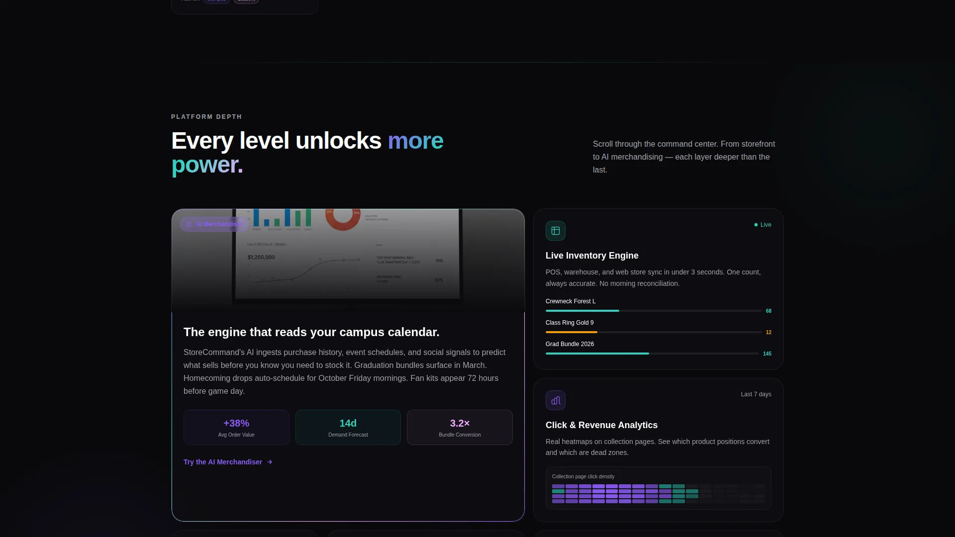
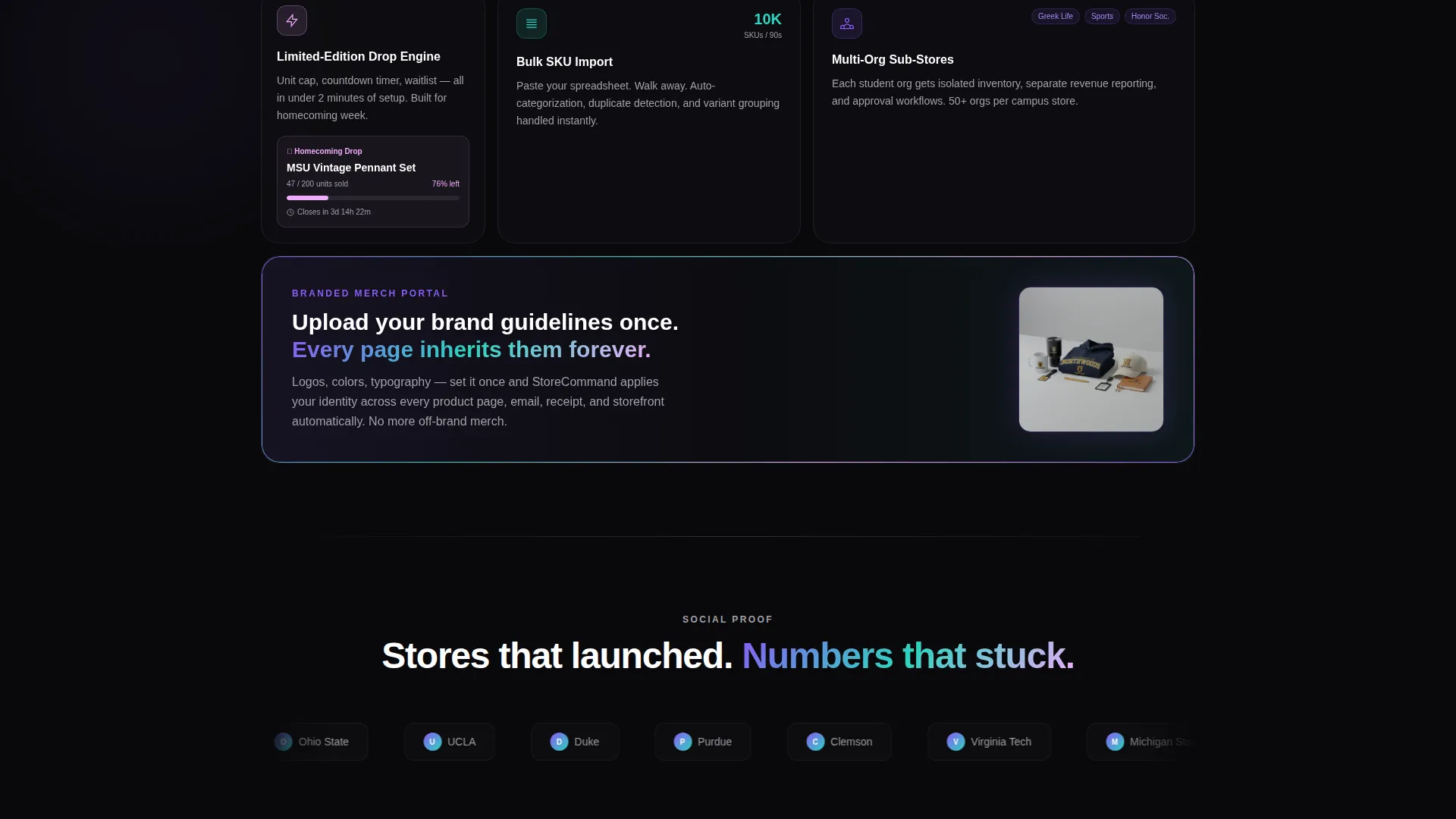
Each section deepens the complexity of the platform story. The flow moves from storefront customization to analytics dashboards to AI merchandising, structured so that each reveal feels like unlocking a new level of capability in a command center.
Page sections overview
| Section | Purpose |
|---|---|
| Hero Dashboard Screenshot | Establishes platform credibility at full visual scale |
| Persona Toggle Grid | Lets visitors filter features by their specific role |
| Product Configurator Module | Delivers hands-on interaction before sign-up |
| Analytics Dashboard Preview | Shows real-time inventory and click-tracking visuals |
| AI Merchandising Section | Highlights bundle recommendations and catalog intelligence |
| Primary Call to Action | Drives free trial sign-up with a pinned nav button |
| Three-Step Sign-Up Form | Converts interest with a low-friction, no-card flow |
Design & branding system
The visual identity follows a Data Command theme using an AI Iridescent color system. The palette feels synthetic and luminous, like a gemstone rotating slowly inside a dark room, each angle catching a different frequency against matte black surfaces.
- Void black (#09090B) as the primary background, holographic violet (#8B5CF6) for primary actions and data highlights, and shifting teal (#2DD4BF) for secondary accents and success states
- Cool zinc (#A1A1AA) handles body text and borders, keeping content readable against the dark base
- A single iridescent gradient (#8B5CF6 to #2DD4BF to #F0ABFC) traces across card edges and hover states like light refracting through a prism
Mobile & speed optimization
The bento grid layout is structured to translate cleanly from desktop to smaller viewports. The interactive modules and persona toggles are built to remain functional and legible across screen sizes.
- Bento grid cards reflow to single or double columns on smaller screens without breaking the layout hierarchy
- Interactive modules including the persona toggle and product configurator are designed for touch and pointer input
- The three-step sign-up form stays compact and tap-friendly at mobile dimensions
How this template helps you convert
Storecommand earns its conversions by letting visitors experience the platform before they commit. The layout is built around progressive trust, with each interactive module lowering the barrier to signing up.
- The animated hero screenshot and live-state product cards immediately communicate that the platform is active and capable, building confidence in the first few seconds of the visit.
- The persona toggle and product configurator give visitors something to do, turning passive browsing into active discovery and making the free plan feel tangible before the sign-up form appears.
- The pinned "Launch Your Campus Store, Free" call to action and the no-credit-card three-step form remove every common objection at the exact moment a visitor is ready to act.
Other information about this template
This template is built specifically for the higher education online store niche, where the buyer journey spans students, alumni, staff, and administrators. A few additional details worth knowing before you use it.
- The template is categorized under Technology with a subcategory of Higher Education Digital Presence
- The Intersection Match Score for this template is 13, reflecting a strong alignment between the Data Command theme and the higher education online store use case
- The freemium conversion model is baked into the layout: the free plan is designed to be generous enough that the upgrade path becomes obvious once a store reaches fifty SKUs
- The dot-edu email verification step in the sign-up flow serves as a lightweight qualifier, ensuring the platform reaches its intended campus audience
- The template style is Bento Grid and the creative direction is Interactive Explorer, meaning the layout prioritizes visitor play over passive reading
Theme
Data Command
Creative direction
Interactive Explorer
Color system
AI Iridescent
Style
Bento Grid
Direction
Freemium/Trial
Page Sections
Persona-switching Bento Grid
Animated Hero Dashboard Screenshot
Real-time Product Configurator
Pinned Freemium Call to Action
Three-step No-card Sign-up Form
Progressive Scroll Reveal Structure
Related questions
Who is this landing page template designed for?
Does this template require a credit card to sign up?
What makes the persona toggle feature useful?
What interactive elements does this template include?
Can I adapt the color system to match my institution's branding?



