E-Commerce Digital Presence Professional Website Template
Storefront is a bold brutalist eCommerce landing page template built for drop-culture brands. It pairs a Midnight Blue color system with hard-cut tab switching, an asymmetric modular card grid, and a two-field early access form. The design earns signups by showing product first and withholding the buy button until visitors join the list.
by Rocket studio
Quick summary
Storefront is a single-page brutalism website design built for curated product drops. It uses a Feature Tab Switcher hero, an asymmetric card grid with stock pulse indicators, a full-bleed brand manifesto interstitial, raw screenshot social proof, and a two-field lead generation form. Every section stacks urgency deliberately, earning the email signup before revealing purchase access.
Who this template is for
This template is built for brands that treat a product drop like a cultural event. The web design favors confidence over convenience, rawness over polish, and exclusivity over mass appeal.
- Trend-driven founders launching limited-run collections who need a brutalist website that converts curiosity into list signups before a product goes live.
- Side-hustle resellers and direct-to-consumer brands who want a brutalism website design that communicates scarcity and edge without a large design budget.
- Creative agency teams and art director leads looking for a bold, high-impact starting point for a client's next project in the fashion or streetwear space.
What problem this template solves
Most eCommerce website design templates push visitors straight to a product page and compete on price. This template flips that process. It withholds the buy button entirely and earns the email address first, turning the landing page into a controlled drop event.
- Conventional templates flatten all products into the same grid, killing the sense of scarcity. This layout uses varied card sizes and stock pulse indicators to restore that urgency.
- Polished, minimalist website design dilutes brand identity for bold labels. This template leans into brutalist elements, raw typography, and high-contrast aesthetics to make the brand feel unavoidable.
- Generic lead forms convert poorly because they ask too early. This template shows product first, builds desire through the scroll, then presents a two-field form at the moment motivation peaks.
What you get with this template
You get a complete, ready-to-edit single-page website built around the launch energy creative concept. Every section is pre-structured and visually intentional, so designers and founders can develop a finished page without starting from scratch.
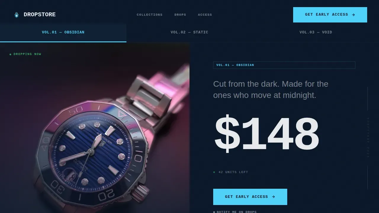
- A Feature Tab Switcher hero with three brutalist collection tabs, oversized mono typography, and hard-cut transitions between product views.
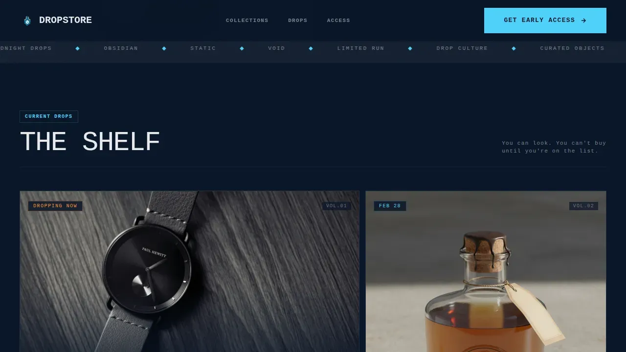
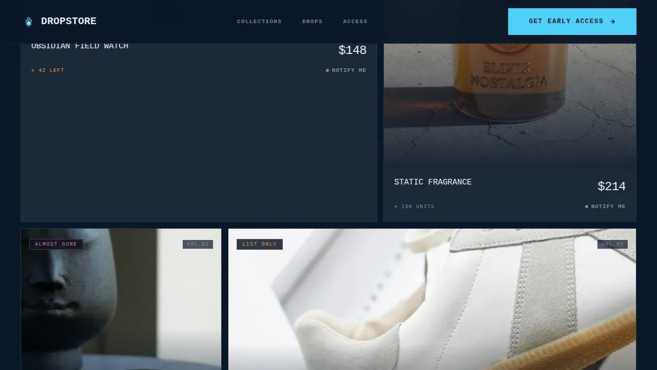
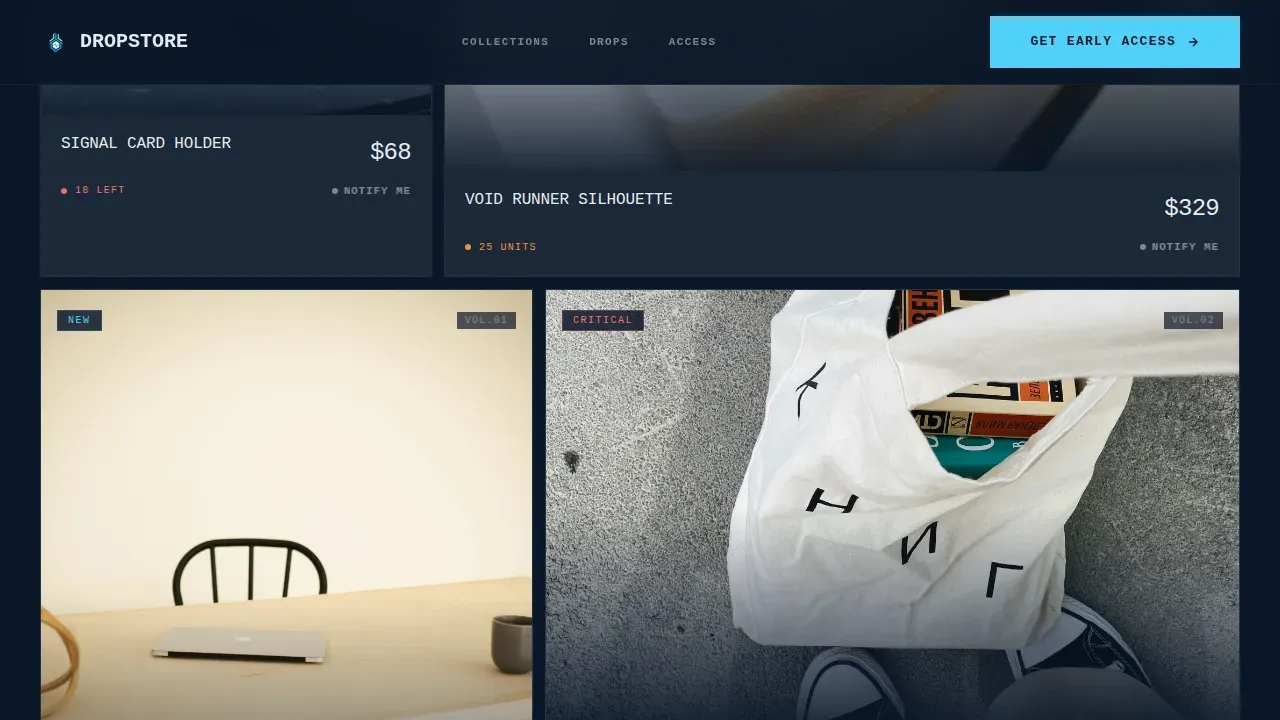
- An asymmetric bento-style card grid with varied card sizes, stock pulse indicators, and per-card "Notify Me on Drops" secondary calls to action.
- A full-bleed interstitial section, raw screenshot social proof grid, two-field early access form, and a minimal centered footer.
Feature list
This template includes six core design and functional features drawn directly from the source brief. Each one is purposeful and prompt-backed.
Feature Tab Switcher Hero
Three brutalist tabs sit across the full viewport width, each labeled with a collection name in oversized mono type. Clicking a tab slams a new product hero into frame with a hard-cut transition, no fade, no ease. The default state loads mid-action: a hand pulling a product from stark packaging against the midnight background.
Asymmetric Bento Card Grid
The product section cascades in a modular, asymmetric grid where each card is a different size. This breaks visual rhythm and forces the eye to hunt across the layout, mimicking the dopamine of browsing a live drop. Each card includes a stock pulse indicator and a quiet "Notify Me on Drops" link beneath the product image.
Full-Bleed Manifesto Interstitial
A single-sentence brand thesis appears mid-page at 120-pixel display size, rendered in raw chalk typography against the abyssal navy background. It acts as a visual reset between the product grid and social proof, reinforcing the brand's identity at maximum typographic weight.
Raw Screenshot Social Proof Grid
Social proof arrives as unpolished, screenshot-style testimonial blocks with visible usernames rather than formatted quote cards. This aesthetic choice aligns with the brutalist design ethos: authenticity over decoration, real voices over manufactured credibility.
Two-Field Early Access Form
The lead generation form asks for an email address and a single-select field for collection interest. Nothing more. Urgency copy surrounds the form to match the countdown atmosphere built by every preceding section. The buy button is withheld until the visitor joins the list.
Floating Mobile Call-to-Action Bar
On mobile, a persistent bottom bar anchored in electric ice keeps the "Get Early Access" call to action visible at all times. This ensures the primary conversion path is never off-screen, regardless of how far a visitor scrolls into the product content.
Page sections overview
| Section | Purpose |
|---|---|
| Feature Tab Switcher | Establishes collections with hard-cut product heroes |
| Asymmetric Card Grid | Showcases products in a varied, urgency-driven layout |
| Manifesto Interstitial | Delivers the brand thesis at full-bleed display scale |
| Social Proof Grid | Presents raw screenshot testimonials with usernames |
| Early Access Form | Captures email and collection interest before purchase |
| Minimal Centered Footer | Closes the page with social icons and copyright |
Design & branding system
The visual identity follows a Midnight Blue color system that feels nocturnal, industrial, and deliberately cool. Typography is split between JetBrains Mono for display and headline use and DM Sans for body copy, pairing mechanical precision with clean readability.
- Color palette: abyssal navy (#0A1628) as the dominant background, gunmetal slab (#1B2838) for card surfaces, electric ice (#4FD1F9) for hover states and interactive accents, and raw chalk (#E8EAED) for all typography.
- Layout: asymmetric brutalist grid with varied card sizes, visible structural shapes, and no decorative gradients or drop shadows that soften the raw edges.
- Animation: GSAP ScrollTrigger drives staggered card reveals, stock pulse effects, tab hard-cuts, and a running marquee to sustain the launch energy atmosphere throughout the scroll.
Mobile & speed optimization
The template is built mobile-first. The persistent floating call-to-action bar means the conversion path is always present on smaller screens, anchored in electric ice so it reads instantly against the dark background. Desktop delivers the full flagship-store experience with wider asymmetric grid proportions.
- GPU-accelerated CSS transforms power all animations, keeping motion smooth without taxing the render pipeline.
- Native CSS smooth scroll handles page navigation, avoiding heavy JavaScript scroll libraries.
- Minimal decorative graphics keep the page focused on product imagery and bold typography, which also reduces the total asset weight per web page view.
How this template helps you convert
The page is engineered around a single conversion goal: the email signup. Every design and layout decision serves that goal rather than competing with it.
- Product is shown first and framed as scarce. The tab switcher, card grid, and stock indicators build desire before any form appears, so visitors arrive at the call to action already motivated.
- The buy button is intentionally absent. Visitors can view every product but cannot purchase until they join the list, making the signup feel like access rather than interruption.
- The floating mobile call-to-action bar and the two-field form minimize friction at the moment of commitment, keeping the path from interest to signup as short as possible for a better user experience.
Other information about this template
This template sits at the intersection of brutalism in web design and drop-culture eCommerce. Understanding that context helps designers get the most out of it and helps buyers understand why it looks the way it does.
- The history of brutalism as a movement stretches back to architecture, where the term comes from the French phrase "béton brut," meaning raw concrete. The brutalist style that peaked in the 1950s and 1960s prized raw materials and structural honesty over decoration.
- Web brutalism carried those ideas into the online world, initially emerging as a reaction against the polished, minimalist aesthetics dominating today's web design. Many designers saw it as a way to restore authenticity and simplicity.
- The younger generation of consumers, particularly those in the 18-to-28 bracket, has embraced brutalism website aesthetics because the rawness feels honest. Brutalist design conveys a rebellious personality that resonates with audiences who distrust over-produced brand identities.
- Well-known examples in the broader web brutalism space include Craigslist, which has maintained its blunt, function-first layout for decades, and Studio Push, which uses a brutalist style to project a strong creative personality. Portfolio website examples like those by Kurt Champion and Jeremy Baxter show how bold typography and high-contrast schemes can make personal work stand out. Balenciaga's website applies brutalism at a fashion-brand scale, using simple color choices and straightforward navigation.
- An art director or graphic design team looking for inspiration for their next project will find this template a strong starting point, particularly for fashion, streetwear, or limited-edition product categories.
- If you plan to redesign an existing store or develop a new drop-culture brand from the ground up, this template provides the structural ideas, visual tools, and section order to get there efficiently.
- The concept of brutalist website design is not limited to a portfolio website or a creative agency context. As this template demonstrates, it translates powerfully into eCommerce when the brand identity demands it.
Theme
Bold Brutalist
Creative direction
Launch Energy
Color system
Midnight Blue
Style
Card Grid (Modular)
Direction
Lead Generation
Page Sections
Feature Tab Switcher Hero
Asymmetric Bento Card Grid
Full-bleed Manifesto Interstitial
Raw Screenshot Social Proof Grid
Two-field Early Access Form
Persistent Mobile Call-to-action Bar
Related questions
Is this template suitable for a brand that sells physical products?
Can I use this template without a developer?
Why does this template hide the buy button?
What makes this a brutalist design rather than just a dark-themed template?
How many collection tabs does the hero section include?



