Online Skill Courses Advanced Portfolio Website Template
Storefront is a single-column landing page template built for an online course that teaches parents how to launch a Shopify store during stolen quiet hours. It combines animated stat counters, real student case studies, and a frictionless email capture form to turn curious visitors into enrolled learners, one bedtime story at a time.
by Rocket studio
Quick summary
Storefront is a single-column flow landing page designed for a Shopify store setup online course aimed at busy parents. The page leads with bold animated metrics, moves through three real student case studies, and closes with a simple email capture. Every section builds trust before asking for commitment, making the path from visitor to enrolled parent feel natural and earned.
Who this template is for
This template speaks directly to parents who carry a business idea but cannot find a full day to act on it. It is built for course creators who want to sell to that exact audience without relying on polished corporate design.
- Stay-at-home parents exploring a side income from a hobby or handmade product
- Couples weighing whether an online store could reduce financial pressure on the family
- Course creators and educators teaching practical e-commerce skills to time-limited students
What problem this template solves
Most online course landing pages either feel too corporate for a family audience or too casual to earn trust. This template solves that tension. It proves results first through real numbers, then proves humanity through real student stories, so the visitor's skepticism softens before the call to action ever appears.
- Parents dismissing the idea because they assume they need large blocks of free time
- Visitors who need social proof before they hand over an email address
- Course creators struggling to communicate that short, irregular sessions are genuinely enough to start
What you get with this template
The template delivers a complete, ready-to-customize single-column landing page. Every section has a defined job, from the opening metric burst to the final email form, and each one flows into the next with a clear narrative logic.
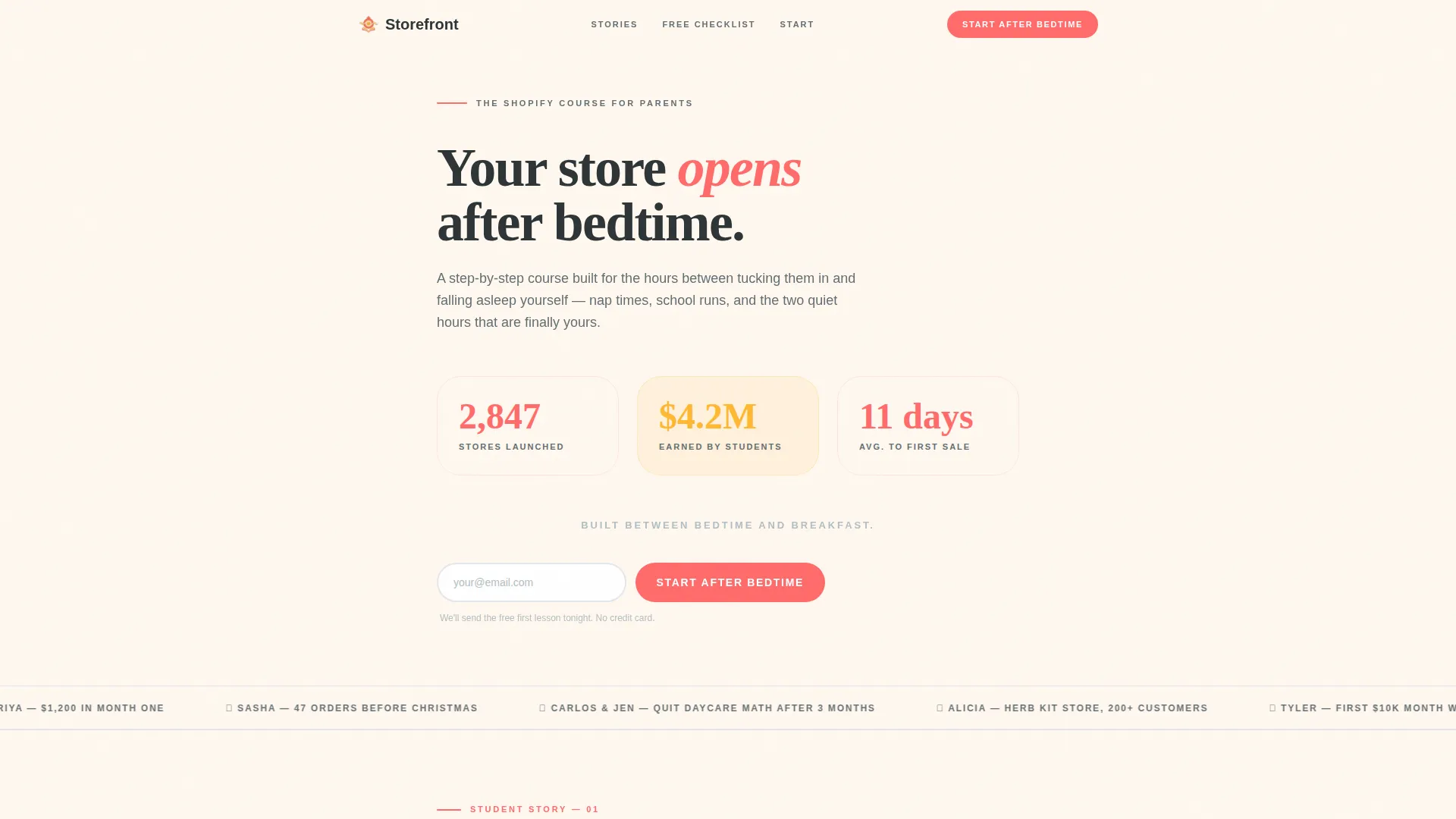
- An animated stats header with three counters showing stores launched, total student earnings, and average days to first sale
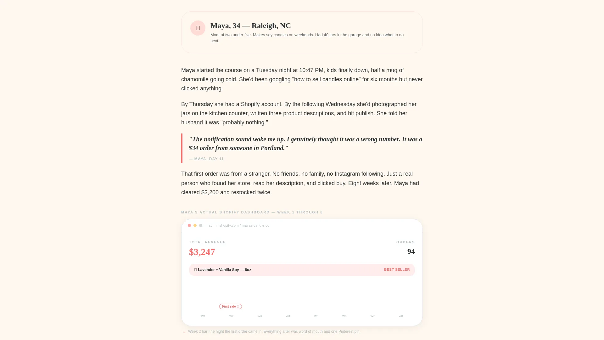
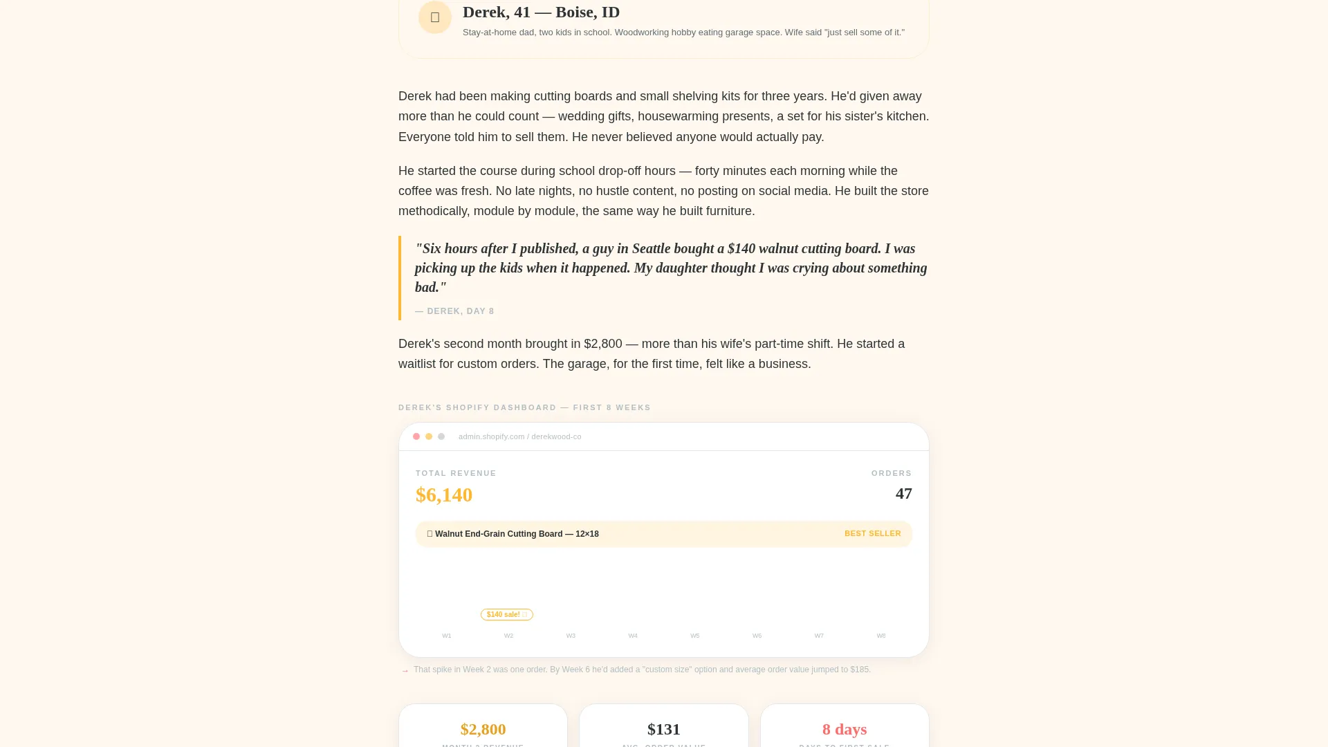
- Three sequential case study sections, each featuring a named parent, a family context line, a store journey narrative, and embedded Shopify dashboard screenshots with coral annotations
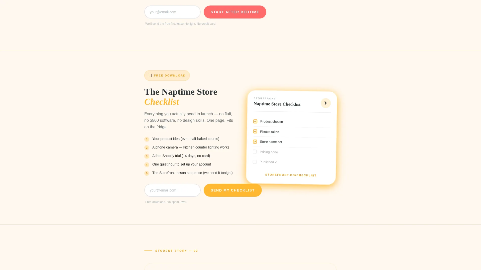
- Two email capture placements: one beneath the header stats and one mid-page gated lead magnet offering a downloadable checklist
Feature list
This section describes the core built-in components that make the template work as a lead generation landing page for a Shopify store setup course.
Animated Metric Counters Header
Three large counters tick upward on page load against the warm white background. The numbers display stores launched, total student earnings, and average days to first sale. They are set in oversized coral and marigold type to feel celebratory rather than clinical.
Sequential Case Study Sections
Three scroll sections each introduce a real student by first name and family situation. Each section walks through a store journey, including what the student sold, what worried them, and the moment their first order arrived. Shopify dashboard screenshots with coral annotation overlays are embedded directly in each case study.
Dual Email Capture Forms
The primary call-to-action form sits beneath the header stats and repeats after each case study. A secondary mid-page placement offers a downloadable checklist as a softer entry point. Both forms use a single email field with a reassuring subline in charcoal body text.
Dopamine Pop Color System
Electric coral drives all primary buttons and testimonial cards. Sunny marigold marks milestone stats and progress indicators. Warm white keeps the background open and relaxed, while charcoal grounds all body text for clear readability without corporate stiffness.
Case Study Narrative Flow
The page is structured so each new parent story delivers a larger outcome than the last. This deliberate escalation shifts the reader's internal voice from curiosity to confidence as they scroll, making the final call to action feel like a logical next step rather than a push.
Downloadable Lead Magnet Block
A mid-page section presents a PDF checklist called "The Naptime Store Checklist" as a tangible, low-commitment offer. It is gated behind the same single email field, giving hesitant visitors a reason to convert without requiring full course enrollment intent.
Page sections overview
| Section | Purpose |
|---|---|
| Animated Stats Header | Opens with three metric counters to establish credibility immediately |
| Primary call to action Block | Captures email beneath the header with a single-field form |
| Case Study One | Introduces the first student story with dashboard screenshots |
| Mid-Page call to action | Repeats the primary email form after the first case study |
| Lead Magnet Block | Offers the checklist PDF as a softer mid-page conversion path |
| Case Study Two | Builds on the first story with a slightly larger student outcome |
| Post-Story call to action | Reinforces the primary call to action after the second case study |
| Case Study Three | Delivers the largest outcome story to peak reader confidence |
| Final call to action Block | Closes the page with the primary email form and course enrollment prompt |
Design & branding system
The visual identity follows a Family First theme executed through a Dopamine Pop color palette. The overall feeling is warm and personal, like a finger painting pinned to a kitchen fridge rather than a polished agency deck. No stock photography appears anywhere on the page; the data and stories carry the visual weight.
- Warm white (#FFF8F0) base background keeps the layout open and easy to read
- Electric coral (#FF6B6B) dominates buttons, testimonial card backgrounds, and annotation overlays
- Sunny marigold (#FFB830) highlights counters, milestone markers, and progress-style indicators
- Grounding charcoal (#2D3436) anchors all body text and supporting sublines for clear contrast
Mobile & speed optimization
The single-column flow layout is inherently suited to small screen viewing, where most busy parents are likely to land. The vertical scroll structure means every section stacks cleanly without horizontal overflow or layout collapse.
- Single-column structure removes the need for complex responsive breakpoints
- Large tap-friendly buttons and a minimal one-field form reduce friction on touch devices
- No hero image or heavy media in the above-the-fold section keeps the initial view fast to render
How this template helps you convert
The page is engineered around a deliberate trust-building sequence. Each section earns the next click rather than demanding it, which matters for an audience that is skeptical about time commitments and online promises.
- The animated stats header proves results before the visitor reads a single line of course copy, replacing skepticism with curiosity in the first three seconds of the visit.
- Each case study section deepens emotional resonance by matching the student's family situation to the visitor's own, making the idea of starting feel personal and realistic rather than abstract.
- The dual-path conversion structure, with a primary enrollment form and a mid-page checklist download, gives both ready-to-commit and still-considering visitors a reason to leave their email address.
Other information about this template
This template was designed specifically for the Shopify store setup online course niche, where the target student is a time-constrained parent rather than a full-time entrepreneur. The content structure and visual language work together to reinforce that the course fits real family life.
- The template is built as a single-column flow landing page, making it straightforward to edit section by section without disrupting the overall layout
- The case study narrative approach is intentional: it positions the course as something real people with real constraints have already completed successfully
- The checklist lead magnet is positioned mid-page to serve visitors who need a tangible first step before committing to full email enrollment
- The "Start After Bedtime" call-to-action language is embedded in the template as the primary button text, directly addressing the time-scarcity concern of the target audience
- This template is a strong fit for course creators using platforms like Shopify as the subject matter for their curriculum, particularly when the student persona centers on family priorities and side-income goals
Theme
Family First
Creative direction
Case Study Narrative
Color system
Dopamine Pop
Style
Single Column Flow
Direction
Lead Generation
Page Sections
Animated Metric Counters Header
Sequential Case Study Sections
Dual Email Capture Forms
Dopamine Pop Color System
Downloadable Lead Magnet Block
Case Study Narrative Escalation
Related questions
Can I customize the student case studies with my own course graduates?
Does the template include working email capture functionality?
What makes this template different from a standard course landing page?
Is the checklist download section separate from the main enrollment form?
Can this template be adapted for a course on a topic other than Shopify stores?



