Advanced E-Commerce Digital Presence Professional Website Template
The Storefront Startup Velocity eCommerce landing page template is a dashboard-style, spec-sheet-designed landing page built for solo DTC founders, Shopify migrants, and small dev agencies. Drop in a product photo and watch a complete storefront materialize with cart logic, inventory hooks, and checkout flows already wired. Fast. Focused. Ready to launch before your espresso cools.
by Rocket studio
Quick summary
This template delivers a high-converting ecommerce landing page with a machined, technical aesthetic. It presents your storefront as a fully realized product from the first scroll. The page uses a dashboard hero, a spec-sheet content flow, a feature comparison section, and a two-step lead capture modal to convert visitors into store-launch sign ups efficiently.
Who this template is for
This ecommerce landing page is purpose-built for people who need to move fast and launch clean. It solves real problems for a specific kind of builder: someone who knows what they want to sell and needs the page to prove it.
- Solo DTC founders and bootstrappers launching a first or second online store on a tight timeline
- Shopify migrants who have outgrown their existing themes and want a sharper, faster landing page design
- Small development agencies spinning up client ecommerce storefronts under Friday-deadline pressure
What problem this template solves
Building a credible ecommerce landing page from scratch takes days. Most builders spend that time wrestling with layout decisions instead of writing compelling copy or sourcing high quality images. This template solves exactly that. It hands you a structured, conversion-ready page design so you can focus on your product and your message, not your markup.
- Founders waste hours on landing page design that should take minutes, while competitors ship faster
- Generic ecommerce products pages fail to communicate a clear value proposition, hurting conversion rates and raising the bounce rate
- A cluttered, slow, or vague page drives away potential customers before they ever see the product's features
What you get with this template
An ecommerce landing page is a dedicated webpage designed to convert visitors into customers. This template gives you a complete, scroll-driven page that covers every conversion touchpoint from hero to checkout. Each section is built with a specific purpose: communicate value, build trust, and move visitors toward a single action.
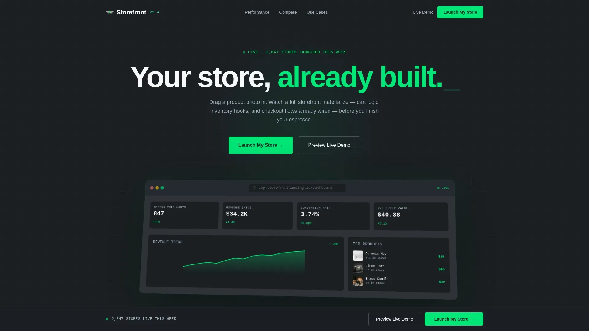
- A full-width browser-chrome dashboard hero section with isometric tilt, live metric cards, and a fade-in headline that communicates your value proposition immediately
- A data-grid spec sheet flow with scroll-linked reveals, performance benchmarks, a feature comparison table, and social proof elements including founder testimonials
- A sticky bottom bar with a primary "Launch My Store" call to action and a ghost-button demo path, plus a two-step lead capture modal for sign ups
Feature list
This ecommerce landing page template ships with a precise set of built-in capabilities. Every feature listed below is drawn directly from the template design and interaction specifications.
Dashboard Hero with Isometric Tilt
The hero section opens with a full-width, browser-chrome-framed render of a live storefront dashboard. Real metrics are displayed: order counts, revenue figures, and a conversion-rate sparkline trending upward. The screenshot sits at a barely-there isometric tilt, casting a soft shadow onto the titanium background. This approach gives visitors a clear, immediate view of the product in action, using compelling visuals to communicate what the storefront engine delivers before a single word is read.
Spec-Sheet Data Grid Content Flow
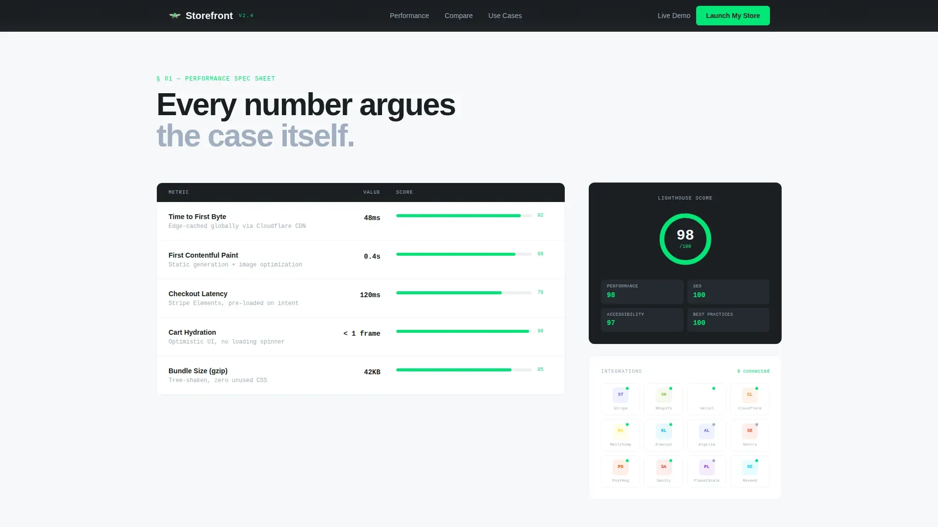
The page design turns scrolling into a technical teardown. Each content row inventories a single capability: response time in milliseconds, a Lighthouse score displayed as a live gauge, and integrations shown as a logo matrix with connection-status dots. This landing page design pattern treats the entire page as a spec document. Every number quietly argues the case. Visitors who want to skip ahead to specific data can scan the grid without losing the main message.
Feature Comparison Table
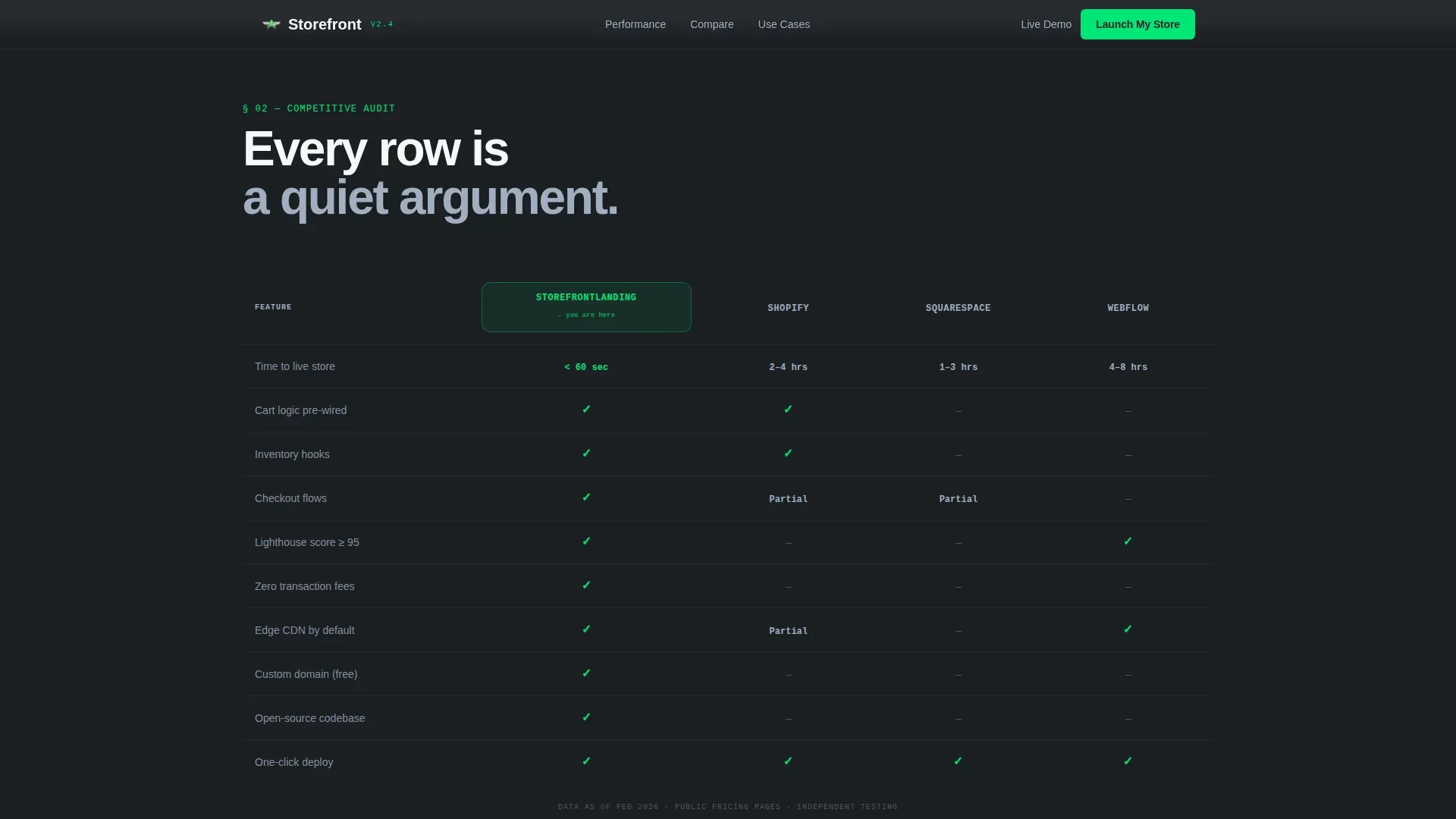
A dedicated section pits this template directly against three named competitors using a structured comparison table. Electric-green checkmarks mark where this template wins. This approach helps potential customers make a fast, informed decision. It functions as a clear value proposition in table form, making the unique selling point visible at a glance without requiring persuasive copy to carry the load alone.
Two-Step Lead Capture Modal
The primary call to action, "Launch My Store," opens a two-step modal. Step one collects store name and product category via dropdown. Step two captures email address and expected launch month. This focused flow keeps sign ups clean and avoids overwhelming visitors with too many fields at once. The modal design removes distractions and focuses each visitor on a single conversion action.
Sticky Bottom Bar with Dual call to action Path
After a visitor scrolls past the performance benchmarks, a sticky bottom bar activates. It holds the primary "Launch My Store" button and a ghost-button "Preview Live Demo" option beside it. The demo path offers a low-friction entry, giving visitors a way to experience the template before committing. An email gate on demo entry means even tire-kickers generate leads for the funnel.
Social Proof and Testimonial Section
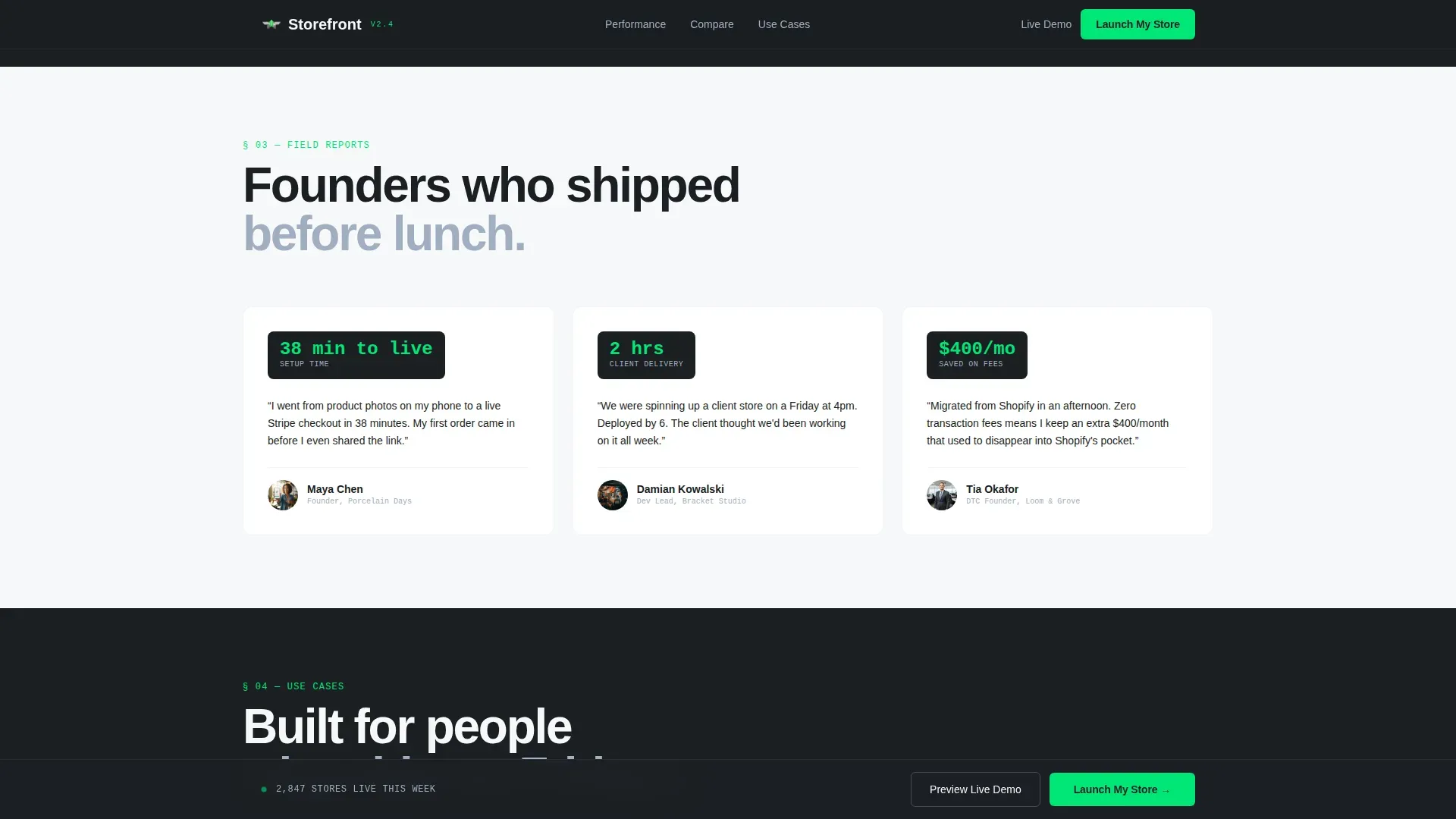
The social proof section surfaces founder testimonials with company names and specific metrics. Trust signals like customer testimonials are essential for building credibility. This section functions as a trust building layer that helps potential customers feel confident about moving forward. Social proof elements presented with real numbers and named sources carry more weight than generic reviews.
Page sections overview
| Section | Purpose |
|---|---|
| Dashboard Hero | Communicate value with a live-metric storefront mockup and fade-in headline |
| Performance Specs Grid | Display response time, Lighthouse score, and integration status as scannable data rows |
| Feature Comparison Table | Compare this template against competitors using electric-green checkmarks |
| Social Proof Block | Showcase founder testimonials with company names and real performance metrics |
| Use Case Bento Grid | Present three target user profiles in an asymmetric layout for fast audience identification |
| Sticky call to action Bar | Pin "Launch My Store" and "Preview Live Demo" actions after the benchmark scroll point |
| Two-Step Launch Modal | Capture store name, product category, email, and launch month across two focused steps |
| Single-Row Footer | Close the page with a minimal, linear footer pattern |
Design & branding system
This template runs on a Monochrome Steel color system. The palette is tight and intentional: gunmetal dark at hex #1B1F23 provides the base, brushed aluminum at hex #A0AEC0 handles secondary text and borders, and titanium white at hex #F7F8FA defines the background surface. One electric-green accent at hex #00E676 is reserved exclusively for calls to action, live-status indicators, and hover states. Typography pairs DM Sans for body copy with JetBrains Mono for data labels and metrics. The result is a sleek design that feels machined and precise, with zero ornamentation.
- Color system: Monochrome Steel with gunmetal, aluminum, titanium, and a single electric-green accent for all active states
- Typography: DM Sans for readable body paragraphs and JetBrains Mono for metric displays, data labels, and spec values
- Visual style: technical spec-sheet aesthetic with high white space discipline, compelling visuals, and scroll-linked animation reveals
Mobile & speed optimization
Mobile optimization is critical for ecommerce landing pages. Over 70% of online shopping starts on mobile devices, which means a page that looks sharp on a 27-inch monitor must also deliver a seamless experience on a 6-inch screen. This template is built desktop-first for the dashboard hero experience, and fully responsive for all other sections. The architecture uses server components for static content and client-only rendering for interactive elements, keeping the page lean and able to load fast under real-world conditions.
- Responsive layout: the hero dashboard, data grid, comparison table, and bento grid all reflow cleanly across screen widths on mobile devices
- Performance architecture: static sections use server components to reduce client-side JavaScript overhead, helping the page load fast and keeping bounce rate low
- Interactive components: the sticky bar, two-step modal, and demo email gate are client-rendered only where necessary, so the rest of the page stays snappy
How this template helps you convert
A good ecommerce landing page loads fast, shows the product clearly, and has one strong call to action. This template is designed around exactly those principles. It does not try to do everything. It focuses on one goal: getting a founder or agency to commit to launching. Every section earns its place by moving a visitor one step closer to that action.
- The hero section delivers a clear value proposition above the fold, backed by real-looking metrics and compelling visuals, so visitors land and immediately understand what the product does and why it matters for their online store.
- The spec-sheet scroll flow builds trust signals systematically: performance data, integration proof, feature comparisons, and customer testimonials all stack evidence before the call to action ever appears, which keeps conversion rates high by giving visitors reasons to believe rather than reasons to hesitate.
- The sticky bar and two-step modal create a low-friction conversion path that generates leads without forcing a hard sell upfront, giving visitors a demo option that still captures email on entry so every interaction has value.
Other information about this template
This section covers additional context about what makes a strong ecommerce landing page, the kinds of page design patterns this template draws inspiration from, and a few best practices that align with how this template is built.
- A landing page is a standalone web page created specifically for a marketing or advertising campaign. This template is designed as a single landing page with one focused conversion goal, not a multi-page site with competing destinations.
- A good ecommerce landing uses clear calls to action, high quality images, and social proof to convert visitors. This template follows that structure with its hero, comparison, and testimonial sections.
- Effective ecommerce landing pages remove distractions like navigation menus to keep visitors focused. This page design removes other pages links and unnecessary navigation, following landing page best practices to avoid overwhelming visitors.
- Startup velocity in ecommerce refers to how quickly a new online business reaches key milestones such as launching a store and acquiring customers. A well-designed landing page template accelerates a startup's velocity by reducing development time from weeks to hours.
- Sales velocity metrics in ecommerce include traffic volume, conversion rate, average order value, and length of the sales cycle. This template's spec-sheet sections present those kinds of metrics visually, making the value proposition tangible.
- The Collection/Category Landing Page is a recognized ecommerce landing page example that showcases a curated collection using a grid layout with strong visuals. This template's product grid in the hero dashboard follows a similar product pages pattern.
- An above-the-fold call to action should be an impossible-to-miss button. The hero section and sticky bar in this template both follow that principle with clear calls to action.
- Templates allow for accelerated time-to-market, enabling immediate deployment of landing pages for market demand testing. This template supports iterative use, making it easy to create new pages for different campaigns or product categories.
- Good landing page templates can boost conversion rates by 55% or more through the use of clear calls to action, social proof, and distraction-free layouts. This template is built to target those same levers.
- A few best practices covered by this template: use compelling copy to communicate key benefits early, use trust signals to reduce friction, and use white space to avoid overwhelming visitors with dense content blocks.
- Effective ecommerce landing pages are integral to maximizing your online store's revenue and customer engagement. This page is built to drive sign ups, generate leads, and help a founder convert visitors from the moment they arrive.
- The f pattern and z pattern are common reading patterns on landing pages. This template's layout is structured so the most important value proposition, calls to action, and social proof elements fall naturally within those visual scan paths.
- This template draws inspiration from spec-sheet user interface patterns common in technical product marketing, where every section presents data that quietly argues the case rather than relying on persuasive copy alone.
- Using the right high quality images and compelling visuals can significantly boost conversions on landing pages. The hero image in this template uses a rendered dashboard screenshot with real product thumbnails and live metrics for exactly that effect.
- The Storefront Startup Velocity eCommerce landing page template is classified under the Technology category with an E-Commerce Digital Presence subcategory, making it a strong fit for founders and agencies building in the direct-to-consumer ecommerce space.
- Zola is an ecommerce landing page example known for simplifying a complex buying decision with a clean, focused page. Netflix's landing page is another landing page example that communicates its value proposition with minimal design. Both are useful references when thinking about how landing page design choices affect trust building and sign ups.
- Organic traffic from search can land on this page just as effectively as paid traffic. The landing page design supports both entry points by making the value proposition and calls to action clear from the first view, regardless of how a visitor arrived.
- Security badges and trust signals are important social proof elements on any ecommerce landing page. This template includes space for social proof elements including founder testimonials and metric-backed case references that give potential customers confidence before they commit.
- Common pain points for ecommerce founders include slow setup, unclear value propositions, and low conversion rates. This template addresses those common pain points directly through its fast-load architecture, above-the-fold messaging, and structured trust building flow.
- A sales landing page is designed for one goal. This template is exactly that: a specific page built around a single conversion action, keeping the main message tight and giving visitors one clear path forward.
- Bullet points, short paragraphs, and faq sections are known to improve readability and reduce bounce rate on landing pages. This template's page design incorporates all of those elements across its content sections.
Theme
Startup Velocity
Creative direction
Spec Sheet
Color system
Monochrome Steel
Style
Dashboard/Data Grid
Direction
Lead Generation
Page Sections
Dashboard Hero with Isometric Tilt
Spec-sheet Data Grid Scroll Flow
Feature Comparison Table
Two-step Lead Capture Modal
Sticky Bottom Bar with Dual Call to Action
Social Proof and Founder Testimonials
Related questions
Can I use this template for a product launch without technical experience?
Does this ecommerce landing page template support mobile devices?
What makes this landing page design different from a standard ecommerce theme?
How does the two-step modal capture leads without adding friction?
Can this template be used to generate leads for multiple product categories?



