Luxe Jewelry Landing Page Template for Preppy Brands
Strand is a luxe minimal landing page template built for preppy jewelry brands. A masonry grid organizes products by life moment rather than category, drawing visitors through a curated scroll that feels like a photo album. The dark full-bleed hero, Soft Mist color palette, and brushed gold accents create an atmosphere that earns the click through curation, not pressure.
by Rocket studio
Quick summary
Strand is a single-page masonry landing page designed for elevated jewelry brands with a coastal, old-money sensibility. Products are organized by life moment rather than category, giving the page a narrative feel. A dark hero photograph, a restrained Soft Mist palette, and brushed gold details work together to build quiet desire from the first scroll.
Who this template is for
This template suits independent jewelry brands and boutique designers who sell to a lifestyle-conscious audience. It works especially well when the product story is as important as the product itself.
- Jewelry brands targeting gifting occasions such as graduation, weddings, or milestone birthdays
- Designers whose pieces speak to a preppy, coastal, or old-money aesthetic
- Founders who want a single polished page that routes visitors straight to purchase without form friction
What problem this template solves
Most product landing pages treat jewelry like inventory. They list by category, sort by price, and miss the emotional reason someone buys a pearl bracelet or a gold toggle. Strand fixes that by replacing category grids with moment-driven clusters that mirror how buyers actually think.
- Visitors land on a page that feels curated, not catalogued, which builds brand trust faster
- Each life-moment cluster connects product to occasion, reducing the mental work of gift selection
- The click-through design removes friction between discovery and purchase by routing every card directly to the product detail page
What you get with this template
Strand delivers a fully structured single-page layout with a clear visual hierarchy and a built-in content strategy baked into the grid. Every section has a defined purpose and a defined visual role.
- A dark full-bleed hero section with animated headline text and a secondary tagline
- A moment-driven masonry grid with lifestyle photography clusters and staggered product cards
- A sticky bottom bar that appears after the first scroll, offering a secondary path to the full catalog
Feature list
A single paragraph introduces how the features combine to create a cohesive experience. Each feature below is a distinct, prompt-backed capability of the Strand template.
Dark Full-Bleed Hero with Animated Headline
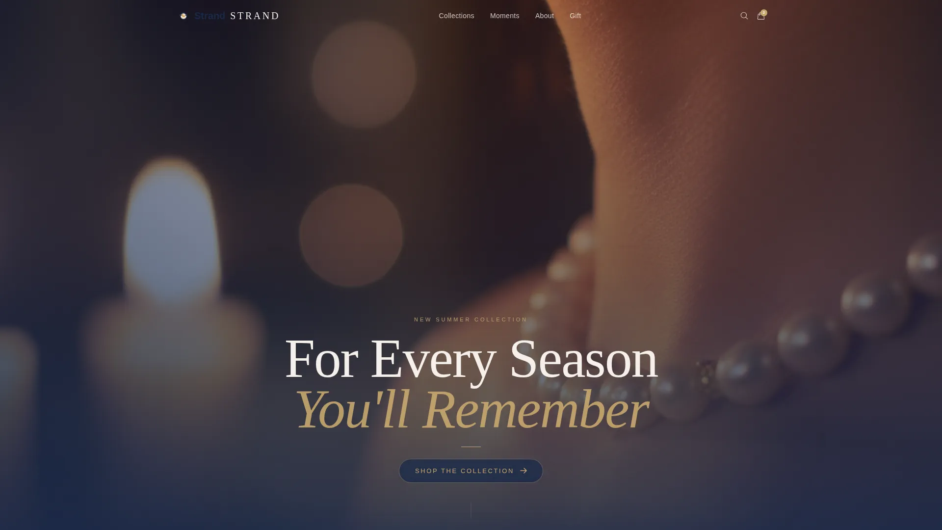
The hero section opens with a near-darkness photograph, a candlelit collarbone and pearl choker that stops the scroll before it starts. After a brief pause, a thin gold sans-serif headline fades in, followed by a fog-gray secondary line. The effect mirrors a jeweler's window at dusk, warm and intimate without a word of urgency.
Moment-Driven Masonry Grid
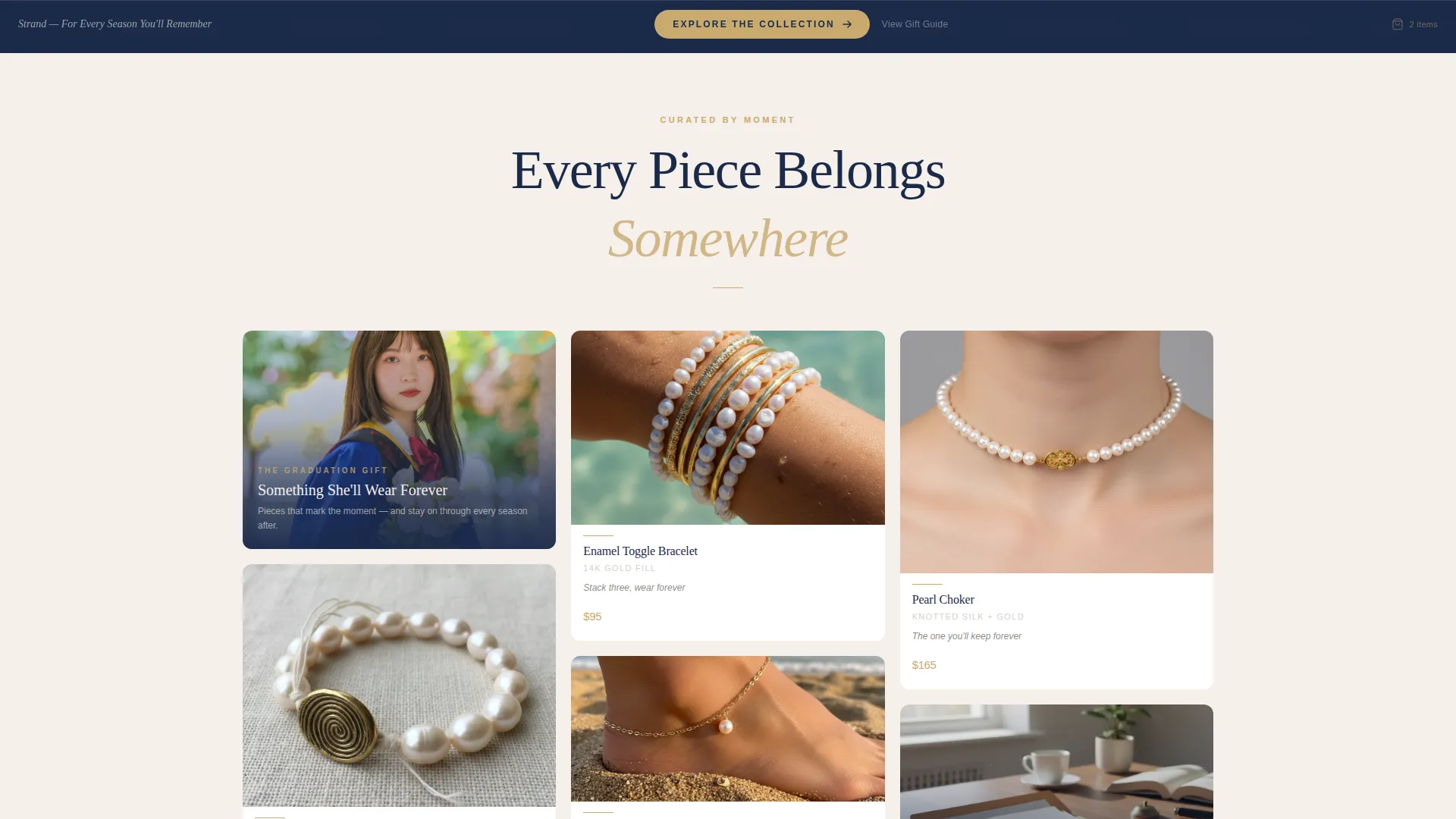
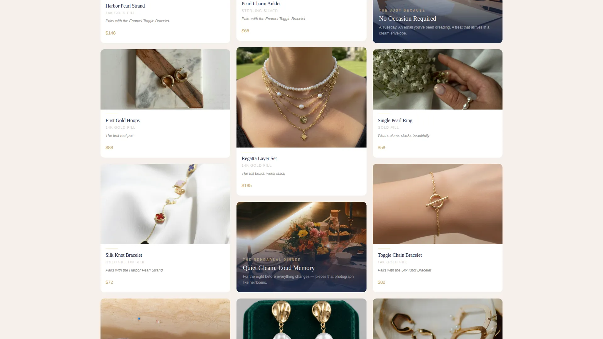
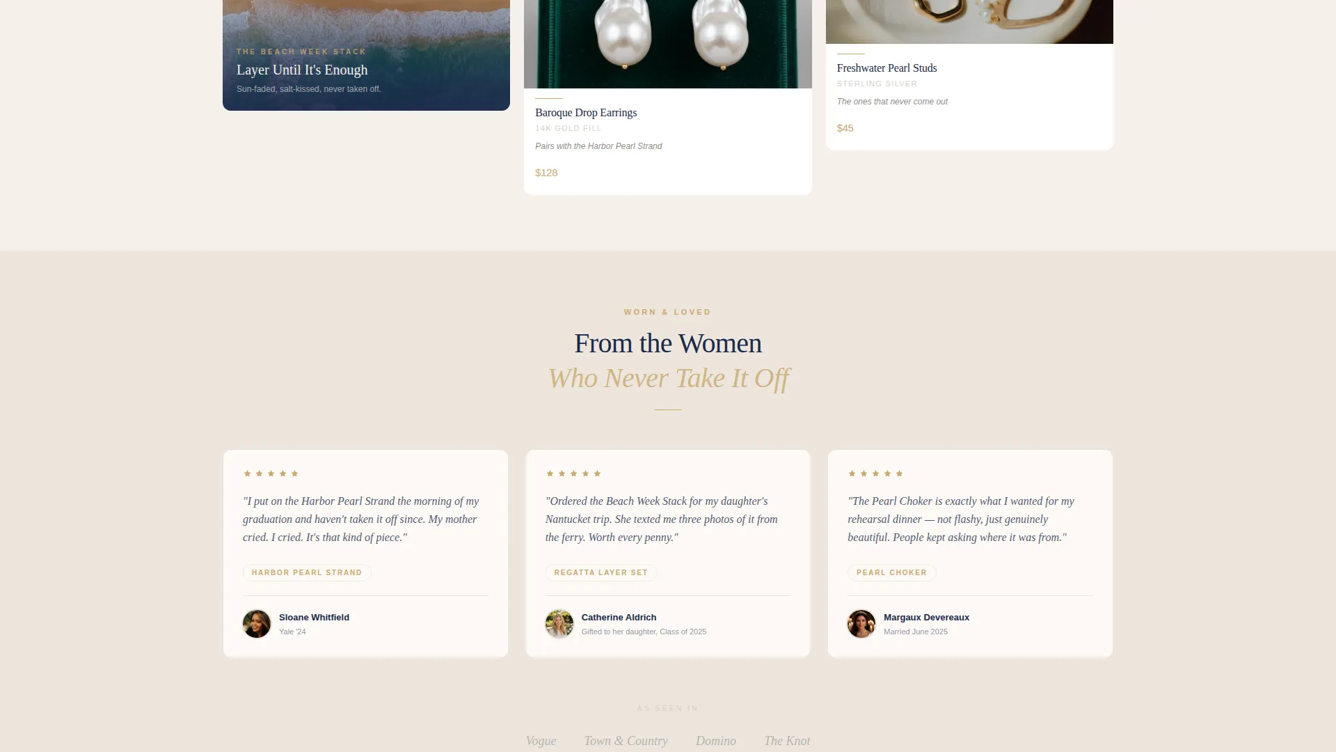
Products are organized into life-moment clusters such as The Graduation Gift, The Beach Week Stack, The Rehearsal Dinner, and The Just-Because. Each cluster opens with a candid lifestyle photograph, then staggered product cards tile beneath it. As the visitor scrolls, seasonal light and tone shift naturally from summer brightness into autumn warmth.
Product Cards with Inline Styling Notes
Every product card displays the price, metal type, and a single editorial styling note such as "Pairs with the Harbor Toggle." The primary call to action, "Shop This Piece," appears in brushed gold on navy, routing visitors directly to the product detail page with size and engraving options ready.
Sticky Secondary Navigation Bar
After the first scroll, a sticky bottom bar appears with the secondary call to action "Explore the Collection." It gives hesitant visitors a low-commitment path to the full catalog without interrupting the masonry flow or adding visual noise to the hero.
Seasonal Scroll Progression
The page is designed to shift mood as visitors scroll. Summer light cools into autumn warmth, gold tones deepen, and layering suggestions grow richer. This progression makes the page feel like flipping through a photo album rather than browsing a product list.
Page sections overview
| Section | Purpose |
|---|---|
| Dark Hero Header | Opens with a candlelit photograph and an animated gold headline to establish brand atmosphere |
| Moment Cluster: Graduation | Groups graduation-appropriate pieces under a lifestyle photograph with staggered product cards |
| Moment Cluster: Beach Week | Presents summer layering pieces in sun-faded Polaroid tones with styling notes |
| Moment Cluster: Rehearsal Dinner | Curates evening-appropriate jewelry for a pre-wedding occasion with editorial framing |
| Moment Cluster: Just-Because | Captures everyday gifting pieces in a relaxed, candid visual tone |
| Sticky Bottom Bar | Persists after first scroll to offer a secondary path to the full catalog |
Design & branding system
The Soft Mist color system is the backbone of Strand's visual identity. Every color has a strict role, so the palette stays cohesive no matter how many product cards fill the grid.
- Heirloom ivory (#F5F0EB) dominates the canvas; harbor fog (#D6CFC7) softens card edges and dividers
- Brushed gold (#C9A96E) appears only where the eye should land: price text, cart icons, and the thin rule beneath a product name
- Deep regatta navy (#1B2A4A) anchors headlines and activates on hover states, giving the page quiet typographic authority
Mobile & speed optimization
The masonry layout is built to reflow gracefully across screen sizes. Card stagger and lifestyle photography clusters adapt to narrower viewports without losing the editorial feel.
- Staggered card columns collapse into a clean single-column feed on mobile, preserving the moment-cluster structure
- The sticky bottom bar remains accessible on touch screens, keeping the secondary call to action within thumb reach at all times
How this template helps you convert
Strand treats the masonry grid itself as the persuasion engine. No countdown timers, no pop-up forms, no urgency copy. The layout earns the click through curation and context.
- Moment-driven organization mirrors the way buyers think about gifting, reducing decision fatigue and making it easier to choose the right piece for the right occasion.
- Every product card carries price, metal type, and a styling note, giving visitors enough information to feel confident before they tap "Shop This Piece."
- The sticky bottom bar catches visitors who are still exploring, offering a gentle second path that keeps them inside the brand experience rather than bouncing.
Other information about this template
Strand is part of a broader category of Luxe Minimal templates designed for lifestyle-driven product brands. It is built for founders who understand that atmosphere sells as much as specification.
- The template style is Masonry/Pinterest, suited to brands with rich photography assets and a multi-moment product story
- The creative direction is Seasonal/Moment, meaning the content strategy is embedded in the layout rather than applied after the fact
- The header concept follows a Dark Full-Bleed and Glow approach, a deliberate contrast to the bright studio-white hero common in direct-to-consumer jewelry pages
- The landing page direction is Click-Through, routing every interaction toward the product detail page rather than collecting leads or emails
Theme
Luxe Minimal
Creative direction
Seasonal/Moment
Color system
Soft Mist
Style
Masonry/Pinterest
Direction
Click-Through
Page Sections
Dark Full-bleed Hero with Animated Headline
Moment-driven Masonry Grid
Product Cards with Inline Styling Notes
Sticky Secondary Navigation Bar
Seasonal Scroll Progression
Related questions
What kind of photography works best with this template?
Can I use this template for multiple jewelry collections?
Is this template suitable for a gifting-focused jewelry brand?
How does the sticky bottom bar work?
Does every product card link directly to the product detail page?



