Consumer App & Platform Reviews Website Template
Streak is a white-label habit tracking landing page template built for SaaS founders, executive coaches, and HR teams who want to ship a fully branded habit tracker under their own name. The template features a live in-browser preview, an interactive comparison table with scenario toggles, and a sticky call-to-action sidebar, all wrapped in a dark mission-control visual identity.
by Rocket studio
Quick summary
Streak is a single-page, comparison-driven landing page template for white-label habit tracking platforms. It opens with a live in-browser product preview, walks visitors through a dynamic three-column comparison table, and closes conversions with a sticky sidebar call-to-action button and a two-step sign-up form. The design follows a dark Data Command aesthetic using Electric Indigo as its core color system.
Who this template is for
This template is built for B2B teams in wellness, coaching, and human resources technology who need to communicate a white-label advantage fast. It works equally well whether you are closing SaaS deals or pitching to enterprise procurement teams.
- SaaS founders who want to add a habit-tracking retention feature to an existing product without building from scratch
- Executive performance coaches who want clients logging progress inside a branded platform they fully control
- Employee-wellness directors and HR platform teams looking to replace generic third-party apps with their own branded experience
What problem this template solves
Building a habit tracker in-house costs time and engineering budget most teams do not have. Using a generic software-as-a-service tool means your users see another company's logo every day, and your data lives behind someone else's export button. This template makes that cost visible and gives buyers a clear path out.
- It removes the confusion caused by comparing build versus buy options with no structured framework
- It eliminates the credibility gap of launching on a plain page with no live product proof
- It replaces vague pricing pages with animated, scenario-driven comparison rows that show the real trade-offs
What you get with this template
You get a fully structured, high-interactivity landing page that does the selling before a visitor scrolls past the header. Every major section is purpose-built around the Comparison/Versus conversion goal, from the live preview at the top to the sticky call-to-action that follows the scroll.
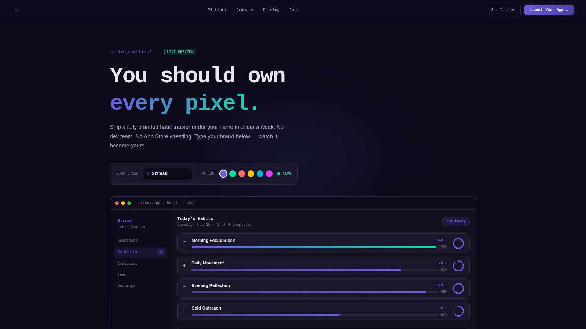
- An interactive header with a functioning habit-tracker rendered in-browser, including sample streaks, completion rings, and a seven-day heatmap
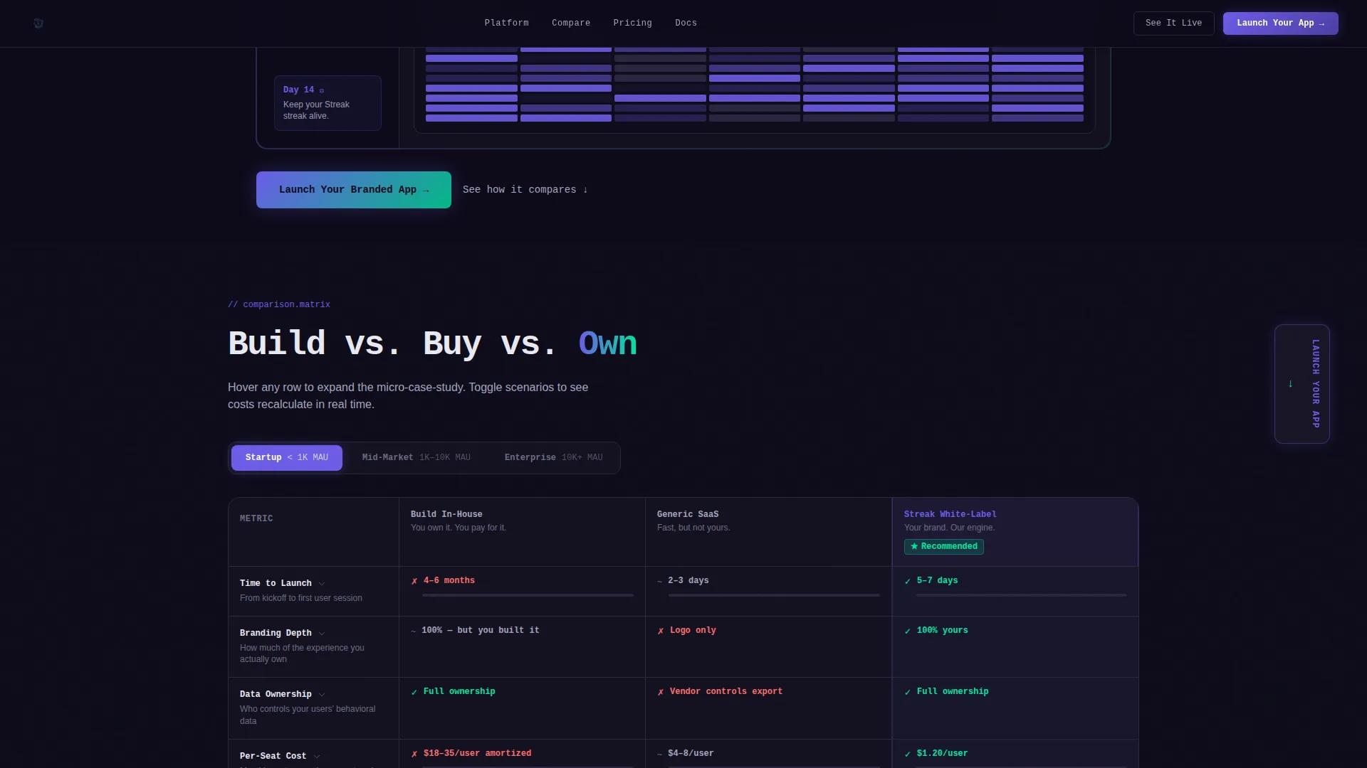
- A three-column comparison table with scenario toggles for startup, mid-market, and enterprise contexts, plus animated cells and expandable micro-case-studies
- A sticky sidebar call-to-action button labeled "Launch Your Branded App" and a two-step form collecting company name, platform type, monthly active users, and desired launch date
Feature list
This template is built around a specific set of high-interactivity components. Each one serves the Comparison/Versus conversion goal directly.
Live In-Browser Habit Tracker Preview
The header renders a working habit-tracker interface directly in the browser. It comes pre-loaded with sample streaks, completion rings, and a seven-day heatmap so visitors experience the product before reading a single headline.
Real-Time Brand-Swap Toolbar
A floating toolbar sits inside the header preview. Visitors type their company name and pick an accent color, and the entire interface re-skins in real time. Logo, button colors, and onboarding copy all update instantly, making the white-label value tangible before any scroll.
Animated Comparison Table with Scenario Toggles
The core scroll section is a three-column table comparing "Build In-House," "Generic SaaS," and "Streak White-Label" across rows like time-to-launch, branding depth, data ownership, per-seat cost, and API flexibility. Visitors toggle between startup, mid-market, and enterprise scenarios and every cell recalculates. Hovering a cell expands a micro-case-study or animates a stat with a live progress bar.
Sticky Sidebar Call-to-Action
The primary call-to-action button anchors to the right of the comparison table and follows the visitor as they scroll. This keeps the conversion path visible at all times without interrupting the comparison experience.
Two-Step Conversion Form
Clicking the primary call-to-action opens a two-step form. Step one asks for company name and platform type (iOS, Android, Web, or all three). Step two asks for monthly active users and desired launch date. The form qualifies leads while keeping friction low.
Stakes Reveal Section
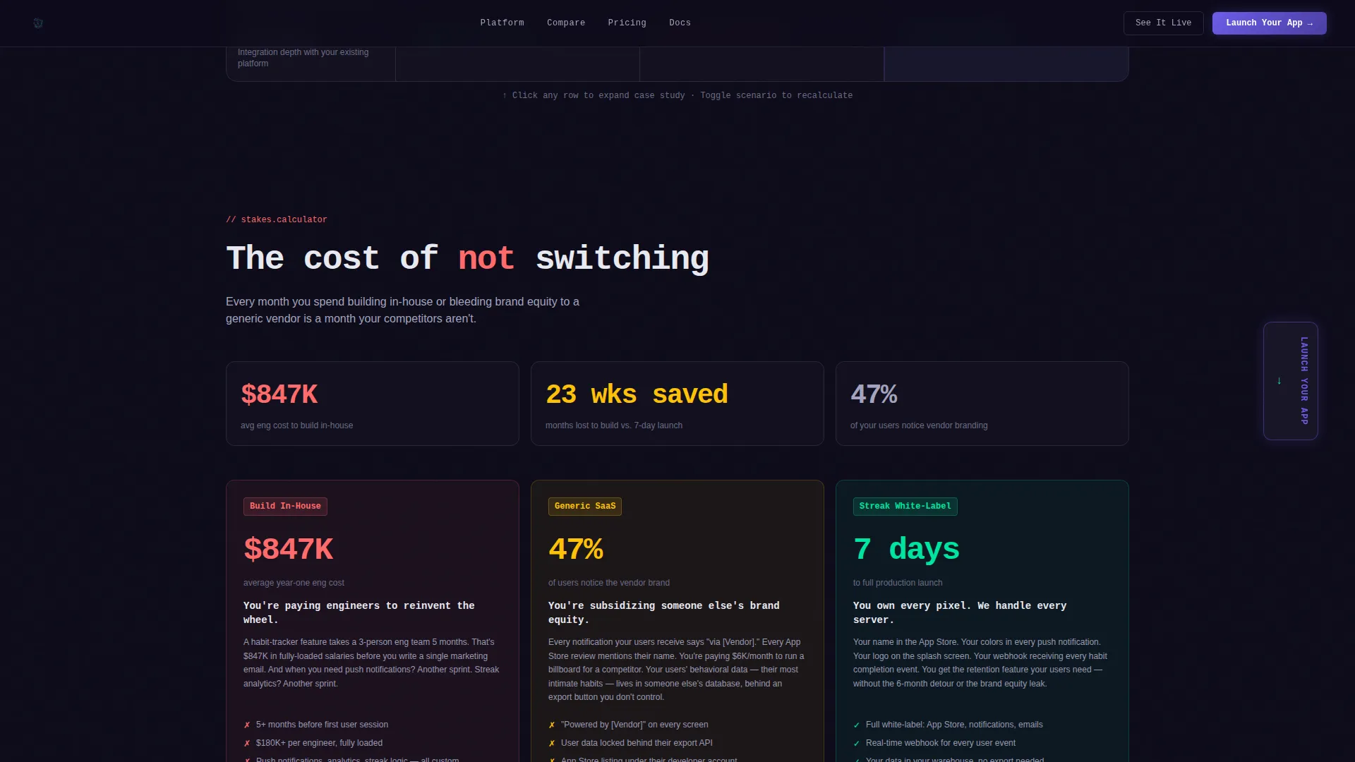
A dedicated section below the comparison table animates the cost of not switching. It surfaces what buyers lose with each alternative: brand equity going to a vendor, user data locked behind someone else's controls, and a six-figure engineering bill for standard features.
Page sections overview
| Section | Purpose |
|---|---|
| Interactive Header Preview | Renders a live habit-tracker with brand-swap toolbar |
| Three-Column Comparison Table | Compares build options across key decision rows |
| Scenario Toggle Controls | Recalculates table data for startup, mid-market, enterprise |
| Stakes Reveal Section | Animates the cost of each non-Streak alternative |
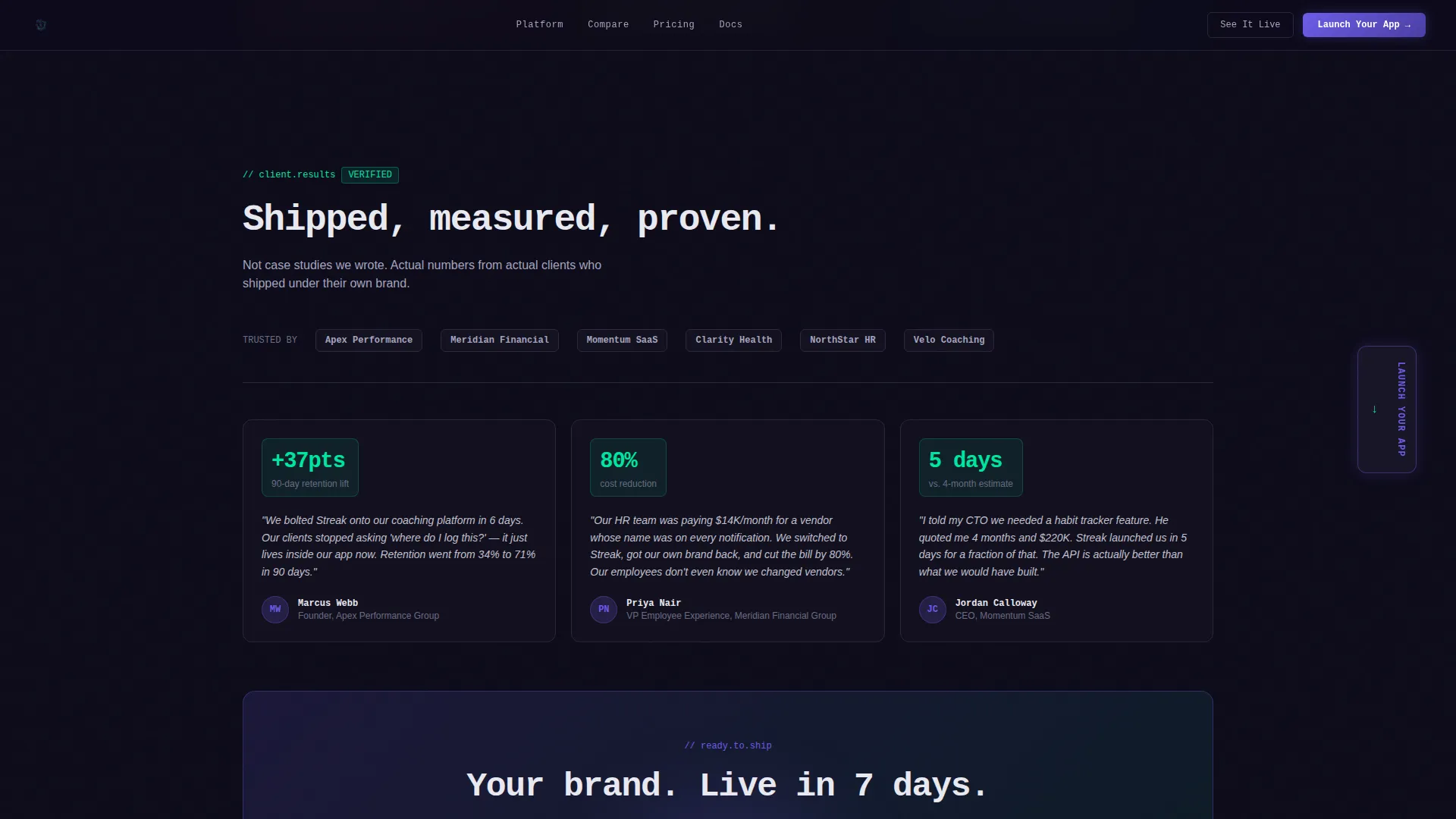
| Social Proof Section | Shows metrics-forward testimonials and launch timelines |
| Sticky call to action Sidebar | Keeps "Launch Your Branded App" visible during scroll |
| Two-Step Lead Form | Collects platform type, users, and launch date |
| Footer Pattern | Minimal developer-style footer closing the page |
Design & branding system
The template uses a Data Command visual identity built around the Electric Indigo color system. The overall feel is a mission-control dashboard running at late night, where every glow is deliberate and dark pixels protect focus on the data that matters.
- Core palette: deep terminal black (#0D0B1A) as the page background, indigo pulse (#6C5CE7) as the primary brand color, data-grid gray (#A4A4BF) for supporting text and table borders, and reactive neon mint (#00E5A0) reserved for positive-state indicators and hover confirmations
- Typography pairing: JetBrains Mono for headings and data labels to reinforce the terminal aesthetic, Manrope for body copy to keep longer paragraphs readable
- The brand-swap toolbar lets buyers preview their own logo and accent color inside the live interface, so the template doubles as a direct sales tool during the visit
Mobile & speed optimization
The template is designed desktop-first to match the DevTools and dashboard aesthetic of its target audience. Interactive sections use client components to keep renders efficient while supporting the high animation load.
- The comparison table, live preview, and animated cells are built as client components so the interactive logic does not block the static parts of the page from loading
- The layout is fully responsive so mobile visitors still reach the comparison table and the call-to-action form without losing core functionality
How this template helps you convert
Every design and layout decision in this template pushes toward one outcome: a qualified visitor clicking "Launch Your Branded App." The page does not rely on persuasion copy alone. It uses live interactivity to make the value undeniable before the visitor reaches the form.
- The live header preview creates immediate product proof. Visitors interact with a real habit-tracker interface and re-skin it with their own brand before reading any sales copy, which builds trust faster than a static hero image ever could.
- The animated comparison table makes the cost of alternatives visible in concrete, data-driven terms. Each row shows a specific trade-off, time, money, or control, so the decision to choose the white-label path feels logical rather than pressured.
- The secondary call-to-action, "See It With Your Brand," loops hesitant visitors back to the header's live re-skin tool. This gives undecided buyers a low-commitment re-engagement path instead of losing them to a back-click.
Other information about this template
This template is categorized under Technology, Consumer App and Platform, with a specific focus on the white-label habit tracking niche. It is structured as a single landing page using the Comparison/Versus conversion direction.
- The footer follows a GitHub Developer Minimal pattern (Pattern 8), keeping the closing section clean and consistent with the terminal aesthetic
- Social proof is designed to be metrics-forward, featuring specific launch timelines and monthly active user numbers rather than generic quote blocks
- Localization defaults are set to English, US dollar pricing, and US date formatting
- Animation intensity is set to high across the comparison table, heatmap, progress bars, and brand-swap toolbar, making this template suitable for technically sophisticated audiences who expect a product to demonstrate its own quality
- The template intersection score is 13, placing it in a well-defined niche with strong alignment between the Technology category and the Consumer App and Platform subcategory
Theme
Data Command
Creative direction
Interactive Explorer
Color system
Electric Indigo
Style
Comparison Table
Direction
Comparison/Versus
Page Sections
Live In-browser Habit Tracker Preview
Real-time Brand-swap Toolbar
Animated Comparison Table with Toggles
Sticky Sidebar Call-to-action
Two-step Conversion Form
Stakes Reveal Section
Related questions
Who is this template designed for?
Does the live preview in the header actually work in the browser?
Can visitors see how the comparison changes for different company sizes?
What does the two-step form collect?
Is this template suitable for both desktop and mobile visitors?



