Stream — Instant API Documentation Landing Page Template
This changelog real time api release notes landing page template is built for platform engineers who cannot afford to miss a breaking change. It delivers a scroll-reveal, terminal-aesthetic single page with Dark Glass Panel headers, a filterable live feed, a horizontal timeline, an email-capture call to action, and app download buttons, every section earning attention before asking for it.
by Rocket studio
Quick summary
This is a single-page, scroll-reveal landing page built around a real-time API changelog feed. It targets platform engineers and DevOps leads who need push notifications for every SDK bump, breaking change, and deprecation before it disrupts production. The design follows a terminal-monitoring aesthetic with void-black backgrounds, electric violet highlights, and phosphor cyan signal accents throughout.
Who this template is for
This template is designed for developer-tool products and mobile apps that surface API and SDK change data to engineering teams. It speaks directly to the people who feel the pain of a silent deprecation at the worst possible hour.
- Platform engineers and DevOps leads who maintain voice and messaging integrations and need to keep users informed across every release cycle
- Startup CTOs running lean development teams who rely on instant alerts for pricing shifts, new features, and API changes
- Product managers and technical writers who need a polished release notes page that communicates software release updates clearly to both technical readers and support teams
What problem this template solves
Software release notes are often scattered across blog posts, email digests, and documentation pages that no one reads until something breaks. A cluttered page can alienate developers who need to find information quickly. This template solves that problem by making the changelog itself the product.
- Engineers miss hotfix release notes and breaking API changes because they rely on manual checking rather than push notifications, leaving the development team exposed to production incidents
- Support teams and customer support teams waste time fielding tickets caused by changes that were documented but never surfaced clearly, which drives up overhead and erodes trust with users
- Product teams and product managers lack a user-focused landing page that demonstrates the value of the feed before asking for a download, making conversion harder than it needs to be
What you get with this template
You get a fully structured, single-page scroll-reveal landing page ready to adapt for any API changelog or release notes app. Every section is purposeful. Every interaction is earned by the visitor through scrolling. Nothing loads until it is needed, and nothing is decorative.
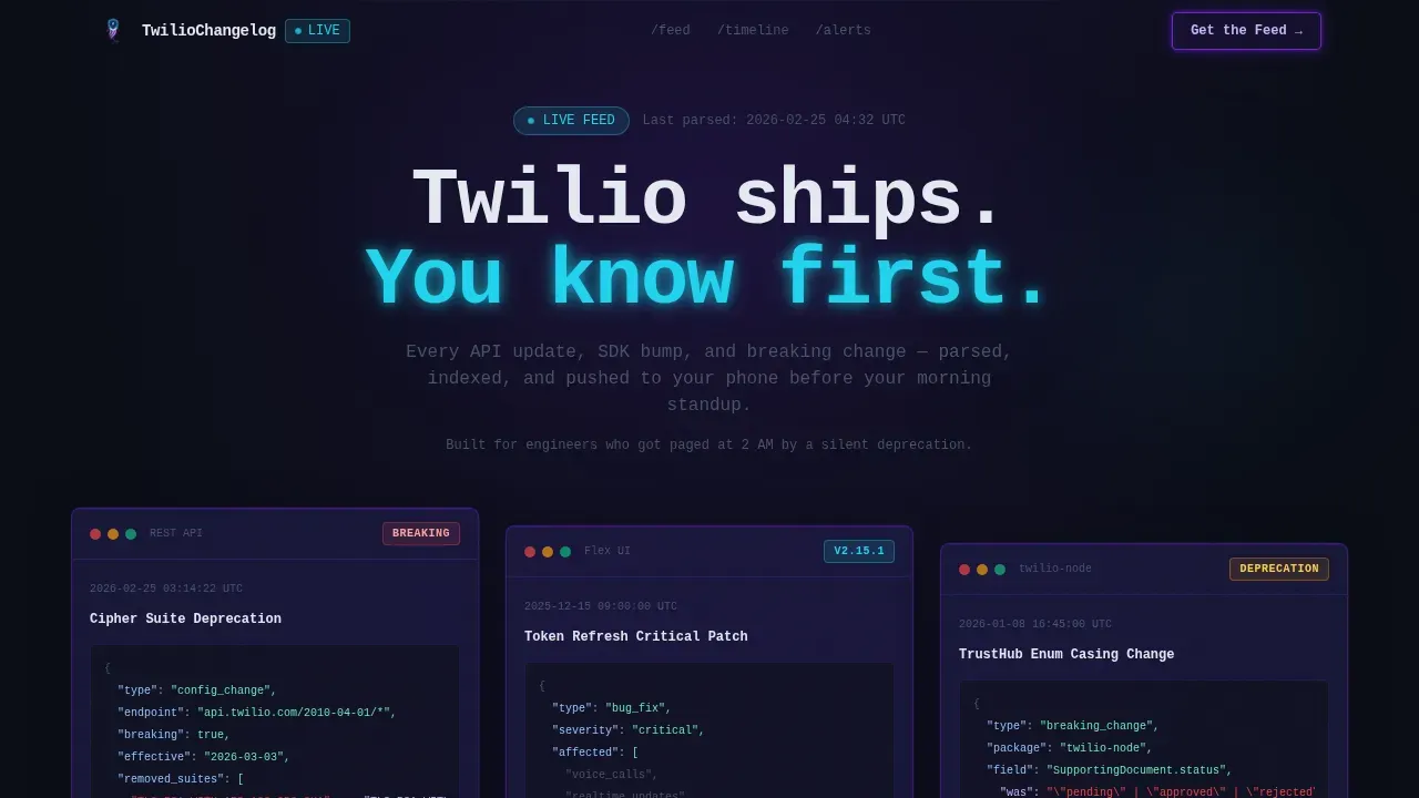
- A Dark Glass Panel header with three frosted, glassmorphism-style changelog cards featuring syntax-highlighted JSON diffs, version number badges in phosphor cyan, and timestamps in muted indigo
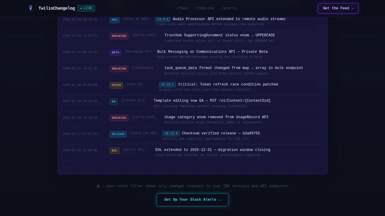
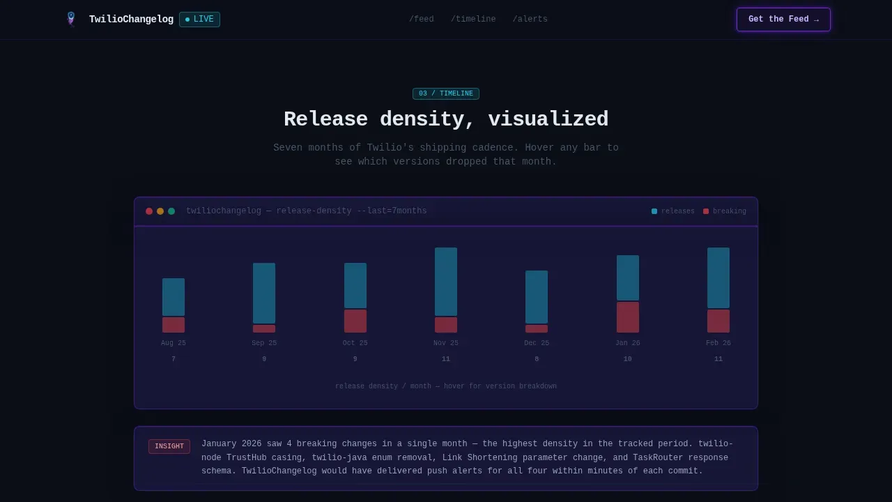
- A filterable terminal-output feed section with toggle tabs for "All Changes," "Breaking Only," and "Your Stack" (locked with an in-app upgrade prompt), followed by a horizontal timeline visualization with hover states showing version numbers and release density across months
- Primary and secondary call-to-action sections: a "Get the Feed" app download block with App Store and Google Play badges, and an inline "Set Up Your Stack Alerts" email-capture field requiring only a single input
Feature list
This template ships with six core capabilities that work together to demonstrate the product before asking for a commitment.
Dark Glass Panel Hero Header
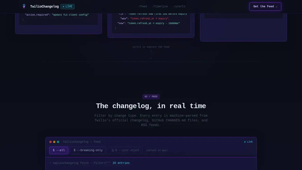
Three frosted, translucent cards float over a void-black background. Each card displays a live-formatted changelog entry with syntax-highlighted JSON diffs, phosphor cyan version badges, and muted-indigo timestamps. The glassmorphism blur and 1px violet borders create a terminal-monitor feel that technical readers immediately recognize and trust.
Filterable Terminal Feed
Below the hero, a stacked feed renders line by line on scroll, mimicking terminal output. Visitors can toggle between "All Changes," "Breaking Only," and "Your Stack." The last filter is intentionally locked with a padlock icon and an "Unlock in app" label, giving technical users a direct, friction-free reason to download.
Horizontal Timeline Visualization
A release density timeline unfurls horizontally as the visitor scrolls. Each point on the timeline is interactive, with hover states that surface the version number and a brief summary of that release. This section communicates version history at a glance and shows the product's breadth of coverage without requiring the visitor to read a wall of text.
Scroll-Reveal Progressive Rendering
Every section loads progressively as the visitor earns it by scrolling. Micro-animations mimic real data rendering: staggered line-by-line reveals, cursor-blink keyframes, and Intersection Observer triggers. The effect makes the page feel like a live production monitoring dashboard, not a static marketing brochure.
Inline Email-Capture Call to Action
After the interactive filter section, a single-input email field prompts visitors to "Set Up Your Stack Alerts." The placement is intentional: visitors who reach this point have already interacted with three technical sections, making them pre-qualified for in-app notifications. No form friction, just one field.
App Download Section with Badge Hover Transitions
The primary call-to-action block presents "Get the Feed" alongside monochrome App Store and Google Play badges that shift to full color on hover. This interaction rewards attention and signals quality. The section is positioned after the visitor has already experienced a limited version of the product through the interactive feed.
Page sections overview
| Section | Purpose |
|---|---|
| Dark Glass Header | Display three live changelog cards with syntax highlights and version badges |
| Filterable Live Feed | Let visitors explore release notes by change type with a locked "Your Stack" tier |
| Horizontal Timeline | Visualize release density and version history across months with hover states |
| Stack Alerts call to action | Capture email addresses from pre-qualified visitors with a single input field |
| App Download call to action | Drive installs with "Get the Feed" and badge hover transitions |
| Developer Minimal Footer | Close with a single-row GitHub-style footer suited to a developer audience |
Design & branding system
The visual identity follows a Dashboard Pro theme built on an Electric Indigo color system. Every color choice is intentional, evoking a production monitoring dashboard in the early hours rather than a polished marketing site.
- Color palette: void black (#0B0E17) as the primary background, deep indigo (#1E1B4B) for card surfaces and elevated panels, electric violet (#6D28D9) for interactive highlights and active states, and phosphor cyan (#22D3EE) as the signal accent for new release badges and critical entries
- Typography: JetBrains Mono handles all code blocks, version numbers, and data output; Manrope is used for user interface copy and body text, keeping a clear boundary between machine-readable content and user-friendly language
- Visual style: terminal aesthetic with glassmorphism card surfaces, 1px violet borders, phosphor glow on accent elements, and consistent formatting across every changelog entry to reinforce trust and readability
Mobile & speed optimization
The template is designed desktop-first to match the workstation environment of its primary audience: platform engineers reading release notes at their desk. The layout still scales responsively for mobile, ensuring that in-app notifications and stack alert sign-ups reach engineers wherever they are.
- Server Components handle all static sections, reducing the JavaScript payload for non-interactive parts of the page and keeping the initial load light for technical users on any connection
- Client Components power the interactive feed, timeline hover states, email capture, and badge hover transitions, isolating interactivity to where it adds direct user value
- Scroll-reveal animations use Intersection Observer and CSS keyframes rather than heavy animation libraries, keeping the progressive rendering smooth without adding unnecessary dependencies
How this template helps you convert
This template converts by demonstration, not persuasion. By the time a visitor reaches the download button, they have already used a version of the product and felt the gap of not having push notifications.
- The Dark Glass Panel header uses real changelog entry data with syntax-highlighted diffs, version numbers, and release dates, so the first thing a visitor sees is proof that the feed works, not a promise that it might
- The filterable feed and locked "Your Stack" tier create a deliberate moment of friction that communicates user benefits clearly: the full experience requires the app, and the locked state makes that obvious without being aggressive
- The inline email-capture call to action appears only after three interactive sections, meaning every visitor who reaches it has self-selected as someone who cares about release notes, new features, bug fixes, and API changes, making the conversion ask feel natural rather than forced
Other information about this template
This template sits at the intersection of developer-tool marketing and release documentation. It is built to support the specific workflow that platform engineers, technical writers, product managers, and support teams rely on when they need to track, distribute, and act on software release information.
- The page layout follows best practices for API changelog design: a chronological feed with version numbers, release dates, and categorized updates covering new features, bug fixes, performance enhancements, and breaking changes
- Good release notes do more than list changes; they explain user benefits, provide relevant links to detailed documentation, and give engineers the context they need to act quickly, which is why each entry in the feed template includes a brief summary, a version number label, and a clear change category
- To write effective release notes that serve both technical readers and product managers, content should use user-friendly language for headlines, reserve technical language for code blocks, and avoid overwhelming users with implementation details they do not need to act on
- The release notes template structure here supports multiple change types: new features, bug fixes, breaking changes, performance enhancements, hotfix release notes, and deprecation notices, each with distinct visual identifiers so the feed remains scannable at a glance
- Creating great release notes is a collaborative effort: technical writers draft the copy, the development team validates accuracy, product teams align on messaging, and customer support teams review for clarity before entries are published
- When you build your own changelog using this template, you can adapt the filterable feed to match your own release cycle, whether that means daily SDK bumps, weekly new releases, or quarterly major version launches
- Release note examples from well-known developer platforms show how effective structured changelogs can be: platforms that categorize updates by type, surface breaking changes prominently, and provide migration guidance see higher feature adoption and fewer support escalations
- The template supports the practice of including a brief overview at the top of each entry, allowing users to scan for relevance before diving into full release notes or detailed documentation
- Using a consistent release notes template across every software release helps internal teams stay aligned, keeps users informed between feature launches, and reduces the volume of reactive tickets that land with customer support teams
- Product teams using this layout can also adapt it to distribute release notes via in-app notifications, blog announcements, blog posts, or direct email by connecting the email-capture section to their preferred notification workflow
- The template encourages a user focused approach: each section is organized so visitors can find new features, bug fixes, and api changes without scrolling through irrelevant entries, and the locked "Your Stack" filter demonstrates how personalized release notes can drive deeper user engagement
- Rocket.new users building their own tool for changelog delivery can use this template as a starting point, adapting the feed, filters, and timeline to match their product release cadence and their audience's expectations for consistent release notes
- For teams managing issue tracking systems alongside their changelog, the template's categorized feed structure maps naturally to labels like Added, Changed, Deprecated, and Fixed, making it easier to distribute release notes that align with the data already captured in project management workflows
- Product managers who want to publish release notes on a predictable schedule can use the timeline section to reinforce that consistency visually, showing visitors that the product has an active release cycle and that feature requests are being addressed regularly
- Supporting early access announcements, feature announcements, and new functionality previews is straightforward with the existing card and badge system; a distinct badge color or label variant can signal pre-release or beta status without requiring a structural change to the page
- Including relevant links within each changelog entry points technical users toward detailed documentation, tutorials, or migration guides without overwhelming the feed itself with long-form content
Theme
Dashboard Pro
Creative direction
Interactive Explorer
Color system
Electric Indigo
Style
Scroll Reveal (Progressive)
Direction
App Download
Page Sections
Dark Glass Panel Hero with Live Changelog Cards
Filterable Terminal-output Feed
Horizontal Release Timeline Visualization
Scroll-reveal Progressive Section Rendering
Inline Stack Alerts Email Capture
App Download Call to Action with Badge Hover Transitions
Related questions
What types of release notes does this template support?
Can I adapt the filterable feed to my own release cycle?
How does this template handle breaking changes specifically?
Who should write and maintain the changelog entries?
Does the email-capture section require a form backend?



