Live Performance Analytics Landing Page Template
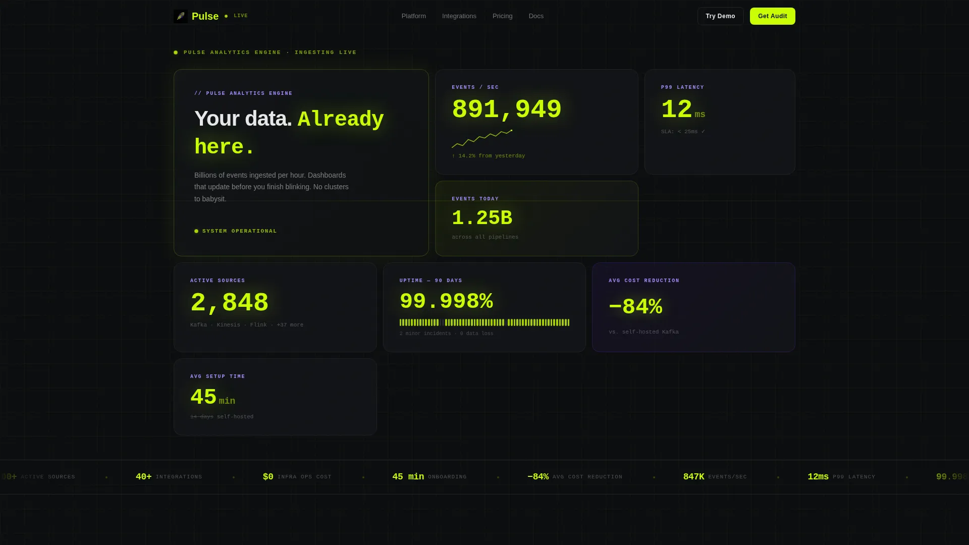
Pulse is a bento grid landing page template built for real-time analytics managed services. It opens with a live Stats wall showing ticking counters, p99 latency, and uptime figures. A sticky metrics audit call to action, a three-step lead capture form, and a demo sandbox path help convert CTOs, growth leads, and DevOps teams who need answers before they ask questions.
by Rocket studio
Quick summary
Pulse is a single-page bento grid template designed to market a real-time analytics managed service. It leads with live-updating metrics, stacks comparison data against self-hosted alternatives, and closes with client case study tiles. Every section opens with a number before a line of copy appears, keeping technically minded buyers engaged from first scroll to form submission.
Who this template is for
This template is built for teams and founders selling data infrastructure services where credibility lives in numbers, not prose. If your product handles high-volume event ingestion and your buyers are technical, Pulse speaks their language immediately.
- CTOs evaluating managed analytics to reduce infrastructure overhead and monthly tooling bills
- Growth leads who need funnel metrics delivered without filing engineering tickets
- DevOps teams looking to replace self-managed streaming pipelines with a reliable managed service
What problem this template solves
Technical buyers distrust marketing copy on instinct. They scroll past paragraphs and look for evidence: latency figures, uptime records, cost comparisons. A generic SaaS landing page fails this audience before it finishes loading. Pulse solves that by making the product itself the visual experience.
- Visitors see live counters and real metrics before reading a single sentence of copy
- The comparison section makes the cost and time case without asking buyers to do the math
- A low-friction demo path lets engineers explore before they commit to a sales conversation
What you get with this template
Pulse includes a fully structured bento grid landing page with six distinct content sections, each designed to advance a specific stage of buyer conviction. Every layout decision reinforces the Stats-First Impact creative direction.
- A twelve-tile asymmetric header grid with real-time counters, digit-flip animations, and a single headline tile
- Three conversion surfaces: a sticky metrics audit bar, a three-step progressive form, and a sandboxed demo email gate
- A filterable integration directory, side-by-side comparison cards, and three client case study tiles headlined by outcome metrics
Feature list
The template delivers the following built-in capabilities grounded in the source brief.
Twelve-Tile Live Stats Header
The header is a bento grid of twelve asymmetric tiles. Each tile displays a live counter: events ingested per second, p99 latency in milliseconds, active data sources, and uptime frozen at 99.998%. Numbers are set in oversized tabular monospace type and animate with subtle digit-flip transitions on update.
Stats-First Bento Layout
Every scroll depth opens with a metric before body copy appears. This Stats-First Impact structure is applied page-wide, not just in the header. Each section reveals another layer of the product story through numbers, making the layout feel like peeling back instrument panels in sequence.
Self-Hosted Comparison Cards
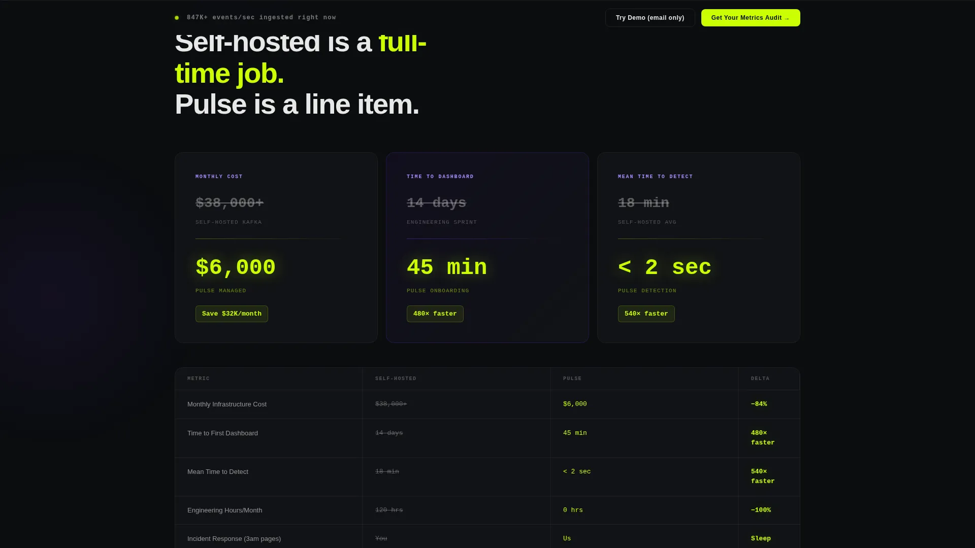
Section two contains three bento cards comparing self-hosted cost, setup time, and mean-time-to-dashboard against the managed service. Favorable deltas are highlighted in electric chartreuse, making the value case visually immediate without requiring explanatory text.
Filterable Integration Directory
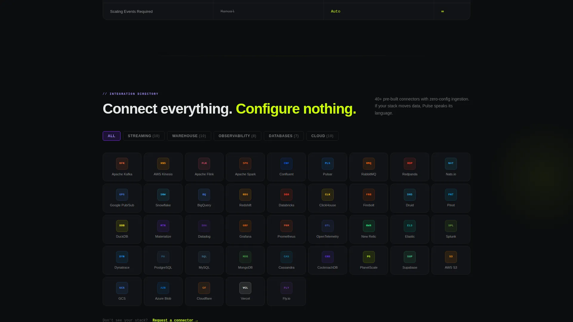
Section three presents a grid of 40-plus integration logos organized by category. Visitors can click a category filter (streaming, warehouse, observability) and the tiles rearrange to show relevant connections. This directory layout supports technical buyers evaluating compatibility before any sales contact.
Client Outcome Case Study Tiles
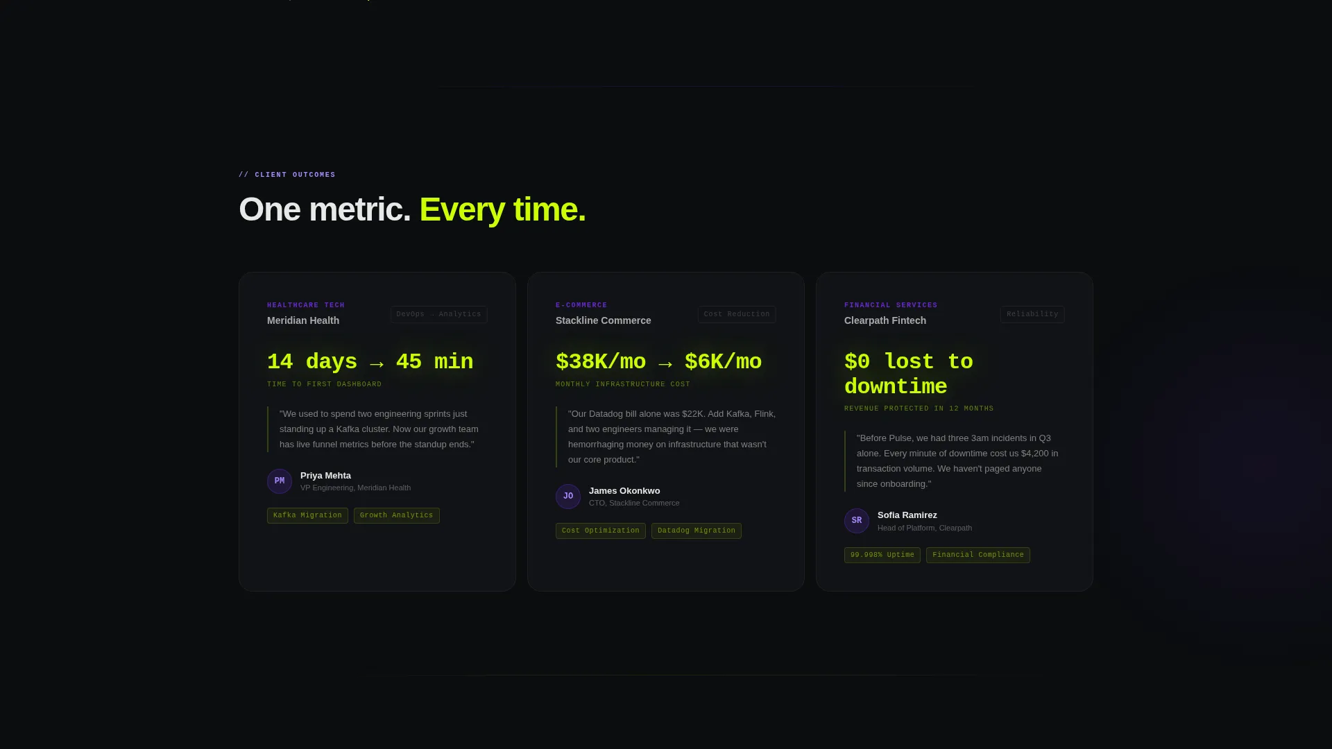
Section four stacks three case study tiles, each headlined by a single before-and-after metric. Examples include "14 days to 45 minutes," "$38K per month to $6K per month," and "$0 lost to downtime." The format is direct and proof-first, letting results carry the persuasion.
Three-Step Progressive Lead Form
The primary conversion flow uses a three-step progressive disclosure form. Step one collects monthly event volume via dropdown. Step two captures current stack via checkboxes. Step three asks for a work email and an optional Slack connect. This staged approach reduces abandonment by asking for low-commitment information first.
Page sections overview
| Section | Purpose |
|---|---|
| Live Stats Header | Opens with twelve real-time metric tiles and the primary headline |
| Comparison Bento Cards | Contrasts self-hosted versus. managed costs, setup time, and time-to-dashboard |
| Integration Directory | Filterable grid of 40-plus logos sorted by streaming, warehouse, and observability |
| Client Case Studies | Three outcome tiles each anchored by a single before-and-after metric |
| Sticky Audit call to action | Pinned bottom bar activates after first scroll to capture high-intent visitors |
| Demo Sandbox Gate | Secondary email-only gate for engineers who prefer to explore before speaking to sales |
Design & branding system
The Acid Digital color system drives every visual decision in Pulse. The palette is built for dark environments where numbers need to feel urgent and alive, not decorative.
- Void black (#0B0D0F) stretches edge to edge as the base, making every glowing number float in deep space
- Electric chartreuse (#CAFF04) floods interactive tiles, live counters, and favorable comparison deltas to direct attention instantly
- Ultraviolet (#7B2FFF) marks category headers and hover states, while phosphor white (#E8E8E8) handles all body text for sustained readability
Mobile & speed optimization
The bento grid layout is structured to translate across viewport sizes without losing the visual density that makes Pulse compelling. The design prioritizes render clarity so live counter tiles remain legible at smaller sizes.
- Asymmetric tile arrangements adapt to narrower screens while preserving the grid's instrument-panel rhythm
- Oversized tabular monospace numerals are sized to remain readable and impactful on mobile viewports
- The sticky metrics audit bar and the progressive form are designed for thumb-friendly interaction in the layout
How this template helps you convert
Pulse layers two distinct conversion paths into a single page, targeting different buyer readiness levels simultaneously.
- The sticky "Get Your Metrics Audit" bar activates after the first scroll, capturing high-intent visitors who already understand their problem and want a direct next step with minimal friction.
- The "Explore the Demo Dashboard" path gates behind a single email field, lowering the barrier for engineers who prefer hands-on evaluation before entering any formal sales process.
Other information about this template
Pulse is built on a Directory and Discovery theme, which means the integration directory section follows filterable grid conventions familiar to technical buyers who evaluate tools by ecosystem fit. The template style is Bento Grid, a layout format well suited to data-dense products where multiple signals need to coexist without competing for attention. The lead generation direction means every design and copy decision serves one of the two conversion paths built into the page structure.
- The template is categorized under Technology, specifically the Real-Time Analytics Managed Service niche, making it relevant to teams building or marketing data pipeline infrastructure products
- The creative direction is Stats-First Impact, a deliberate choice that treats the product's own performance data as the primary visual and persuasive element
- The header concept is a Stats and Metrics wall, which positions the service's live capabilities front and center before any feature description begins
Theme
Directory & Discovery
Creative direction
Stats-First Impact
Color system
Acid Digital
Style
Bento Grid
Direction
Lead Generation
Page Sections
Twelve-tile Live Stats Header
Stats-first Bento Page Structure
Self-hosted Comparison Cards
Filterable Integration Directory
Client Outcome Case Study Tiles
Three-step Progressive Lead Form
Related questions
Who is the ideal buyer for this template?
Can I update the live counter values to match my actual product metrics?
Does the template include both the audit form and the demo sandbox gate?
How does the filterable integration directory work?
Can I customize the comparison card figures for my own pricing?



