Powerful Talent Acquisition Landing Page Template
Pipeline is a bento grid recruiting email newsletter landing page built for talent acquisition teams, agency recruiters, and HR directors. It combines a Tech Glass visual identity with a Problem→Solution Arc layout, progressive lead capture, and a scroll-triggered template assembly sequence. The result is a high converting page that shows visitors exactly what they get before asking for anything.
by Rocket studio
Quick summary
Pipeline is a single-page lead generation landing page designed for staffing and recruiting professionals who need a polished email newsletter template. The page follows a Problem→Solution Arc, opening with an isometric dashboard preview and walking visitors through modular template blocks before presenting a three-field progressive capture form. Every section is built to reduce friction and move recruiters toward signing up with confidence.
Who this template is for
This template speaks directly to the people who send recruiting emails every single day. It is built for professionals who know their current newsletters are not performing and who want a faster, smarter way to communicate with candidates and clients. Understanding the target audience is central to why this landing page converts: the layout, the copy structure, and the form flow are all shaped around recruiting workflows.
- Talent acquisition managers handling dozens of open roles who need polished candidate roundups their leadership will actually read
- Agency recruiters sending client shortlists on tight deadlines who need a newsletter format that looks credible and moves fast
- HR directors producing monthly hiring digests who want decision makers to stop skimming and start engaging
What problem this template solves
Most recruiting newsletters look like cold email blasts. They are walls of text with no visual hierarchy, no clear call to action, and no reason for the reader to click through. This landing page exists to show visitors that a better format is possible, and that they can have it without starting from scratch. One of the most common mistakes in recruiting outreach is treating a newsletter like a cold email. Pipeline solves that problem by giving recruiters a proven structure they can deploy immediately.
- Bloated, unformatted recruiting emails that produce low open rates and near-zero click-throughs on job links
- No clear value proposition in candidate communications, leaving hiring managers and clients confused about next steps
- Hours wasted building newsletter layouts manually when a pre-built, structured template could give recruiters a real head start
What you get with this template
This is a fully designed bento grid landing page that demonstrates the Pipeline recruiting newsletter template in action. The page itself is the pitch. Visitors watch the template assemble in real time as they scroll, which builds trust before the form ever appears. A polished, professional landing page like this can improve your conversion rates by removing doubt and replacing it with visual proof.
- A complete bento grid landing page with hero, problem section, modular block showcase, scroll-triggered assembly sequence, and a lead capture form section
- A three-field progressive capture form collecting work email, company size, and applicant tracking system platform, plus a secondary gated PDF download path for visitors not ready to commit
- A Tech Glass visual identity using deep obsidian backgrounds, reactive teal accents, frosted glass card surfaces, and graphite body text throughout
Feature list
This section covers the essential elements built into the Pipeline landing page template.
Isometric Dashboard Hero Section
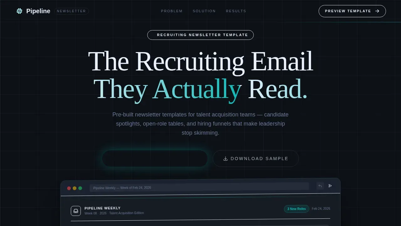
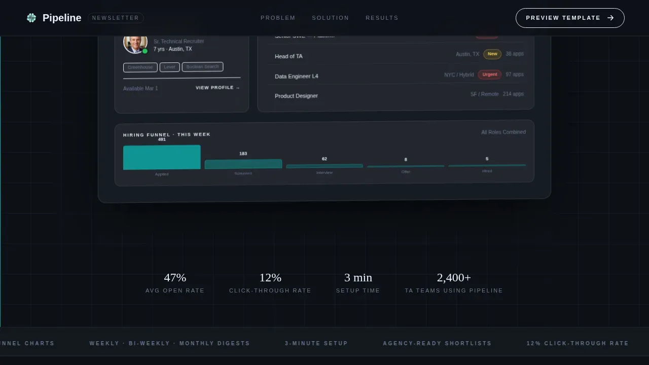
The hero section opens with a full-width, pixel-perfect rendering of the newsletter template displayed inside a simulated email client. The preview floats at a slight isometric tilt over the deep obsidian background. Visible elements include a candidate spotlight card with a headshot placeholder, an open-roles table with location tags and urgency badges in teal, and a hiring funnel mini-chart. A frosted glass reflection sits beneath the preview. The powerful headline "The Recruiting Email They Actually Read" appears in light weight above the hero image, giving visitors an immediate, clear headline that communicates the core message before anything else.
Problem→Solution Arc Layout
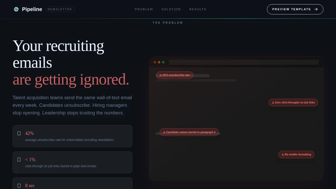
The page is structured around a deliberate Problem→Solution Arc. The section below the fold presents annotated screenshots of bloated recruiting emails, with red callout annotations highlighting failure metrics. The visual contrast between the problem section and the solution tiles is intentional: it shows visitors exactly why a better format matters. This creative direction is one of the best practices for high converting landing pages because it meets visitors at their frustration point before offering the fix.
Scroll-Triggered Template Assembly Sequence
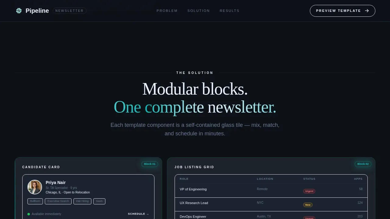
As visitors scroll deeper into the page, individual template blocks animate into place using a scroll-linked sequence. Candidate cards, metric dashboards, job listing grids, and event banners each appear as their own glass-edged bento tile. They then assemble into a complete newsletter in real time. This assembly sequence functions as live visual proof, showing the system working before any form fields appear. It is a powerful tool for building trust at scale without relying solely on written claims.
Progressive Three-Field Lead Capture Form
The lead capture form uses multi step forms logic presented as a three-field progressive capture sequence. A visitor fills in their work email first. The second step asks for company size, offering options for solo recruiter, small agency, and enterprise talent acquisition team. The third step asks for the applicant tracking system platform. Keeping form length short and using fewer fields at each step helps reduce friction and improve the conversion rate significantly. The form follows best practices for lead generation landing pages: ask for just what you need, in the order that builds the most trust.
Gated PDF Secondary Conversion Path
A secondary call to action offers visitors the option to download a sample newsletter as a gated PDF. This path requires only a work email, making it a lower-commitment entry point for potential customers who are not ready to commit to the full form. This secondary path helps capture new subscribers across different stages of intent without diluting the primary call to action. It is an example of how a well-designed lead generation landing page gives visitors two meaningful ways forward.
Teal Benchmark Data Chips
After the assembly sequence, a final row displays open-rate and click-through rate benchmarks from real staffing firms, rendered as glowing teal data chips. These chips serve as social proof in a format that matches the page's design language. Social proof placement this close to the form is a deliberate choice: it gives visitors a final reason to trust the template before they commit. The data chips build instant trust without requiring testimonial quotes or logos.
Page sections overview
| Section | Purpose |
|---|---|
| Hero Dashboard Preview | Introduces the template with an isometric email client rendering and powerful headline |
| Problem Annotation Row | Shows annotated bad-email screenshots with red callouts to establish the pain point |
| Modular Block Showcase | Displays individual template components as frosted glass bento tiles |
| Scroll Assembly Sequence | Animates blocks into a complete newsletter in real time as the visitor scrolls |
| Benchmark Data Chips | Presents open-rate and click-through rate stats as glowing teal social proof elements |
| Lead Capture Form | Three-field progressive form with secondary PDF download path |
| Linear Footer Row | Single-row footer following the Pattern 1 linear layout |
Design & branding system
The visual identity is built around the Teal Catalyst color system layered over a Tech Glass aesthetic. The overall effect feels like a glass control room: dark surfaces, teal status lights, and translucent panels floating over depth. The design prioritizes white space and clear visual hierarchy so that each bento tile reads as its own unit before the full layout comes together. Maintaining this kind of clear visual hierarchy helps guide visitors through the content toward the call to action naturally.
- Deep obsidian (#0D1117) as the primary background, reactive teal (#0ABAB5) as the signature accent across buttons and data highlights, frosted panel white (#E8F0FE) for card surfaces, and muted graphite (#3B4252) for body text and supporting text
- Fraunces serif for display headlines and DM Sans for body copy and user interface elements, creating a contrast between editorial weight and clean readability
- High animation fidelity including beam borders, staggered reveals, isometric tilt on the hero image, and GSAP ScrollTrigger powering the block assembly sequence
Mobile & speed optimization
The Pipeline landing page is designed desktop-first, reflecting the reality that talent acquisition managers and agency recruiters typically work from workstations. However, the layout is built with a mobile-responsive fallback so that visitors on other devices still receive a coherent experience. Mobile-first design is essential for landing pages broadly because over 60% of general web traffic arrives from mobile devices, and even a desktop-primary audience will check links on the go. The layout of a landing page should be responsive and load quickly to prevent losing potential leads.
- Desktop-first layout with mobile-responsive fallback, ensuring the bento grid reflows cleanly across screen sizes without breaking the visual hierarchy
- GSAP ScrollTrigger used for the assembly animation sequence, with CSS handling ambient glass and beam border effects to keep the interaction layer efficient
- Critical call to action buttons and form fields remain accessible and tappable on mobile, following the principle that every element on the page should reduce friction regardless of the device
How this template helps you convert
Every layout decision on this landing page is made with conversion rate optimization in mind. The page earns the lead before it asks for one. Visitors watch the template working in real time, see benchmark data as social proof, and only then encounter the form. This sequence is just what a high converting page needs: show value first, capture details second. The average landing page conversion rate for B2B sits around 2.23%, but a well-structured lead generation landing page that follows this value-first model can significantly improve on that baseline. Companies focused on generating qualified leads understand that qualified leads come from pages that demonstrate value before demanding information.
- The hero section presents a clear headline and an immediate visual demonstration of the template, giving visitors a reason to keep scrolling before any form fields appear, which is one of the core best practices for converting visitors into leads
- The scroll-triggered assembly sequence replaces static screenshots with a live build moment, acting as a powerful tool for visual proof that speaks directly to the recruiter's daily workflow and drives conversions by making the outcome tangible
- The progressive form and secondary PDF path together reduce friction at the point of commitment, using fewer fields and multi step forms logic to lower the barrier for both ready-to-buy visitors and those who need more time before they are prepared to hand over their details
Other information about this template
The Pipeline landing page template belongs to a broader category of professional services web page solutions designed for staffing and recruiting companies. It is built as a one page lead generation asset, not a full website, so it keeps focus sharp and avoids the common mistakes that come with cluttered navigation and competing calls to action. A landing page is a standalone web page created specifically for a marketing or advertising campaign, and this template follows that principle exactly.
The page layout is well suited for teams who want a swipe file starting point for their recruiting communications strategy. Rather than building from a blank canvas, recruiters and talent acquisition leaders get a head start with a structured, high converting layout that already accounts for the best practices their cold email and newsletter sends demand. Whether the goal is warming up candidates, updating clients on the sales pipeline, or sending a weekly digest that decision makers will actually open, this template provides the structural foundation.
Social proof placement is handled deliberately throughout the page. The benchmark data chips appear after the assembly sequence, which means visitors have already seen the template working before they encounter the trust signals. This ordering follows established social proof placement best practices: let the product speak first, then validate with data. The approach helps build trust incrementally rather than front-loading credentials that visitors have not yet earned the context to appreciate.
This template is a powerful tool for any recruiting company or professional services firm that sends regular email newsletters to candidates, clients, or internal stakeholders. It is also a strong example of how distraction-free design and compelling copy can work together without requiring a large design team or custom development.
- The bento grid layout creates natural white space between sections, helping each block breathe and keeping the visitor focused on one idea at a time
- The form design follows best practices for form fields: work email first, company size second, platform third, keeping form length minimal and the visitor fills experience smooth
- Social proof in the form of benchmark data chips helps build instant trust with skeptical visitors who want evidence before they commit
- The secondary PDF download path functions as a follow up email trigger, capturing an address from visitors who are not ready for the full form but are still interested in the template
- Trust signals are positioned near the form to reduce perceived risk, following the principle that recognizable brands and verifiable data near a form increase conversion rate
- The page is an example of the Value-First landing page model: a strong hero section with bullet points communicating benefits, followed by proof, followed by a call to action
- Top performers in talent acquisition and recruiting agency spaces use newsletter formats that resemble this template's structure to maintain consistent outreach and keep their sales pipeline active
- Industry awards and company name recognition are less relevant here than tangible open-rate data, which is why the template uses data chips rather than badge-based trust signals
- The core message of the landing page, "the recruiting email they actually read," is reinforced at every scroll point so that visitors never lose sight of the offer and follow ups feel natural
Theme
Tech Glass
Creative direction
Problem→Solution Arc
Color system
Teal Catalyst
Style
Bento Grid
Direction
Lead Generation
Page Sections
Isometric Dashboard Hero with Live Preview
Problem to Solution Arc Scroll Flow
Scroll-triggered Template Assembly Sequence
Three-field Progressive Lead Capture Form
Teal Benchmark Data Chips for Social Proof
Tech Glass Bento Grid Visual System
Related questions
Is this a full website or a single landing page?
What does the progressive form capture collect?
Who is the primary target audience for this landing page?
Does the template include the actual newsletter design or just the landing page?
Can I adapt the form and call to action text for my own brand?



