Integrated Insurance Management Landing Page Template
Resolve is a Bold Brutalist landing page template built for insurance operations teams who need a unified ticketing system. It showcases a split-screen dashboard, an interactive module explorer, and a signal-orange call to action that guides visitors straight into a live sandbox. Every section is designed to triage attention, build trust, and convert prospects into active users.
by Rocket studio
Quick summary
Resolve is a single-page landing template purpose-built for an insurance help desk and ticketing platform. It pairs a 50/50 brutalist split-screen hero with an interactive module rail that lets visitors explore queue management, routing logic, SLA rules, audit logs, and integrations before ever speaking to sales. The result is a landing page that earns the click by letting people touch the product first.
Who this template is for
This template speaks directly to the insurance operations community. It is built around the workflows these roles live inside every day, so the copy and layout feel immediately familiar rather than generic.
- Operations managers at mid-size carriers who are drowning in shared inboxes and need a structured ticketing system to track every request.
- Team leads at managing general agencies (MGAs) who lose hours chasing status updates across Slack threads and need one platform to manage all conversations.
- Compliance officers who need a tamper-proof audit trail to resolve disputes and demonstrate accountability to regulators.
What problem this template solves
Insurance teams lose hours every week dealing with service requests that fall through the cracks of shared inboxes, disconnected chat threads, and manual follow-ups. A well-designed landing page for a claims ticketing platform must communicate the solution immediately and with precision. This template does exactly that.
- Visitors instantly see the cost of chaos: tickets without a ticket ID, requests with no owner, and SLA breaches no one noticed.
- The interactive explorer lets visitors self-discover how the system can triage, route, and resolve incoming requests without a sales call.
- Every section removes doubt by showing the platform in action, so customers arrive at the call to action already confident.
What you get with this template
This template delivers a fully structured landing page ready for a claims ticketing platform product. Every section serves a clear purpose, and the design system is consistent throughout.
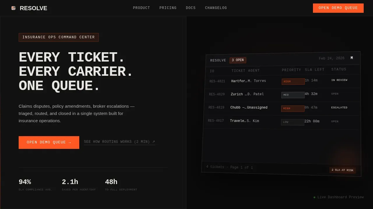
- A 50/50 split-screen hero with a benefit-driven headline on the left and an isometric product screenshot on the right, showing a live ticket queue with mock carrier data and priority tags.
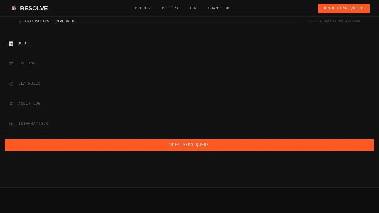
- A clickable Interactive Explorer module rail covering Queue, Routing, SLA Rules, Audit Log, and Integrations, each swapping the right panel with a drawer-slide animation.
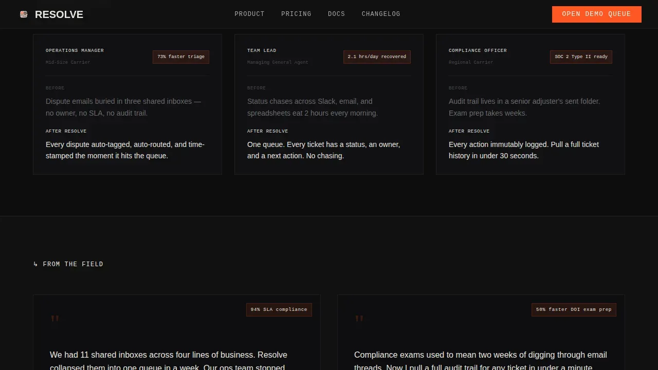
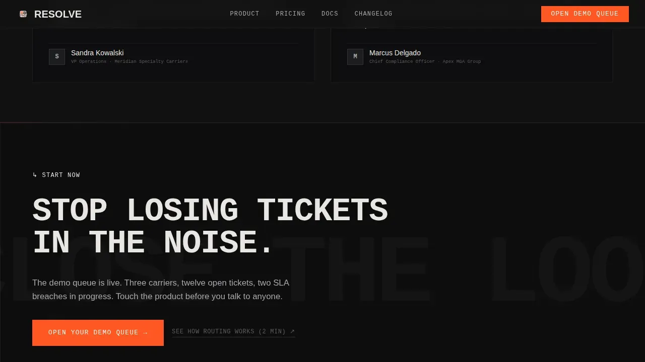
- A proof strip, two social proof testimonials, a final call to action section, and a linear single-row footer that reiterates the primary call to action before visitors leave.
Feature list
This template packages a set of features that work together to communicate the platform's value and move visitors toward commitment.
Split-Screen Hero with Live Dashboard Screenshot
The hero occupies the full viewport as a 50/50 split. The left panel holds a massive uppercase headline in concrete white against forge-black. The right panel shows a pixel-sharp isometric dashboard screenshot with three mock tickets, color-coded priority tags, an SLA countdown timer, and an agent assignment column. No device frame, no blur, just raw interface on black.
Interactive Module Explorer Rail
Scrolling past the hero reveals a clickable navigation rail with brutalist icon tabs. Each tab, Queue, Routing, SLA Rules, Audit Log, and Integrations, swaps the right panel to show that module. A drawer-slide micro-animation accompanies each transition. This lets visitors track how the ticketing system handles escalating complexity, from simple queue management to full compliance reporting.
AI-Powered Routing and Automation Display
The routing module panel highlights ai-powered assignment logic. Visitors see how new tickets are automatically sorted, tagged, and escalated without manual triage. The description communicates the importance of automation in cutting the time agents spend on organizing and sorting incoming requests.
SLA Rules and Breach Alert Panel
The SLA module shows countdown timers and breach alert states. This panel gives operations teams full context on how the system enforces service-level agreements and surfaces at-risk tickets before they breach. It is a direct answer to the pain of discovering escalations after the deadline has already passed.
Compliance Audit Log View
The audit log panel demonstrates time-stamped, tamper-resistant records for every ticket. Compliance officers can see the complete chain of custody for each request, from first contact to final resolution, with full context preserved at every step. This addresses one of the strongest purchase motivators for this industry.
Signal-Orange call to action System
The primary call to action, "Open Your Demo Queue," appears in signal-orange inside the hero and again fixed to the bottom of the navigation rail. A secondary text link, "See How Routing Works (2 min)," sits beneath it for visitors who want proof before commitment. No form on the landing page itself; the click passes visitors into a sandbox environment.
Page sections overview
| Section | Purpose |
|---|---|
| Hero Split Screen | Introduce platform with headline and live dashboard screenshot |
| Interactive Module Rail | Let visitors explore Queue, Routing, SLA, Audit, Integrations |
| Proof Strip | Surface three ICP pain points with signal-orange resolution callouts |
| Social Proof Block | Show two named testimonials with specific ticket and time metrics |
| Final call to action Section | Deliver primary call to action push before visitors exit |
| Linear Footer | Reiterate call to action and provide navigation in a single-row layout |
Design & branding system
The visual identity is Bold Brutalist, built on a Monochrome Steel palette. Every color and type choice is structural, not decorative. The design communicates authority and precision before a single word is read.
- Color system: forge-black (#121212) as the dominant background, cold-rolled steel (#3A3A3C) for secondary panels, brushed aluminum (#A8A9AD) for supporting text, exposed concrete white (#E8E6E1) for headlines, and signal-orange (#FF5722) reserved exclusively for interactive elements, notification badges, and calls to action.
- Typography: DM Mono and Manrope in oversized uppercase slabs, set in steel gray against black fields, with generous negative space that makes the density feel intentional.
- Motion: high-intensity beam sweeps, drawer-slide transitions between module panels, and staggered scroll-reveal animations that escalate complexity as visitors explore deeper.
Mobile & speed optimization
This template is designed desktop-first, reflecting the reality that operations managers manage tickets from workstation dashboards. The interactive module rail and split-screen layout are optimized for large-viewport use.
- The static hero loads without heavy client-side overhead; module switching is handled client-side to keep the experience fast and smooth.
- The layout scales responsively so the landing page remains usable on tablet and mobile devices for on-the-go adjusters who need quick access.
How this template helps you convert
This landing page is built as a conversion-focused template that treats every interaction as a micro-conversion. Visitors do not just read about the system; they experience it before committing.
- The Interactive Explorer turns passive scrolling into active product exploration. Each module a visitor clicks builds ownership, so they arrive at the call to action already feeling like users rather than prospects.
- The fixed signal-orange call to action and secondary text link work together to capture both ready buyers and those who need one more layer of proof, addressing the full range of visitor intent without adding friction.
Other information about this template
This section covers additional context that supports informed purchasing decisions and helps teams assess fit before they sign up or upgrade their current solution.
- This template is the resolve unified claims ticketing platform landing page template, purpose-built for the insurance software industry and niche help desk and ticketing use cases.
- Helpdesk ticket templates are a key part of a well-organized support system. Standardizing helpdesk tickets ensures that all necessary information is collected consistently, and standardized tickets facilitate faster resolution times.
- Service desk solutions can track, triage, and assign incoming requests from various sources. Service desk solutions also provide a self-service portal that empowers customers and employees to find answers to common questions.
- A customer service request template helps in gathering all the necessary information from the customer. Templates ensure that maintenance requests are clear and contain all necessary information, which is one of the core benefits of this system.
- Unified Endpoint Management (UEM) solutions enhance IT management by providing a centralized platform for managing devices and applications. UEM solutions streamline IT support workflows by integrating ticketing systems with device management capabilities, which makes them a useful reference point when evaluating this template's tech stack fit.
- Key features of a unified claims platform include a centralized inbox, digital First Notice of Loss (FNOL) capabilities, self-service tools, automation, ai-powered features, and clear integration capabilities with existing tools.
- Social proof and trust signals built into this template include named customer testimonials with specific metrics, carrier role descriptions, and security-conscious design cues that communicate reliability to prospects dealing with sensitive claims data.
- The landing page layout uses a minimalist structure with intentional negative space to guide visitors toward the call to action, consistent with professional landing page design principles.
- Additionally, the template's structure supports scale: as the platform grows and agents handle more tickets, the same layout communicates increased capability without requiring a redesign.
- Reports, metrics, and visibility tools are highlighted in the SLA and audit log panels, giving prospects a clear picture of the management layer behind the ticketing system.
- The footer reiterates the main call to action before visitors leave, following effective call to action strategies for conversion-focused landing pages.
Theme
Bold Brutalist
Creative direction
Interactive Explorer
Color system
Monochrome Steel
Style
Split Screen (50/50)
Direction
Click-Through
Page Sections
Split-screen Hero with Dashboard View
Interactive Module Explorer Rail
Ai-powered Routing and Automation Panel
SLA Rules and Breach Alert Display
Compliance Audit Log Panel
Signal-orange Fixed Call to Action System
Related questions
What type of business is this template designed for?
Does the template include an interactive product demo experience?
Can I customize the color palette and typography?
Is there a contact form on the landing page?
How does this template support compliance-focused buyers?



