Complete Advanced Tech & AI Platforms Comparison Website Template
The Automate Kill the Busywork AI Workflow Automation Landing Page Template is a scroll-reveal, single-page layout built for B2B SaaS platforms in the workflow automation space. It pairs a Bold Brutalist visual identity with a Glassmorphic dark IDE aesthetic, an interactive workflow canvas hero, and a Before/After comparison engine that prosecutes legacy tools with live-counting metrics and spec-sheet precision.
by Rocket studio
Quick summary
This template is a purpose-built landing page for AI workflow automation platforms. It opens with a draggable, animated canvas above the fold and progresses through spec-sheet reveals, Before/After versus panels, and a competitor comparison grid. Every section is designed to make the visitor feel the cost of their current process before presenting the exit.
Who this template is for
This template is built for founders, operations leads, and product teams selling AI-powered automation. It communicates directly to buyers who are tired of busy work and ready to move their business forward.
- RevOps leads and operations managers who are buried in fragile, manual pipelines and need to automate repetitive tasks at scale.
- Engineering managers who have lost sprint cycles to internal tooling and want to redirect their teams toward strategic initiatives.
- Founders and business owner operators who have discovered that their so-called automated workflows still require a real person to babysit them at midnight.
What problem this template solves
Most operations teams drown in low value tasks that compound silently: copying data between tabs, chasing follow ups manually, and watching wasted time pile up in a typical week. Research shows the average business owner spends more than 15 hours a week on low-value administrative work. This template gives your platform a page that names that pain loudly and then dismantles it visually.
- Visitors arrive skeptical. The interactive canvas hero proves capability before they read a single word, reducing the need for manual tasks like persuasion through long paragraphs.
- The Before/After comparison engine eliminates abstract claims. It shows crossed-out manual effort on the left and live-counting wins on the right, so buyers see the delta in seconds.
- There is no email gate blocking the primary call to action. Visitors click directly into a sandbox, reducing friction and moving qualified traffic faster toward conversion.
What you get with this template
You get a fully structured, scroll-reveal landing page with every core section pre-built and ready to populate with your platform's real data. The layout covers hero through footer without leaving any section gaps.
- An interactive workflow canvas in the hero section, pre-loaded with three connected nodes and a floating dock for a draggable fourth node, complete with animated data pulse edges.
- A Spec Sheet scroll flow with progressive section reveals, a live-metrics marquee ticker, and a competitor comparison grid set against a void black and frosted glass visual system.
- A pinned frosted-glass call-to-action bar that appears after the second scroll reveal and stays fixed, plus contextual secondary calls to action inside each versus row linking to teardown pages.
Feature list
This section covers the core built-in capabilities that make this template work as a conversion tool for ai workflow automation platforms.
Interactive Workflow Canvas Hero
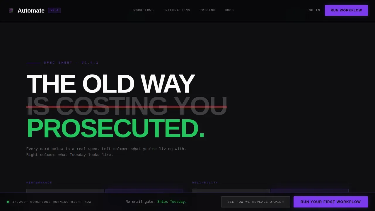
The header embeds a live, manipulable workflow canvas above the fold. Three pre-built nodes, a CRM trigger, an AI classification step, and a Slack notification, are already wired together with animated data pulses traveling the edges. Visitors can drag a fourth node from a floating dock, drop it onto the canvas, and watch the workflow reroute in real time. The headline "Kill the busywork." sits raw and enormous in the top-left corner in confrontational grotesque type. The canvas itself is the pitch.
Before/After Comparison Engine
Each spec card in the scroll flow is split into two columns. The left column shows the old process in muted gray with crossed-out metrics: manual data entry, broken follow ups, raw data sitting in a Google Sheets tab nobody trusts. The right column fires in electric ultraviolet with live-counting numbers that tick upward as the section enters the viewport. This format lets the platform prosecute mundane tasks and routine work without making unverifiable claims. The contrast is visceral and data driven.
Competitor Comparison Grid
A horizontal scrolling rail near the bottom of the page lays the platform against competing automation tools in a brutally honest feature grid. Every cell is a checkmark or a dash. No hedging. This section is designed to handle the lead qualification moment when a buyer is already comparing options and needs to see the main points laid out cleanly.
Scroll-Reveal Progressive Disclosure
Each section enters the viewport through GPU-accelerated scroll-linked reveal animations. Data pulse animations, counting numbers, and scan lines fire on entry using Intersection Observer triggers. The page does not front-load information. It discloses each automation capability the way a technical datasheet discloses specs, one reveal at a time, so the weight of each point lands before the next one arrives.
Pinned Frosted-Glass Call to Action Bar
After the second scroll reveal, a frosted glass bar appears at the top of the viewport and stays pinned for the rest of the page. The primary call to action, "Run Your First Workflow," drops the visitor directly into a sandbox pre-loaded with their detected industry vertical and the same canvas from the hero. No free account form blocks the path. A secondary call to action, "See How We Replace [Competitor]," appears contextually in each versus row.
Monochrome Integrations Rail
The integrations section renders partner and tool logos in monochrome on individual frosted glass tiles, staggered at different depths on a void black background. Each tile is bordered with a single-pixel frost line. This section handles the "does it connect to my stack?" question visually, without requiring a paragraph of explanation.
Page sections overview
| Section | Purpose |
|---|---|
| Hero Canvas | Interactive node canvas with animated data pulses and the "Kill the busywork." headline |
| Metrics Ticker | Live-scrolling marquee with throughput benchmarks and latency numbers |
| Spec Sheet Versus | Before/After comparison cards with live-counting metrics and crossed-out legacy data |
| Integrations Rail | Monochrome logo tiles on frosted glass showing connected tools |
| Competitor Grid | Horizontal feature grid comparing the platform against competing automation tools |
| Footer Row | Linear single-row footer with minimal navigation |
Design & branding system
The visual identity is Bold Brutalist filtered through a Glassmorphic dark IDE palette. Every element feels like a translucent modal floating over a pitch-black terminal, bordered with a single-pixel frost line, brutally flat yet somehow hovering above the surface.
- Color palette: void black (#09090B) for all backgrounds, frosted panel white at 12% opacity (#FFFFFF1F) for glass cards, electric ultraviolet (#7C3AED) for active states and data flowing through nodes, and hard signal green (#22C55E) that fires only on successful automation run confirmations.
- Typography: JetBrains Mono for all data, numbers, and spec labels; Manrope for headlines set at confrontational scale with no softening. The combination reads like a dark IDE at 1 AM.
- Layout logic: frosted glass cards layered at staggered depths over solid black backgrounds, each card bordered with a single-pixel frost line. No gradients. No decorative flourishes. Every pixel earns its place.
Mobile & speed optimization
The template is desktop-first by design, built for operations teams who live on large monitors. A mobile fallback layout is included to handle traffic from smaller screens without breaking the core visual system.
- GPU-accelerated transforms power the scroll-linked reveals and data pulse animations, keeping motion smooth without degrading the browsing experience on capable hardware.
- Intersection Observer triggers fire section animations only when each element enters the viewport, so the page does not run heavy animation logic on content the visitor has not reached yet.
How this template helps you convert
The page is structured as a conversion argument, not a feature brochure. Each section adds pressure before releasing it through a clear call to action. Research shows that compelling headlines and single focused calls to action drive conversion significantly, and this template is built around both principles.
- The interactive canvas hero creates immediate proof of capability. Visitors interact with the product concept before reading a claim, which builds trust faster than any paragraph of copy. AI tools that show rather than tell earn the scroll.
- The Before/After comparison engine makes the cost of inaction visible. Buyers who see their current busy work reflected in crossed-out metrics on the left column feel the weight of their existing process. The right column offers the relief. This sequence is designed to automate the persuasion arc, not just describe it.
- The pinned call-to-action bar removes every moment of hesitation between decision and action. The visitor does not need to scroll back to the top. The button is always present, always one click away, inviting them to finally focus on running their first workflow instead of evaluating one more tool.
Other information about this template
This template is a strong fit for teams building or marketing platforms in the AI automation and operations tooling category. It is designed to address the specific buyer journey of someone who has already tried simpler approaches and found them insufficient.
- Most entrepreneurs and operations leads have already experimented with no-code or low-code automation tools. This template acknowledges that context and positions a more capable platform without dismissing the buyer's existing knowledge. Notion AI, Google Sheets automations, and Google Docs workflows are familiar territory for this audience, and the versus sections can speak to those tools directly.
- The automate kill the busywork ai workflow automation landing page template is designed around a single conversion path: get the visitor into the sandbox. There is no secondary email capture diluting that intent. A free account or trial entry point is the terminal action the entire page is built toward.
- Task automation use cases covered by this layout include data entry elimination, automated follow ups, welcome email sequencing, scheduling posts to social channels, lead qualification routing, content creation pipelines that turn long form content into social posts, and ai agent-driven decision trees that remove human error from recurring tasks.
- The template structure follows a proven framework: value proposition, pain points, solution reveal, benefits, proof via live metrics, competitor comparison, and a single dominant call to action. This maps directly to what research shows drives conversion on ai powered B2B landing pages.
- Robotic process automation buyers, who are evaluating whether to build systems on top of existing infrastructure or adopt a new tool, will find the competitor grid section particularly useful. It handles the comparison moment without requiring a sales call.
- The page is built to start scaling traffic immediately on launch. Because the canvas and versus sections do the heavy persuasion work, teams can reduce friction in the sales process and redirect valuable time toward closing rather than educating.
- Smart workflows built on this platform can automate repetitive work across the full operations stack: email responses, follow ups, data routing, and task automation that previously required a real person to monitor and trigger manually.
- Artificial intelligence handles the classification and decision steps inside the canvas demo, showing visitors that ai automation is not about replacing people but about replacing the low value tasks that prevent those people from doing their best work.
- The template supports content creation use cases as well. Teams that produce blog posts, repurpose long-form material into social posts, or manage scheduling posts workflows can use the versus sections to show how ai powered automation removes the manual layer from that process.
- Version control and process documentation are everyday tasks that the template's spec sheet sections can address, helping buyers see the full surface area of what automated workflows can cover across their business.


Theme
Bold Brutalist
Creative direction
Spec Sheet
Color system
Glassmorphic
Style
Scroll Reveal (Progressive)
Direction
Comparison/Versus
Page Sections
Interactive Workflow Canvas Hero
Before/after Comparison Engine
Competitor Feature Comparison Grid
Scroll-reveal Progressive Disclosure
Pinned Call-to-action Bar
Monochrome Integrations Rail
Related questions
Is this template suitable for a SaaS platform that sells workflow automation?
Does the template include the animated canvas and data pulse effects?
Can I customize the Before/After comparison cards for my own metrics?
Does the page require visitors to sign up before they can try the product?
Is the competitor comparison grid editable?


