Running Gear Store Landing Page Template
Stride is a modular card-grid landing page built for running gear stores. It opens with a cinematic full-viewport hero, then guides visitors through a ground-up gear discovery flow. A sticky filter bar, before-and-after product cards, and a persistent "Find Your Fit" call-to-action work together to turn casual browsers into confident, click-ready shoppers.
by Rocket studio
Quick summary
Stride is a single-page running gear landing page designed for sports retail brands. It uses a modular card grid, a sunset-gradient visual identity, and a before-and-after reveal mechanic to help visitors find the right gear fast. Every section builds from footwear upward, mirroring the real experience of gearing up before a run.
Who this template is for
This template suits running-focused retail brands that want a visually immersive storefront without the clutter of a full e-commerce build. It is ideal for store owners who want to drive confident product discovery rather than immediate add-to-cart conversions.
- Running gear retailers launching a new seasonal collection or flagship storefront page
- Sports boutiques offering gait analysis, shoe-finder consultations, or curated gear bundles
- Store brands serving a wide runner spectrum, from beginner five-kilometer runners to ultramarathon athletes
What problem this template solves
Running gear shoppers arrive with very specific problems: blisters, shin pain, soaked kit, and dead legs in the final miles. A generic product grid gives them no context for why one product matters over another. Stride closes that gap.
- Shoppers cannot connect product features to their personal pain points without visual proof
- Standard storefronts bury discovery under navigation menus, slowing down confident purchase decisions
- New runners especially need guidance, not just a catalog, to trust their first gear choices
What you get with this template
Stride delivers a fully structured, single-page layout ready to present a running gear range from the ground up. Every section has a clear role, and the visual system is consistent from header to footer.
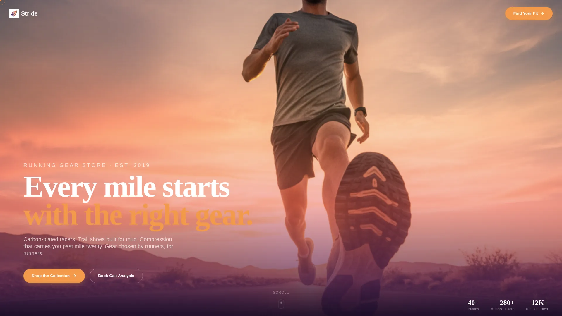
- A full-viewport lifestyle hero with a bold headline and a soft scroll cue
- A sticky filter bar with terrain, distance, and problem-based filter chips for live grid reshuffling
- A modular before-and-after product card grid, a persistent bottom call-to-action bar, and a sunset-gradient design system
Feature list
This template is built around a set of tightly focused layout features. Each one serves a specific role in turning page visits into product-page clicks.
Full-Viewport Lifestyle Hero
The header fills the entire screen with a dramatic knee-height runner shot. The shoe tread is sharp in the foreground while the figure stretches toward a coral-and-gold horizon. A single white headline fades in low, and a subtle scroll cue invites the visitor downward without any navigation distraction.
Before-and-After Product Cards
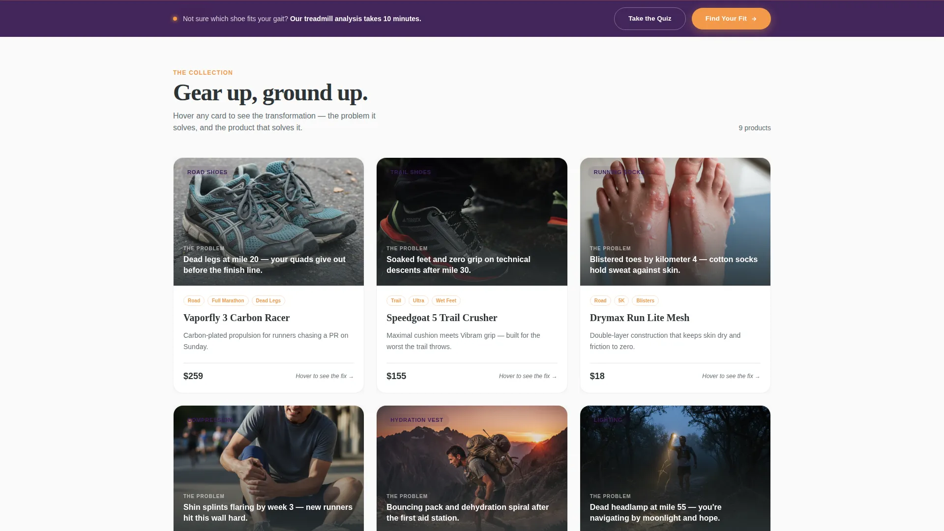
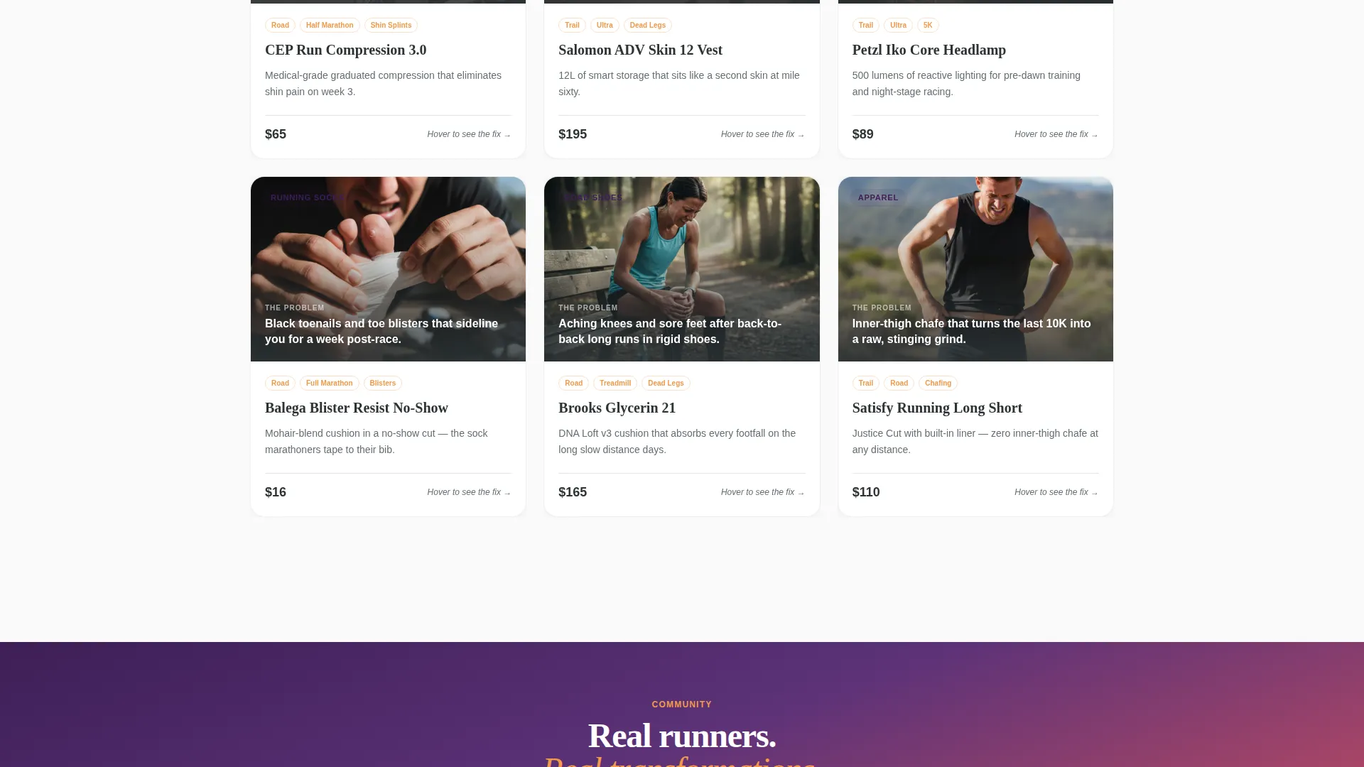
Each card in the grid presents a runner's common problem on one face and the specific product that solves it on the other. Cards flip or slide between states, giving visitors immediate visual proof before they ever click through to a product page.
Sticky Filter Bar
A persistent filter strip sits above the card grid at all times. Runners can sort by terrain, distance, or problem type. Each chip selection reshuffles the visible cards, turning the page into a living directory tuned to the visitor's actual needs.
Ground-Up Gear Sequencing
The grid builds from foundation pieces outward. Shoes and insoles appear first, followed by socks, apparel, accessories, and tech. This sequence mirrors the natural act of gearing up, making the browsing experience feel intuitive and purposeful.
Persistent "Find Your Fit" Bar
A fixed bottom bar carries the primary call-to-action at all times. It links to a gait-analysis booking or an interactive shoe-finder quiz, ensuring that every visitor has a clear next step regardless of where they are on the page.
Sunset Gradient Design System
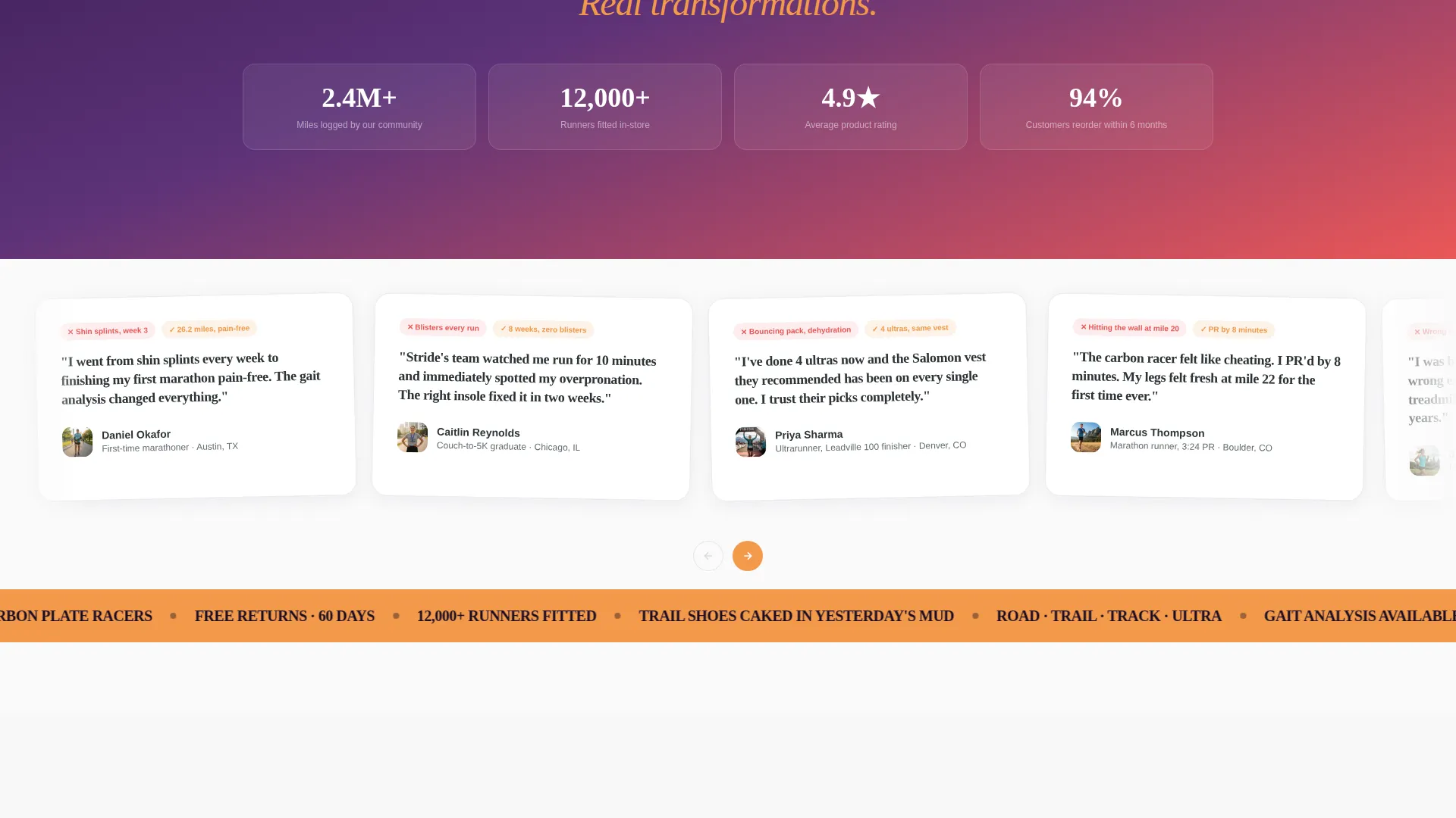
The entire page uses a cohesive four-color palette built around deep horizon purple, warm amber, faded coral, and cool asphalt. Gradient washes move across section backgrounds, while amber pulses on every interactive element to give clicks a sense of warmth and energy.
Page sections overview
| Section | Purpose |
|---|---|
| Full-viewport hero | Opens with a lifestyle image, headline, and scroll cue |
| Sticky filter bar | Lets visitors filter cards by terrain, distance, or problem |
| Modular card grid | Displays before-and-after product cards in ground-up order |
| Persistent bottom bar | Keeps the primary "Find Your Fit" call-to-action always visible |
Design & branding system
The visual identity follows a sunset-gradient direction that balances high energy with calm depth. Every color choice is purposeful, and the palette works as a system rather than a set of isolated accents.
- Four-color palette: deep horizon purple (#3D1F56), warm amber blaze (#F2994A), faded coral (#EB5757), and cool asphalt (#2D3436) for body text
- Cards sit on clean off-white (#FAFAFA) with asphalt-colored type and purple category tags; interactive elements pulse amber on hover
- Gradient washes move from coral to amber across section backgrounds, creating a long-exposure highway feel at golden hour
Mobile & speed optimization
The modular card grid is designed to reflow cleanly across screen sizes. Filter chips and the persistent bottom bar remain accessible on smaller viewports without overlapping content.
- Card grid shifts from multi-column desktop layout to a single-column mobile stack
- Sticky filter bar and the bottom call-to-action bar maintain their positions on touch devices
- Before-and-after card interactions are adapted to work with both hover states on desktop and tap gestures on mobile
How this template helps you convert
Stride is built around click-through rather than impulse purchase. Every layout decision is made to build confidence before asking for action.
- The before-and-after card mechanic shows the product solving a real problem, so visitors click "See It in Action" from a position of trust rather than curiosity alone.
- The sticky filter bar reduces scroll fatigue by surfacing only the most relevant products for each visitor's specific terrain, distance, or problem type.
- The persistent "Find Your Fit" bottom bar ensures that visitors who are not yet ready to browse can still take a meaningful guided step toward the right gear.
Other information about this template
Stride is categorized under Retail and E-Commerce, specifically within the Sports and Outdoor Store subcategory. It is designed as a single landing page rather than a multi-page site, making it a fast, focused entry point into a broader product catalog.
- The template style uses an overlap and layered approach, with cards and gradient sections sitting in visual depth rather than flat rows
- The "See It in Action" card call-to-action routes to individual product detail pages; no cart or checkout flow is included on this page
- This template is well suited to seasonal campaign launches, gear guide promotions, or as a persistent storefront front door that directs traffic into specific product categories
Theme
Luxe Minimal
Creative direction
Unboxing Experience
Color system
Citrus Burst
Style
Overlap/Layered
Direction
Marketplace/Multi
Page Sections
Full-viewport Lifestyle Hero
Before-and-after Product Cards
Sticky Filter Bar
Ground-up Gear Sequencing
Persistent Find Your Fit Bar
Sunset Gradient Design System
Related questions
Does this template include a shopping cart or checkout?
Can I change the filter chip categories?
How does the before-and-after card mechanic work?
Is this template suitable for a new running store with a small product range?
Can the color palette be adjusted to match an existing brand?



