Equestrian Analytics Dashboard Landing Page Template
Stride is a dark, high-performance equestrian analytics dashboard landing page template built for competitive riders, dressage trainers, and racing syndicates. It leads with a live-style metrics hero, walks visitors through a Problem-to-Solution arc, and converts on a freemium model with a three-tier comparison table, a case study block, and a no-credit-card signup flow.
by Rocket studio
Quick summary
Stride is a single-page landing page template designed for equestrian analytics platforms. It opens with a stats-driven hero, guides visitors through a clear problem-and-solution narrative, and closes with a freemium signup. The template is desktop-first with full mobile support, built around a dark carbon fiber visual system and telemetry green signal accents.
Who this template is for
This template is built for founders, product teams, and marketers launching equestrian performance software. It speaks directly to the horse sport world and its specific data needs.
- Competitive event riders and dressage trainers who need to present stride data clearly to clients or investors
- Racing syndicates and yard managers looking to position a multi-horse tracking platform to potential subscribers
- Equestrian vertical SaaS teams that need a conversion-ready landing page with tiered pricing built in
What problem this template solves
Riders and trainers often make high-stakes training decisions based on feel alone. When a platform can actually quantify stride frequency, symmetry, and recovery data, the challenge becomes communicating that value fast enough to earn a signup. Generic SaaS templates do not speak the language of equestrian sport.
- No dedicated structure for comparing free, pro, and syndicate tiers with horse-sport-specific feature rows
- No ready-made narrative arc that moves a skeptical rider from pain point to proof to action
- No visual system that matches the technical intensity a performance equestrian audience expects
What you get with this template
You get a fully structured, single-page landing page template with every section pre-built and sequenced for conversion. The design system, copy structure, and interactive components are all purpose-built for an equestrian analytics context.
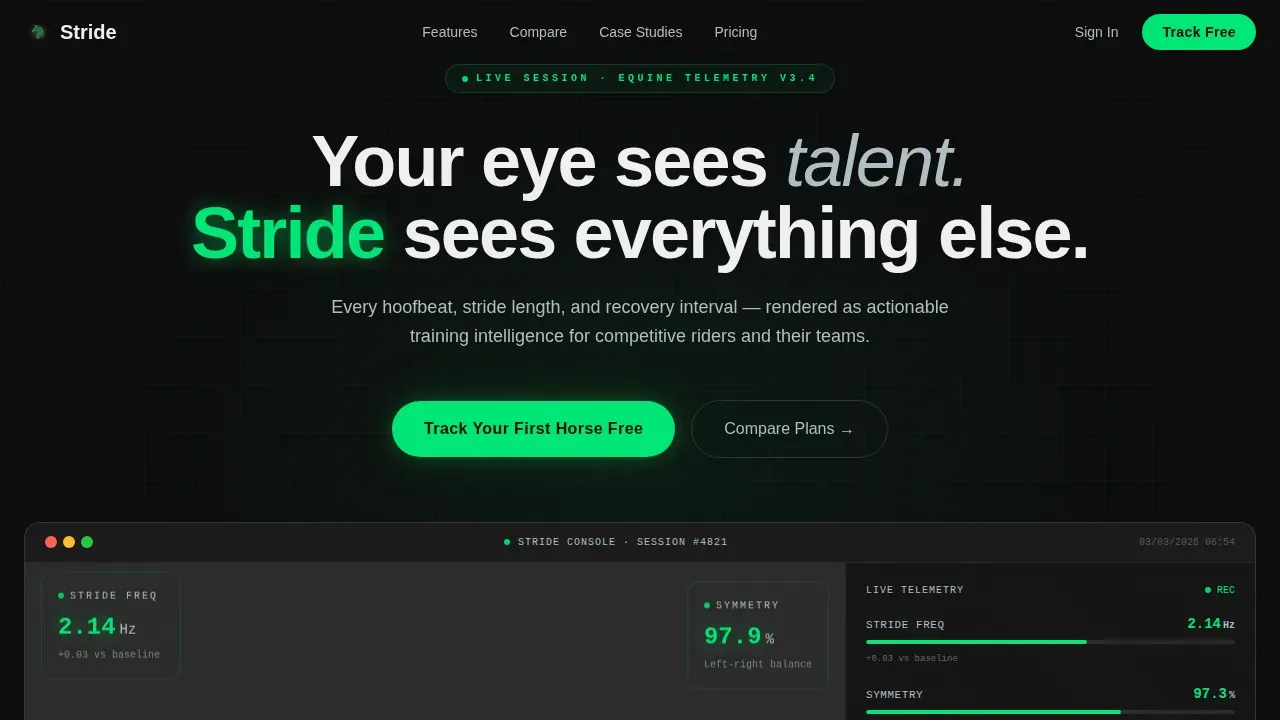
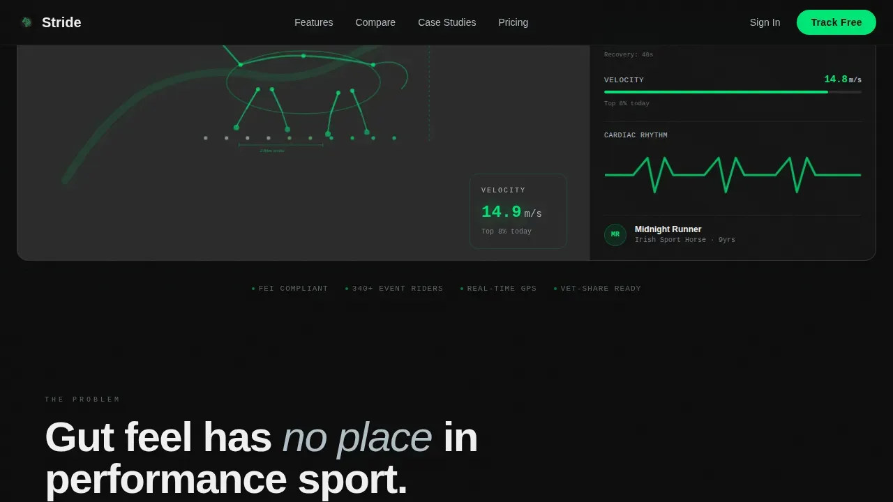
- A live-style hero section with a horse motion skeleton overlay, floating metric cards, and ticking data counters
- A three-column comparison table with equestrian-specific rows covering horses tracked, stride asymmetry alerts, vet-share reports, competition-day overlays, and multi-rider access
- A freemium signup form asking only for name, email, and discipline, plus a secondary demo request path for yards and syndicates
Feature list
This template includes purpose-built components that work together across the full landing page scroll.
Animated Metrics Hero Section
The header renders a horse mid-gallop as a motion skeleton overlay, surrounded by live-style metric cards showing stride frequency, symmetry index, peak heart rate, and a velocity heat-mapped GPS track. Numbers tick and update subtly to imply a system that is always active.
Problem Arc Narrative Block
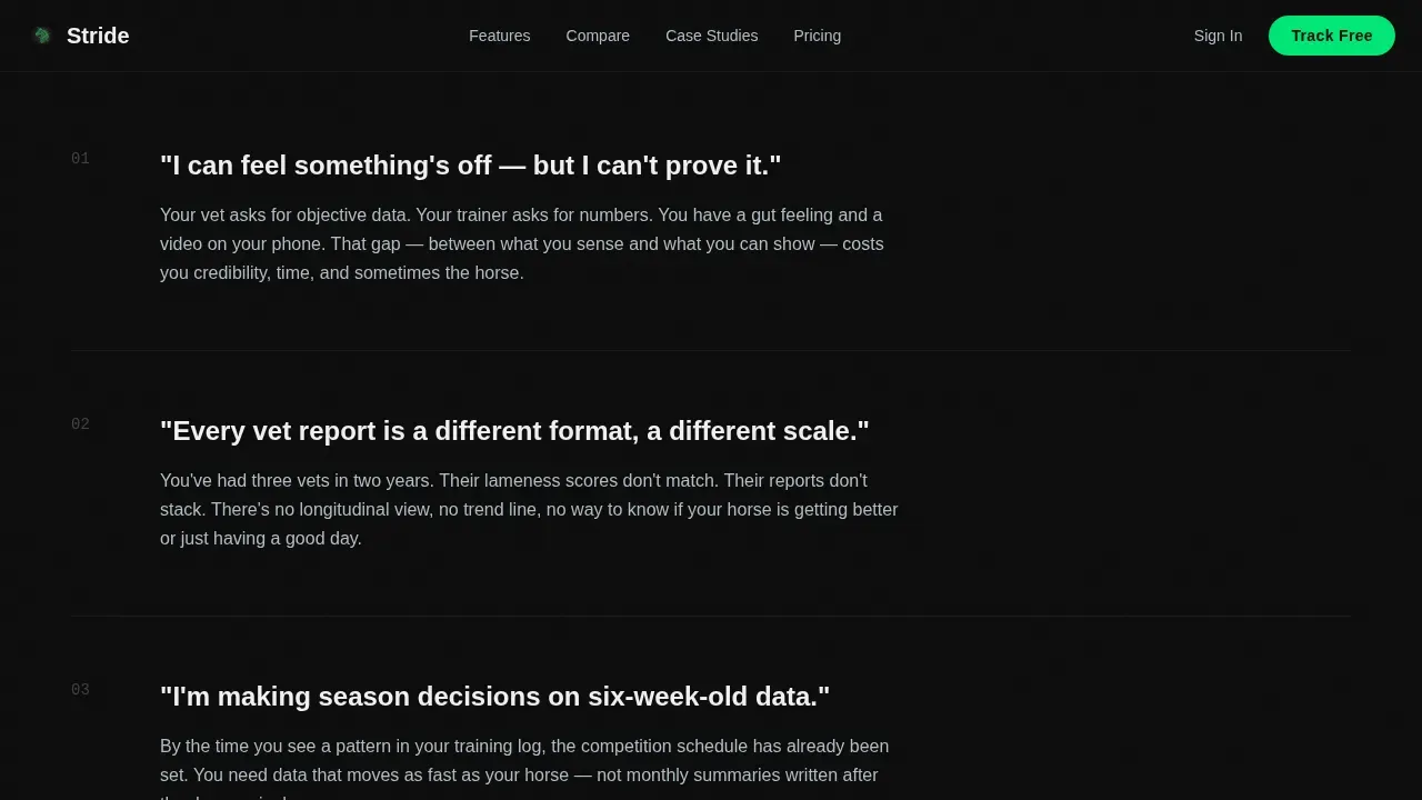
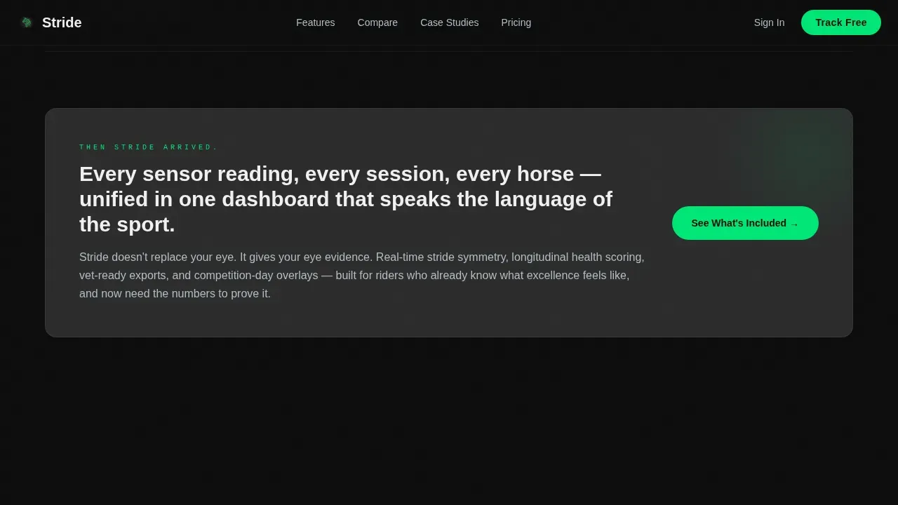
A dedicated scroll section states rider pain points in plain, frustrated language before pivoting sharply to the solution. This structure primes visitors emotionally before they reach the comparison table, making the product feel necessary rather than optional.
Three-Tier Comparison Table
The comparison table stacks Stride Free, Stride Pro, and Stride Syndicate in clearly labeled columns. Rows cover the features that matter most to equestrians, so each tier communicates genuine value. Row highlights draw attention to the most persuasive upgrade triggers.
Auto-Play Case Study Block
A single case study section auto-plays a narrative about a three-star eventer whose suspension data identified a developing soft-tissue issue two weeks before lameness appeared. This social proof block is designed to make the platform's value tangible and specific.
Freemium Conversion Flow
The primary call-to-action button, "Track Your First Horse Free," appears beneath the hero metrics and again after the comparison table. The signup form collects only name, email, and discipline to keep friction low. No credit card is required.
Demo Request Path
A secondary conversion path below the case study section targets yard managers and syndicate operators with a short-form demo request link. This keeps enterprise-level prospects on a separate, low-pressure track.
Page sections overview
| Section | Purpose |
|---|---|
| Hero Metrics Wall | Establish platform credibility with live-style data and motion overlay |
| Problem Arc Block | Name rider pain points before introducing the solution |
| Comparison Table | Show Free versus Pro versus Syndicate with equestrian-specific rows |
| Case Study Block | Deliver real-world proof through the three-star eventer narrative |
| Signup Call to Action | Convert visitors with a no-credit-card free tier form |
| Demo Request Path | Capture yard and syndicate leads through a secondary form link |
| Footer | Single-row linear footer with essential links |
Design & branding system
The visual identity follows a Dynamic Motion theme built on a Carbon Fiber color system. Every design decision reinforces a sense of technical precision and live performance data.
- Color palette: deep cockpit black (#0D0D0D) for backgrounds, woven carbon gray (#2B2B2B) for content cards, telemetry green (#00E676) exclusively on live numbers, progress bars, and call-to-action buttons, and brushed titanium (#B0BEC5) for secondary text and dividers
- Typography: DM Sans for headings and body copy, JetBrains Mono for all data values and numeric displays, maintaining a clean instrument-panel aesthetic throughout
Mobile & speed optimization
The template is built desktop-first to support the data-heavy comparison table and dashboard hero. Full mobile support is included so riders and trainers on the go can still engage with the page clearly.
- Animated sections use client-side rendering for ticking counters, floating cards, and scroll reveals, while static sections use server components to keep load times efficient
- The comparison table and metric hero reflow cleanly on smaller screens so no critical information is lost on mobile devices
How this template helps you convert
Every section in this landing page is sequenced to reduce doubt and increase the likelihood of a free signup.
- The hero section leads with specific, real-feeling data points that establish platform credibility before a single word of marketing copy appears, earning trust immediately.
- The comparison table makes the free tier feel genuinely useful and the pro tier feel like a natural next step, so the upgrade conversation begins the moment a rider sees their first data visualization.
- The dual conversion path serves both individual riders and larger operations, capturing free signups and demo requests without forcing either audience into a flow that does not fit them.
Other information about this template
This template is part of the Stride equestrian analytics product family and is designed to serve the global English-language equestrian market with USD pricing conventions built in.
- Discipline selector in the signup form covers eventing, dressage, racing, and showjumping for personalized onboarding
- Interactivity includes metric counters, comparison table row highlights, form validation, and parallax scroll effects
- The footer follows a Pattern 1 linear single-row layout for a clean, uncluttered close to the page
- The template supports a B2B and B2C freemium SaaS model, making it suitable for platforms targeting both individual riders and multi-horse operations
Theme
Dynamic Motion
Creative direction
Problem→Solution Arc
Color system
Carbon Fiber
Style
Comparison Table
Direction
Freemium/Trial
Page Sections
Animated Metrics Hero Section
Problem Arc Narrative Block
Three-tier Comparison Table
Auto-play Case Study Block
Freemium Conversion Flow
Secondary Demo Request Path
Related questions
Does the free tier signup require a credit card?
What disciplines does the onboarding form cover?
Who is the secondary demo request path designed for?
How does the comparison table show tier differences?
Is this template suitable for launching a new equestrian analytics product?



