Stripe Documentation Professional Website Template
A split-screen landing page built for developer-facing payment infrastructure. The template uses a dark Tech Glass aesthetic with teal syntax highlights and frosted panel surfaces. It walks visitors through a Problem→Solution Arc, broken code on the left, clean fixes on the right, and closes with a progressive lead-capture form designed to earn the click before asking for it.
by Rocket studio
Quick summary
This is a single-page, split-screen landing page template built for a payment API product. It pairs a void-black Tech Glass visual identity with a Problem→Solution Arc narrative flow. Six escalating developer pain points resolve in real code on the right panel. A progressive form captures qualified leads after competence is already proven.
Who this template is for
This template is built for technical audiences who evaluate tools by reading code, not marketing copy. It speaks directly to the engineers and technical decision-makers who choose and integrate payment infrastructure.
- Backend engineers who debug webhook failures and need to trust a payment API before adopting it
- Startup technical leads comparing payment stacks before their first production launch
- Platform architects building two-sided marketplace products that require multi-party payout logic
What problem this template solves
Most landing pages for developer tools rely on feature lists and vague promises. Engineers don't convert that way. They convert when they see real code solving real problems. This template addresses that gap directly.
- Generic marketing copy fails to build trust with technical buyers who want proof before commitment
- Single-panel layouts can't show the before-and-after contrast that makes a code-based solution click
- Standard lead forms ask for information before demonstrating value, causing drop-off among skeptical engineers
What you get with this template
You get a fully structured, single-page layout with two parallel content panels running side by side at a 50/50 split. Every section is pre-built and purpose-specific, from the animated header down to the progressive conversion form.
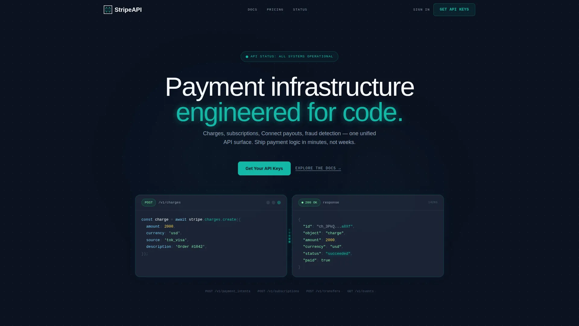
- A dark-glass header with a live-typing code snippet on the left and a real-time JSON response render on the right
- Six Problem→Solution scroll sections, each pairing broken or incomplete code with a clean working implementation
- A progressive lead-capture form with a work email field, a company name field, and an integration-type dropdown
Feature list
This template includes purpose-built layout and interaction components drawn directly from the source brief. Each one serves a specific role in moving a technical visitor toward conversion.
Split-Screen Code Panels
The header opens with two frosted glass rectangles floating side by side against a void-black background. The left panel displays a POST request mid-keystroke, characters appearing line by line. The right panel renders the JSON response in real time, with the success status glowing teal the instant the request completes.
Problem→Solution Scroll Arc
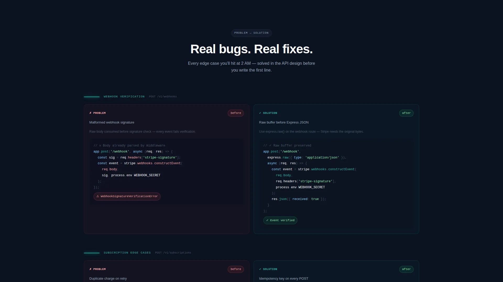
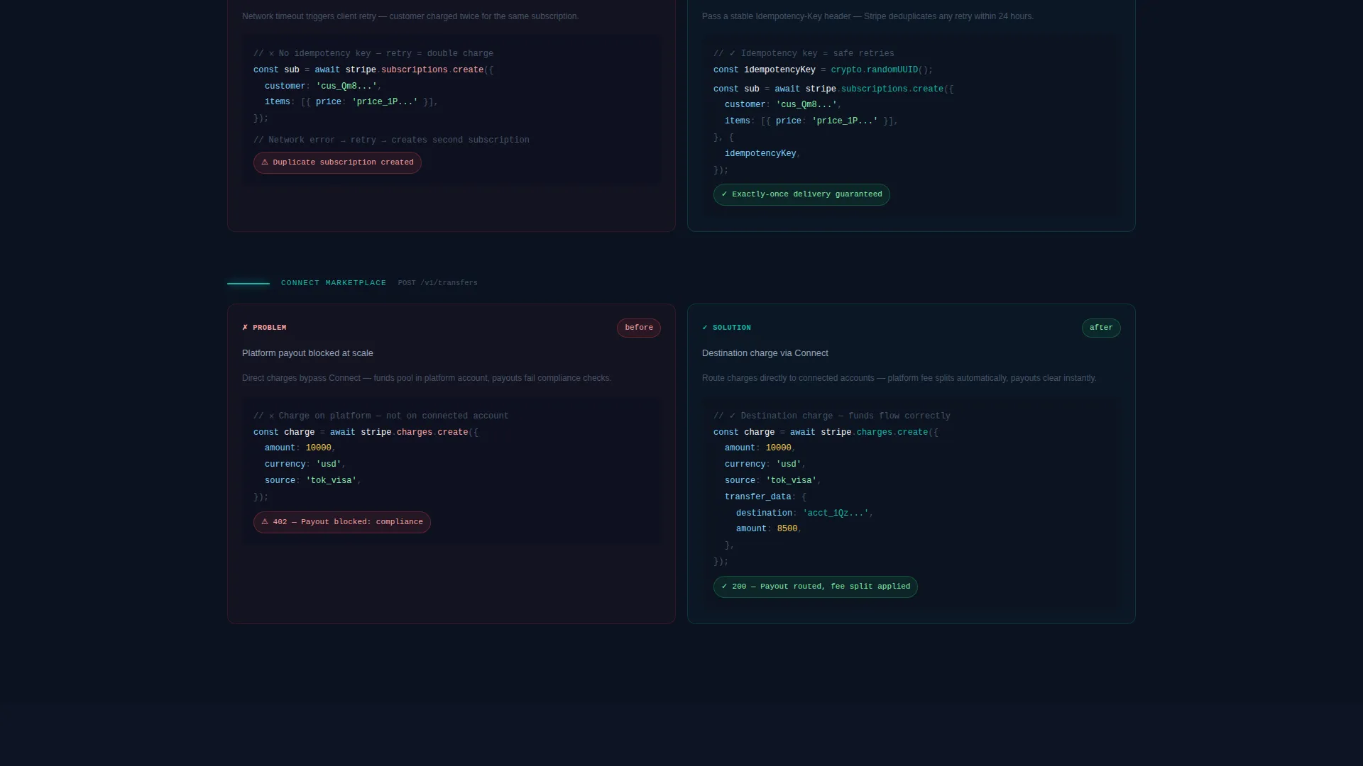
Each scroll section begins with a real developer pain point shown as broken or incomplete code on the left panel. The right panel resolves it with a clean, working implementation. The arc escalates in complexity across six stages: a simple charge, recurring billing, a multi-party payout, and a real-time fraud rule.
Terminal Wipe Transitions
Each section transition mimics a terminal screen clearing. The teal accent color migrates from an error-state red on the left to a success-state green on the right as the visitor scrolls. This reinforces the problem-to-resolution narrative at a visual level without text explanation.
Progressive Lead Capture Form
The conversion form reveals fields progressively. Entering a work email surfaces a company name field and an integration-type dropdown with three options: new build, migration, and marketplace platform. This reduces friction at first contact while gathering meaningful qualification data.
Dual Conversion Path Layout
The primary call to action, "Get Your API Keys," appears as a glass-styled button in the header and anchors the page after the final problem-solution pair. A secondary text link, "Explore the Docs," sits beneath every primary call to action to catch engineers who need more context before committing.
Circuit Diagram Grid Overlay
A faint dotted-line grid connects the two header panels, styled like a circuit diagram. This visual detail reinforces the technical identity of the page without using stock imagery or human faces.
Page sections overview
| Section | Purpose |
|---|---|
| Glass Header Panels | Introduce the API with live typing code and a real-time JSON response |
| Simple Charge Section | Show a basic payment request and its clean working resolution |
| Recurring Billing Section | Demonstrate subscription edge cases resolved with correct implementation |
| Webhook Failure Section | Contrast a malformed webhook signature with the correct validation fix |
| Idempotency Keys Section | Show failed key handling alongside a reliable retry-safe solution |
| Connect Payout Section | Illustrate multi-party marketplace payouts built with platform logic |
| Fraud Rule Section | Present a real-time fraud detection rule as the final escalation step |
| Primary call to action Block | Anchor the "Get Your API Keys" form after all six proof sections |
Design & branding system
The visual identity follows a Tech Glass theme built on the Teal Catalyst color system. Every color is chosen to emit rather than reflect, giving the page a heads-up display quality against its dark background.
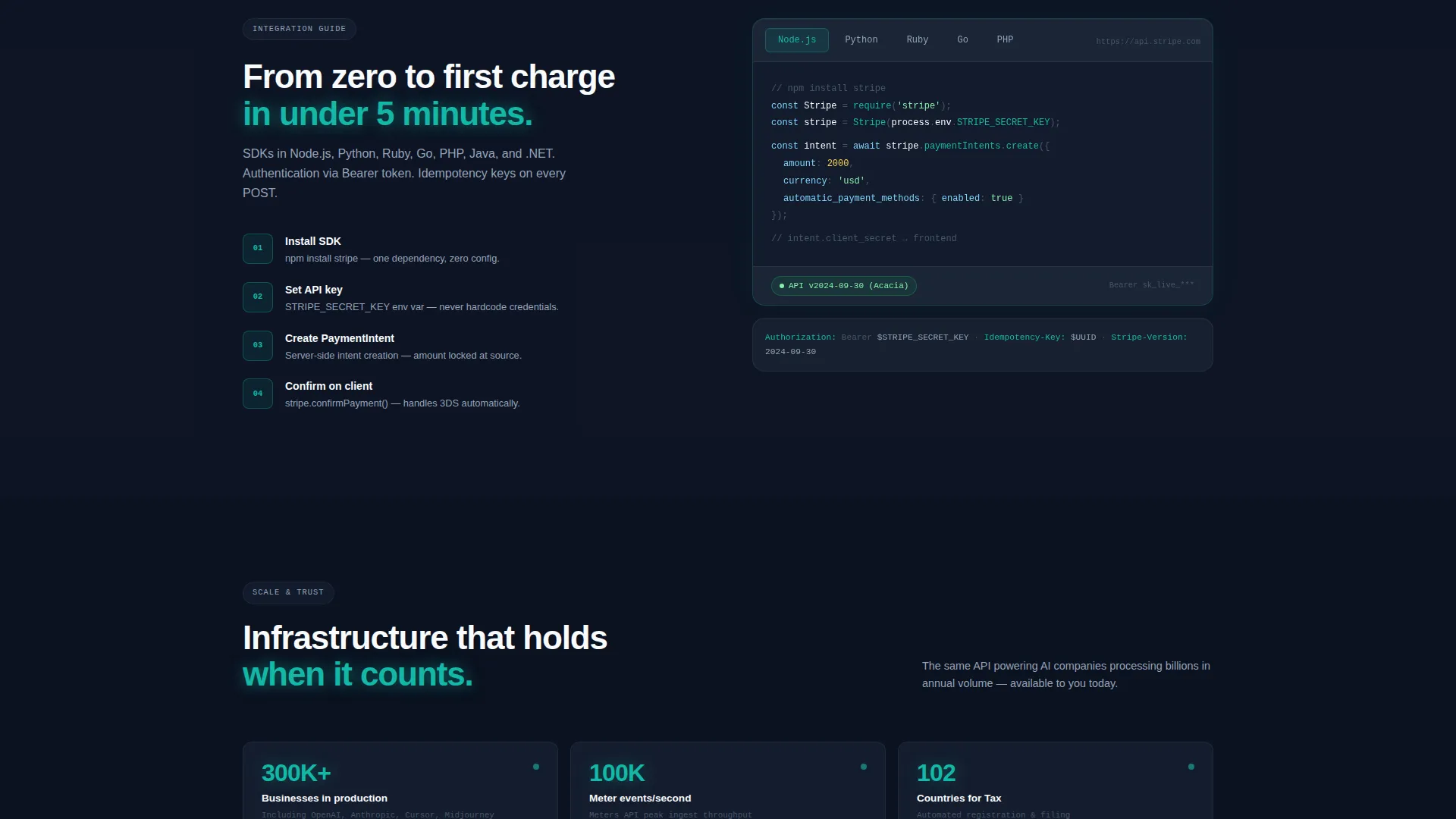
- Deep void black (#0B1120) as the primary background, frosted panel gray (#1E293B) for card surfaces, and sharp white (#F8FAFC) for monospaced type
- Translucent teal (#14B8A6) for active states, syntax highlights, and success-state indicators, with error states rendered in red before resolving to teal on scroll
- No stock imagery and no human faces; the visual language is glass, code, and light throughout
Mobile & speed optimization
The template is built with a layout structure that supports responsive rendering across screen sizes. The split-screen format adapts gracefully to narrower viewports without sacrificing the code-panel narrative.
- The 50/50 split panels stack vertically on smaller screens so the problem-and-solution flow remains readable
- Monospaced type and glass-panel surfaces are specified at a component level, keeping the visual system intact across device widths
- The progressive form collapses to a single-column input flow on mobile, reducing friction for visitors on smaller screens
How this template helps you convert
This template is built around a specific conversion philosophy: prove competence before asking for anything. The layout earns the click by the time the visitor reaches the form.
- The animated header immediately signals technical credibility, showing a live API request and response before any marketing copy appears
- Six sequential problem-solution pairs build trust progressively, so visitors arrive at the form already convinced the product works
- The dual call-to-action structure captures both ready-to-act engineers and those who need more documentation before deciding
Other information about this template
This template is designed for use in a documentation and support context, specifically for teams building or showcasing a payment API reference experience. It fits within the Stripe API reference and Stripe documentation niche.
- The template style is Split Screen (50/50), making it well suited for any technical product that benefits from side-by-side code comparison
- It is categorized under Documentation and Support, with a subcategory alignment toward Stripe Documentation and Stripe API reference use cases
- The Tech Glass theme and Teal Catalyst color system are reusable across other developer-tool landing pages with minimal restyling
- The lead generation direction means the primary goal is capturing qualified signups, not passive content consumption
Theme
Tech Glass
Creative direction
Problem→Solution Arc
Color system
Teal Catalyst
Style
Split Screen (50/50)
Direction
Lead Generation
Page Sections
Split-screen Code Panel Header
Problem→solution Scroll Arc
Terminal Wipe Transitions
Progressive Lead Capture Form
Dual Conversion Path Layout
Circuit Diagram Grid Overlay
Related questions
Can I edit the code snippets shown in the panels?
Does this template support more or fewer than six problem-solution sections?
What does the integration-type dropdown in the lead form do?
Can I change the call-to-action button copy?
Who is the secondary documentation link designed for?



