Stripe Documentation Advanced Professional Website Template
This developer-focused landing page template delivers a dashboard-style grid layout built for payment integration getting-started guides. It combines a live code snippet header, scannable spec-card sections, and a clean lead-generation form into one fast-loading single page. The dark terminal aesthetic, teal accents, and expandable mobile cards make it feel ready to ship the moment you open it.
by Rocket studio
Quick summary
This template is a single-page, dashboard-style layout designed to guide developers through a payment integration setup. It opens with a logo bar and a live code snippet, then walks through Authentication, Payments, Webhooks, and Testing in a clean data-grid format. Two calls to action capture leads without friction, and the entire design mirrors a well-configured developer environment.
Who this template is for
This template speaks directly to technical builders and early-stage teams who need to present or document a payment integration quickly. It is not built for marketers writing campaign copy. It is built for people who think in endpoints and curl commands.
- Solo founders who need a polished getting-started page without a design team behind them
- Full-stack engineers who need to ship a checkout integration landing page before the end of the week
- CTOs evaluating payment stack options who want a clean, spec-driven overview they can share with stakeholders
What problem this template solves
Most landing pages for developer tools bury the technical detail under marketing language. Developers lose patience fast. This template flips that. It leads with the code, structures every section like a spec sheet, and keeps the reader in a focused, terminal-like flow from top to bottom.
- Generic landing pages waste a developer's time with vague promises instead of concrete API details
- Developer documentation pages often lack a conversion layer, so interested visitors leave without signing up
- Mobile views of data-heavy pages frequently collapse into unreadable walls of text
What you get with this template
You get a fully structured, single-page layout that doubles as both a getting-started guide and a lead-generation tool. Every section is pre-built as a discrete data card. You fill in your content, and the grid is ready to publish.
- A logo bar header with a live code snippet card and a primary call-to-action button
- Four spec-sheet data cards covering Authentication, Payments, Webhooks, and Testing
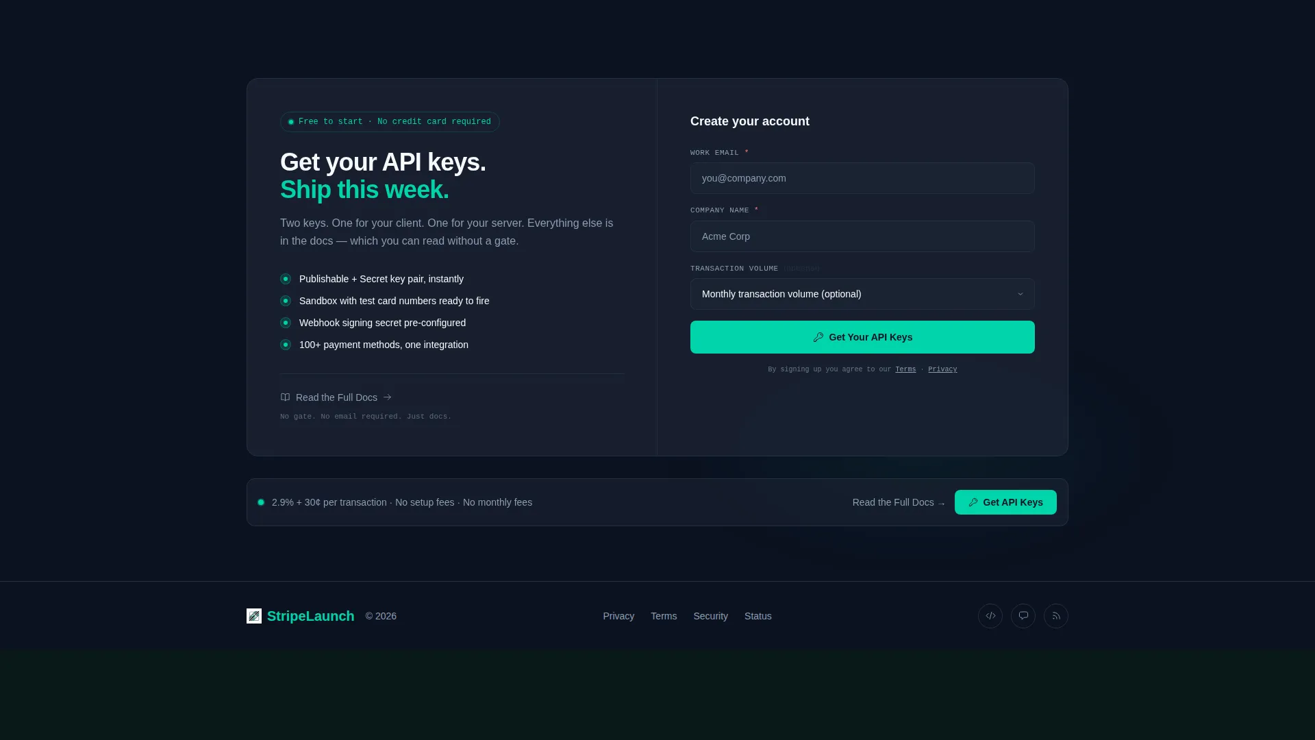
- A lead-generation form with a work email field, a company name field, and an optional transaction volume dropdown
Feature list
This template includes purpose-built components designed for developer-audience landing pages. Each one is described below.
Logo Bar with Social Proof Strip
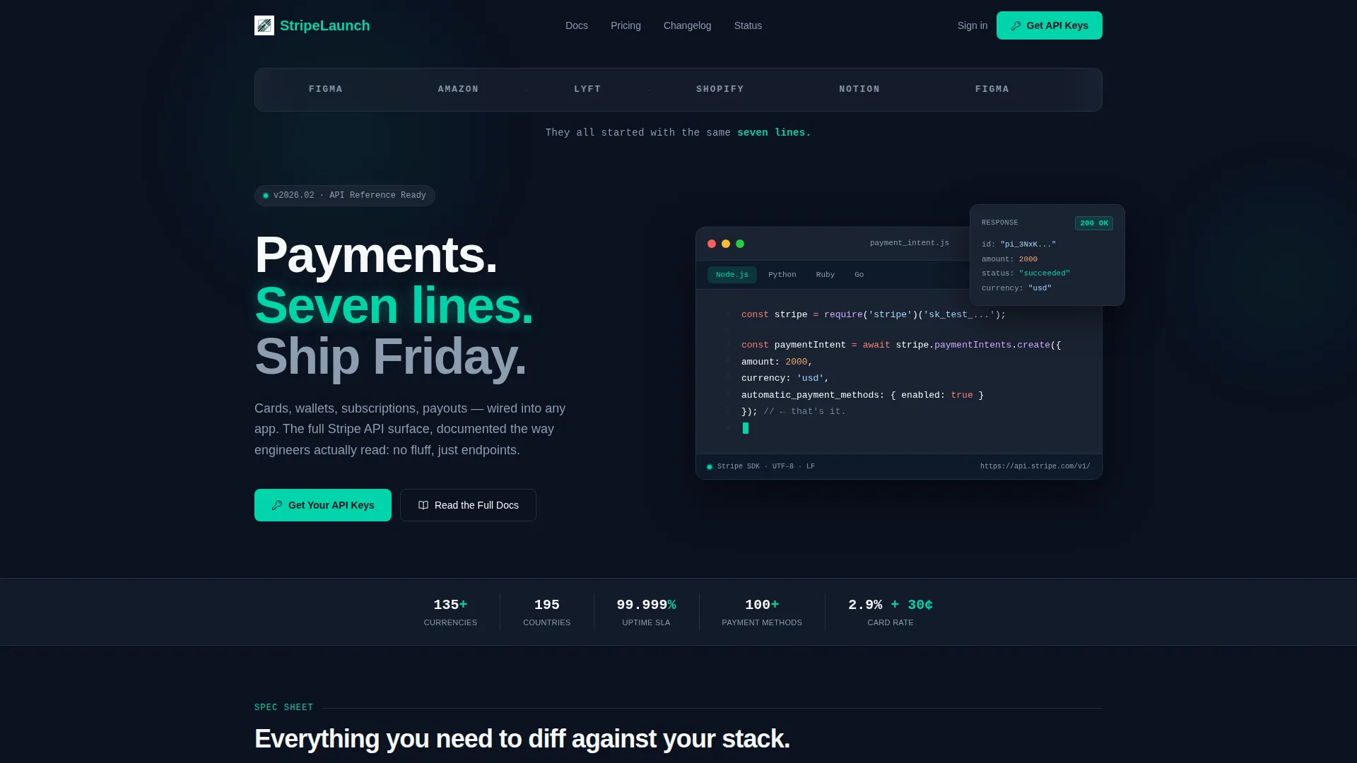
A full-width horizontal strip displays familiar company logos in monochrome slate above the fold. A single descriptive line sits beneath the logos, immediately establishing credibility before a visitor reads a single word of body copy.
Live Code Snippet Card
A dark terminal card sits below the logo bar and displays a short integration example. The teal cursor blinks at the end of the last line, reinforcing the idea that the integration is ready to run. The snippet is kept short enough to read without scrolling.
Spec Sheet Data Grid
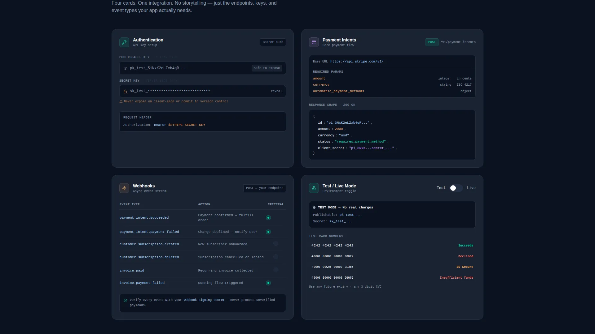
Each scroll section is a discrete data card in a structured grid. The four cards cover Authentication, Payments, Webhooks, and Testing. Developers can mentally scan and compare each block against their current stack without reading marketing copy.
Test and Live Mode Toggle
The Testing card includes a toggle switch styled in electric teal. Visitors can switch between test mode and live mode views directly on the page, giving them an interactive preview of how the integration behaves in each environment.
Dual Call-to-Action Layout
The primary call to action, labeled "Get Your API Keys", appears in the header and again as a floating element at the bottom of the grid. A secondary ungated link, "Read the Full Docs", sits alongside it, offering value before asking for anything in return.
Expandable Mobile Card Grid
On smaller screens, the data grid tightens into a single column of expandable cards. Each card preserves the spec-binder feel of the desktop layout without sacrificing readability or requiring horizontal scrolling.
Page sections overview
| Section | Purpose |
|---|---|
| Logo Bar Strip | Builds immediate credibility with recognizable company logos above the fold |
| Live Code Card | Shows the integration snippet and signals that setup is fast and straightforward |
| Authentication Card | Presents API key setup with two clearly labeled input fields |
| Payments Card | Displays the payment endpoint, HTTP method, and response shape |
| Webhooks Card | Lists supported event types in a compact inline table |
| Testing Toggle Card | Lets visitors switch between test and live mode with a teal toggle |
| Lead Generation Form | Captures work email, company name, and optional transaction volume |
| Floating call to action Bar | Keeps the primary call to action visible as the visitor scrolls the grid |
Design & branding system
The visual identity follows a Startup Velocity theme built on a Teal Catalyst color system. The palette is deliberately dark and focused, designed to feel like a productive IDE session rather than a marketing page.
- Deep terminal black (#0B1120) as the page background, cool slate (#1A2332) for card surfaces and code blocks, and crisp white (#F6F8FA) for all body text and documentation copy
- Electric teal (#00D4AA) reserved for live-state accents, success indicators, the mode toggle, and the blinking cursor in the code snippet card
- Monochrome slate rendering for all logos in the logo bar, keeping the focus on the code and the copy rather than competing brand colors
Mobile & speed optimization
The template is structured so that the desktop data grid collapses gracefully on mobile without losing its spec-sheet character. No content is hidden or removed on smaller screens.
- The multi-column data grid shifts to a single-column layout of expandable cards on mobile devices
- Each expandable card preserves the full content of its desktop counterpart, so mobile visitors get the same technical detail
- The floating call-to-action bar remains visible at the bottom of the screen on mobile, keeping the conversion path accessible throughout the scroll
How this template helps you convert
The conversion design is built around the idea of earning trust before asking for anything. Two paths are offered, and neither one feels like a dead end.
- The primary path presents "Get Your API Keys" as the main form, asking only for work email, company name, and an optional transaction volume estimate, keeping the barrier to entry low.
- The secondary path offers "Read the Full Docs" as a free, ungated exit, so visitors who are not ready to sign up still leave with a positive impression rather than bouncing.
- Placing the primary call to action in both the header and the floating bottom bar means the conversion option is always within one scroll of wherever the visitor is reading.
Other information about this template
This template sits within the Documentation and Support category, specifically designed for a Stripe getting started guide use case. It is a strong fit for any payment integration onboarding page that needs to communicate technical depth while still capturing leads.
- The template style is Dashboard and Data Grid, making it well suited for any API-first product that wants to present integration steps in a scannable, spec-driven format
- The Spec Sheet creative direction means each section functions independently, so teams can reorder or swap cards to match their own API documentation flow
- This template was built under a Startup Velocity theme, which prioritizes speed-to-publish and developer ergonomics over heavy visual customization
- The intersection match aligns this template directly with Stripe documentation and Stripe getting started guide content, making it immediately relevant for teams building onboarding flows around the Stripe platform

Theme
Startup Velocity
Creative direction
Spec Sheet
Color system
Teal Catalyst
Style
Dashboard/Data Grid
Direction
Lead Generation
Page Sections
Logo Bar with Social Proof Strip
Live Code Snippet Card
Spec Sheet Data Grid
Test and Live Mode Toggle
Dual Call-to-action Layout
Expandable Mobile Card Grid
Related questions
Can I use this template without a design background?
Does the template include actual API integration logic?
Can I change the color scheme from the default dark palette?
Is the lead-generation form connected to any email or CRM platform?
Can I add or remove data cards from the grid?



