Pro Construction Landing Page Template
Scaffold is a construction subscription management landing page template built for operations teams at mid-size commercial builders. It pairs a Dashboard Pro visual style with a Slate & Sky color system, a live-typing API code snippet header, and a modular card grid layout. The design guides visitors through a waste-discovery narrative that ends with a clear "Run Your Free Audit" call to action.
by Rocket studio
Quick summary
Scaffold is a single-page, click-through landing page template for a construction subscription management platform. It uses a modular card grid layout, a Dashboard Pro theme, and a Slate & Sky color system. The header leads with a live-typing code snippet. Every section builds toward one action: starting a free audit.
Who this template is for
This template is built for founders, product marketers, and developers launching a construction software product that helps commercial builders control SaaS license costs. It speaks directly to operations managers and back-office teams at mid-size general contractors.
- Operations managers at mid-size commercial builders who oversee multiple software licenses and per-seat subscriptions
- Product teams launching a construction subscription management platform and needing a high-converting landing page
- Developers or agencies building a demo page that communicates technical depth without relying on stock imagery
What problem this template solves
Mid-size general contractors often carry dozens of active software subscriptions across estimating, project management, and field tools. Waste builds up quietly. Licenses go unused, seats stay assigned to departed staff, and renewal dates pass unnoticed. By quarter-end, the damage is already done.
- No clear visual way to show operations managers exactly how much unused license spend they carry
- Standard landing page templates lack the technical credibility needed to speak to data-driven back-office buyers
- Generic designs cannot convey the "exhale moment" when sprawling subscription costs finally snap into order
What you get with this template
You get a fully structured, single-page landing page template with distinct modular sections ready to customize. The layout follows a deliberate scroll narrative: detect waste, recommend action, show recovered dollars.
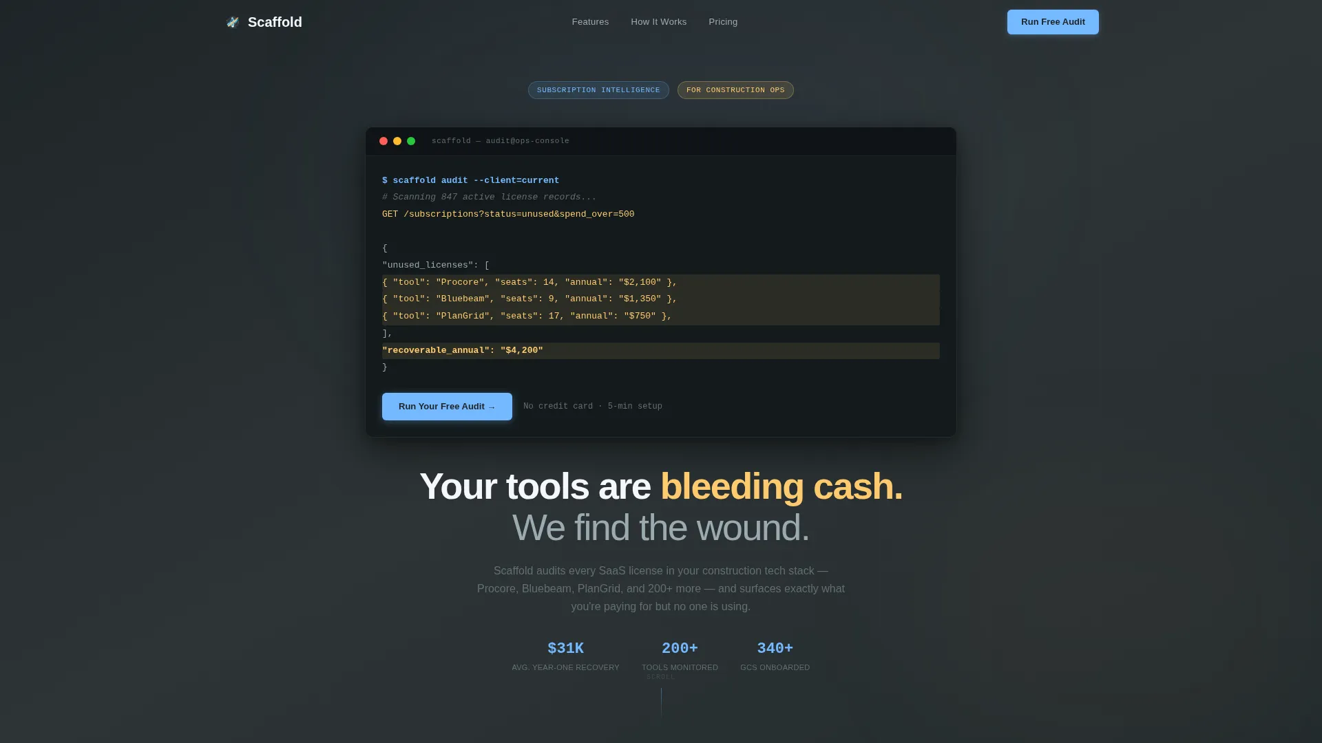
- A live-typing API code snippet header block with animated terminal output and an amber-highlighted JSON response
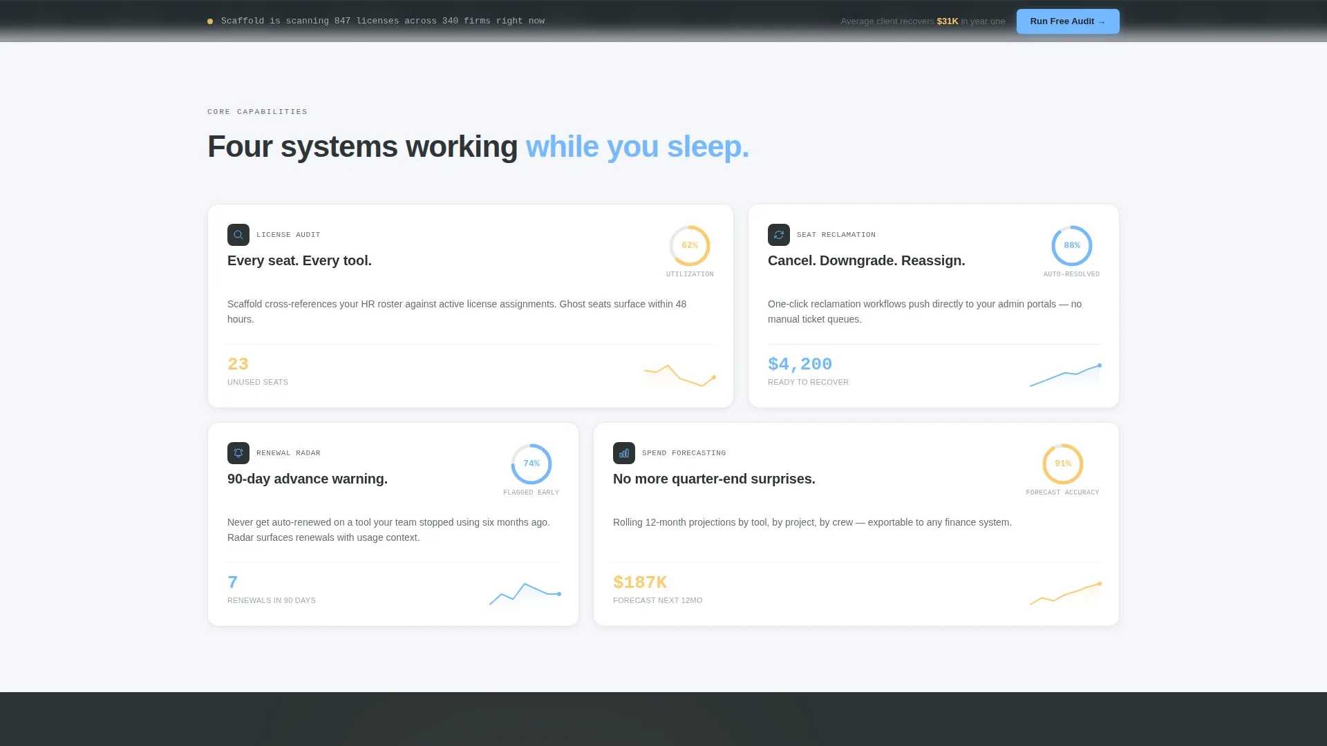
- A staggered cascade of modular capability cards covering License Audit, Seat Reclamation, Renewal Radar, and Spend Forecasting
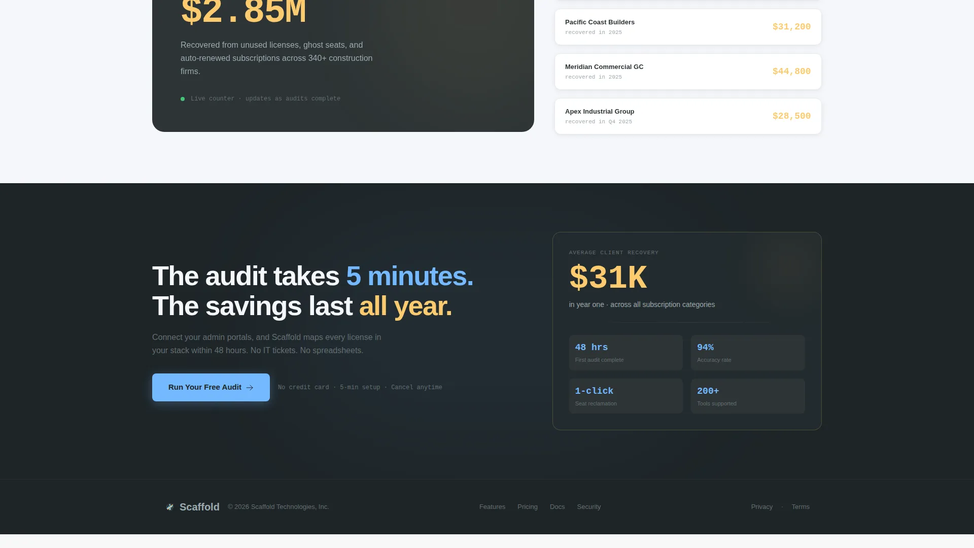
- A fixed bottom call-to-action bar and a full-width pre-footer conversion block with a single-stat proof card
Feature list
This template is built around purposeful design decisions. Each feature below is directly specified in the template brief.
Live-Typing Code Snippet Header
The header centers a styled terminal block that auto-types an API call line by line. A blinking cursor holds attention while the JSON response renders. When the payload appears, amber highlighting draws the eye to the savings figure, and a headline slides up beneath it.
Staggered Modular Card Grid
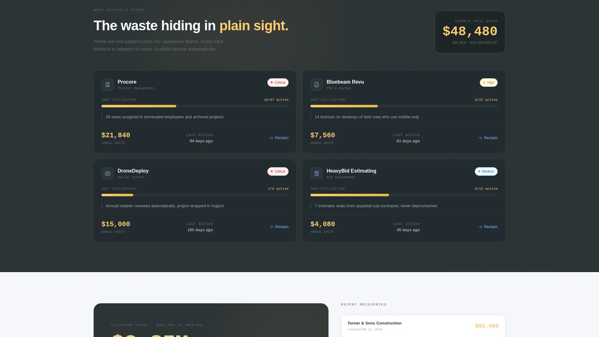
Capability cards appear in a timed cascade as the visitor scrolls. Each card is a mini-dashboard tile showing live-looking data, progress rings, and spark-line charts. The grid moves from detection cards through recommendation cards to dollar-recovery cards.
Real-Time Recovered Spend Counter
A cumulative dollar figure grows visibly as the visitor scrolls down the page. The motion is quick and purposeful. Every increment communicates that the platform is already scanning and finding waste, reinforcing the core value before any signup happens.
Fixed Viewport Call-to-Action Bar
The primary call-to-action button, labeled "Run Your Free Audit," appears first inside the header area. It then locks to the bottom of the viewport on scroll so it remains visible at every stage of the page without interrupting the content flow.
Single-Stat Pre-Footer Proof Block
Above the footer, a full-width conversion section pairs the primary call-to-action with one high-impact proof statement. The stat shown is "Average client recovers $31K in year one," giving hesitant visitors a concrete reason to act.
Alternating Slate and Near-White Backgrounds
Section backgrounds alternate between structural slate and near-white to create visual rhythm without decorative elements. Cards float on subtle shadows. Sky-blue anchors every interactive element, and alert amber is reserved strictly for savings callouts and hover states.
Page sections overview
| Section | Purpose |
|---|---|
| Header Code Snippet | Opens with a live-typing API terminal block and animated JSON payload to hook technical buyers immediately |
| Capability Card Grid | Staggered modular cards present License Audit, Seat Reclamation, Renewal Radar, and Spend Forecasting as mini-dashboard tiles |
| Spend Recovery Counter | A growing dollar figure communicates cumulative recovered spend in real time as the visitor scrolls |
| Fixed call to action Bar | A persistent bottom-viewport button keeps "Run Your Free Audit" reachable at every scroll position |
| Pre-Footer Proof Block | Full-width section pairs the call to action with a single proof stat to convert undecided visitors |
Design & branding system
The visual identity uses a Dashboard Pro theme with a Slate & Sky color system. The palette is deliberately utilitarian, designed to feel like a jobsite trailer at dawn: steel-gray surfaces catching the first blue light, with amber drawing the eye exactly where it needs to go.
- Core palette: structural slate (#2D3436) for primary surfaces, toolbar charcoal (#636E72) for secondary elements, open-sky blue (#74B9FF) for all interactive elements, and alert amber (#FDCB6E) reserved for savings callouts and hover states
- Section backgrounds alternate between slate and near-white (#F5F6FA), with cards elevated on subtle shadows to create depth without noise
- No stock imagery or dashboard mockups are used; raw terminal output and data-forward card tiles carry the entire visual story
Mobile & speed optimization
The modular card grid layout is structured to reflow cleanly across screen sizes. Staggered cascade animations are built to be quick and purposeful, with zero decorative motion added.
- Cards are self-contained modular tiles that stack into a single column on smaller screens without losing their data-forward visual structure
- The fixed bottom call-to-action bar is designed to sit above the mobile navigation safe area so it stays accessible on touch devices
- Motion is kept minimal and meaningful; every animated element communicates data appearing rather than adding visual decoration
How this template helps you convert
This template earns the click rather than demanding it. The page builds a quiet, evidence-based case for action across every scroll position.
- The header terminal block creates immediate credibility by speaking the language of operations managers who already work in admin consoles and data exports, making the value proposition feel personally relevant before a single word of marketing copy appears.
- Each capability card quietly quantifies waste in live-looking data formats, so by the time visitors reach the pre-footer section, signing up feels less like filling out a form and more like picking up cash they can already see on the floor.
Other information about this template
This template is built specifically for the construction software category and targets the construction subscription management niche. It is designed as a click-through landing page, meaning the page itself contains no signup form. The call to action click routes visitors to a separate one-screen onboarding flow that asks for company size, estimated active subscription count, and a work email address.
- The template style is a Card Grid (Modular) layout following the Dashboard Pro theme, making it straightforward to add, remove, or reorder capability cards as a product offering evolves
- The Slate & Sky color system and the terminal-style header make this template a strong fit for construction technology products where the buyer audience includes technically fluent operations staff
- The design avoids all stock photography and generic dashboard mockups, keeping the visual language consistent with the raw, data-first aesthetic that resonates with back-office buyers in commercial construction
Theme
Dashboard Pro
Creative direction
Launch Energy
Color system
Slate & Sky
Style
Card Grid (Modular)
Direction
Click-Through
Page Sections
Live-typing API Code Snippet Header
Staggered Modular Card Grid
Real-time Spend Recovery Counter
Persistent Fixed Call to Action Button
Pre-footer Single-stat Proof Block
Alternating Background Rhythm
Related questions
Does this template include the onboarding flow after the call to action click?
Can I change the capability cards to match my product's feature set?
Is the code snippet header pre-built or do I need to build it myself?
What color system does this template use?
Who is the ideal end user for a page built on this template?



