Online Course Platform Blog Website Template
The Lesson Warm Family Home Studio Course Creator landing page template is a warm, card-grid layout built for homeschool parents, parenting bloggers, and family therapists who are ready to turn their knowledge into a sellable online course. It combines a cinematic hero section, a growing client story grid, and two focused calls to action into one complete, conversion-ready course landing page.
by Rocket studio
Quick summary
This template gives video course creators in the homeschool and parenting space a full online course landing page that feels genuinely human. It opens with a real-life hero photo, grows through a modular client card grid, and drives two clear actions: download a free checklist and watch a gear tour video. The design is warm, editorial, and built entirely for trust.
Who this template is for
This landing page serves a specific, underserved creator audience. It is designed for people who have real knowledge to share and a real audience ready to pay, but who feel stuck before the finish line when it comes to packaging and presenting their course online.
- Homeschooling mothers building their first digital product and looking for a course landing page that feels approachable, not corporate
- Family therapists and parenting workshop leaders who want to turn existing training material into evergreen online course income
- Parenting bloggers and content creators who already have an audience and want to point them toward a paid course
What problem this template solves
Most online course landing page options feel built for tech-savvy marketers, not for parents filming phonics lessons at a kitchen table. The gap between "I have something to teach" and "I have a page where students can sign up" is wide, and it stops a lot of capable creators cold.
- There is no visually appealing, ready-made course landing page designed for the homeschool and family education niche
- Generic templates fail to build trust with an audience that responds to warmth, authenticity, and community proof rather than bold sales tactics
- Creators lose leads because they cannot quickly explain the value of their course or display the social proof that converts visitors into students
What you get with this template
This is a complete, single-page layout with every section planned, designed, and ready for your content. You do not need to determine the structure from scratch or search for a layout that fits. The page delivers a clear course description, client stories, a downloadable resource, and a free video introduction, all in one focused flow.
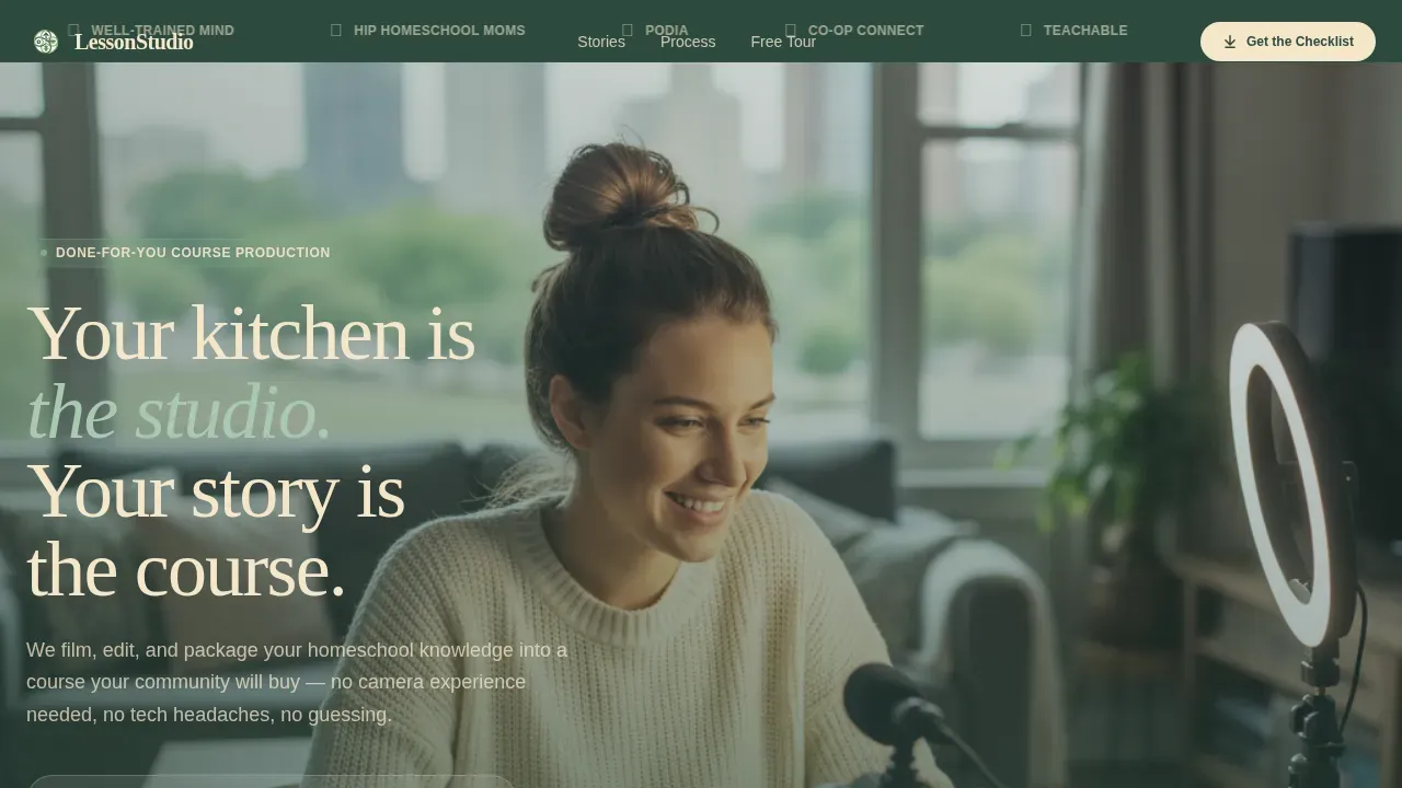
- A full hero section with a cinematic photo, a fade-in headline, a logo bar of recognizable platforms, and a checklist download form
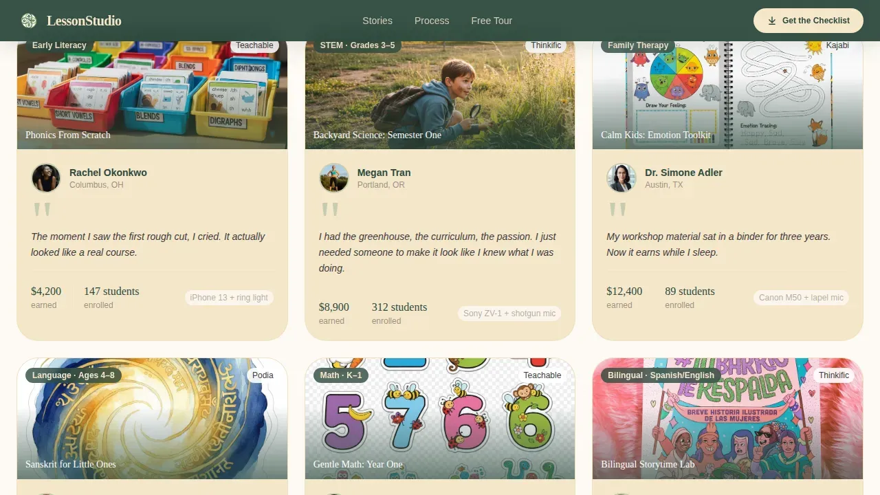
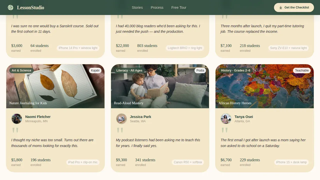
- A modular client card grid that grows from three cards to nine as users scroll, displaying real faces, course thumbnails, and one-sentence quotes
- A mid-grid floating call to action form, a three-step asymmetric "How It Works" section, a gear tour video lightbox, and a structured footer
Feature list
This template is built around five core capabilities, each designed to serve a specific conversion or trust-building role on the page.
Cinematic Hero Section with Fade-In Headline
The hero section opens with a warm, high-resolution photograph of a real person filming at a dining table, ring light on, crayon drawing taped to the wall. The headline fades in over the image: "Your kitchen is the studio. Your story is the course." This first impression sets the tone for the entire course landing page and signals immediately that this page is for people, not brands.
Growing Client Card Grid
The modular card grid is the emotional core of this online course landing page. Each card shows a client's face, the course they built, a one-sentence quote from the moment it clicked for them, and a thumbnail of their finished product. The grid starts at three cards and expands to nine as users scroll, with staggered reveal animations. Visitors discover a growing community of people just like them, and that momentum builds trust more effectively than any marketing copy alone.
Dual Call to Action Structure
The page includes multiple calls to action without creating friction. The primary call to action, "Download the Home Studio Checklist," appears beneath the hero photo and again as a floating form at the grid's midpoint. The secondary call to action, "Watch the Free Gear Tour," opens a seven-minute video in a lightbox without sending visitors away from the page. This dual structure gives users two clear on-ramps and helps increase conversions across different visitor intent levels.
Downloadable Checklist as Lead Magnet
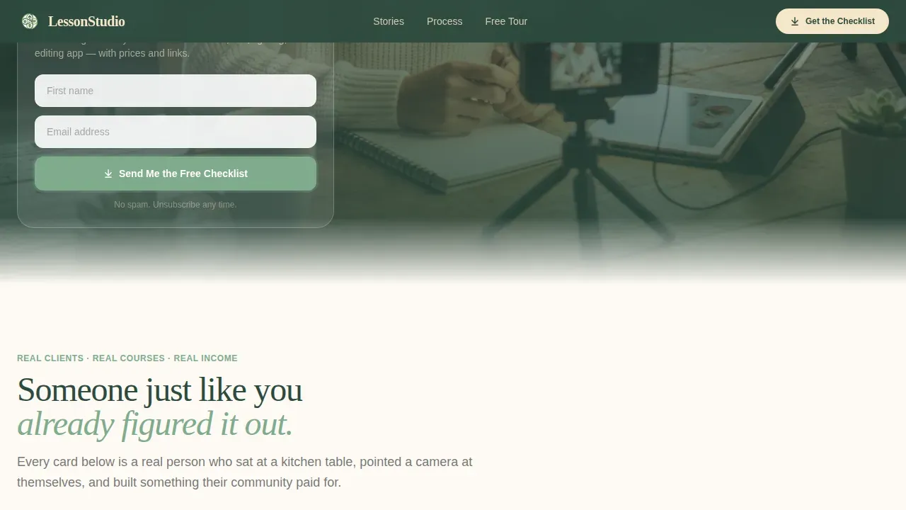
The checklist is a printable PDF listing the exact camera, microphone, lighting setup, and editing app each featured client used, complete with price tags and purchase links. It is immediately useful whether or not a visitor ever comes back. This approach captures more leads by delivering tangible value at the point of sign-up, removing the sense that the form is just a gate.
Video Lightbox for Free Gear Tour
The gear tour video opens in a lightbox directly on the page. Visitors get a sneak peek at the studio setup process without clicking away. In an era of dwindling attention spans, keeping users on the page while delivering a video trailer experience is a clear advantage. The lightbox is deferred so it does not slow the initial page load.
Page sections overview
| Section | Purpose |
|---|---|
| Logo Bar | Display platform logos and recognizable brand seals to establish social proof above the hero |
| Hero Photo | Show a real creator at work to create an immediate and relatable first impression |
| Headline Fade-In | Deliver the primary course message with a cinematic text animation over the hero image |
| Checklist Download Form | Capture first name and email with a low-friction two-field form beneath the hero |
| Client Card Grid | Present growing rows of real client stories, course thumbnails, and quotes as social proof |
| Mid-Grid call to action | Float a second checklist form at the grid midpoint to catch visitors already in scroll momentum |
| How It Works | Explain the three-step process with an asymmetric visual layout, no numbered timeline |
| Free Gear Tour | Drive video views with a call to action that opens a seven-minute lightbox video on the page |
| Footer | Close the page with a horizontal flow footer pattern that includes navigation and contact details |
Design & branding system
The visual identity follows a Family First theme using a Forest Trust color system. Every design decision points toward warmth, credibility, and a nature-journal aesthetic that feels hand-touched and lived-in, never sterile or corporate. The typography pairs Fraunces serif headings with DM Sans body text for a professional appearance that still reads like a letter from a friend.
- Deep pine (#2D4A3E) anchors the header, footer, and key call to action buttons; sun-warmed birch (#F5E6CA) washes across card backgrounds; soft fern (#7FAB8C) handles hover states and active links; and pencil-lead charcoal (#3B3B3B) keeps body copy grounded and readable
- Scroll reveal animations, staggered card entries, and a headline fade-in create medium-level motion that feels editorial rather than showy
- Lifestyle photography showing real creators in real home environments is preferred over sterile stock images, keeping the page visually appealing and authentic to the niche
Mobile & speed optimization
The page is built mobile-first because the primary audience uses phones to search, browse, and decide. Every section stacks gracefully on small screens, and the card grid reflows cleanly from a multi-column layout to a single-column scroll. The online learning landing experience must work as well on a phone as it does on a laptop, and this template is designed to deliver that.
- Images are lazy-loaded so the page feels fast on mobile connections without sacrificing visual quality
- The video lightbox is deferred and only loads when a user actively triggers it, keeping the initial online course landing page load lean
- The floating checklist form is designed to stay usable and visible on small screens without covering key content
How this template helps you convert
A course landing page is a conversion-focused page with one job: get users to take action. This template is structured to convert visitors at multiple points in the scroll journey, using trust signals, low-friction forms, and content that answers the questions potential students are already asking.
- The hero section and client card grid work together to build trust before asking for anything, making visitors far more likely to sign up when they reach the checklist form
- The dual call to action structure gives users two ways to engage: download the checklist or watch the gear tour video, so no one leaves the page without a clear next step and the page can generate more leads from a single visit
Other information about this template
This template is part of a broader ecosystem of online course landing page resources available for creators who want to launch without building from scratch. A wide variety of landing page templates are available on the platform, already designed and requiring only light customization to match your course details and brand.
- The average conversion rate across landing pages built on tools like Leadpages sits around 11%, and an effective landing page in a warm, niche-specific style like this one is positioned to meet or exceed that benchmark when paired with a focused audience
- This template supports the kind of effective landing page design that conveys a cozy, inviting, and professional atmosphere, which is particularly important for online learning landing pages targeting parents and home educators
- The page structure reflects best practices for a successful online course landing page: a compelling headline that makes a strong first impression, positive testimonials in a visually rich format, a clear course outline so potential students know what to expect, an app landing experience for mobile users, and multiple calls to action that do not overwhelm
- Practical, actionable copy blended with emotional appeal is the right approach for this niche; the template's marketing copy framework is built around that balance, addressing real pain points like filming in a cluttered home and turning lived knowledge into a paid course
- Creators can use the included course outline section to help visitors discover exactly what lessons are covered and where they will be by the end, giving even more tips for building confidence before the first paid enrollment
- The template is available on an app landing platform that operates on a subscription basis, with a free trial and paid plans, so creators can build and publish their own course landing page without a large upfront investment
Theme
Family First
Creative direction
Team & People
Color system
Forest Trust
Style
Card Grid (Modular)
Direction
Content/Resource
Page Sections
Cinematic Hero Section
Growing Client Card Grid
Dual Call to Action Flow
Downloadable Checklist Lead Magnet
In-page Video Lightbox
Asymmetric How It Works Section
Related questions
Can I use this template even if I have never built a landing page before?
What makes this course landing page different from a generic course template?
How does the checklist lead magnet help me get more leads?
Does the page include space for testimonials and social proof?
Can I adjust the number of cards in the client grid?



