Construction Software Advanced Professional Website Template
Submittal is a construction document management landing page template built on a bento grid layout. It guides visitors from the chaos of untracked submittals and request for information threads to a clear product solution. The page is designed to drive app downloads with an interactive search demo, paired app store badges, and a scannable QR code tile.
by Rocket studio
Quick summary
Submittal is a single-page bento grid template for a construction document management platform. It opens with a credibility-building logo bar, moves through a problem-to-solution visual arc, and closes with a direct app download call to action. Every section is designed to earn trust fast and push project teams toward installing the product.
Who this template is for
This template is built for teams marketing construction software to hands-on project professionals. It speaks directly to the people who live inside document workflows every day.
- Project engineers managing stacks of superseded specification sheets and revision cycles
- General contractors juggling multiple subcontractor submittals before weekly owner-architect-contractor meetings
- Owners' representatives who need to retrieve an approved shop drawing from months ago in seconds
What problem this template solves
Construction projects generate thousands of documents. Requests for information, submittals, change orders, and punch lists pile up across email threads, shared drives, and job trailer desks. Version confusion slows decisions and causes costly delays.
- Teams lose time hunting through inboxes for the correct revision of a document
- Paper sets get damaged on site, and digital files get buried without a clear version trail
- Delayed document retrieval stalls approvals and pushes project milestones back
What you get with this template
You get a fully structured landing page that takes a visitor from recognizing the pain to wanting the solution. The layout is dense with proof points, demos, and clear next steps.
- A bento grid layout with varied card sizes for hero screenshots, stat callouts, and micro-testimonials
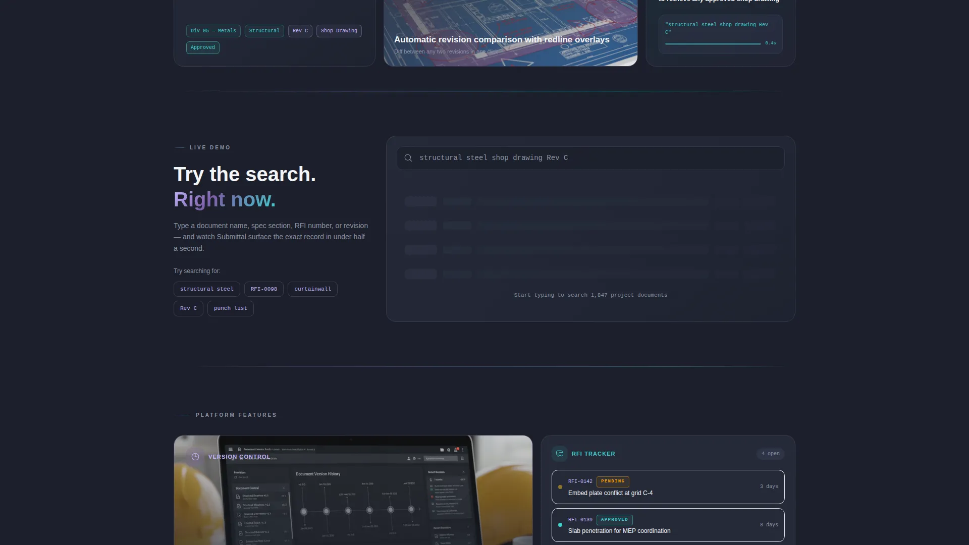
- An interactive search demo card that lets visitors type a document name and watch results appear live
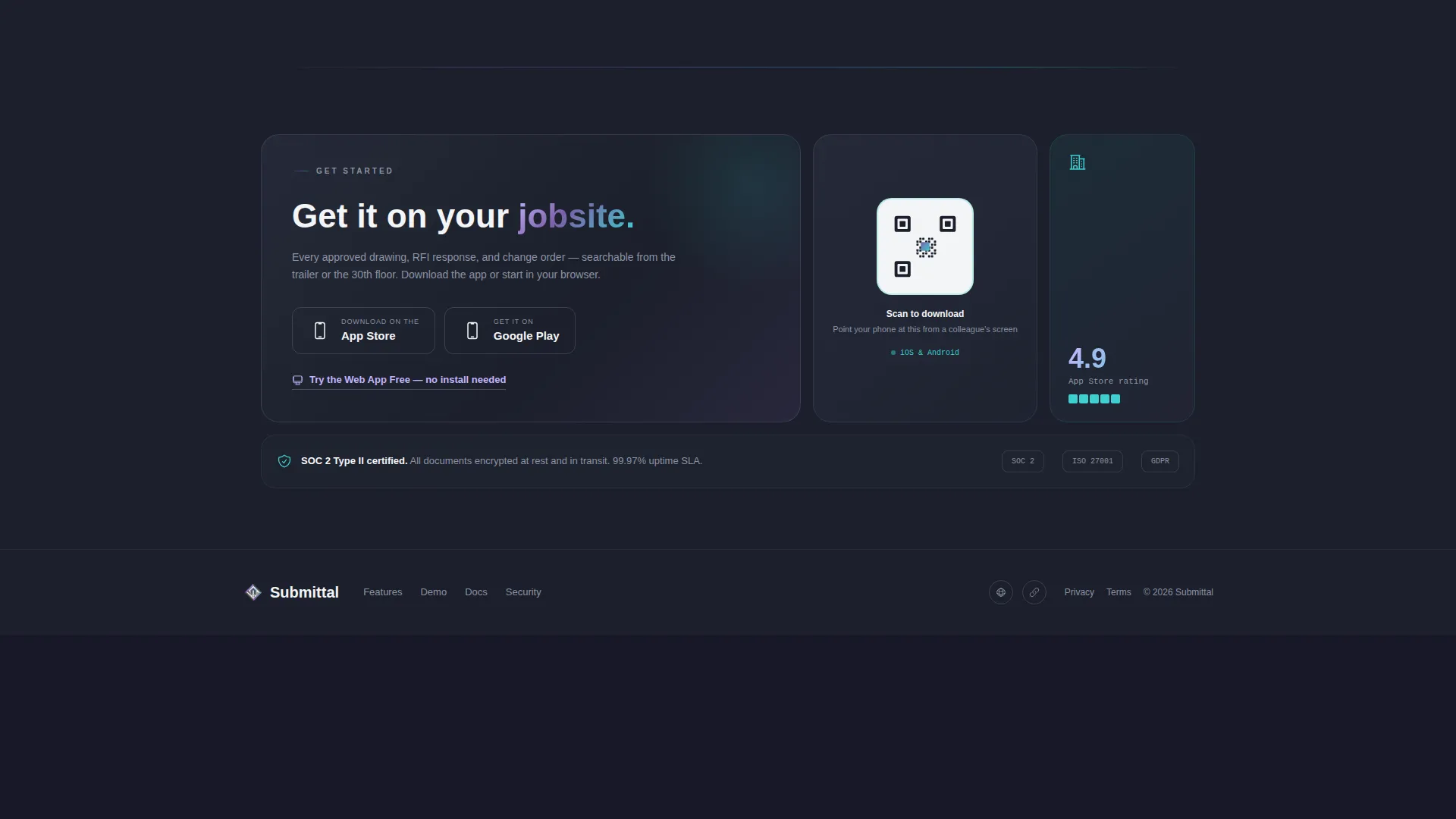
- Dual call-to-action paths with app store badges, a QR code tile, and a web app free trial link
Feature list
This template packs every persuasion layer a construction software product page needs into one cohesive, scannable layout.
Problem-to-Solution Bento Arc
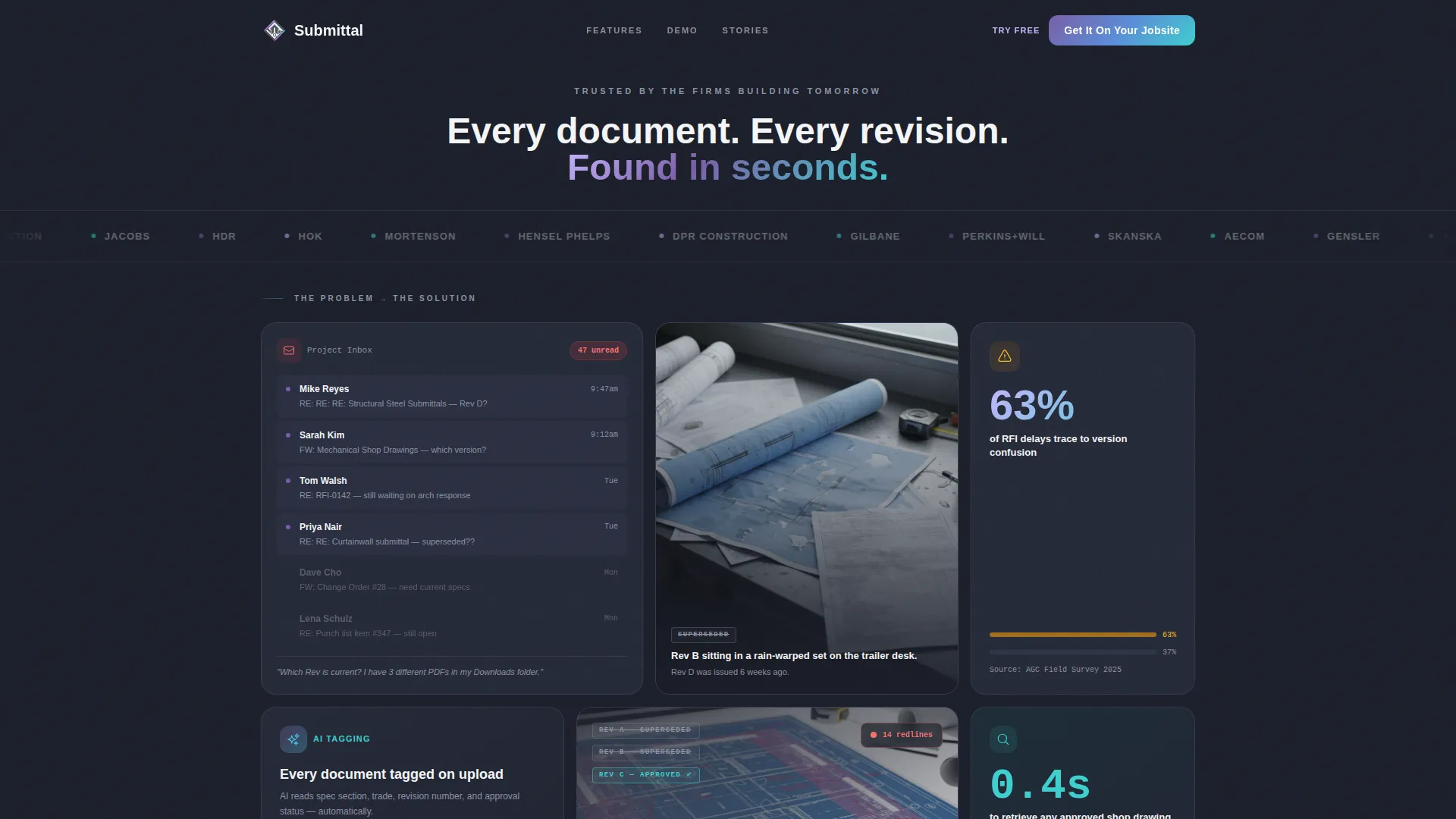
The first row of the grid opens with pain-state cards: a cluttered email inbox showing 47 unread submittal threads, a rain-warped paper set on a job trailer desk, and a stat card citing that 63 percent of request for information delays trace to version confusion. As the visitor scrolls, the grid brightens and shifts to solution cards, creating a visual transformation that mirrors the product promise.
Logo Bar Header
A horizontal scroll of trusted general contractor, architecture, and engineering firm logo silhouettes anchors the top of the page above a single headline. The logos sit on deep charcoal and quietly glow with an iridescent edge. This establishes industry credibility before any feature is explained.
Interactive Search Demo Card
Mid-scroll, visitors can type a document name directly into a demo search bar and watch results populate in real time. The demo card shows the platform finding a structural steel shop drawing revision in under a second. This proves the core product value before asking anyone to download or sign up.
App Download Call to Action
The primary call to action reads "Get It On Your Jobsite" and is paired with both App Store and Google Play badges. A QR code tile is embedded directly in the bento grid so on-site workers can scan from a colleague's screen without switching devices.
Micro-Testimonial Cards
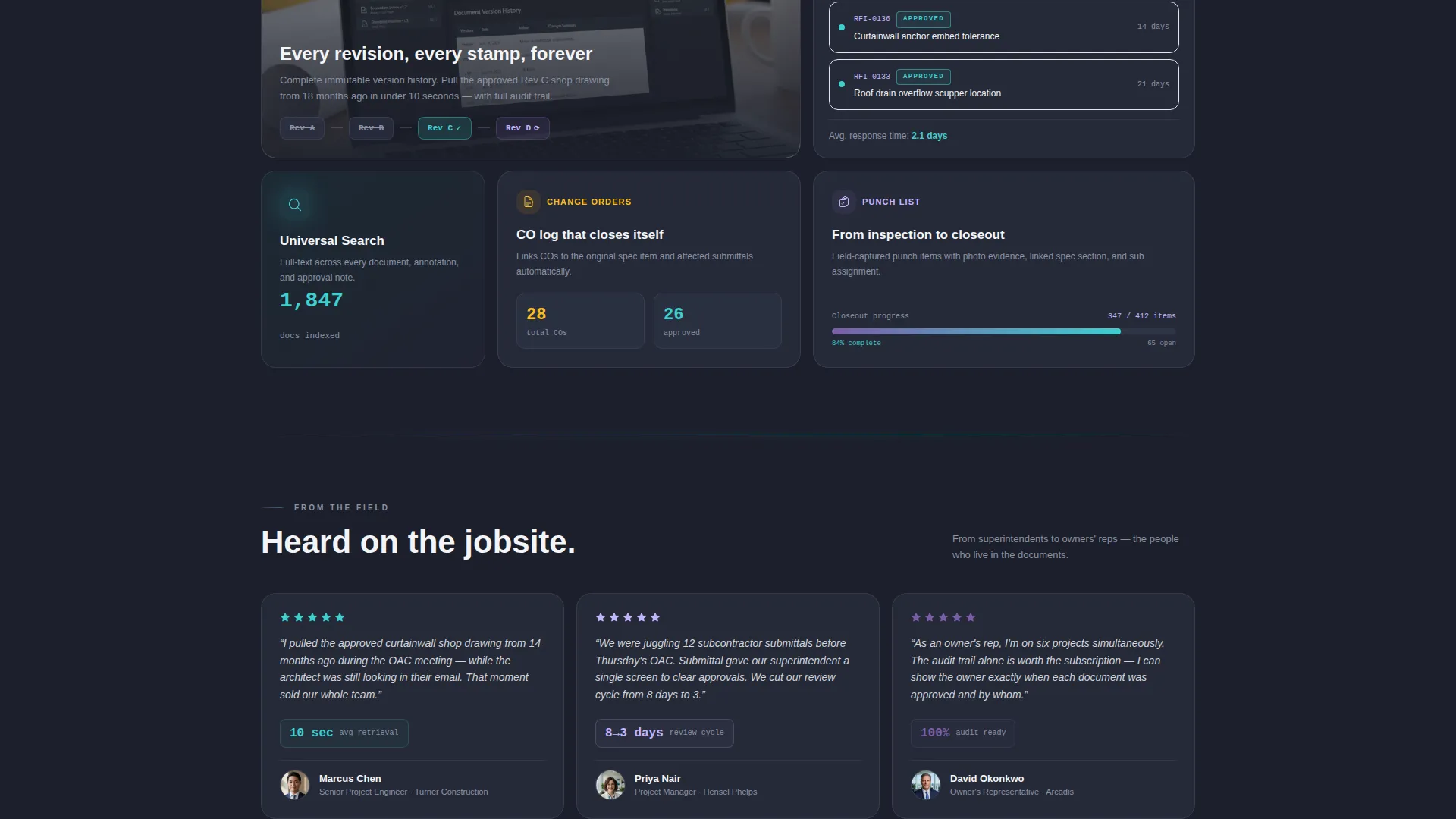
Medium-sized rectangle cards are placed throughout the grid and carry short quotes from field-level users such as superintendents. These testimonials reinforce trust at the moment a visitor is evaluating the product, grounding the platform's claims in real job-site voices.
Revision Comparison Tile
A dedicated bento card demonstrates automatic revision comparison with redline overlays. It shows two versions of a document side by side and highlights what changed, making the version-control story immediately visual and concrete.
Page sections overview
| Section | Purpose |
|---|---|
| Logo Bar Header | Establish trust with recognizable firm silhouettes above the headline |
| Pain State Row | Show the document chaos visitors already recognize from their own work |
| AI Tagging Card | Introduce the platform's automated document tagging capability |
| Search Demo Card | Let visitors experience document retrieval speed live mid-scroll |
| Revision Comparison Tile | Visualize automatic redline overlays for version control |
| Stat Callout Cards | Anchor the problem with a measurable data point about RFI delays |
| Micro-Testimonial Cards | Add field-level credibility through superintendent voice quotes |
| App Download Section | Drive installs with badges, QR code tile, and a web app free trial link |
Design & branding system
The visual identity follows a Directory and Discovery theme powered by an AI Iridescent color system. The palette feels industrial at its core, with surfaces that refract something unexpectedly considered across the page.
- Core colors: deep site-plan charcoal (#1B1F2A) for backgrounds, iridescent violet (#7B5EA7) for primary accents shifting to electric teal (#3ECFCF) on hover states and active filters, clean drywall white (#F4F5F7) for card surfaces, and a faint prismatic shimmer (#C4B5FD) on section dividers
- Card surfaces use the drywall white to create contrast against the charcoal base, making document content feel organized and legible like a well-run plan room
- The overall art direction evokes a hard hat catching light on a steel beam: grounded in construction reality but refracting intelligence across every tile
Mobile & speed optimization
The bento grid is designed with on-site mobile users in mind. A QR code tile is embedded directly into the layout so field workers can scan and download the app without navigating away.
- Card sizes are varied by design, which naturally adapts the grid rhythm for smaller viewport widths
- The QR code tile gives mobile visitors on the job site an instant path to the app without typing a URL
- The dual call-to-action structure covers both field users on mobile and office-based project managers on desktop
How this template helps you convert
Every layout decision in this template is aimed at reducing hesitation and moving the visitor toward action.
- The problem-to-solution arc earns the visitor's attention by reflecting their real daily frustration before introducing any product feature, which builds trust naturally.
- The interactive search demo card removes doubt by letting visitors experience the platform's core value directly on the page, before any commitment is required.
- The paired app download paths, one for mobile via QR code and one for desktop via the web app free trial link, ensure that every visitor type has a frictionless next step regardless of how or where they are viewing the page.
Other information about this template
This template is categorized under Technology with a subcategory of Construction Software and a niche focus on construction document management. It is a single-page bento grid landing page designed for app download conversion.
- The template style is Bento Grid, which creates visual rhythm through asymmetric card sizing and varied content density across the layout
- The theme is Directory and Discovery, signaling to visitors that every document has a place and every revision is findable
- The creative direction follows a Problem-to-Solution Arc, guiding the viewer from recognizable job-site chaos to confident product clarity as they scroll
Theme
Directory & Discovery
Creative direction
Problem→Solution Arc
Color system
AI Iridescent
Style
Bento Grid
Direction
App Download
Page Sections
Problem-to-solution Bento Arc
Logo Bar with Industry Credibility
Live Interactive Search Demo
Dual App Download Call to Action
Revision Comparison Tile
Micro-testimonial Cards
Related questions
Who is this landing page template designed for?
Can I use this template to promote a web app instead of a mobile app?
What makes the bento grid layout effective for this type of product?
Does the template include an interactive element?
How does the QR code tile work on the page?



