SaaS Multi-Product Portfolio Suite Website Template
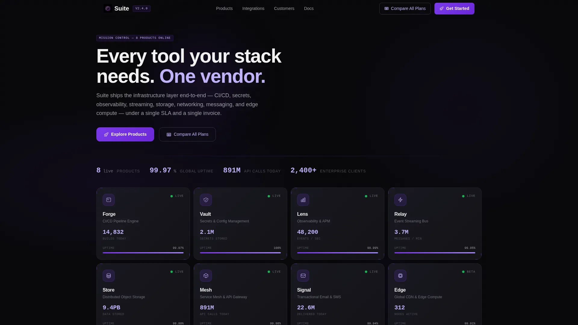
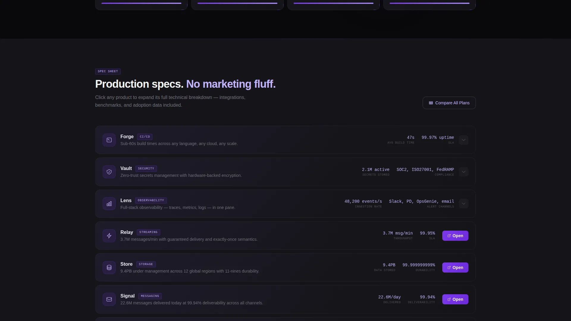
Suite is a dashboard-style SaaS landing page template built for software companies that need to present an entire product portfolio at once. Six to eight Dark Glass Panel cards lead the page, each showing a live-looking metric in electric violet. The Spec Sheet scroll pattern then expands each product into a full-width breakdown, turning density into persuasion.
by Rocket studio
Quick summary
Suite is a single-page SaaS portfolio landing page template designed around a Data Command theme. It uses a Void and Violet color system to present multiple software products inside a dark, high-density dashboard grid. Visitors get product specs, live-looking metrics, and integration cues without ever hitting a demo gate or email wall.
Who this template is for
Suite is built for software companies that sell more than one product and need a single page to show the full picture. The layout speaks directly to technical and procurement buyers who evaluate platforms on evidence, not narrative.
- Chief Technology Officers comparing vendor consolidation options against point solutions
- Procurement leads assessing platform breadth before entering a buying cycle
- Startup founders looking for a scalable, unified software environment
What problem this template solves
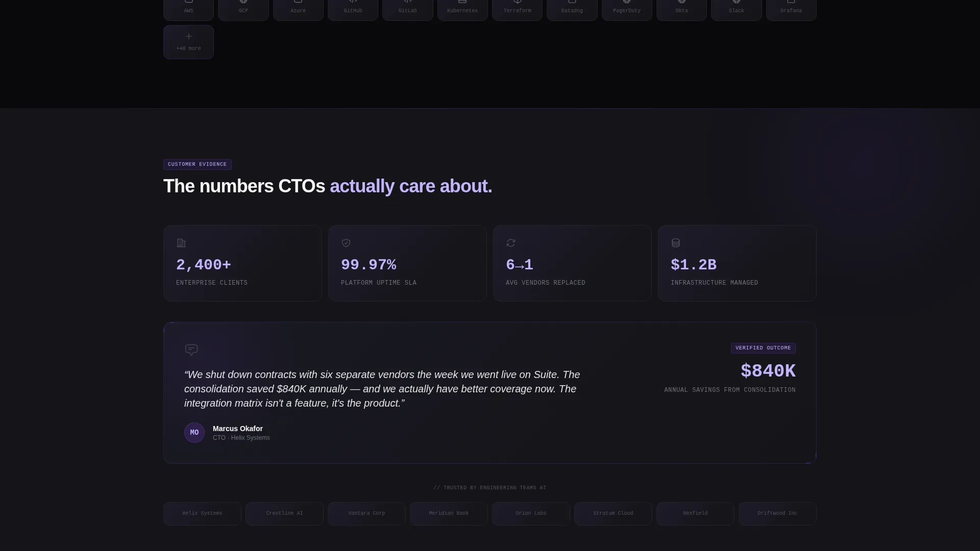
Most SaaS portfolio pages bury their best proof behind hero images and generic copy. Suite flips that. The template leads with real-looking numbers and product specs, so skeptical buyers see substance before they read a single line of marketing text.
- Visitors leave generic portfolio pages without a clear sense of what each product actually does
- Technical buyers distrust pages that gate information behind forms or demo requests
- Multi-product companies struggle to show portfolio breadth without overwhelming the visitor
What you get with this template
Suite delivers a tightly composed, scroll-driven landing page where every section earns the next click. The layout is clinical and addictive by design, built to reward visitors who scan for evidence.
- A header grid of six to eight Dark Glass Panel cards, each holding a product icon, one-line descriptor, and a live-looking violet metric
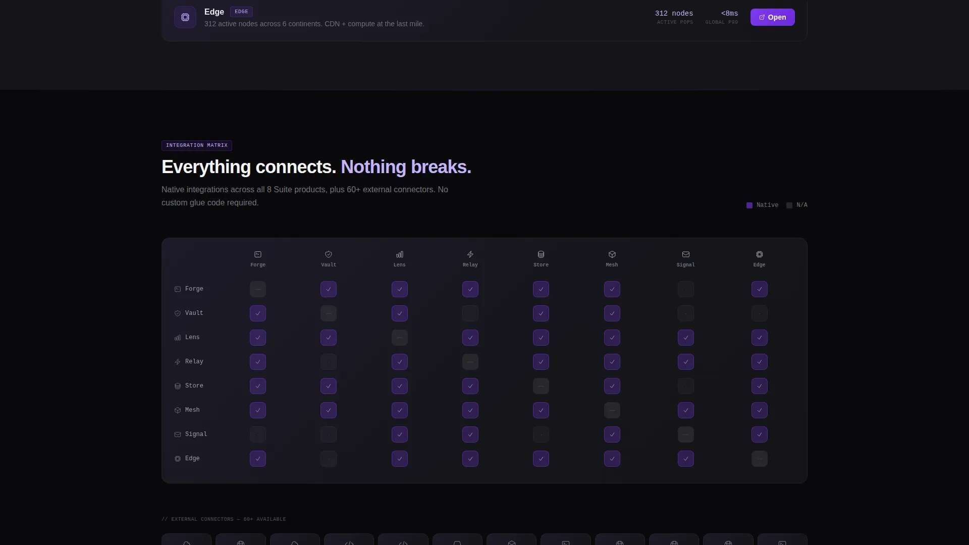
- A Spec Sheet scroll pattern that expands each card into a full-width product breakdown with monospaced specs, integration icon rows, and a micro-chart
- Persistent top-bar navigation carrying a "Compare All Plans" action alongside per-product "Open Product Page" calls to action
Feature list
Suite is built around a small number of high-impact components that work together to communicate scale and credibility.
Dark Glass Panel Header Grid
Six to eight translucent product cards sit in a tight header grid. Each card shows a product icon, a single-line descriptor, and one live-looking metric rendered in electric violet numerals against frosted black. A faint ambient gradient at the card edges simulates light catching physical glass.
Spec Sheet Scroll Pattern
Each scroll segment expands one product panel into a full-width breakdown. Key specifications appear in monospaced type, integration compatibility is shown as icon rows, and a micro-chart displays an adoption curve or performance benchmark. The rhythm is grid, expand, specs, collapse, next.
Per-Product Click-Through calls to action
Every expanded product card ends with a violet "Open Product Page" button that routes directly to the individual product site. No forms, no gates. The call to action earns its click by appearing after the specs, not before them.
Persistent Top-Bar Action
A fixed top bar carries the secondary action, "Compare All Plans," which links to a unified pricing matrix. It stays visible throughout the entire scroll, giving visitors a constant path to the next step without interrupting the spec-reading flow.
Void and Violet Color System
The palette is built on absolute void black, deep graphite panels, electric violet for active states and data highlights, and cooled lavender for secondary labels. Violet pulses across progress bars, hover rings, and live-status dots. The result feels like a premium development environment at night.
Micro-Charts and Live-Status Indicators
Each expanded product section includes a micro-chart showing adoption curve or performance benchmark data. Live-status dots in violet confirm that products are active and running, reinforcing confidence in the portfolio without requiring external data connections.
Page sections overview
| Section | Purpose |
|---|---|
| Header panel grid | Introduces all products at a glance with live-looking metrics |
| Expanded product card | Delivers full specs, integrations, and micro-chart per product |
| Integration icon row | Shows compatibility context within each product breakdown |
| Micro-chart block | Visualizes adoption curve or benchmark for each product |
| Per-product call to action | Routes visitors to the individual product page |
| Persistent top bar | Keeps "Compare All Plans" accessible throughout the scroll |
Design & branding system
The visual identity is built on the Data Command theme, where dark is not a mode but the foundational language of the interface. Every layer of the layout uses the Void and Violet palette to communicate precision and authority.
- Absolute void black (#09090B) as the base canvas, deep graphite (#141419) for floating panels, electric violet (#7C3AED) for active states and data highlights, and cooled lavender (#C4B5FD) for secondary labels and ghost text
- Monospaced typography inside spec sections to reinforce the technical, clinical tone of a hardware catalog
- Ambient gradient edges on panel cards simulate overhead light on physical glass, giving flat user interface elements a tactile depth
Mobile & speed optimization
The template is designed with a lean component structure that keeps page weight low. The dark-canvas layout avoids large image assets entirely, relying on color, type, and grid composition instead.
- No hero images or stock photography means fewer large file requests on any device
- The panel grid and expanded card layout are structured to reflow cleanly for narrower viewports
- The persistent top bar and per-product calls to action remain accessible as the grid adapts to smaller screen widths
How this template helps you convert
Suite converts by front-loading proof. Visitors reach a call to action only after they have already seen the evidence that earns it.
- The header grid delivers an immediate impression of portfolio scale, signaling that this company ships multiple products at production quality before the visitor has scrolled at all.
- The Spec Sheet scroll pattern presents specifications, integration rows, and micro-charts in a repeating rhythm that builds confidence with every product reveal, making each "Open Product Page" call to action feel like a natural next step rather than a sales push.
- The persistent "Compare All Plans" bar gives buyers a direct path to pricing context at any point in the scroll, reducing the friction that typically causes technical evaluators to abandon a page before converting.
Other information about this template
Suite is a strong fit for SaaS company portfolio pages where the audience arrives already informed and needs confirmation, not introduction. The template style is Dashboard and Data Grid, and the creative direction follows a Spec Sheet approach throughout.
- The template ships as a single landing page with no multi-page routing required beyond external product links
- The Void and Violet palette is fully customizable, allowing teams to substitute brand colors while preserving the dark-canvas structure
- The Data Command theme makes Suite particularly well suited for infrastructure tools, developer platforms, API products, and operations software where a technical aesthetic builds immediate trust
- The header concept, Dark Glass Panels, can be adapted to show anywhere from six to eight products depending on portfolio size
Theme
Data Command
Creative direction
Spec Sheet
Color system
Void & Violet
Style
Dashboard/Data Grid
Direction
Click-Through
Page Sections
Dark Glass Panel Header Grid
Spec Sheet Scroll Pattern
Per-product Click-through Ctas
Persistent Top-bar Navigation
Void and Violet Color System
Micro-charts and Status Indicators
Related questions
Can I use Suite if my company sells fewer than six products?
Does the template require live data connections to display metrics?
Can I adapt the color palette to match my existing brand?
Who is the target audience for a landing page built with Suite?
Where do the 'Open Product Page' buttons link?



