Summit — Donor Platform Landing Page Template
Ledger is a hub-and-spoke donor management landing page template built for nonprofit professionals who are tired of losing donors to disorganized follow-up. The dark, glassmorphic design pairs a live-dashboard product screenshot with a Problem-to-Solution scroll arc, guiding every visitor from felt frustration to confident action and a free trial click.
by Rocket studio
Quick summary
Ledger is a single-page, anchor-navigated landing page template designed for home services donor management platforms. It opens with a full-width product screenshot, walks visitors through four urgent pain points, and closes each section with the screen that solves it. The result is a tightly structured, emotionally resonant click-through page that earns a trial signup.
Who this template is for
This template is built for software founders, product marketers, and platform teams selling donor management tools to the nonprofit sector. If your buyers are stretched-thin nonprofit staff who respond to empathy over feature lists, Ledger speaks directly to them.
- Development directors at regional nonprofits managing donor pipelines
- Volunteer coordinators and chapter leaders tracking recurring gifts
- Executive directors preparing board reports and annual giving summaries
What problem this template solves
Most donor management software landing pages lead with feature grids and pricing tables. That approach misses the real problem: nonprofit staff do not feel seen. Ledger flips the script by naming the chaos first and showing the solution second.
- Donors lapse because no system flags them before they go cold
- Manual reporting eats hours that should go toward relationship building
- Board night scrambles happen when data lives in scattered spreadsheets
What you get with this template
You get a fully structured, single-page landing page ready to customize for your donor management platform. Every section is purpose-built for a specific moment in the buyer's scroll journey.
- A sticky anchor nav with four pain-point spoke labels and smooth-scroll behavior
- A product screenshot hero with a parallax tilt effect on a frosted glass card
- Three strategically placed calls to action and a fixed bottom conversion bar
Feature list
This template is built around deliberate structural and visual decisions, each serving the click-through objective.
Problem-to-Solution Spoke Architecture
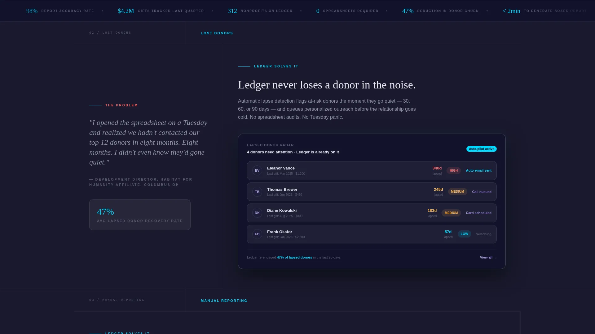
Each of the four anchor nav spokes opens on a donor director's real frustration, stated in plain language, then dissolves into the product screen that resolves it. The tension builds spoke by spoke, making the final reveal feel genuinely satisfying rather than scripted.
Product Screenshot Hero Header
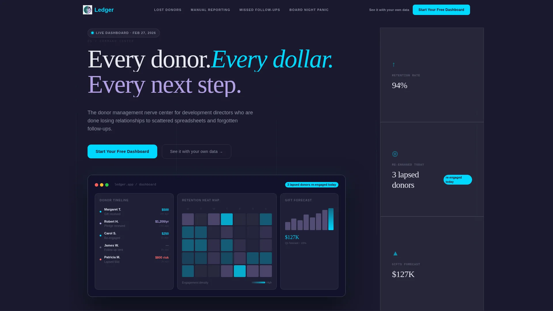
The full-width header features a pixel-perfect dashboard screenshot mid-use: a donor timeline on the left, a retention heat map in the center, a gift forecast chart on the right, and a live notification badge. It sits on a frosted glass card with a subtle parallax tilt over the deep charcoal background.
Sticky Anchor Navigation
A persistent top nav labels each spoke with a buyer pain point: "Lost Donors," "Manual Reporting," "Missed Follow-Ups," and "Board Night Panic." Visitors can jump directly to the section most relevant to their current frustration, reducing bounce from impatient readers.
Triple-Placement Primary Call to Action
The "Start Your Free Dashboard" button appears at the header, after the third spoke, and inside a fixed bottom bar that emerges on scroll. This placement strategy keeps the conversion prompt visible without interrupting the narrative arc.
One-Click Annual Report Section
The final spoke, "Board Night Panic," showcases a one-click annual report generator as the page's emotional payoff. It is designed to produce what the brief calls an audible exhale: the moment a director realizes their biggest recurring dread is already solved.
Secondary Demo Booking Link
A text-link call to action reading "See it with your own data" sits alongside the primary button for directors who need a personalized walkthrough before committing. It captures high-intent visitors who are not yet ready to self-serve.
Page sections overview
| Section | Purpose |
|---|---|
| Hero Header | Anchor the page with a live-feeling dashboard screenshot and headline |
| Sticky Anchor Nav | Let visitors jump to the pain point most relevant to them |
| Lost Donors Spoke | Name the lapsed-donor problem and show the retention heat map solution |
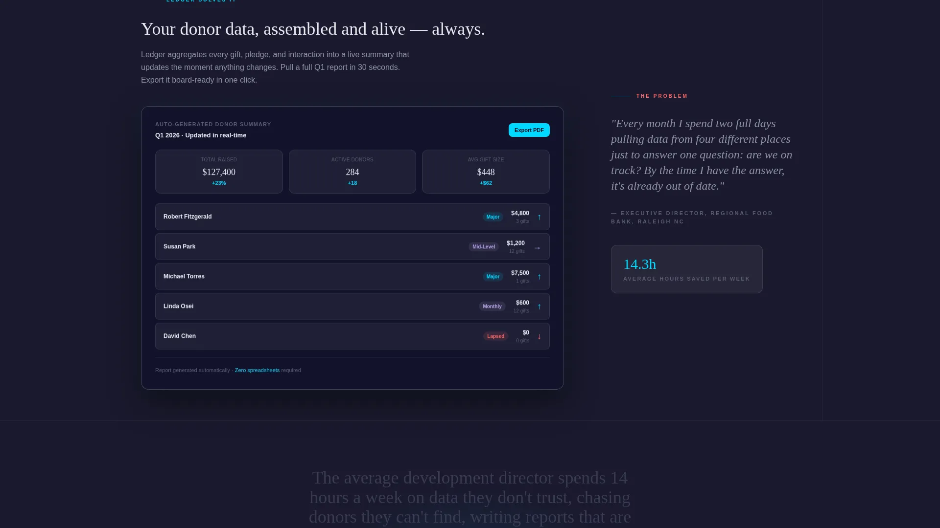
| Manual Reporting Spoke | Address time-lost-to-spreadsheets and reveal automated reporting screens |
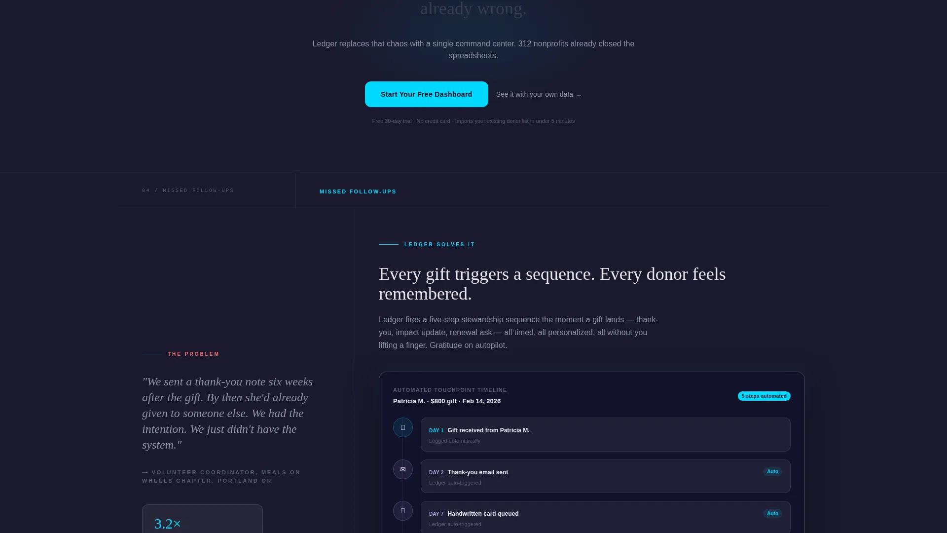
| Missed Follow-Ups Spoke | Highlight forgotten outreach and show the donor timeline in action |
| Board Night Panic Spoke | Deliver the emotional payoff with a one-click annual report generator |
| Mid-Page Call to Action | Reinforce trial signup after the third spoke at peak persuasion |
| Fixed Bottom Bar | Keep the primary conversion button visible throughout the scroll |
Design & branding system
The visual identity follows a Data Command theme executed through a glassmorphic color system. The palette feels like a mission control room at 2 a.m.: dark surfaces, glowing readouts, and translucent panels floating over depth. The warmth is intentional so nonprofit staff feel empowered rather than intimidated.
- Deep command-center charcoal (#1A1A2E) as the base background layer
- Frosted glass panel white at 12 percent opacity (#FFFFFF1F) for card surfaces
- Electric teal (#00D9FF) for live-data accents, active nav states, and primary button highlights
- Soft lavender (#B4A0E5) as the secondary hover-state and graph fill color
Mobile & speed optimization
The layout is structured for clean reflow across screen sizes, keeping the anchor nav accessible and the product screenshot legible on smaller viewports. Nonprofit staff often review materials on mobile between meetings, so the template accounts for that context.
- Sticky nav collapses gracefully so it does not crowd the reading area on small screens
- Fixed bottom conversion bar remains visible without obscuring content on mobile
- Section-by-section scroll flow maintains narrative momentum regardless of device size
How this template helps you convert
Ledger is designed as a click-through landing page with one job: move a qualified visitor to a free trial signup or demo booking. Every structural decision serves that outcome.
- The hero screenshot creates immediate product credibility before a single word of copy is read, reducing early-exit skepticism from busy nonprofit directors.
- The four-spoke pain-point arc builds emotional investment section by section, so by the time the third call to action appears, the visitor has already narrated their own problem back to themselves.
- The fixed bottom bar ensures the primary conversion button is never more than a glance away, removing friction at the exact moment a visitor decides they have seen enough.
Other information about this template
This template is part of a growing library of niche-specific landing page designs for software platforms targeting the nonprofit and social-sector space. It is suited to teams who want a visually distinctive starting point rather than a generic SaaS layout.
- The hub-and-spoke structure makes it straightforward to add or remove pain-point spokes as the product narrative evolves
- The glassmorphic dark-mode aesthetic is uncommon in the donor management software category, giving adopters a strong visual differentiator
- The page is built as a single-page click-through with no embedded form fields, keeping the path to conversion clean and intentional
Theme
Data Command
Creative direction
Problem→Solution Arc
Color system
Glassmorphic
Style
Hub & Spoke (Anchor Nav)
Direction
Click-Through
Page Sections
Problem-to-solution Spoke Architecture
Product Screenshot Hero Header
Sticky Anchor Navigation
Triple-placement Primary Call to Action
One-click Annual Report Section
Secondary Demo Booking Link
Related questions
Can I customize the four spoke sections for different pain points?
Does this template include actual dashboard screens or placeholder images?
What happens when a visitor clicks the primary call to action button?
How many calls to action appear on the page?
Is this template suitable for a nonprofit promoting its own donor program?



