Summit — Operations Hub Landing Page Template
Dispatch is a hub-and-spoke landing page template built for home services CRM tools. It opens with a revenue-loss calculator, guides visitors through side-by-side comparison modules, and pushes every scroll toward a clear call to action. The Void and Violet visual system makes data the hero, not stock photography.
by Rocket studio
Quick summary
Dispatch is a single-page, anchor-nav landing page template designed for home services software and CRM products. It leads with an interactive revenue-loss calculator, moves through versus-comparison spoke sections, and uses a dark glass visual system to keep every element focused on one job: turning a skeptical tradesperson into a signed-up user.
Who this template is for
This template is built for software founders and marketing teams selling CRM or field-service tools to the trades. It speaks directly to the people buying those tools too, which makes demos and ad landing pages far more effective.
- Owner-operators running plumbing, electrical, or HVAC businesses from a truck
- Office managers tracking jobs, callbacks, and invoices across too many apps
- Growing shops that have recently added crew and need one place to see everything
What problem this template solves
Home services businesses lose revenue quietly. Missed calls go unreturned, invoices sit unpaid, and follow-ups fall through the cracks while the owner is under a sink. A generic SaaS landing page does not speak to that reality. Dispatch does.
- It quantifies the visitor's specific revenue loss before pitching any feature
- It replaces vague benefit claims with direct comparisons against spreadsheets and voicemail workflows
- It captures leads who are curious but not yet ready to commit, through a secondary stack-scoring path
What you get with this template
You get a fully structured, single-page layout with a calculator-first flow, sticky evidence bar, and multi-spoke comparison architecture. Every section is designed to escalate urgency without relying on generic copy or stock imagery.
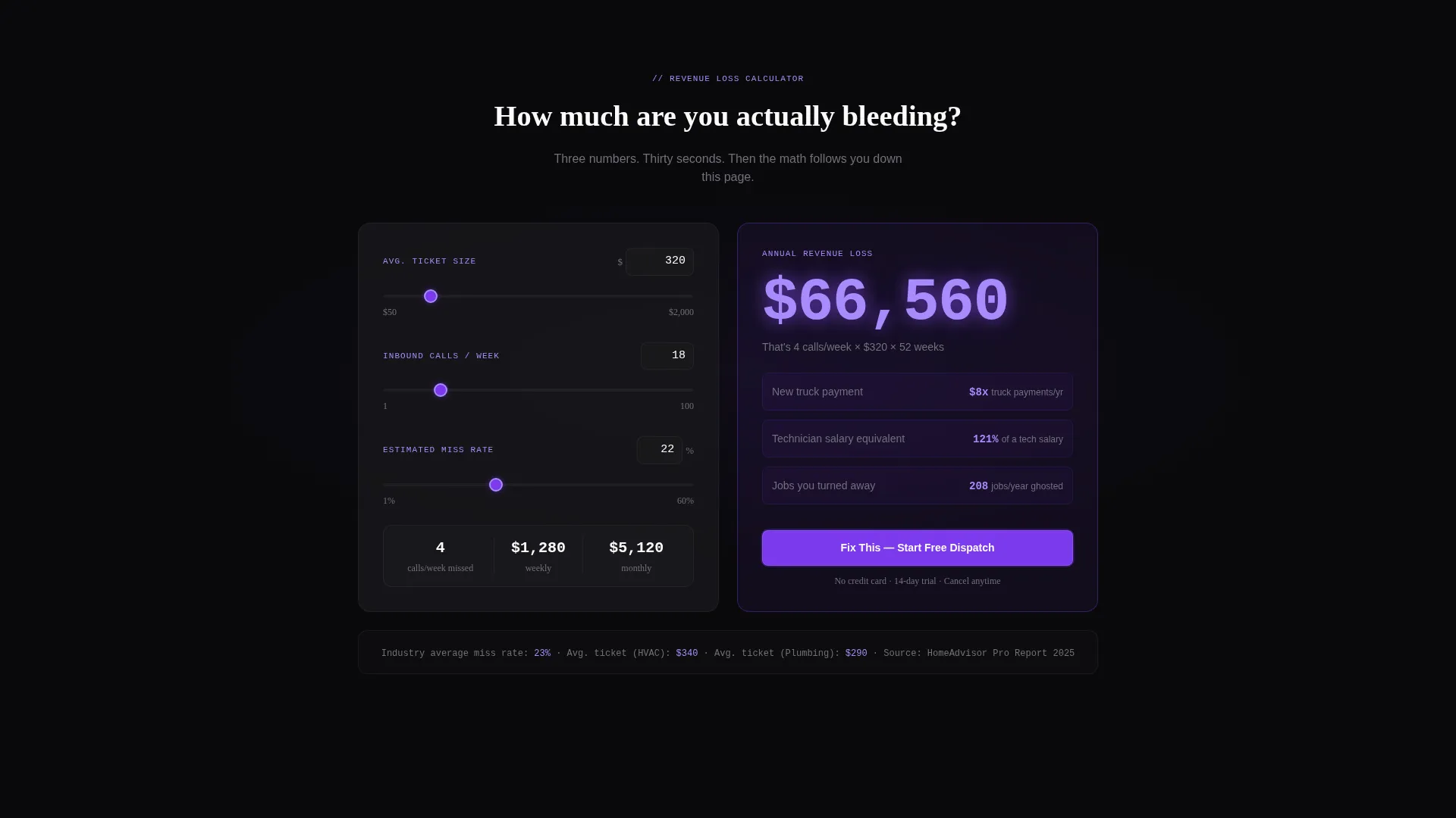
- An interactive revenue-loss calculator anchored at the top spoke of the page
- Dark glass panel header with three live-looking CRM interface previews
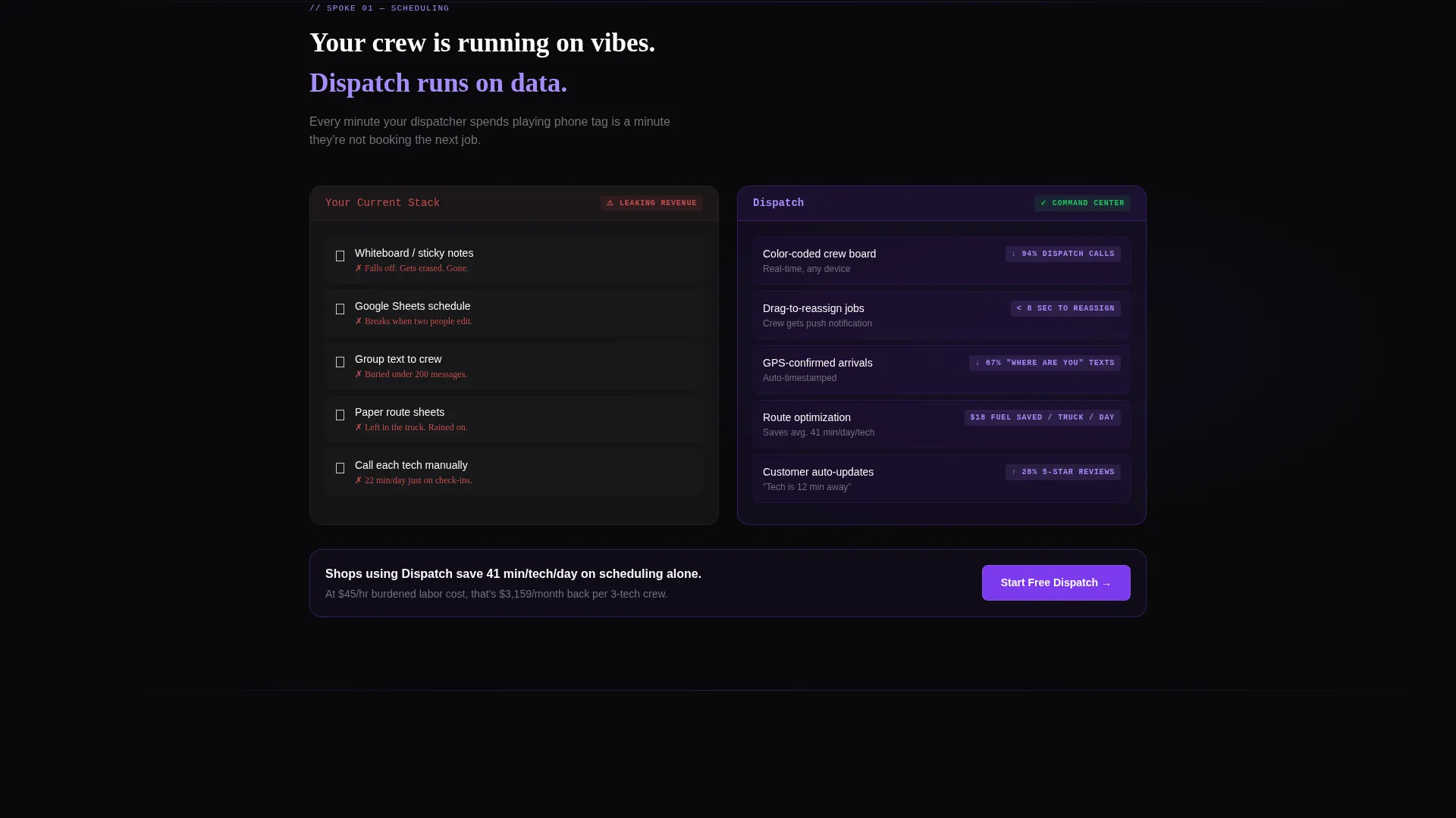
- Side-by-side versus modules comparing the visitor's current workflow against the product
- A sticky bar that carries the calculated revenue figure as the visitor scrolls
- A secondary lead-capture path through a three-question stack-scoring tool
Feature list
This template is designed around a small set of high-impact components. Each one earns its place in the layout.
Revenue-Loss Calculator
The page opens with an interactive tool. Visitors enter their average ticket size, weekly call volume, and estimated miss rate. The tool instantly renders a violet-glowing annual revenue figure. That number becomes the emotional anchor for everything that follows.
Sticky Revenue Bar
Once the calculator produces a result, that figure locks into a persistent bar at the top of the viewport. It follows the visitor through every comparison spoke, making the cost of inaction feel real at every scroll stop.
Dark Glass Panel Header
Three translucent dark glass cards float side by side at the top of the page. Each one shows a live-looking CRM data snapshot: a color-coded crew schedule, a paid invoice with a green timestamp, and a missed-call recovery queue with an auto-text confirmation. There is no hero illustration, no stock photography.
Hub-and-Spoke Anchor Navigation
A horizontal anchor nav links to each comparison spoke below. Visitors can jump directly to the section most relevant to their pain point, whether that is scheduling, invoicing, or follow-up recovery. Active nav pills glow in soft iris on hover and selection.
Versus Comparison Modules
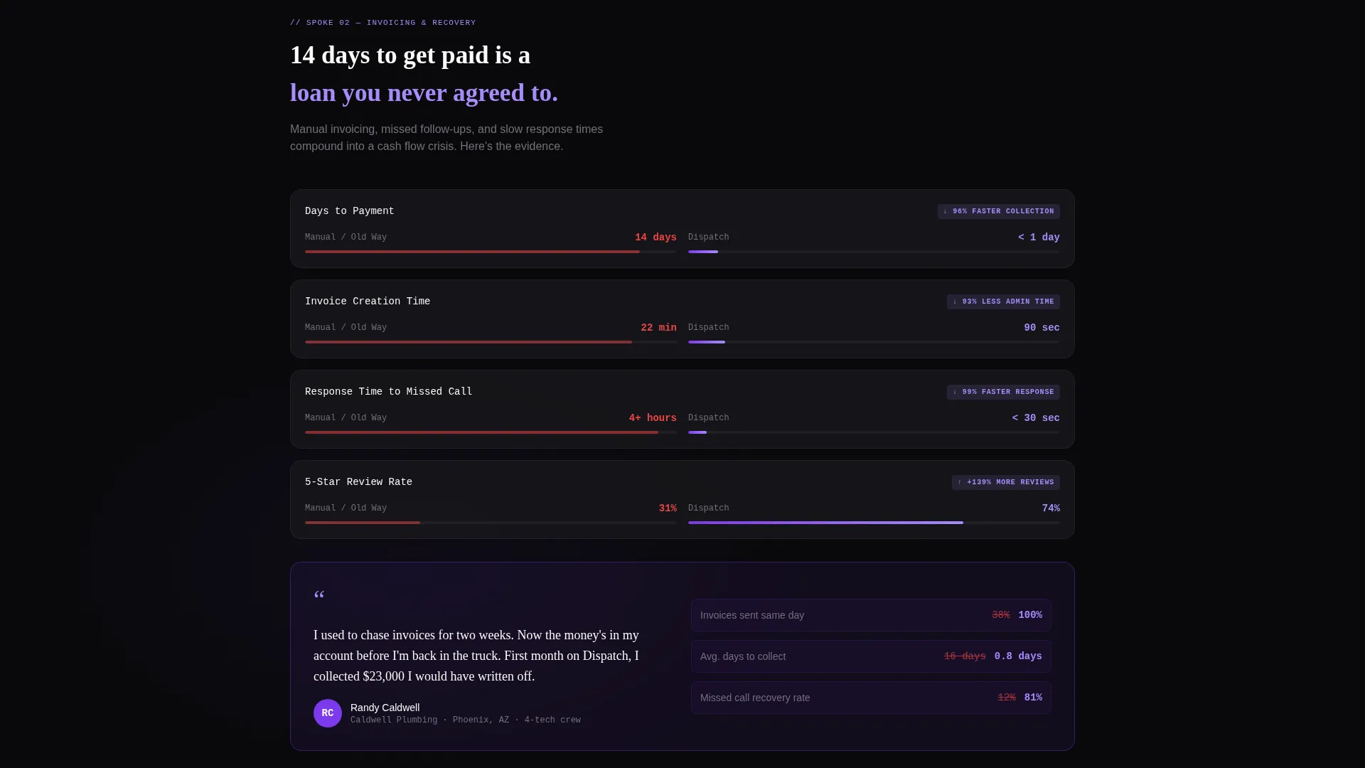
Each spoke section presents a side-by-side dark glass panel layout. The competitor column dims; the product column illuminates with violet accents. Evidence includes response time benchmarks, average days-to-payment figures, and customer review lift percentages.
Stack-Scoring Lead Capture
A secondary conversion path presents three quick questions about the visitor's current scheduling method, invoicing tool, and review management approach. The tool generates a personalized gap report delivered by email, capturing leads who are not ready to start a free trial yet.
Page sections overview
| Section | Purpose |
|---|---|
| Dark Glass Header | Show live CRM data snapshots and set the data-as-hero tone |
| Revenue Calculator Spoke | Let visitors quantify their own annual loss before any feature pitch |
| Sticky Evidence Bar | Keep the calculated revenue figure visible during the full scroll |
| Schedule Comparison Spoke | Compare current scheduling workflows against the product side by side |
| Invoice Comparison Spoke | Show average days-to-payment gap between manual invoicing and Dispatch |
| Review Lift Spoke | Present customer review improvement benchmarks as social evidence |
| Stack Scorer Tool | Capture leads via a three-question gap-report generator |
| Primary call to action Junction | Repeat the main call-to-action button at each spoke transition point |
| Footer Section | Close the page with final call to action and secondary navigation |
Design & branding system
The visual identity follows a Startup Velocity theme built on a Void and Violet color system. The palette is intentionally minimal: every color is signal, not decoration. It feels like a dispatch screen running in a dark garage late at night.
- Backgrounds stay in absolute void black (#09090B) and cool panel glass (#18181B)
- Deep interstellar violet (#7C3AED) appears only on active nav pills, toggle states, and call-to-action pulses
- Electric white (#FAFAFA) handles all body and heading text; soft iris (#A78BFA) lights hover and active states
Mobile & speed optimization
The layout is designed with field workers in mind. Many visitors will land on this page from a phone, standing in a driveway or sitting in a truck cab. The template structure supports that use case directly.
- The anchor navigation collapses cleanly for smaller viewports so spoke links remain reachable
- Dark glass panels and the calculator component are built to render without layout breakage on mobile screens
- The sticky revenue bar is sized and positioned to stay readable without blocking content on phone-sized displays
How this template helps you convert
Dispatch is built around a Comparison and Versus conversion strategy. It does not ask for a commitment before proving the cost of inaction. That sequence is deliberate.
- The calculator makes the visitor's revenue loss feel personal and mathematically specific before any feature is introduced, lowering resistance to the primary call-to-action button that follows immediately after.
- The sticky bar and escalating evidence across each spoke keep urgency compounding as the visitor scrolls, so every call-to-action repetition lands with more weight than the one before it.
- The stack-scoring secondary path captures email leads from visitors who are comparison-shopping or not yet ready to commit, extending the conversion window beyond the initial visit.
Other information about this template
This template is part of the broader home services software and field service management category. It is purpose-built for SaaS and CRM products that serve the trades, and the layout decisions reflect that niche directly.
- The template style is Hub and Spoke with Anchor Navigation, making it well-suited for products with multiple distinct use cases or competitor comparisons to address
- The creative direction is Calculator and Tool First, a pattern that works well for home services CRM products where the cost of the problem is concrete and quantifiable
- The Startup Velocity theme and Void and Violet color system are pre-configured, giving teams a dark-mode, high-contrast starting point without needing to build a design system from scratch

Theme
Startup Velocity
Creative direction
Calculator/Tool First
Color system
Void & Violet
Style
Hub & Spoke (Anchor Nav)
Direction
Comparison/Versus
Page Sections
Revenue-loss Calculator
Sticky Revenue Evidence Bar
Dark Glass Panel Header
Hub-and-spoke Anchor Navigation
Versus Comparison Modules
Stack-scoring Lead Capture Tool
Related questions
Who is this landing page template designed for?
Do I need to write new copy to use this template?
How does the revenue-loss calculator work within the template?
Can this template support a secondary lead-capture goal?
Is this template only suitable for plumbing and HVAC businesses?



