Accounting Firm Software Professional Website Template
Ledger is a bold brutalist landing page template built for accounting firm email marketing services. It pairs a void-black card grid layout with electric violet accents to walk visitors through a problem-to-solution story. The template is designed to generate leads through a stripped-back audit call to action and a gated benchmark report, targeting managing partners, solo practitioners, and fractional marketing leaders.
by Rocket studio
Quick summary
Ledger is a single-page, card grid landing page template purpose-built for accounting firm email marketing platforms. It uses a bold brutalist visual identity, a void-black and electric violet color system, and a diagnostic problem-to-solution scroll arc. Two conversion paths capture leads at different readiness levels, and every design decision is built to feel urgent, credible, and direct.
Who this template is for
This template speaks directly to the people who sell email marketing tools or managed email services to accounting firms. It is also a strong fit for anyone positioning a growth platform at the intersection of compliance-heavy professional services and modern marketing automation.
- Managing partners at firms with 10 to 50 staff who need better client retention campaigns
- Solo practitioners buried in compliance work who have let marketing go cold
- Fractional chief marketing officers hired to modernize firms still running on referrals
What problem this template solves
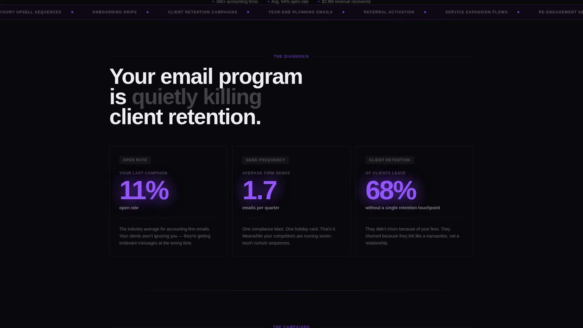
Most accounting firms send fewer than two emails per quarter. Open rates sit in the single digits, onboarding sequences never get built, and clients quietly leave without a single retention touchpoint. This template gives a marketing platform a page that makes those painful truths impossible to ignore, then immediately presents the solution.
- Firms with embarrassingly low open rates need to see proof before they believe change is possible
- Visitors who are not ready to book a call still need a lower-friction path to stay in the funnel
- A generic SaaS layout cannot convey the urgency this niche actually feels at quarter-end
What you get with this template
You get a fully structured, single-page layout with a dark full-bleed header, a modular card grid, a problem-to-solution scroll arc, and two conversion entry points. Every section is designed around a specific job, from confronting the visitor with their own metrics to capturing their contact details.
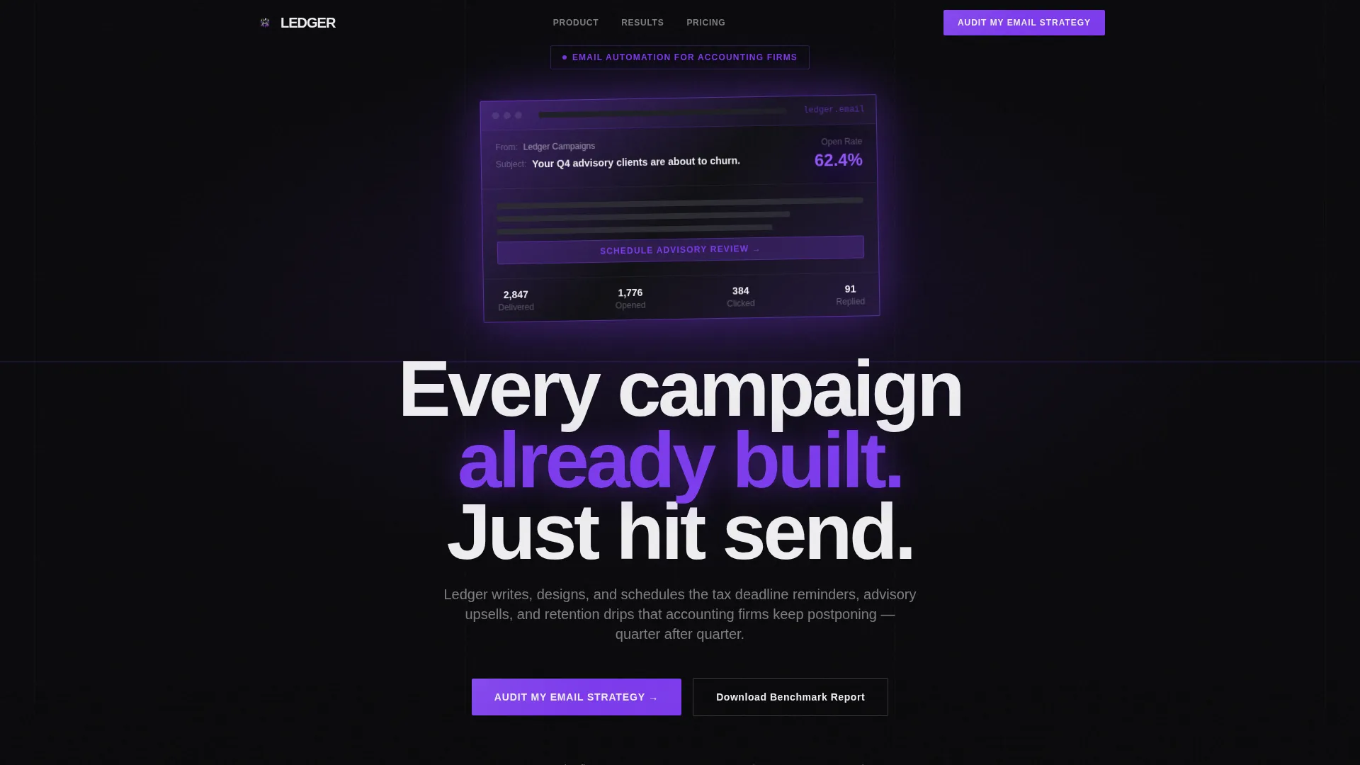
- A glowing void-black header featuring a live-looking email preview with a pulsing open-rate stat
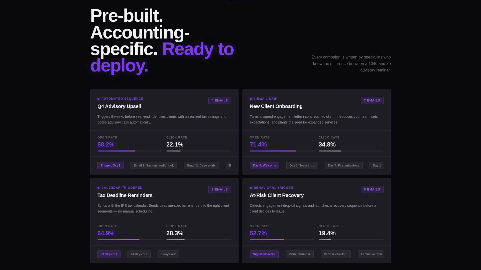
- Brutalist problem cards showing real industry stats followed by solution cards with campaign proof
- A primary lead-generation modal with three inputs and a secondary gated benchmark report download
Feature list
Void-Black Full-Bleed Header
The header fills the entire viewport in pure void black. A single email template fades in at center screen, glowing violet at its borders as if backlit from inside. The subject line and a pulsing open-rate stat appear alongside it, making the product the hero before a single word of copy is read.
Problem-to-Solution Card Arc
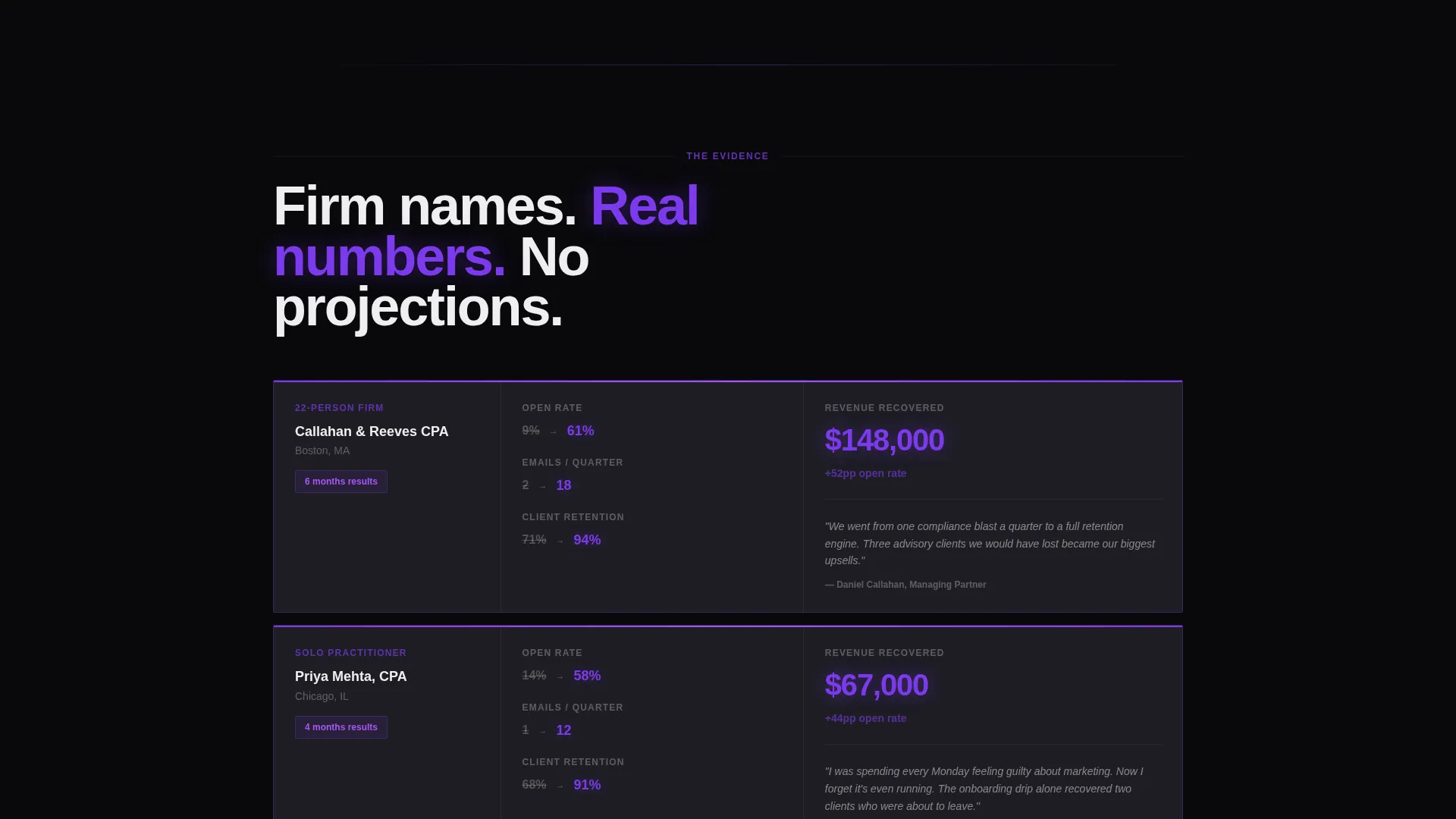
The page opens with a row of stark black cards each showing one brutal industry stat in electric violet. As the visitor scrolls, solution cards appear with campaign screenshots and automation flowcharts, each elevated by a violet edge glow that intensifies on hover. The arc closes with proof cards stacked like case study evidence.
Dual Conversion Paths
The primary call-to-action button reads "Audit My Email Strategy" and opens a brutalist modal with a firm size selector, a current email platform dropdown, and a single open text field. A secondary path offers a downloadable benchmark report gated behind only an email address, capturing visitors not yet ready to talk.
Modular Card Grid Layout
The layout is built on a modular card grid, meaning sections can be reordered, expanded, or contracted without breaking the visual logic. Each card is a self-contained unit with consistent spacing, making the page easy to customize for different offers or audience segments.
Brutalist Modal Lead Form
The lead capture modal strips friction to its minimum. Three inputs only: firm size, current email platform, and a single retention frustration question. No phone number field. The form feels fast and deliberate, which matches the tone of a platform that promises to remove marketing busywork.
Violet Accent Interaction System
Electric violet is reserved for the highest-priority interface signals: call-to-action buttons, hover states on cards, progress indicators, and stat highlights. This creates a visual hierarchy where the eye naturally follows the conversion path through the page without needing to be told where to look.
Page sections overview
| Section | Purpose |
|---|---|
| Dark Header Block | Introduce the product with a glowing email preview and pulsing open-rate stat |
| Primary call to action Strip | Anchor the "Audit My Email Strategy" button directly beneath the header |
| Problem Cards Row | Surface three brutal industry stats in stark brutalist cards |
| Solution Cards Grid | Present campaign screenshots and automation flowcharts with violet edge glow |
| Proof Case Studies | Stack firm-level results as evidence cards with open-rate lifts |
| Final call to action Row | Repeat the primary audit call to action anchored at the bottom of the grid |
| Benchmark Report Gate | Offer a downloadable report gated behind a single email address field |
Design & branding system
The template uses a Void and Violet color system built around four values: absolute void black (#09090B) for backgrounds and card faces, electric violet (#7C3AED) for interactive and highlight elements, muted graphite (#1E1E24) for card layer separation and section dividers, and phosphor white (#EEEEF0) for all body text and card borders.
- Typography is set in heavy, oversized sans-serif weights that land hard against the dark grid with no decorative curves
- Violet is used sparingly and intentionally, appearing only on calls-to-action, hover states, progress bars, and metric highlights
- Graphite creates depth between card layers without introducing color noise into the black-dominant palette
Mobile & speed optimization
The modular card grid is structured so that columns stack cleanly on smaller screens without losing the problem-to-solution narrative sequence. The dark background keeps contrast high across display types, and the layout avoids heavy image assets by using the product interface itself as the visual centerpiece.
- Card-based sections reflow into single-column stacks on mobile while keeping stat cards and call to action buttons prominent
- The header's glow effect and pulsing stat are built into the layout without relying on large external media files
How this template helps you convert
The page is engineered around two facts: some visitors are ready to act today, and others need a lower-commitment first step. Both groups are served without diluting the urgency of the primary offer.
- The "Audit My Email Strategy" modal reduces friction to three fields, making it easy for a busy managing partner to submit in under a minute
- The gated benchmark report captures email addresses from visitors who are researching rather than buying, keeping them in a nurture sequence
Other information about this template
This template is categorized under Technology, specifically within the accounting firm software subcategory, targeting the accounting firm email marketing niche. It is designed as a card grid modular landing page using a bold brutalist theme, and it is well suited to platforms that want to position themselves as the automated email solution for professional services firms that have historically underinvested in client communication.
- The template style is explicitly modular, so individual card rows can be replaced or reordered to match different campaign focuses or seasonal offers
- The intersection match score of 13 indicates a tightly defined niche, meaning the template is built for a specific audience rather than a broad software category
- The creative direction follows a problem-to-solution arc, which is a proven structure for converting visitors who already feel the pain but have not yet committed to a fix
Theme
Bold Brutalist
Creative direction
Problem→Solution Arc
Color system
Void & Violet
Style
Card Grid (Modular)
Direction
Lead Generation
Page Sections
Void-black Full-bleed Header
Problem-to-solution Card Arc
Dual Conversion Paths
Modular Card Grid Layout
Brutalist Modal Lead Form
Violet Accent Interaction System
Related questions
Who is this landing page template designed for?
What are the two conversion paths on this page?
Can I customize the card grid without breaking the layout?
Does the template include the lead capture modal?
What color system does this template use?



