Ski Resort Vertical SaaS Booking Website Template
Summit is a split-screen landing page template built for ski resort booking platforms. It combines a live ROI calculator, a code-snippet header, and a comparison section into one high-converting single-page flow. Designed with a Tech Glass visual identity in Void and Violet, it speaks directly to resort operations directors, marketing managers, and ski school coordinators ready to replace fragmented legacy systems.
by Rocket studio
Quick summary
Summit is a single-page landing page template purpose-built for ski resort booking platforms. It opens with a split-screen header pairing a live API code snippet against a guest-facing checkout card. An interactive ROI calculator anchors the scroll, followed by a legacy-versus-unified comparison section. Every design choice serves one goal: make the cost of staying on legacy systems numerically undeniable.
Who this template is for
Summit is designed for vertical software-as-a-service (SaaS) teams selling booking technology to ski resorts. It resonates most with go-to-market and product teams who need to demonstrate unified platform value in one focused session.
- Resort operations directors managing multiple vendor systems and looking to consolidate
- Marketing managers losing conversions to third-party redirects and fragmented checkout flows
- Ski school coordinators replacing spreadsheet-based group booking with a single transaction engine
What problem this template solves
Ski resort booking technology is often split across five or more separate vendor systems, each with its own login, fee structure, and guest data silo. Prospects arrive on most SaaS landing pages and cannot immediately see how switching would affect their own numbers. Summit closes that gap.
- Visitors leave without converting because the financial cost of inaction is never made personal
- Legacy stack comparisons typically rely on abstract claims rather than side-by-side proof
- Sales teams spend discovery calls calculating ROI that a well-built landing page could deliver upfront
What you get with this template
Summit delivers a complete, section-led landing page layout ready to present a unified ski resort booking system to its ideal buyers. The template is structured around calculator-first conversion logic, with every section below the fold built to reinforce the initial data hit.
- A split-screen hero with a working API code snippet panel and a glass-card checkout preview panel
- An interactive ROI calculator with three inputs and three projected outputs displayed instantly
- A scroll-driven comparison section that animates legacy stacks against the unified platform using glass panels and violet light accents
Feature list
This template bundles a focused set of purpose-built components. Each one is grounded in the conversion logic described in the source brief.
Split-Screen Code and Checkout Header
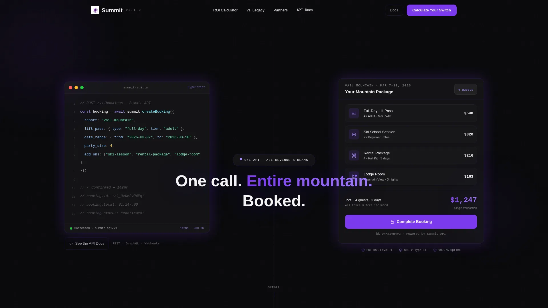
The hero divides the viewport equally. The left panel shows a syntax-highlighted dark editor displaying a real POST /bookings API request with fields for resort, lift pass, date range, party size, and add-ons. The right panel shows the guest-facing result: a glass-card checkout interface bundling lift tickets, a ski lesson, and a rental package into one cart with a total price glowing in electric lilac.
Interactive ROI Calculator
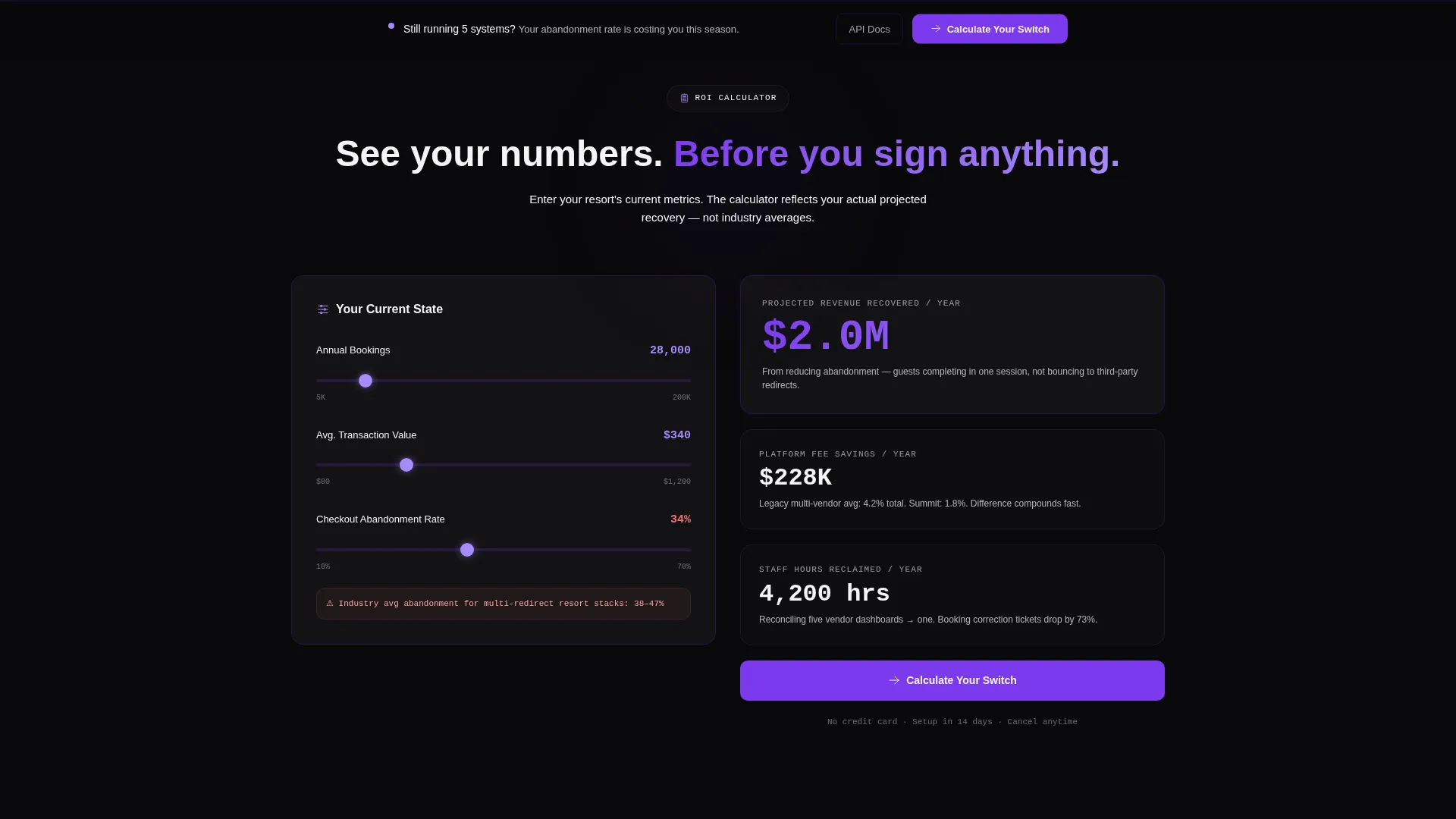
Placed immediately below the header, the calculator accepts three inputs: current annual bookings, average transaction value, and estimated abandonment rate. It instantly outputs projected revenue recovery, a platform fee comparison, and time saved in staff hours per week. This transforms an abstract value proposition into the visitor's own numbers.
Animated Legacy versus. Unified Comparison
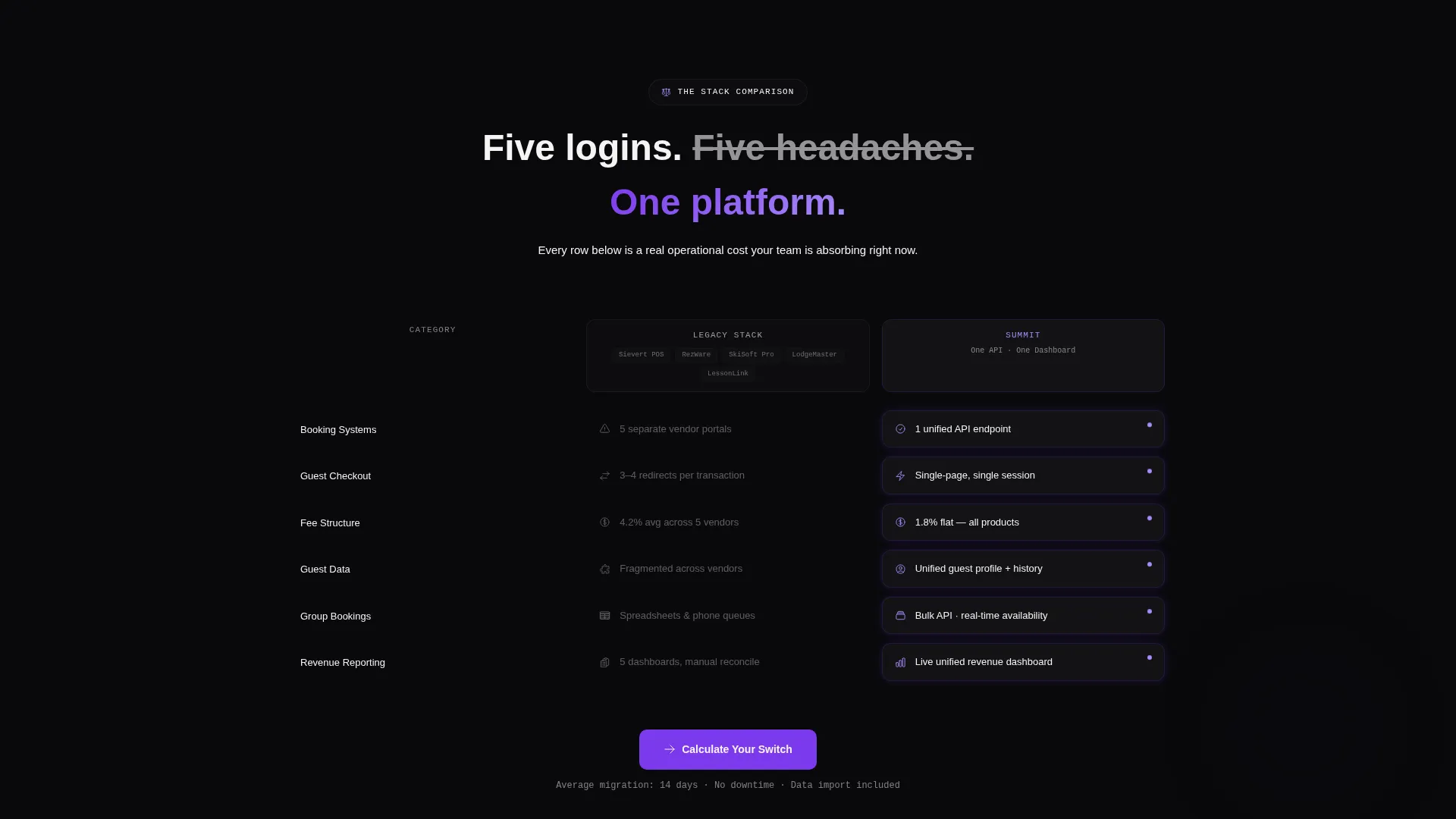
Side-by-side glass panels contrast the legacy stack against the unified platform row by row. The legacy side dims to zinc gray on scroll while the platform side pulses with violet light. Each row targets a specific pain point: logins, fee structures, guest data fragmentation, and revenue stream consolidation.
Embedded Testimonial Cards
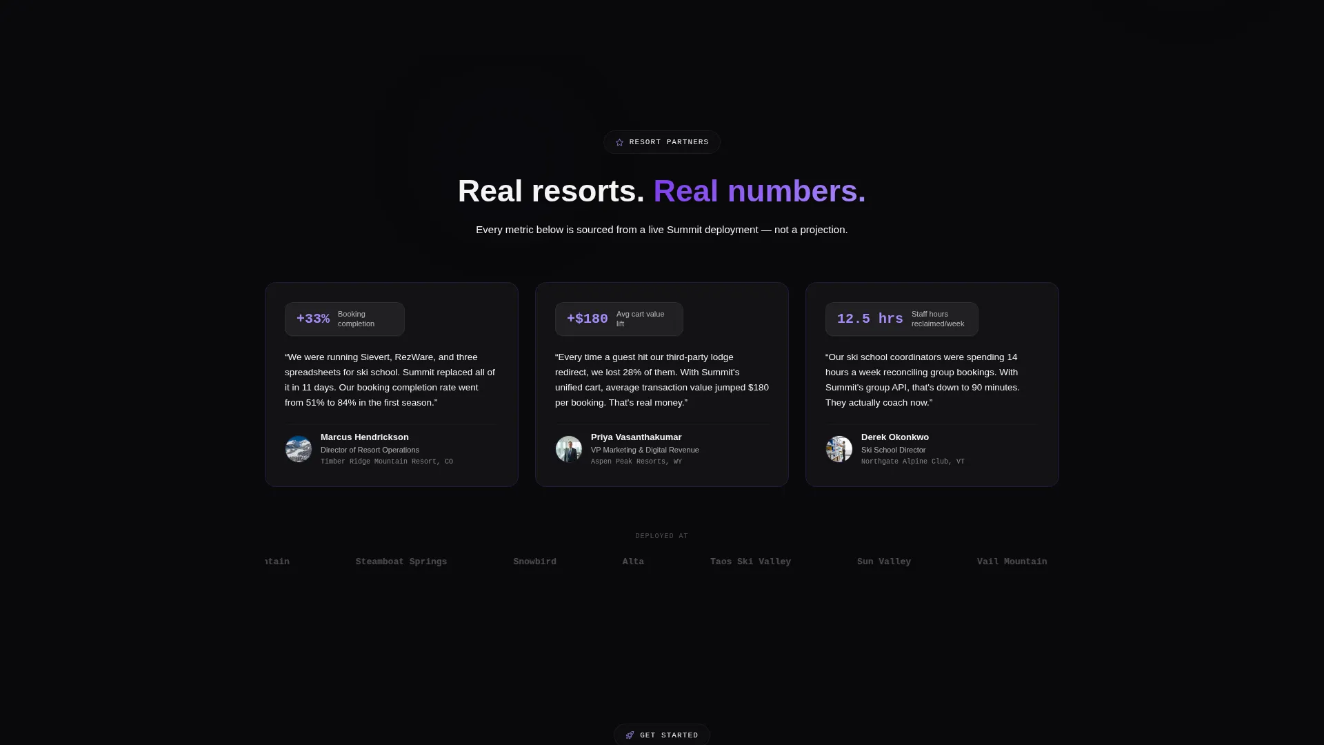
Testimonial cards from resort partners appear between comparison rows. Each card cites a specific operational metric, such as booking completion rate improvement, average cart value lift, or staff hours reclaimed per week. These are positioned as proof between moments of comparison tension.
Dual Call-to-Action Architecture
The primary call to action, "Calculate Your Switch," anchors first to the ROI calculator output and then reappears as a sticky bottom bar after the visitor scrolls past the third comparison row. A secondary path, "See the API Docs," serves technical evaluators arriving from developer channels.
Minimal Qualification Form
The bottom of the page includes a low-friction lead capture form asking only for resort name, annual visitor volume, and work email. The form qualifies intent without adding unnecessary fields that increase drop-off.
Page sections overview
| Section | Purpose |
|---|---|
| Split-Screen Hero | Introduce the API and guest checkout side by side |
| ROI Calculator | Let visitors project their own revenue recovery instantly |
| Calculator Output | Display projected gains and platform fee comparison |
| Comparison Panels | Contrast legacy stack against unified platform row by row |
| Testimonial Cards | Reinforce comparison rows with real partner metrics |
| Sticky call to action Bar | Restate primary call to action after third comparison row |
| Lead Capture Form | Qualify and convert visitors with three low-friction fields |
Design & branding system
The template uses a Tech Glass visual identity built on the Void and Violet color system. The overall aesthetic is described as a cockpit console at 12,000 feet after dark: glowing interface elements floating on an absolute void background with every point of light intentional.
- Core palette: absolute void black (#09090B) for backgrounds, deep orbital violet (#7C3AED) for active elements, frosted glass panels using #FFFFFF0A with backdrop blur, and electric lilac (#A78BFA) for hover states and active calculator fields
- Typography uses snow white (#F4F4F5) for primary text and muted zinc (#A1A1AA) for secondary text, keeping hierarchy clear without relying on heavy weight contrast
- Cards and containers use translucent glass panels with subtle 1-pixel violet-tinted borders; violet appears only where the system is live, including buttons, toggles, active inputs, and data output fields
Mobile & speed optimization
Summit's layout is structured to translate the split-screen desktop experience into a clear single-column mobile flow. The template prioritizes visual hierarchy so every section remains scannable on smaller screens.
- The 50/50 split-screen hero stacks vertically on mobile, presenting the code panel above the checkout card in a logical top-down reading order
- Glass panel cards and the ROI calculator inputs are sized for touch interaction, maintaining the visual identity across screen sizes
- Sticky call-to-action behavior is retained on mobile so the bottom bar remains accessible as visitors scroll through the comparison section
How this template helps you convert
Summit is built around a specific conversion logic: show prospects their own numbers before making any product claim. This sequence earns the call to action rather than demanding it.
- The ROI calculator delivers a personalized financial output in the first scroll, making the cost of inaction concrete and visible before the visitor reads a single feature claim.
- The comparison section builds on that initial data hit by showing exactly which legacy pain points the unified platform replaces, with visual emphasis on the platform side through violet light animation on scroll.
- The dual call-to-action structure captures both operations buyers ready to commit and technical evaluators who need to inspect the API first, reducing drop-off across two distinct visitor intents.
Other information about this template
Summit is part of a broader set of vertical SaaS landing page templates designed for niche go-to-market use cases. A few additional notes help set accurate expectations for teams evaluating this template.
- The template is categorized under Technology with a Ski Resort Vertical SaaS subcategory, making it specific enough to use without heavy restructuring for this niche
- The intersection match score for this template is 13, reflecting strong alignment between the Tech Glass theme, Calculator/Tool First creative direction, Code Snippet header concept, and Comparison/Versus landing page direction
- The Void and Violet color system is a named design system within this template family; teams should expect to work within its palette rather than replacing it with brand colors that conflict with the glass panel contrast logic
- The template is delivered as a single-page layout and does not include multi-page routing, a blog, or a documentation site by default
Theme
Tech Glass
Creative direction
Calculator/Tool First
Color system
Void & Violet
Style
Split Screen (50/50)
Direction
Comparison/Versus
Page Sections
Split-screen Code and Checkout Hero
Interactive ROI Calculator
Animated Legacy Versus. Unified Comparison
Embedded Partner Testimonial Cards
Dual Call-to-action Structure
Low-friction Lead Capture Form
Related questions
Who is the Summit template designed for?
Does the ROI calculator require a backend connection to function?
What makes the split-screen header more than a standard hero section?
Can this template be adapted for outdoor or hospitality verticals beyond ski resorts?
When does the sticky call-to-action bar appear during scrolling?



