Supplify - Seamless Educationstore Landing Page Template
Supplify is a scroll-reveal landing page template built for K-12 online education supply stores. It pairs a neon-charged Acid Digital color system with a progressive feature matrix that compares modern procurement against legacy workflows. Dual app download calls-to-action and a sticky bottom bar push visitors toward action from the first scroll.
by Rocket studio
Quick summary
Supplify is a single-page, scroll-reveal landing page template designed for K-12 education supply stores. It opens with a product screenshot header, builds trust through an animated feature comparison matrix, and closes with dual app download calls-to-action. The visual identity is bold and tech-forward, making school supply ordering feel fast and modern.
Who this template is for
This template is built for anyone running or launching a digital storefront that sells classroom supplies to K-12 schools. It speaks directly to the real humans on both sides of the purchase order.
- First-year teachers furnishing a classroom on a tight budget who need a fast, intuitive ordering experience
- Veteran educators and department heads restocking mid-semester who have no patience for slow procurement processes
- District purchasing coordinators managing hundreds of line items against tight fiscal-year deadlines
What problem this template solves
Traditional school supply procurement is slow and frustrating. Paper catalogs, fax-back forms, and three-week delivery windows waste time that teachers and administrators simply do not have.
- Buyers lose hours navigating outdated procurement workflows instead of focusing on students
- Store owners lack a compelling digital presence that communicates speed, reliability, and purchase-order integration at a glance
- App-driven storefronts struggle to communicate their advantage over legacy systems without a clear, visual side-by-side comparison
What you get with this template
You get a complete, scroll-reveal landing page layout ready to customize for your K-12 education supply store. Every section is designed to move a visitor from curiosity to download in a single uninterrupted scroll.
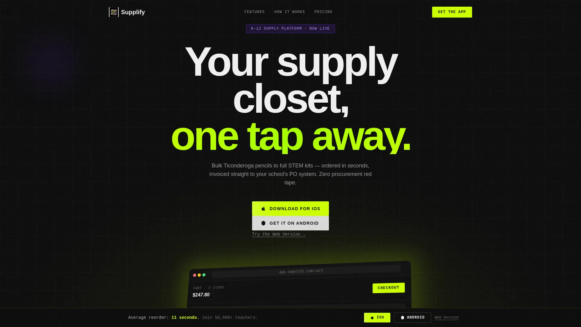
- A product screenshot hero section with an isometric app render and a headline that loads on fade-in
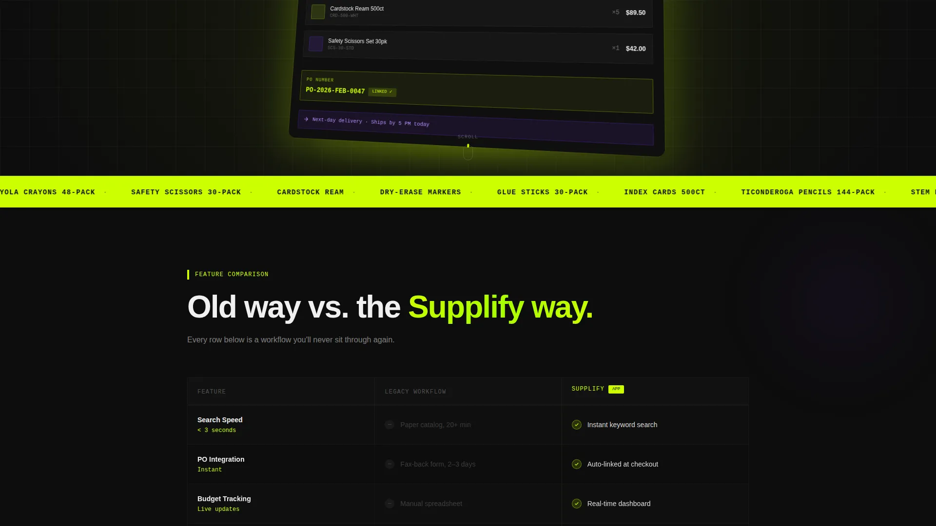
- An animated feature matrix that compares your platform against legacy procurement row by row
- Sticky dual app download calls-to-action pinned to the bottom of the viewport after the first scroll-reveal fires
Feature list
This template ships with a focused set of layout and interaction features. Each one is grounded in the scroll-reveal, app-download landing page format described in the brief.
Scroll-Reveal Progressive Layout
Each section materializes as the visitor scrolls down the page. This progressive reveal creates momentum and keeps attention locked on one message at a time, building the case for the app before the download prompt appears.
Isometric Product Screenshot Header
The hero section features a pixel-perfect isometric render of the app's home screen. The cart is pre-loaded with recognizable classroom items and a glowing purchase-order number field is visible at checkout, making the product feel real and immediately useful.
Animated Feature Comparison Matrix
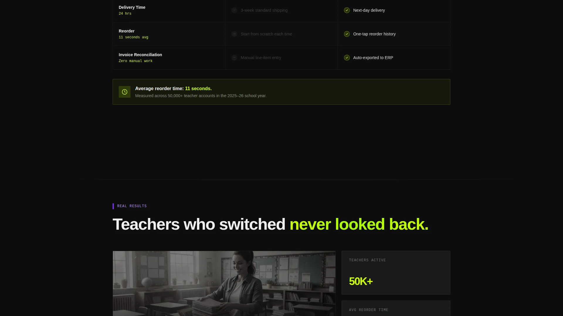
A full comparison grid appears row by row as the visitor scrolls. Each row contrasts the old procurement workflow against the app across dimensions like search speed, purchase-order integration, real-time budget tracking, next-day delivery, and one-tap reorder. Violet checkmarks animate into the app column while legacy columns show grayed-out dashes.
Sticky Dual App Download Bar
After the first scroll-reveal fires, a bottom-pinned bar appears with "Download for iOS" and "Get It on Android" platform-native badges. A secondary "Try the Web Version" text link serves desktop-bound purchasing coordinators who are not on a mobile device.
Full-Bleed Lifestyle Frames
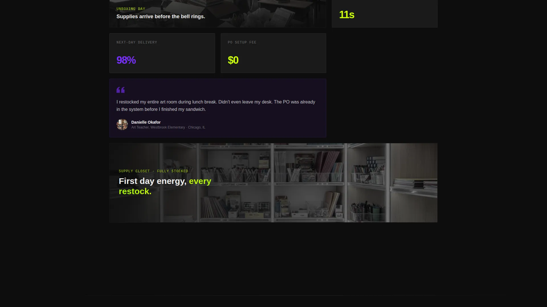
Between grid sections, full-bleed image frames depict real classroom moments: a teacher unboxing supplies at her desk, a supply closet lit like a vending machine. These frames keep the scroll from feeling like a data table and reinforce the human value of the product.
Quantified Time-Saving Callout
A bold inline callout reads "Average reorder: 11 seconds." This single data point earns the download tap by making the time savings feel concrete and immediate rather than abstract.
Page sections overview
| Section | Purpose |
|---|---|
| Hero Header | Introduce the app with an isometric product screenshot and fade-in headline |
| Feature Matrix | Compare app versus legacy procurement row by row with scroll-triggered animation |
| Lifestyle Frame One | Break the grid rhythm with a full-bleed teacher unboxing image |
| Time-Saving Callout | Quantify reorder speed with a bold inline stat to justify the download |
| Lifestyle Frame Two | Reinforce supply-closet imagery and keep emotional energy high |
| App Download Bar | Drive conversions with dual platform badges and a web version fallback link |
Design & branding system
The visual identity is built on the Acid Digital color system interpreted through a Startup Velocity theme. The palette feels like a neon sign buzzing in a dark warehouse: fast, unapologetic, and engineered to make school supply ordering feel like a tech product launch.
- Electric chartreuse (#CCFF00) is used for primary calls-to-action and progress indicators, while deep terminal black (#0D0D0D) fills section backgrounds for maximum contrast
- Synthetic violet (#7B2FFF) handles secondary highlights and category tags, and scanner-white (#F0F0F0) is applied to body text and card surfaces for clean legibility
- The hero product screenshot casts a faint chartreuse glow onto the surface beneath it, reinforcing the neon-warehouse energy throughout the scroll experience
Mobile & speed optimization
The template is structured as a single-page scroll flow, which keeps the layout lean and well-suited to mobile viewing. The sticky app download bar is designed with mobile-first intent, appearing naturally within thumb reach after the first content section reveals.
- The scroll-reveal progressive layout loads sections in sequence, reducing the visual weight of any single viewport load
- Full-bleed lifestyle frames and the isometric hero are designed to reframe naturally at smaller screen widths without losing their compositional impact
- The bottom-pinned call-to-action bar ensures the download prompt stays accessible throughout the entire scroll journey on any device size
How this template helps you convert
Every design and copy decision in this template points toward one outcome: a visitor who downloads the app or tries the web version before they leave the page.
- The animated feature matrix builds an undeniable visual argument scroll by scroll, so by the time the download bar appears, the visitor has already seen the evidence and made up their mind
- The "Average reorder: 11 seconds" callout transforms an abstract benefit into a specific, memorable number that justifies the tap and removes hesitation
- The sticky dual call-to-action bar with a web version fallback ensures every visitor type, whether on mobile or desktop, has a clear and frictionless next step available at all times
Other information about this template
This template sits at the intersection of the Technology category and the Education K-12 Digital Presence subcategory. It is purpose-built for the Education K-12 Online Store niche and carries an intersection match score of 13, indicating a strong alignment between the visual treatment and the audience intent.
- The template style is Scroll Reveal (Progressive), the creative direction is Feature Matrix, and the landing page direction is App Download
- The header concept is Product Screenshot and the theme is Startup Velocity, both of which reinforce the tech-product positioning that differentiates this storefront from traditional catalog-based suppliers
- This template is suitable for store owners who want their K-12 education supply platform to feel like a consumer tech launch rather than a government procurement portal
Theme
Startup Velocity
Creative direction
Feature Matrix
Color system
Acid Digital
Style
Scroll Reveal (Progressive)
Direction
App Download
Page Sections
Scroll-reveal Progressive Layout
Isometric Product Screenshot Hero
Animated Feature Comparison Matrix
Sticky Dual App Download Bar
Quantified Time-saving Callout
Full-bleed Lifestyle Frames
Related questions
Who is this landing page template designed for?
Can I customize the color palette and branding?
Does this template include the actual app or backend store functionality?
How does the animated feature comparison matrix work?
Is there a conversion path for users who are not on a mobile device?



