Agriculture Software Specialist Professional Website Template
Yield is a dashboard-style agriculture case management landing page built for county agents, USDA program technicians, crop adjusters, and agricultural lenders. It presents a live-feeling data environment, complete with a code-snippet hero, swimlane case timelines, FSA tract map grids, and a document intake queue, all rendered in a matte, industrial Tech Glass visual identity.
by Rocket studio
Quick summary
Yield is a single-page, dashboard-driven landing page template for agriculture case management platforms. It opens with an animated API code block and flows through discrete data modules: a case timeline, a satellite map grid, and a document queue. The design speaks directly to USDA technicians, crop adjusters, and ag lenders who need to trust a system fast.
Who this template is for
This template is built for software teams and product marketers selling tools into the agricultural data and compliance space. It speaks the language of the people actually using these systems every day.
- USDA Farm Service Agency (FSA) program technicians managing FSA-578 compliance filings
- Crop insurance adjusters reconciling satellite imagery with field loss claims
- Agricultural lenders tracking collateral across multiple land parcels simultaneously
What problem this template solves
Most agriculture software landing pages lead with stock photography of wheat fields and vague benefit statements. That approach loses the technically minded county agent or adjuster within seconds. This template solves for credibility at first glance.
- Scattered field reports, compliance documents, and insurance claims have no single home in generic page designs
- Technical buyers need proof the platform understands their data workflow before they click anything
- Generic marketing pages create friction for professionals who evaluate tools by their data precision, not their branding
What you get with this template
You get a complete, single-page landing page structured as a live product demo. Every scroll section is a discrete data module that builds confidence progressively toward a clear, no-friction call to action.
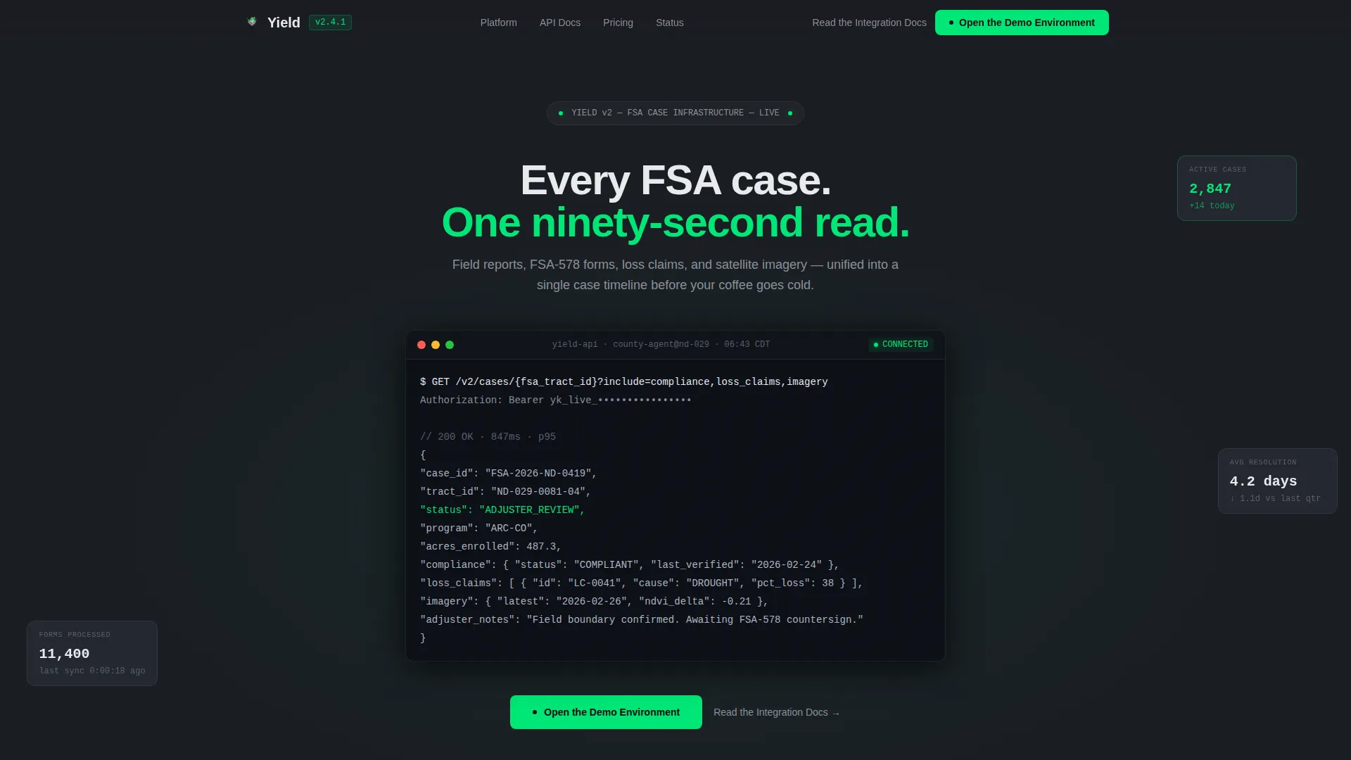
- An animated code-snippet hero block showing a real API call with a typed JSON response sequence
- Three dashboard tile sections: a swimlane case timeline, an FSA tract map grid, and a document intake queue
- A persistent top navigation bar with a primary call-to-action button and a secondary documentation link beneath each module
Feature list
This template delivers its impact through purpose-built sections and a design system calibrated for technical trust. Each feature below maps directly to what the template contains.
Animated API Code Hero
The header opens with a monospaced code block showing a real-looking API call: GET /v2/cases/{fsa_tract_id}?include=compliance,loss_claims,imagery. A typing animation unfolds the JSON response line by line, returning field boundaries, program enrollment status, and adjuster notes. No stock imagery. The code itself is the proof of concept.
Swimlane Case Timeline Tile
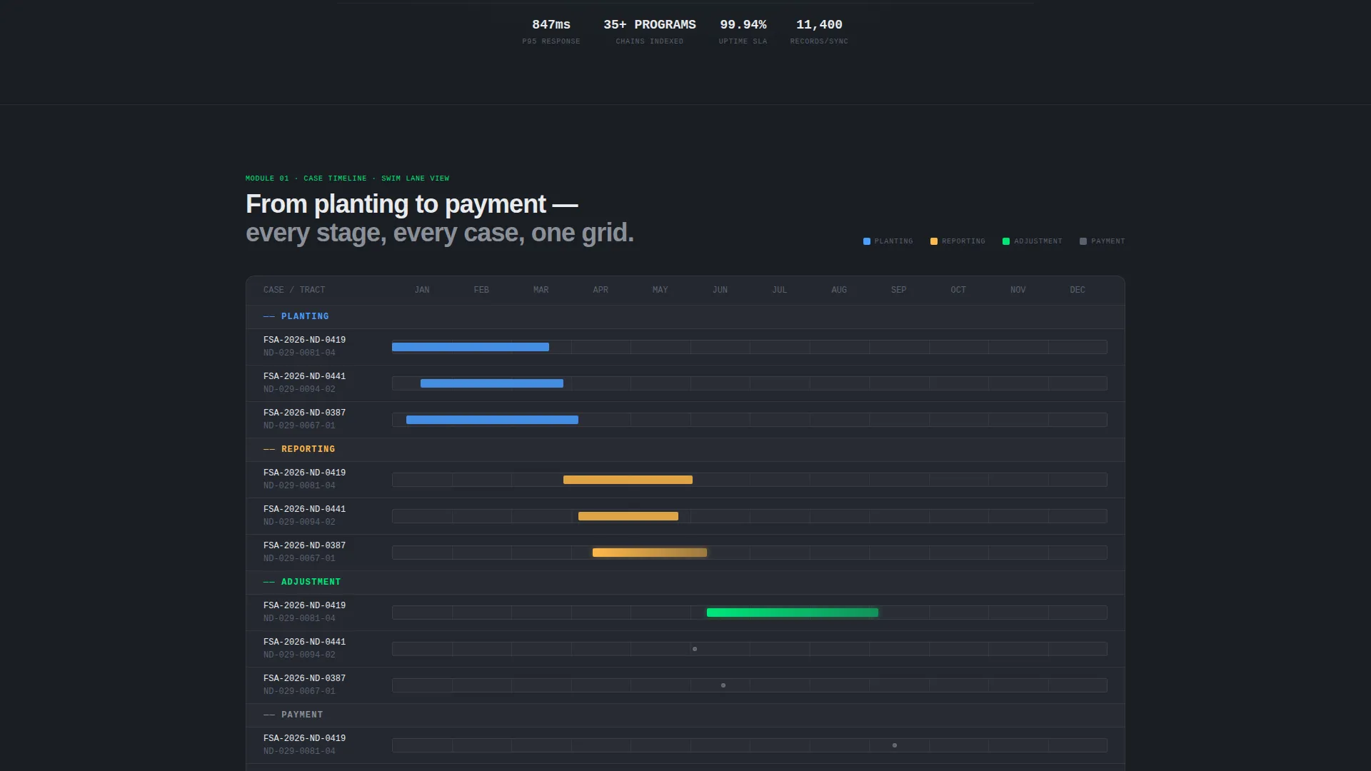
The first data module renders a horizontal swimlane timeline covering planting, reporting, adjustment, and payment stages. It is designed to look like a live case view a county agent can scan in under two minutes. Subtle spec labels showing response time in milliseconds and records per sync are embedded as visual design elements.
FSA Tract Map Grid Tile
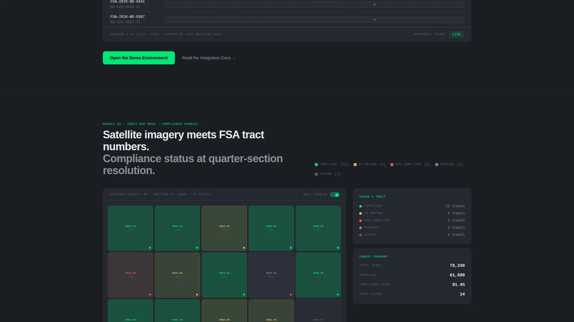
The second data module overlays FSA tract numbers on a satellite imagery grid with color-coded compliance status indicators. Active and flagged tracts are distinguished by the status-green accent color, making the compliance state of any parcel immediately visible.
Document Intake Queue Tile
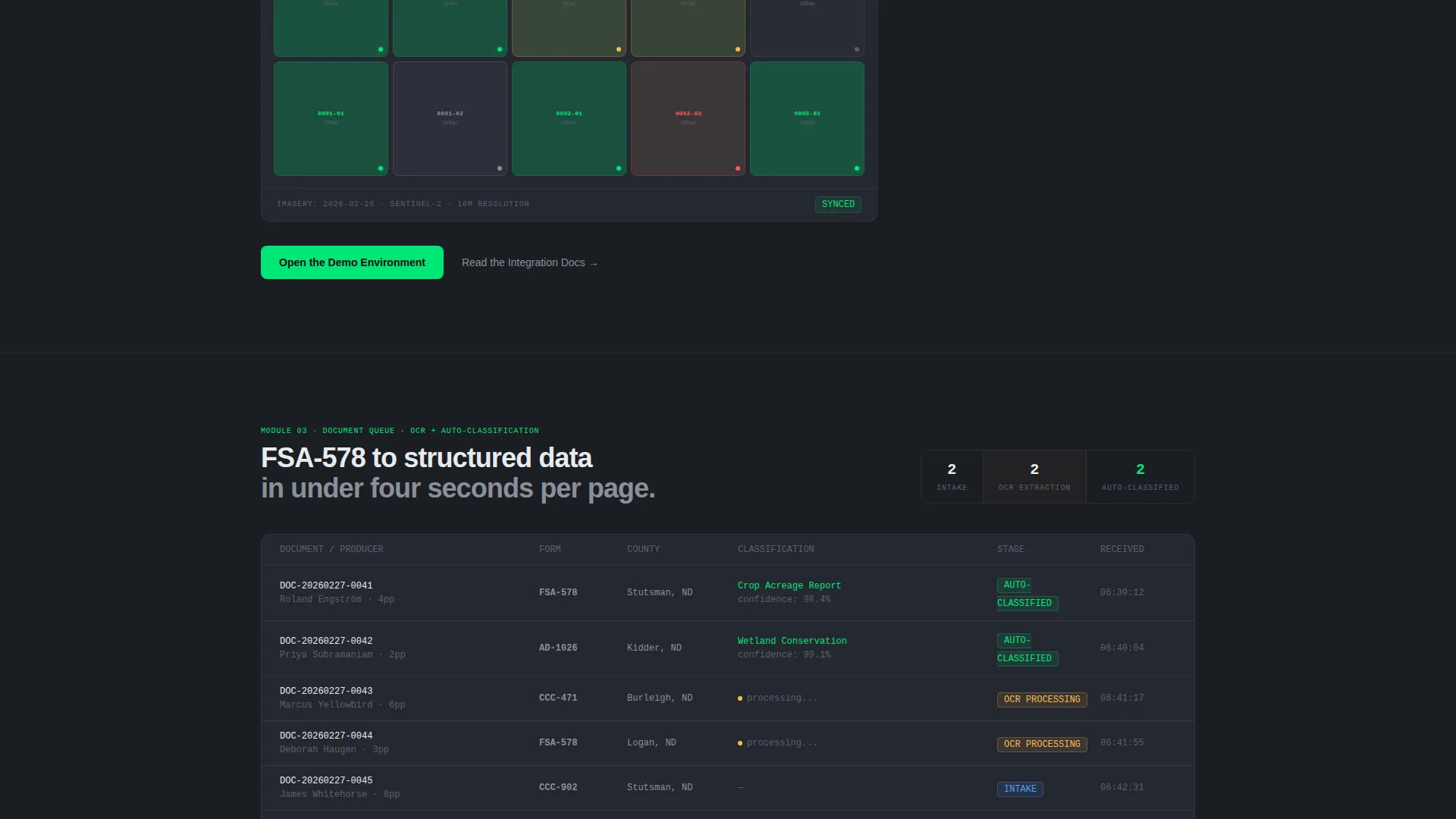
The third data module shows a real-time-looking document queue with three pipeline stages: intake, optical character recognition (OCR) extraction, and auto-classification. It visualizes exactly the kind of workflow a crop adjuster or technician handles daily, reinforcing platform relevance without a single word of explanation.
Click-Through call to action Architecture
The primary call-to-action, "Open the Demo Environment," appears in a persistent top navigation bar and repeats after every third data module. There is no form on the page. The click lands visitors directly in a sandbox pre-loaded with sample FSA case data. A secondary text link, "Read the Integration Docs," sits beneath each module for technical evaluators.
Spec Sheet Design Cadence
Each scroll section is treated as a discrete dashboard tile rather than a marketing block. Performance metrics such as uptime percentage and sync record counts appear as design elements within each tile. This Spec Sheet creative direction makes the page feel less like advertising and more like an actual product walkthrough.
Page sections overview
| Section | Purpose |
|---|---|
| Animated Code Hero | Opens with a typed API call and JSON response to establish data credibility immediately |
| Top Navigation Bar | Provides persistent access to the primary call to action and keeps orientation clear on scroll |
| Case Timeline Tile | Displays horizontal swimlane stages for planting, reporting, adjustment, and payment |
| Map Grid Tile | Overlays FSA tract numbers on satellite imagery with color-coded compliance status |
| Document Queue Tile | Shows intake, OCR extraction, and auto-classification pipeline in a live-style view |
| Secondary Doc Link | Offers a text link to integration documentation beneath each dashboard module |
| Repeated call to action Block | Reinforces the demo sandbox call to action after every third data module |
Design & branding system
The visual identity follows a Tech Glass theme executed through a Carbon Fiber color system. The palette is deliberately industrial: no gradients, no decorative flourishes, no photography. Trust is built through information density and visual restraint.
- Deep graphite (#1A1D23) as the primary page background, brushed titanium (#3A3F4B) for card surfaces and data containers, and cold white (#E8EAED) for all typography and grid lines
- Status-green (#00E676) used exclusively for active case indicators, success states, and interactive hotspots, making every green element feel functionally meaningful
- Monospaced typography in the hero section reinforces the terminal-at-dawn aesthetic; the overall palette reads like the matte side of a server rack
Mobile & speed optimization
The template is designed with lean, modular sections that translate cleanly to smaller viewports. Each dashboard tile is a self-contained block, which keeps layout reflow straightforward.
- Data module tiles stack vertically on mobile without losing the industrial grid aesthetic
- The persistent navigation bar and repeated call-to-action placement ensure the primary conversion path is always within reach, regardless of screen size
- Spec label overlays and status indicators are sized for legibility at standard mobile resolutions
How this template helps you convert
This template is engineered around a single conversion goal: get a qualified agriculture software buyer from the landing page into the demo sandbox without introducing any friction.
- The animated code hero qualifies visitors immediately. Someone who recognizes the API structure knows this platform speaks their data language, which means every subsequent scroll builds on earned trust rather than starting from zero.
- Each dashboard tile acts as inline proof of functionality. By the time a visitor reaches any call-to-action button, they have already seen the case timeline, the map grid, and the document queue in action, so the click feels like a natural next step rather than a leap of faith.
Other information about this template
This template is categorized under the Technology vertical with an Agriculture Software subcategory, aligning it with the agriculture case management niche. It is built as a single-page flow with a Dashboard and Data Grid template style.
- The header concept is a Code Snippet, the creative direction follows a Spec Sheet cadence, and the landing-page direction is optimized for Click-Through conversion
- The theme is Tech Glass rendered through the Carbon Fiber color system, making it well-suited for platforms serving county offices, crop insurance carriers, and agricultural lending institutions
- The template title is Yield, and it is listed in the marketplace under the Yield - Powerful Agriculture Landing Page Template name
Theme
Tech Glass
Creative direction
Spec Sheet
Color system
Carbon Fiber
Style
Dashboard/Data Grid
Direction
Click-Through
Page Sections
Animated API Code-snippet Hero
Swimlane Case Timeline Module
FSA Tract Map Grid Module
Document Intake Queue Module
Persistent Click-through Call to Action System
Carbon Fiber Tech Glass Design System
Related questions
Who is this landing page template designed for?
Does this template include a lead capture form?
Can I adapt the dashboard tile sections to show my own platform data?
What makes the code-snippet hero different from a typical product screenshot?
Is this template suitable for a non-agriculture data platform?



