Instant Retail AI Insights Landing Page Template
Pulse is a scroll-reveal landing page template built for enterprise retail AI analytics platforms. Designed with a Bold Brutalist carbon fiber visual identity, it opens with a boot-sequence KPI wall, guides visitors through interactive data modules, and funnels them toward a live demo. Purpose-built for VP-level operators, e-commerce directors, and category managers who need margin clarity fast.
by Rocket studio
Quick summary
Pulse is a single-page, scroll-reveal landing page template engineered for enterprise-grade retail AI analytics products. It opens with a full-viewport dark canvas where live retail metrics materialize before the headline types itself in. Every scroll stop is an interactive micro-demo. The page ends at one destination: the live demo environment.
Who this template is for
This template is designed for technology companies and SaaS founders building products in the retail intelligence space. It speaks directly to buyers who live inside complex data environments and make high-stakes decisions fast.
- VP Retail Operations managing 200-plus store fleets who need chain-wide visibility into revenue per square foot, basket size, and shrink percentages
- E-commerce directors drowning in SKU-level data who need actionable insights and real-time signals they can act on before the next ops review
- Category managers with regional profit-and-loss accountability who need fast root-cause analysis when an unfavorable trend surfaces in a specific region
What problem this template solves
Retail analytics products are powerful, but they are notoriously hard to sell. The buying audience is skeptical, time-poor, and data-sophisticated. A generic software landing page will not move them. They need to feel the product thinking before they commit to a demo.
- Fragmented data presentations fail VP-level buyers who arrive already fluent in business intelligence concepts and expect the page to match their cognitive level
- Static screenshots and marketing copy cannot demonstrate real-time data behavior, which is the core value proposition of any AI-powered retail analytics platform
- Long-form forms and gated demo requests kill conversion for enterprise visitors who want to see the product before they identify themselves
What you get with this template
Pulse delivers a complete, production-ready landing page structure with every section pre-built and sequenced for maximum persuasion. The layout is designed to teach visitors by doing, escalating from single-metric clarity to multi-variable AI correlation proof as they scroll deeper.
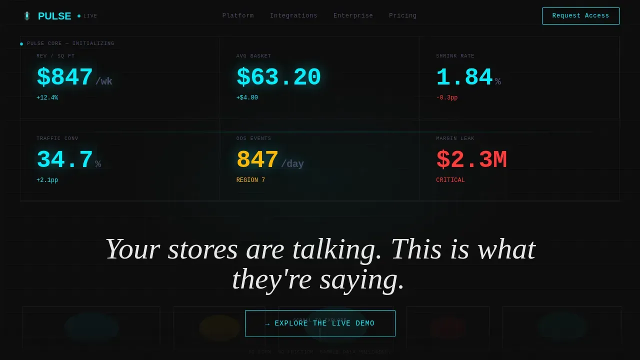
- A full-viewport boot-sequence header with live KPI counters, a heat map floorplan silhouette, and a self-typing headline rendered in monospaced type
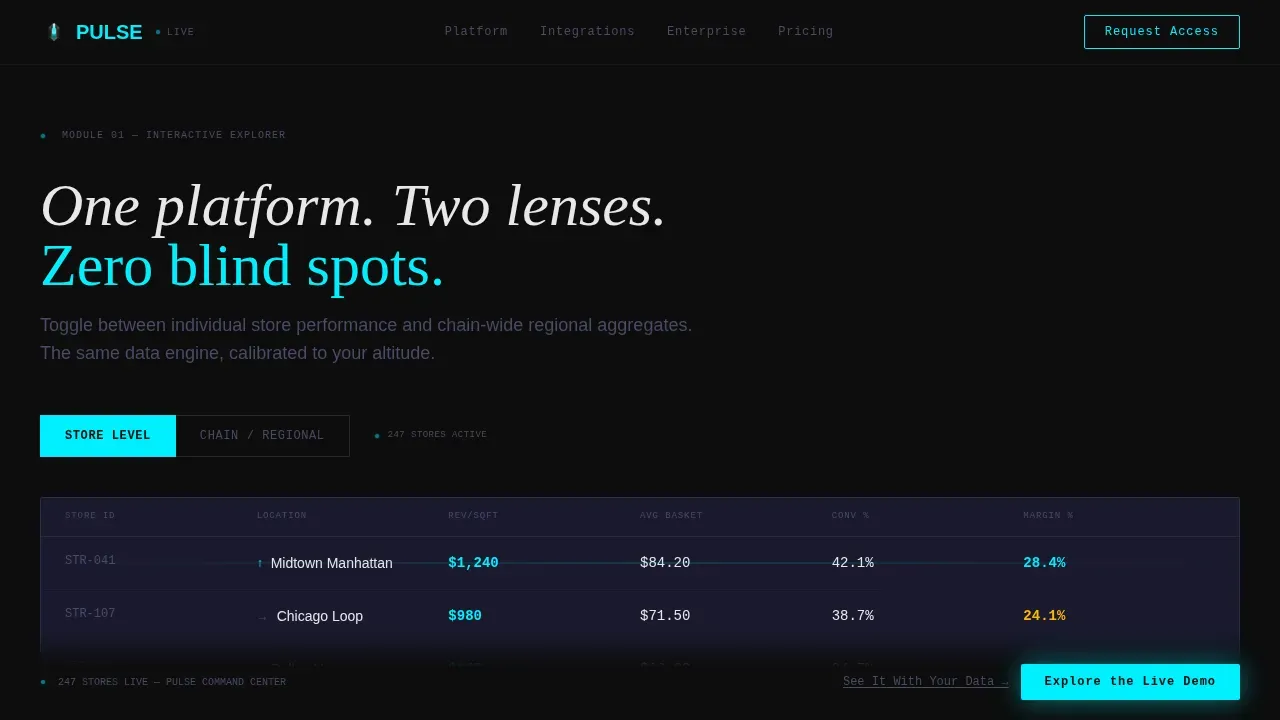
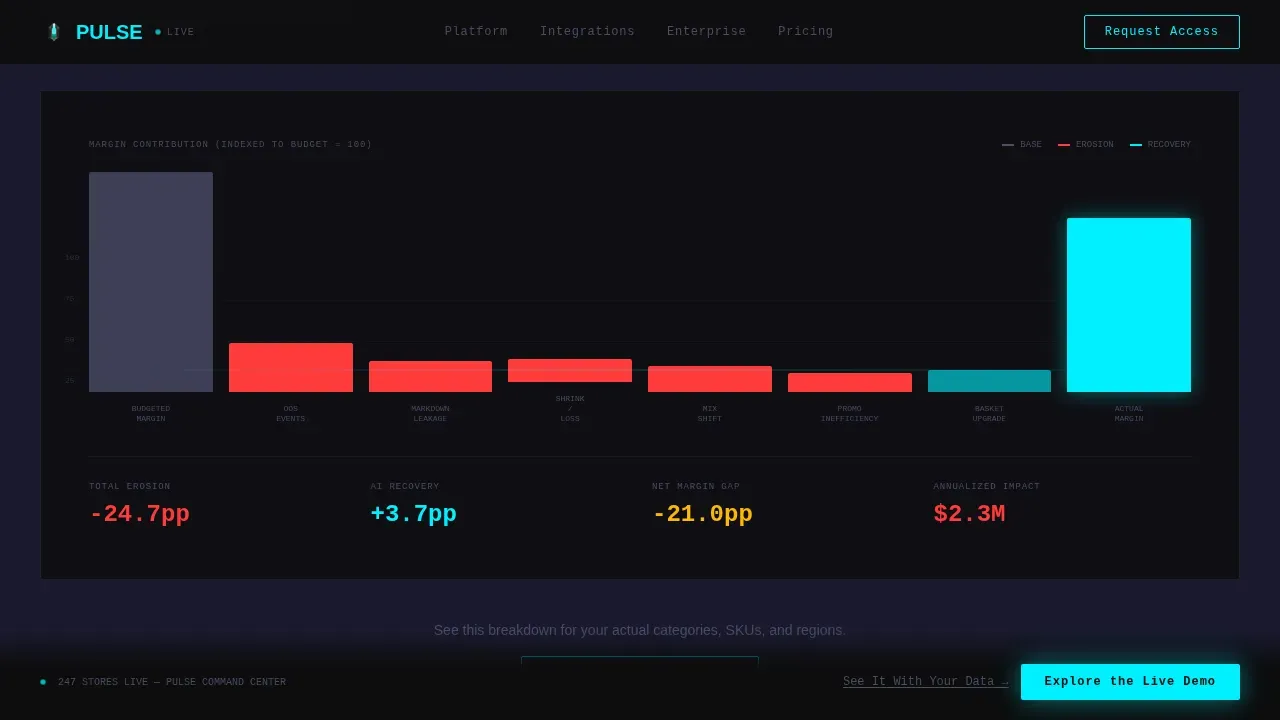
- Five interactive content sections including a store-versus-chain toggle explorer, a margin erosion waterfall chart that builds bar by bar on scroll, and an AI correlation engine proof section
- A two-stage call-to-action system: a ghost-outlined button after the header, solidifying into a filled electric-cyan bar after the visitor engages with two data modules, plus a sticky bottom rail call to action reading "See It With Your Data"
Feature list
This section details the core built-in capabilities of the Pulse template. Every feature listed below is grounded in the source brief and the design direction provided.
Boot-Sequence KPI Hero Wall
The header is a full-viewport dark canvas with no hero image and no lifestyle photography. Retail metrics materialize one by one as if the dashboard is booting up. Revenue per square foot ticks upward. Basket size pulses. A heat map of store traffic blooms across a floorplan silhouette. Numbers render in oversized monospaced type with electric cyan accents flickering on the key metrics that matter most. The self-typing headline activates after the data lands, delivering the message at exactly the right moment.
Interactive Store and Chain Toggle Explorer
The first scroll stop hands the visitor real controls. A toggle lets them switch between a store-level and a chain-level view of a sample dataset. This is not a slideshow. The visitor is interacting with structured data, experiencing the relevance of relevant metrics at two different granularities. This module is the template's first proof point that the platform thinks at the scale the buyer operates at.
Scroll-Triggered Margin Waterfall Chart
The second interactive module presents a margin erosion waterfall chart. As the visitor scrolls deeper, bars build one by one, each representing a different cost driver. This visual explanation of margin leakage is more persuasive than any bullet point. It shows buyers exactly the kind of insight summaries they would receive inside the live product, building anticipation and trust before the call to action solidifies.
AI Correlation Engine Section
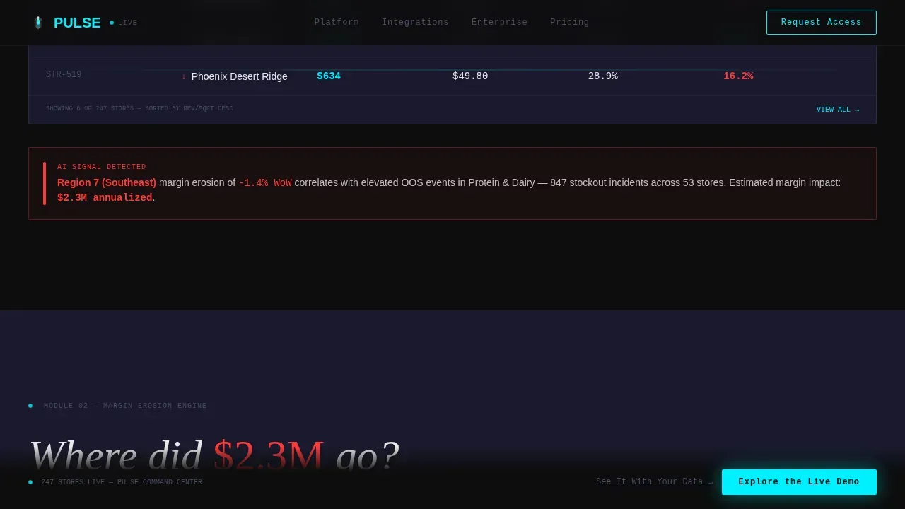
The third major content module escalates complexity deliberately. It moves from single-metric clarity to multi-variable AI correlation maps, demonstrating that the platform handles deeper insights as the operator's questions get harder. This section proves the product can surface detected insights across multiple variables simultaneously, which is the capability that separates genuine AI-powered analytics from standard reporting dashboards.
Progressive Two-Stage Call-to-Action System
Pulse uses a conversion architecture designed around earned engagement. The primary call to action, "Explore the Live Demo," begins as a ghost-outlined button after the header. After the visitor interacts with at least two data modules, the button solidifies into a filled electric-cyan bar. There is no form on the page. The click carries visitors directly into a pre-loaded sandbox environment with sample retail data. A sticky bottom-rail secondary call to action reads "See It With Your Data" for visitors ready to connect their own feeds.
Scroll-Reveal Progressive Animation Engine
Every section in the template activates through scroll-reveal progression. The animation system uses IntersectionObserver step activation, a typewriter effect for the headline, pulsing KPI counters driven by requestAnimationFrame, and GPU-accelerated transforms throughout. The result is a page that feels like a live product demo rather than a marketing brochure.
Page sections overview
| Section | Purpose |
|---|---|
| Hero KPI Wall | Boot-sequence metric reveal with self-typing headline and ghost call to action |
| Store Chain Toggle | Interactive view switcher between store-level and chain-level sample data |
| Margin Waterfall Chart | Scroll-triggered bar-by-bar margin erosion visualization |
| AI Correlation Engine | Multi-variable intelligence proof demonstrating advanced detected insights |
| Speed to Insight | Integration timeline section with solidified electric-cyan call to action bar |
| Sticky Bottom Rail | Persistent secondary call to action for visitors ready to connect live data sources |
| Minimal Footer | Developer-style single-row footer with minimal links |
Design & branding system
The visual identity follows a Bold Brutalist theme built on a Carbon Fiber color system. Every design decision is intentional and industrial. The palette feels like running a thumb across a matte-black chassis with one luminous seam.
- Color system: deep carbon black (#0D0D0D) as the primary canvas, machined graphite (#1A1A2E) for layered surfaces, titanium mid-tone (#4A4A68) for secondary elements, signal white (#E8E8E8) for all typography, and electric cyan (#00F0FF) reserved exclusively for live data points, hover states, and call-to-action edges
- Typography system: JetBrains Mono for all data and numbers to reinforce the raw dashboard aesthetic, Fraunces for display headlines to provide editorial contrast, and DM Sans for body copy to keep body text clean and readable
- Visual hierarchy places large bold primary KPIs at the top of the page, followed by secondary trends and interactive modules, so visitors absorb the most important information first and dig deeper as they scroll
Mobile & speed optimization
The template is architected as desktop-first because VP-level retail operators use large monitors where dashboard real estate is essential. The design prioritizes the primary use case without sacrificing smaller-screen usability for field managers who need on-the-go access.
- Desktop-first layout prioritizes large-viewport data density, ensuring that multi-variable charts and toggle explorers render with full clarity on the screens where buying decisions are actually made
- Animation performance relies exclusively on GPU-accelerated transforms and requestAnimationFrame counters, keeping the scroll-reveal sequences smooth without introducing unnecessary layout recalculations
- Mobile responsiveness ensures that managers monitoring key metrics away from their desk can still navigate the page and reach the call to action, even when not on a primary workstation
How this template helps you convert
The Pulse template is a click-through engine. Every design and interaction decision exists to move the visitor from skeptical observer to engaged demo participant.
- The boot-sequence header creates immediate credibility. Real retail metrics rendered in raw numbers and monospaced type signal product authenticity within the first five seconds, before any marketing copy has been read.
- The progressive interaction model earns engagement. By letting visitors toggle views and watch charts build, the page delivers personalized insights in context rather than making claims about them, making the solidified call-to-action feel like a natural next step rather than a sales push.
- The no-form conversion path removes the highest-friction point in enterprise SaaS acquisition. Visitors click directly into the sandbox environment, removing every barrier between curiosity and product experience.
Other information about this template
Pulse is named for the real-time pulse of retail data that the platform monitors. The template is built to support any enterprise business intelligence product that needs to demonstrate the speed and depth of its insights platform before asking for a commitment. Below is additional context that may be useful when evaluating this template for your use case.
- The template's interactive explorer pattern is well-suited to platforms that aggregate data from multiple data sources, including point-of-sale systems, enterprise resource planning tools, e-commerce platforms, and CRM data feeds, into a single unified view
- The scroll-triggered waterfall chart section can demonstrate cost metrics, shrink percentages, total sales variance, lead volume trends, and any other metric that benefits from a sequential visual build
- The two-stage call-to-action architecture supports continuous optimization of conversion paths, since teams can measure engagement with each data module independently and adjust the solidification trigger based on real world feedback
- The template structure supports a metrics layer concept where goal values are assigned to relevant metrics and visitors can see how the platform surfaces an unfavorable trend against a defined target, making the value proposition immediately concrete
- For platforms that deliver personalized insights directly to operators via mobile notifications, a Slack message, or email digests, the Speed to Insight section can illustrate how detected insights reach the right person at the right time across multiple channels
- The design supports platforms where a data analyst or operations manager can define key metrics, assign owners to those metrics, and configure digest frequency settings without requiring training sessions or deep technical knowledge
- Platforms that connect to external data sources such as Google Sheets exports for offline reporting, or that sit alongside tools like Google Ads campaign data to correlate website traffic and traffic source attribution with in-store performance, will find the template's data infrastructure narrative section natural to extend
- The template is compatible with business intelligence ecosystems where granular permissions control who sees which insight types, where admin insights govern metric crosses, and where large organizations need to enforce the same definition of a metric across every region and team
- Visual explanations in the waterfall and correlation sections can represent natural language insights that the platform generates automatically, showing visitors how AI converts raw numbers into plain language summaries they can act on in seconds
- The sticky bottom-rail call to action, "See It With Your Data," is designed for visitors who arrive already informed. It caters to buyers who have reviewed the platform elsewhere and are ready to connect their own data sources, skip the sandbox, and move toward a direct evaluation
- The template is suitable for platforms where insight summaries surface noteworthy changes in inventory levels, customer satisfaction scores, unique visitors to digital storefronts, or any metric that benefits from AI-powered anomaly detection
- Teams referencing Tableau Pulse as a competitive benchmark will find this template useful for positioning their platform's natural language, personalized data insights, and insight summaries capabilities in context. Explore Tableau Pulse to understand how Tableau Pulse metrics, Tableau Pulse insights, and the Tableau Pulse page communicate value, then use Pulse to show how your platform delivers comparable or superior depth. Tableau Cloud deployments and the Tableau mobile app, including Tableau mobile experiences broadly, are common reference points for buyers evaluating alternatives. Tableau pulse ensures a high standard that competing platforms can address directly through a compelling demo-first landing page like this one. Teams can use this template to communicate how their own insights platform delivers trusted insights and informed decisions, whether buyers are familiar with Tableau pulse or evaluating BI tools for the first time. Google Analytics data, Google Ads integration context, and Google Sheets connectivity are common data sources that buyers will expect to see acknowledged in the platform narrative. The generative AI capabilities of the platform, including natural language querying, follow up questions, and plain language insight summaries, can all be demonstrated through the interactive modules this template provides. The template supports data-driven decisions at the pace that one platform serving large organizations demands, and pulse ensures that every visitor leaves with a clear understanding of what the product does before they are asked for anything in return.
Theme
Bold Brutalist
Creative direction
Interactive Explorer
Color system
Carbon Fiber
Style
Scroll Reveal (Progressive)
Direction
Click-Through
Page Sections
Boot-sequence KPI Hero Wall
Interactive Store and Chain Toggle Explorer
Scroll-triggered Margin Waterfall Chart
AI Correlation Engine Proof Section
Progressive Two-stage Call-to-action System
Scroll-reveal Progressive Animation Engine
Related questions
What kind of product is this template designed to promote?
Does this template include a lead capture form?
Can I adapt the interactive data modules to reflect my platform's actual metrics?
Is this template suitable for a non-retail analytics product?
What animation and interaction capabilities does this template include?



